

To create cohesive interiors, you start with a restrained color palette—2–4 core hues—then layer accents to guide mood and flow. Tie textures and finishes together with similar reflectivity, while mixing tactile contrasts for depth. Layer lighting in ambient, task, and accent to sculpt mood without glare. Guarantee rhythm through repeated elements across rooms and maintain proportion with scaled furniture. Keep intentional contrast at thresholds, and use patterns sparingly to unify spaces. If you keep this approach, you’ll release deeper harmony as you proceed.
Key Takeaways
- Establish a neutral backbone palette, then layer 2–4 core hues with high-saturation accents for focused cohesion and mood shifts.
- Align colour placement with a clear focal point, using lighter transitions between rooms to create visual breathing space.
- Layer textures and finishes with similar reflectivity, balancing sheen and matte to maintain harmony across surfaces.
- Layer lighting (ambient, task, accent) with dimmable controls to sculpt mood, depth, and focal emphasis.
- Use purposeful, restrained patterns and expressive details to reinforce theme while ensuring readability and timelessness.
Step 1: Define a Cohesive Interior Color Palette
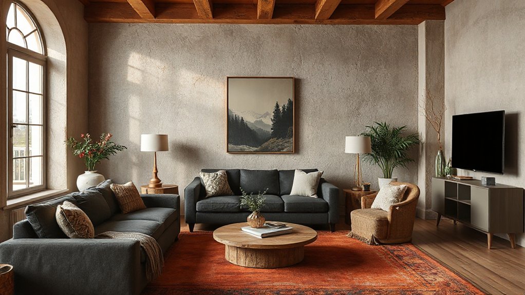
Craft a cohesive interior color palette by starting with a unifying base and then layering accents. You select a neutral foundation that grounds the space, then introduce color through purposeful swatches.
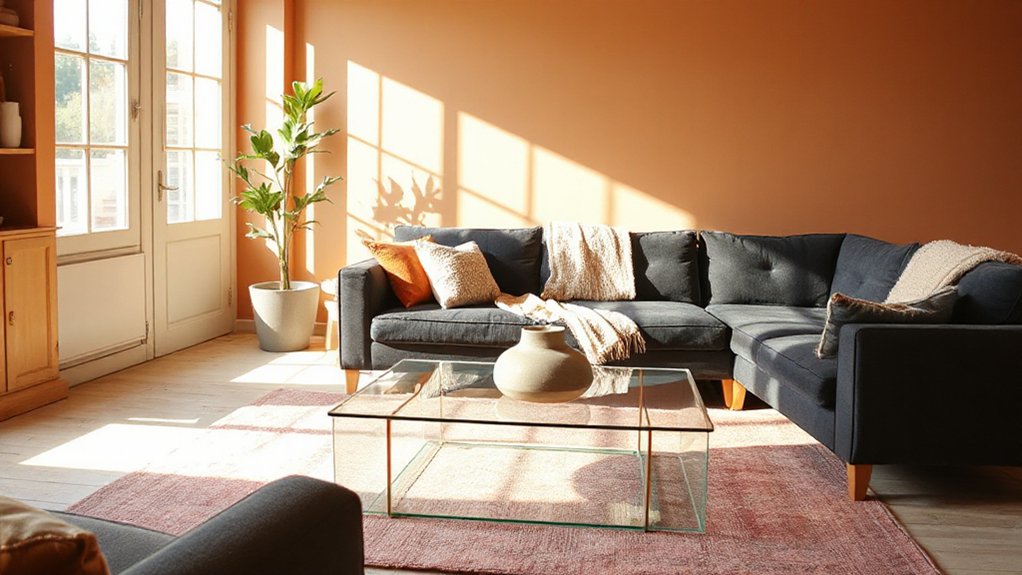
Use color psychology to guide choices: calm blues or muted greens evoke serenity, while warm terracotta or amber adds energy without overpowering.
Consider cultural influences to honor heritage and personal story, integrating motifs and tones that resonate authentically.
Limit the base palette to two to four core hues, then apply accents in higher-saturation pops to create focal points.
Guarantee contrast remains harmonious by checking lightness values across surfaces, textiles, and artwork.
Test combinations under different lighting, evaluating mood shifts at various times of day.
Document decisions to maintain consistency throughout the design process.
Step 2: Layer Textures for Depth and Contrast
Textures layer depth and contrast by pairing tactile surfaces with complementary finishes. You establish hierarchy by mixing softly textured fabrics with crisp surfaces, then balance sheen and matte to avoid visual competition.
Start with a neutral base and add a pattern in a contrasting texture to create subtle movement. Emphasize texture contrast to guide attention: a smooth table against a ribbed upholstery, a velvet cushion beside a leather chair, a woven rug under polished wood.
Consider color psychology when combining textures, ensuring hues reinforce mood rather than overwhelm it. Maintain cohesion through repeating textures in varied scales, so no single element dominates.
Keep shifts seamless by aligning grain direction and edge finishes, and always test under practical lighting to confirm the intended depth.
Step 3: Choose Materials That Read as Intentional
Material readability matters: choose fabrics, finishes, and surfaces that communicate purpose at a glance.
Opt for intentional texture choices that stay durable, timeless, and visually cohesive across spaces.
Your selections should read as deliberate design decisions, not accidental mix-and-match.
Material Readability Matters
How materials communicate intent? You pick surfaces that read as purposeful at a glance, not by chance. Material readability matters because every choice signals function, durability, and mood.
When you select finishes, you’re scripting behavior: woods that read warm and sturdy, metals that imply precision, fabrics that convey softness yet wear well. Aim for consistency in scale, texture, and sheen so the eye travels smoothly across the room.
Consider material symbolism and cultural significance to guarantee choices resonate beyond aesthetics, aligning with the space’s use and occupants. You’ll create cohesion when each element supports the whole, avoiding mixed signals.
In short, readable materials guide perception, reduce interpretation fatigue, and reinforce intentional design rather than drift.
Intentional Texture Choices
Texture matters because what you feel tells the story before you see it. When you choose materials with intent, you guide perception through tactility as well as sight.
Aim for deliberate textural contrast that clarifies zones, enhances depth, and avoids visual monotony. Pair smooth, glossy surfaces with restrained, matte finishes to create emphasis without shouting.
Introduce Pattern mixing thoughtfully: combine a subtle weave with a geometric accent to add rhythm without clutter.
Let textures echo across rooms—cotton, linen, leather, wood—so each space feels connected rather than disjointed.
Prioritize coherence over novelty: select materials that reinforce your palette and lighting, while allowing tactile variety to elevate the overall composition.
Informed texture choices cultivate a cohesive, purposeful atmosphere.
Durable, Timeless Finishes
When you select finishes that endure, you’re investing in a space that stays as intentional as it looks. Durable, timeless materials communicate craft and restraint. Choose surfaces and textures that age gracefully, resisting fads while remaining legible in your design language.
Favor solid, high-quality substrates, low-maintenance finishes, and seams that invite hands-on use without showing wear. Eco-friendly finishes prove you value longevity and responsibility, reducing future replacement cycles.
Pair these with classic scales, subdued gloss, and tactile warmth to maintain cohesion across zones. For color, lean into Vintage-inspired palettes that evolve with patina rather than date your space.
Prioritize consistency in sheen, grain, and tension between soft and hard elements, so every material reads as purposeful.
Step 4: Layer Lighting to Shape Mood and Depth
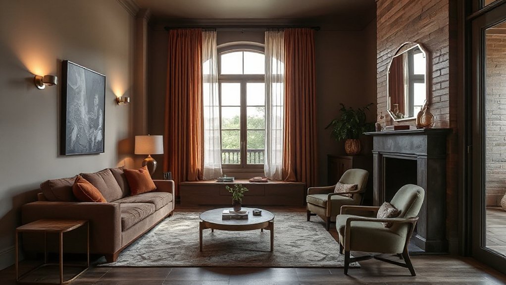
Layering lighting is how you sculpt mood and depth in a room, starting with a solid plan that pairs ambient, task, and accent layers to avoid flat, one-note illumination.
You build a coherent palette by pairing light types with color psychology and your chosen lighting fixtures, ensuring warmth, intensity, and direction support the space.
Keep these priorities in mind:
1) Establish hierarchy with dimmable fixtures to modulate mood.
2) Use layers to reveal texture, color, and form without glare.
3) Position accents to highlight focal features and balance rooms.
This approach yields rooms that feel intentional, vibrant, and harmonious, where light guides perception while remaining functional and refined.
Step 5: Balance Contrast With Continuity Across Rooms
To guarantee each space feels connected while still reading as distinct, align contrast—through color, material, and proportion—with a unifying through-line that travels from room to room. You balance bold statements with quiet repeats, ensuring contrast harmony without jarring *progressions*.
Use consistent undertones in color temperature and texture, so a statement piece echoes in adjacent areas through proportional echoes and rhythm. Establish visual flow by distributing light and dark values along sightlines, guiding the eye from foyer to living, then to private zones.
Let texture shifts introduce tactility, not conflict, and keep hardware, trim, and furniture legs aligned in scale. Across rooms, repeat a signature finish subtly, sustaining connectivity while allowing each space to read as purposefully unique.
This approach preserves cohesion while maintaining visual interest.
Step 6: Scale and Proportion of Furniture for Cohesion
You’ll want to start by ensuring your furniture scale aligns with the room’s proportions, so each piece reads as part of a cohesive whole.
Consider how size harmony across adjacent zones guides sightlines, traffic flow, and how users interact with the space.
When proportions are balanced, the room feels deliberate, unified, and naturally comfortable.
Scale Considers Proportion
Scale and proportion determine how furniture reads in a space. You balance silhouettes and volumes to prevent crowding or emptiness, ensuring each piece supports the room’s rhythm.
Scale isn’t just size; it’s how objects relate to human scale, to light, and to the surrounding elements. By aligning scale with proportion, you cultivate cohesion that feels intentional and calm.
Consider color symbolism and texture symbolism when judging size relationships, as these cues amplify perceived harmony. Use a few precise selections rather than many to maintain clarity.
- Match sofa length to room width for steady lines.
- Vary chair scale to create inviting clusters without overcrowding.
- Pair large pieces with smaller accents to anchor balance while preserving movement.
Furniture Size Harmony
Begin with the seating cluster: match sofa and chairs to the room’s proportions, leaving comfortable circulation paths and clear sightlines. For tables, choose dimensions that balance with seating, avoiding oversized or undersized surfaces that disrupt rhythm.
Consider the vertical scale of lamps, shelves, and art to maintain consistent visual weight. Prioritize furniture arrangement that reinforces flow, preventing crowding while preserving function.
When scales align, the room feels intentional, unified, and calm, guiding eye movement naturally through the space.
Step 7: Create a Practical Furniture Plan That Supports the Palette
To make the palette practical, translate color and texture choices into a coherent furniture plan that supports daily use and visual flow. You shape spaces with purpose, prioritizing function alongside aesthetics. This step anchors your palette in real life by aligning scale, form, and circulation to user needs.
Focus on furniture placement and ergonomic design to prevent fatigue and awkward movements.
- Align seating and work zones so sightlines remain clear and passageways are natural.
- Choose multi-functional pieces that carry the palette while maximizing flexibility.
- Tolerate negative space to keep rooms breathable, ensuring pathways stay unobstructed.
Step 8: Craft a Lighting Plan: Ambient, Task, and Accent
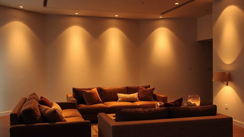
You’ll start by balancing ambient layering with a soft overall glow that shapes the room without overpowering highlights.
Then, you’ll define task lighting for work zones, ensuring clarity and reducing eye strain, while keeping color temperature consistent.
Finally, you’ll use accent lighting to highlight architecture or artwork, creating focal points that enhance the palette and mood.
Ambient Layering Basics
How do you build a lighting plan that genuinely supports daily living? Ambient layering rests on three precise choices: balance, flow, and control. You’ll shape spaces by combining general illumination with strategic diffusion, avoiding glare and harsh shadows. This baseline sets mood and function before adding accents.
- Establish zones with uniform brightness levels that align with usage.
- Implement dimming and warm-to-cool transitions to support color psychology.
- Integrate lighting automation to adapt scenes for time, activity, and mood.
Keep the plan compact and scalable, ensuring seamless transitions between rooms. By prioritizing consistent ambience, you’ll reinforce color choices, texture perception, and daylight integration. This approach reduces visual fatigue and reinforces a cohesive interior narrative through lighting.
Task and Accent Roles
Accentuate specific tasks and moments with purpose-built lighting: task lighting delivers focused, glare-free illumination where you work, read, or detail projects.
While accent lighting draws attention to architectural features, art, and textures. In this phase, you define how each area supports intent, balancing brightness with mood.
Use color theory to select color temperatures that align with function; cooler temps boost alertness for work, warmer tones foster comfort for reading nooks.
Layered layers create texture contrast, so shapers, fabrics, and surfaces pop without glare. Guarantee dimming controls allow quick shifts between focus and ambience.
Position luminaires to minimize shadows on work surfaces and maximize highlights on prized elements.
Document a plan that maps tasks to light levels, guarding consistency across rooms for cohesive interiors.
Step 9: Color Placement Strategies for Harmonious Flow
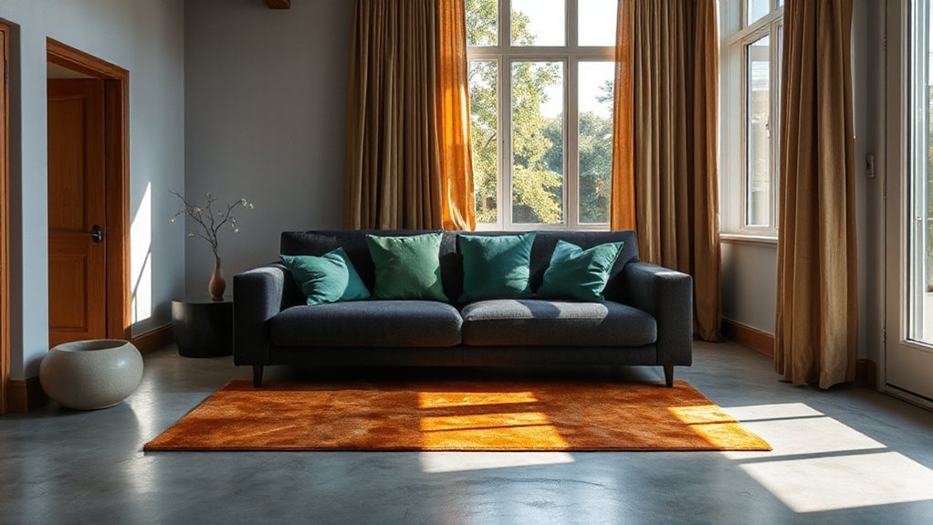
Color placement is the key to guiding the eye and unifying rooms, so start with a clear focal point and build around it. You’ll shape flow by distributing color with intent, not chance, using contrasts and complements to direct attention smoothly. Harness color psychology to cue mood shifts, and guarantee emotional resonance supports each zone.
- Establish a dominant hue in the focal area, then echo it in secondary spaces to reinforce a cohesive narrative.
- Use lighter tones for progression between rooms to create visual breathing room while maintaining continuity.
- Apply accent colors sparingly at thresholds and furniture accents to punctuate rhythm without jarring interruptions.
Step 10: Texture Play: Weaving Fabrics, Woods, and Surfaces
Textures anchor design by tactile contrast. You blend textiles, woods, and surfaces to build a dynamic trio that readies a room for cohesion.
Start with textural contrast: pair plush with sleek, rough with refined, and matte with subtle sheen to keep interest without shouting. You balance surfaces so each texture plays a distinct role, yet supports the whole.
Surface layering becomes your method: lay a soft rug over a structured floor, add linen drapery to a cotton-sateen chair, then crown with a wooden table that echoes grain in cabinetry. This approach respects proportion and rhythm, guiding how light travels and how shadows define form.
The result is calibrated, purposeful tactility that reinforces color decisions without competing with them.
Step 11: Finishes and Sheen That Reinforce Cohesion
Finishes and sheen shape how a space reads as a whole, tying the palette and textures you’ve chosen into a unified whole. You control mood and cohesion through deliberate finish options and disciplined sheen variations, ensuring surfaces read consistently rather than clashing.
- Finish options: select coatings that reflect light similarly, from walls to furniture, preserving a harmonious tone.
- Sheen variations: vary only within a narrow range (matte to eggshell) to maintain subtle unity across materials.
- Application consistency: match substrate, primer, and topcoat to avoid tonal shifts that disrupt flow.
This approach minimizes visual noise, reinforces intent, and supports your chosen color story with tactile continuity. Finish choices become a quiet, powerful conductor of cohesion.
Step 12: Common Cohesion Pitfalls and How to Fix Them
Even with a clear vision, cohesion can unravel if you overlook common missteps. In Step 12, you identify and fix frequent cohesion flaws before they derail your scheme.
Design misalignment steals sense: even small mismatches in scale, proportion, or finish create dissonance. Check hardware, trim, and textiles for consistent gloss, weight, and texture—then adjust until edges feel intentional, not accidental.
Color clashes appear when you fracture color relationships across rooms; pair adjacent palettes thoughtfully and maintain a unifying undertone to anchor shifts.
Avoid too many competing patterns; prioritize one dominant motif and support with restraint.
Test lighting choices at actual brightness levels, not in isolation, to ensure tonal balance end-to-end.
Finally, document decisions so future updates stay aligned with your cohesive vision.
Step 13: Real-World Examples: From Drab to Cohesive Homes
Step 13 showcases real-world transformations, revealing how cohesive design moves from a drab start to a polished, intentional home. You’ll see practical applications of color psychology and artistic expression that translate theory into lived experience.
- You compare initial spaces with curated swatches, observing how hue relationships guide mood and flow.
- You select textures and finishes that reinforce a unified narrative, ensuring tactile coherence alongside color.
- You test lighting plans that reveal the true moment of cohesion, calibrating warmth and contrast for daily life.
Real-world examples prove theory in action, showing how deliberate color choices, paired with expressive details, elevate rooms from tired to purposeful. You’ll recognize patterns you can adapt, reinforcing how restraint and intention yield lasting harmony.
Frequently Asked Questions
How to Avoid Palette Clash Between Rooms?
To avoid palette clash, maintain color harmony across spaces and guarantee design flow. You’ll synchronize core neutrals, repeat an accent hue, and vary saturation thoughtfully, creating cohesive transitions that feel deliberate rather than matched.
Which Textures Read as Consistent Across Spaces?
Texture that reads consistent across spaces is subtle, tonal, and natural. You’ll achieve textural continuity, then cultivate tactile harmony with fabrics and surfaces you reuse in key spots, creating a quiet, suspenseful flow that guides perception.
How to Balance Bold Accents With Neutrality?
Balance bold accents with neutrality by anchoring the palette in neutral tones, then use selective accent pieces. This accent balance creates Neutral harmony while letting pops of colour feel intentional, cohesive, and visually powerful.
What Lighting Techniques Unify Varied Areas?
Start with ambient layering to unify spaces, then use focal point anchoring to draw attention. You’ll balance glow and shadows, guiding sight across varied areas while maintaining cohesion, rhythm, and a calm, purposeful atmosphere.
How to Test Cohesion Before Committing Purchases?
Test cohesion before purchases by staging a mock room: arrange furniture arrangement first, then add decorative accessories in small clusters to evaluate balance, scale, and flow before committing.
Conclusion
You can transform a space from scattered to cohesive by sticking to a unified color palette, deliberate textures, and intentional lighting. Keep materials readable and finishes consistent to reinforce the look. A surprising stat: homes with a thoughtfully layered lighting plan report perceived room size increasing by up to 35%, boosting comfort without added square footage. Follow the steps, anticipate cohesion pitfalls, and let texture and light guide the eye toward a balanced, purposeful interior that feels endlessly intentional.

