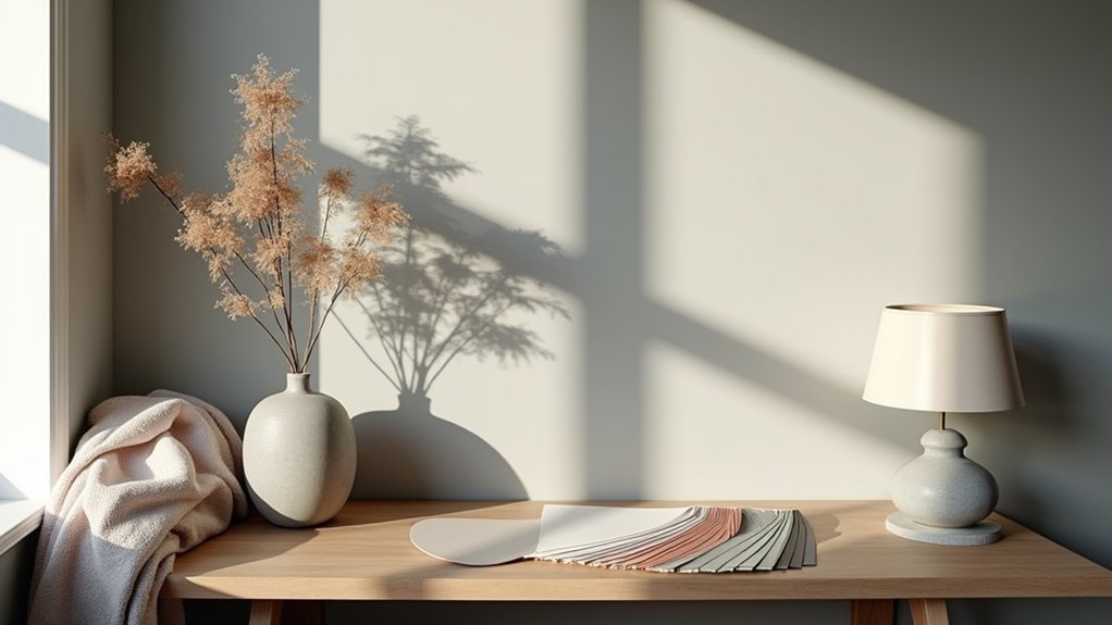

You’ll uncover secret color palettes that interior designers rely on for timeless cohesion. Start with timeless neutrals that whisper luxury, then layer warm earth tones for coziness, add moody hues for depth, and finish with soft pastels for airy balance. Test colors in real lighting, document outcomes, and use budget-smart swaps to keep value high. Avoid overusing neon or overpowering contrasts. Want more precise steps and examples? There’s more you can apply right away.
Key Takeaways
- Cohesive, restrained palettes shaped by space, light, function, with a clear hierarchy: dominant field, supporting accents, and tiny highlights.
- Layered tones and subtle textures prevent jarring contrasts; test sheets on-site under consistent lighting to confirm cohesion.
- Balance warm and cool undertones using neutral anchors, with limited undertone shifts to maintain harmony.
- Use a unifying hue to stabilize contrast across scales and surfaces; reserve high-contrast pairings for accents.
- Test in real lighting, document mood and symbolism, and adjust saturation rather than hue for adaptable, intentional palettes.
What Makes a Secret Color Palette Work in Interiors
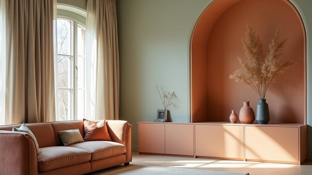
A secret color palette works in interiors when it’s cohesive, restrained, and responsive to the space, people, and light. You shape it through deliberate choices that align with function and mood, avoiding whimsy over rigor.
Color psychology guides you to set emotional intention, then test how hues interact with fabric, texture, and scale. You balance saturation, value, and contrast to preserve legibility and flow, ensuring progression feels deliberate rather than decorative.
Paint application matters: brushstrokes, finish, and coverage influence perception as much as color itself. You document a hierarchy—dominant field, supporting accents, and tiny highlights—so rooms read clearly from every vantage.
This disciplined approach yields a secret palette that feels natural, durable, and quietly transformative rather than reactive or faddish.
Timeless Neutrals That Whisper Luxury
Timeless neutrals whisper luxury by grounding spaces in quiet, refined hues that endure beyond trends. You select shades that read as calm, then layer texture, light, and proportion to sustain value over years.
In practice, color psychology guides your choices: warmer whites create coziness without overpowering, cool beiges invite sophistication, and greiges strike a balance between serenity and polish.
You prioritize neutral palettes with subtle undertones to avoid chromatic fatigue, ensuring longevity in design. Paint durability matters: choose high-quality finishes that resist scuffs and UV fading, preserving the room’s quiet luxury.
You pair neutrals with deliberate contrasts—matte walls, satin millwork, and a few metallic accents—to elevate without shouting. The result is a refined, adaptable backdrop for evolving furnishings and art.
Warm Earth Tones for Cozy, Welcoming Rooms
Warm earth tones wrap a room in instant coziness, inviting conversation and everyday comfort. You’ll choose a grounded palette—terracotta, sand, olive, and taupe—that anchors furniture, textiles, and architectural features.
Color symbolism guides your selections: warm browns suggest stability, soft greens evoke renewal, and muted oranges foster warmth without aggression. You balance contrast by pairing lighter creams with deeper, clay-based hues to maintain legibility and rhythm.
Cultural influences appear in fabric patterns, craft textures, and historical references, informing where accents should rest and how finishes reflect narrative history.
You’ll apply a restrained saturation approach, testing swatches in natural light to guarantee warmth translates consistently. The goal is approachable serenity: intimate spaces that feel intentional, breathable, and subtly expressive without visual clutter.
Moody Hues for Depth and Drama
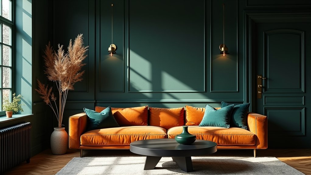
Moody hues create depth and drama by embracing saturated neutrals, charcoal, navy, and plum to sculpt rooms with emotional resonance. You harness Color psychology to cue mood shifts, using rich tones to ground spaces and guide movement between zones.
Vibrant contrasts sharpen architectural features, while subtle textures soften the intensity. You pair deep walls with lighter ceilings to amplify height and keep balance intact. Introduce metallic accents sparingly to catch light without breaking the mood.
The result is a curated, purposeful palette that feels sophisticated, not heavy.
- Saturated neutrals layered with charcoal for foundation
- Navy surfaces offset by warm wood tones
- Plum accents punctuating architectural details
- Metallic highlights to catch refracted light
- Textured fabrics to soften the intensity
Soft Pastels for Gentle, Airy Vibes
Soft pastels soften the intensity of the Moody Hues by introducing airy, light-filled spaces that feel calm and approachable. You’ll notice how these tones reduce visual weight without sacrificing depth, creating rooms that read as serene yet intentional.
Color symbolism plays a central role: pinks evoke warmth, blues imply calm, and creams offer openness, guiding mood without shouting. You leverage texture and lighting to maximize softness, keeping surfaces matte and finishes restrained to preserve airiness.
Seasonal palette variation matters: spring’s approachable, candy-like cardamom hues contrast with autumn’s muted, dusty variants for a subtle shift in ambiance.
Use pastels to frame architectural features and natural light, ensuring contrast stays deliberate. In practice, curate restrained accents and select harmonious neighbors for cohesive, sophisticated interiors.
Bold Accents Without Overwhelm
Bold accents can energize a space without creating visual chaos when you anchor them with restraint. You’ll balance bold accents with quiet, neutral fields to preserve legibility and flow, using color contrast to guide the eye rather than shout at it.
- Choose one bold hue as a focal accent and repeat it in small doses.
- Pair it with a near-neutral backdrop to heighten color contrast.
- Introduce texture to prevent flatness and add tactile interest.
- Use lighting to modulate intensity without overpowering the room.
- Trim the palette to two or three complementary shades for cohesion.
The 60-30-10 Rule You Can Actually Use
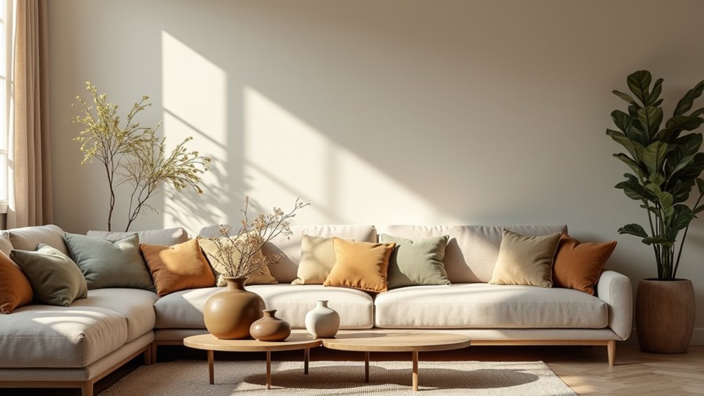
The 60-30-10 rule is a practical guideline you can apply to every room: allocate 60% of the space to a dominant color, 30% to a secondary hue, and 10% to an accent.
Use this framework to create balance without overthinking texture or pattern. Choose a dominant color that aligns with your room’s purpose and lighting, then pick a complementary secondary that harmonizes or contrasts intentionally.
The accent should pop—think trim, artwork, or textiles—without dominating. Color symbolism matters: select tones that reinforce mood, brand, or personal meaning.
Cultural influences can steer your palette, especially in how hues pair and where they’re applied. Finalize with consistent calibration across furnishings, walls, and accessories to sustain visual coherence and purposeful impact.
Layering Whites and Off-Whites for Subtle Contrast
Layering whites and off-whites creates depth without shouting contrast, using layered white undertones to ground your spaces. You’ll mix soft neutral diversities and subtle light-play techniques to keep ceilings, trim, and fabrics cohesive yet intriguing.
This approach emphasizes precise tonal shifts that read as calm, sophisticated luminosity rather than stark whiteness.
Layered White Undertones
You’ll observe how cool and warm whites interplay across surfaces, trim, and cabinetry, revealing depth without contrast fatigue. This technique relies on nuanced undertones rather than stark brightness, so you avoid harsh reflections and visual fatigue.
- A whisper of ivory near daylight
- Subtle greige in shadows
- Hints of taupe along edges
- Faint warm almond on ceilings
- Clean white anchors the palette
This approach debunks color myths by highlighting how gentle shifts, not extremes, yield dimension. Underrated shades emerge through careful pairing, improving perceived room size and mood.
If you see a space feel flat, layer slight undertones instead of repainting entirely, and you’ll maintain a coherent, timeless feel.
Soft Neutral Diversities
Have you ever noticed how soft neutrals can whisper rather than shout, creating subtle contrast without harsh edges? You’ll layer whites and off-whites strategically, building depth through temperature and undertone rather than stark contrast. Use clean, consistent base shades as anchors, then introduce slight shifts—almond, ivory, bone—to sculpt dimension without shouting.
This approach relies on color symbolism: whites can signify openness and purity, while creams suggest warmth and welcome. Cultural influences shape perceptions of hue seasonality, texture, and light response, guiding your choices toward harmonious compositions.
Keep edges soft with gentle progressions and avoid jarring pairs; the goal is fluent, almost seamless advancement. Document your palette rules for repeatability, ensuring each room reads as an intentional, cohesive continuum rather than a collection of disjointed whites.
Subtle Light-Play Techniques
Soft light can reveal texture and depth when you pair whites and off-whites with intention. You layer tones to carve subtle contrast, letting color symbolism guide mood without shouting. Let light reflection do the work, not loud color. This technique relies on controlled luminance, precise undertones, and deliberate placement.
- Observe how a warm cream mirrors a cool eggshell across surfaces.
- Align matte and satin finishes to modulate glare with discipline.
- Use daylight shifts to read tonal hierarchy throughout the day.
- Pair pared-down neutrals with a single, purposeful accent hue.
- Test sheets on-site to confirm cohesion under consistent lighting.
Balancing Warm and Cool Undertones
Understanding warm-cool balance starts with precise undertone identification, so you can pair pigments that feel cohesive rather than competing. Start by recognizing how lighting shifts perception, then tune your palette to maintain harmony between warmth and coolness in textiles, finishes, and wall color.
Use clear undertone harmony tips to keep rooms balanced, inviting, and visually intentional.
Warm-Cool Balance Basics
Balancing warm and cool undertones is essential to cohesive interior design, ensuring colors feel harmonious rather than clashing. You’ll master this by testing neutral anchors, then layering accents that echo both sides without dominance. Visualize a palette where warmth supports cool clarity, and vice versa, to avoid discord.
- Neutral base grounding with a cool stone or warm taupe
- Accent pops that reference both sides, like terracotta with sage
- Lighting that neutralizes bias, balancing daylight and bulbs
- Texture as a bridge, mixing silky and matte surfaces
- Color symbolism and cultural influences shaping perceived mood
Keep ratios deliberate: 60/40 or 70/30 leaning toward your dominant feeling. This method preserves color symbolism while honoring cultural influences for cohesive spaces.
Undertone Harmony Tips
To harmonize warm and cool undertones, start with a precise neutral anchor and test undertone consistency across fabrics, finishes, and lighting. You’ll verify that proposed hues read identically in daylight and artificial light, avoiding color drift.
Use a controlled palette: establish a dominant neutral, then introduce select warm and cool accents in equal measure. Prioritize undertone alignment over saturation, since intensity can exaggerate discord.
In color psychology terms, balance signals calmness with energy, guiding furniture coordination and mood.
When selecting textiles, pair cool grays with warm woods through subtle complementary notes, then reinforce with metal finishes that reflect both sides.
Limit the number of undertone shifts to two or three, ensuring cohesion from room to room.
Maintain documentation of tested samples for repeatable success and confident decisions.
How Colors Trigger Feelings: Palette Psychology
Colors don’t just decorate a room—they shape mood, behavior, and perception. In palette psychology, you feel what a hue intends, not what it merely looks like. You leverage color therapy to guide energy, focus, and calm, while recognizing emotional resonance varies by context and culture.
Precision matters: a single shade can quiet a space or sharpen attention, depending on saturation and pairing.
- A desaturated blue promotes focus without heaviness
- Warm yellows ignite optimism without glare
- Soft greens soothe and sustain patience
- Earth tones anchor tradition and reliability
- Charcoal accents create contrast and perceived sophistication
Lighting and Color: It’s All About Perception
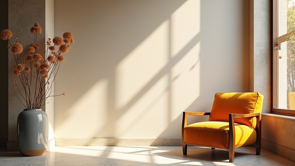
Natural light, artificial lighting, and color interact to shape how a room feels long after you step inside. You control perception by aligning color theory with luminance. Warmer LEDs will skew warm-toned palettes, while cool white enhances restraint in high-contrast schemes.
You’ll notice that brightness affects saturation: higher brightness makes colors pop; lower brightness softens them. Choose lighting fixtures that reinforce your intended mood, not just illuminate. Dimmers give you adaptability, enabling subtle shifts between day and night.
Consider color temperature in relation to wall and furniture finishes, ensuring consistent perceived hue. Avoid conflicting tones by testing with samples under the actual fixtures you’ll install.
Precision in pairing color theory with lighting fixtures yields spaces that feel intentional, cohesive, and visually calm.
Surfaces That Quietly Elevate Color
Surfaces don’t just hold color—they frame it. You’ll elevate color by choosing quiet surfaces that don’t compete with the palette. Favor tactile restraint, letting texture and sheen support rather than shout.
- Subtle grain on wood that adds warmth without dominating the space
- Matte plaster walls for a soft, even backdrop
- Satin or low-sheen tile that reflects light without glare
- Linen or cotton fabrics with gentle texture for cushions and drapes
- Concrete or stone with restrained finish to ground color without harsh contrast
Surface textures and material finishes interact with light, guiding perception and mood. You want cohesion, not distraction; let the right finishes whisper color so your palette feels intentional, timeless, and refined.
Personalize Your Palette: Tailor to Your Vibe
Your palette should feel like you—rooted in how you live, the rooms you actually use, and the moments you want to amplify. Personalize your scheme by anchoring choices in color psychology: map mood goals to tones, then test how different hues shift energy in real spaces.
Focus on core neutrals for stability, then layer selective accents that reflect your vibe. Palette personalization means deliberate restraint: pick a limited, cohesive group of colors, and deploy them with intention across furniture, textiles, and art.
Use contrast to guide attention, not to overwhelm. Document a simple rule set (e.g., warm neutrals, cool accents) and apply it consistently. Revisit periodically, adjusting as tastes evolve or you inhabit new spaces.
Mixing Patterns and Color Without Clashing
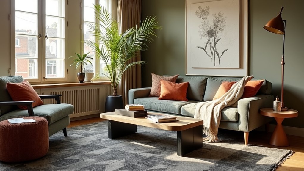
Start with Pattern Harmony: choose one unifying motif and let the rest follow its tempo. Then apply Color Balance Rules to pair bold prints with calm solids, so each element supports the others rather than competes.
This framework keeps mixing patterns intentional and cohesive, not chaotic.
Pattern Harmony Guide
When mixing patterns and color, aim for a cohesive rhythm: pick one dominant pattern and support it with two smaller ones, all aligned by a shared color family. You’ll achieve harmony through deliberate scale, spacing, and contrast, letting color psychology guide emphasis and mood. Pattern coordination hinges on repetition, directional flow, and a unifying thread that keeps eyes moving without chaos.
- A large botanical print anchors the palette, bold yet calm
- A mid-sized geometric echoes the anchor’s lines
- A fine tonal texture fills gaps with subtle depth
- A solid base color grounds both patterns
- Accent accessories repeat the shared color family sparingly
This approach yields deliberate resonance, clarity, and balance, ensuring your room feels cohesive rather than cluttered.
Color Balance Rules
Color balance means making color choices that support the pattern rhythm without muddying it. You stabilize contrast by repeating a unifying hue across scales, textures, and prints. Use a dominant color to ground the room, with secondary tones that reinforce the main palette.
Reserve high-contrast pairings for accents, and limit bold patterns to secondary surfaces to prevent visual fatigue. Apply Color theory by aligning warmth and coolness, ensuring complementary or analogous relationships that feel intentional, not accidental.
Consider palette psychology: calm neutrals invite rest, while strategic pops energize zones without shouting. Test every combination under natural daylight and artificial light, adjusting saturation rather than hue to avoid clash.
Document rules, then trust consistency over novelty for timeless, cohesive interiors.
Real-Life Rooms Built From Secret Palettes
Secret palettes don’t just look good on swatches; real rooms prove their power. You’ll see how color theory guides balance, contrast, and focus, turning subtle shades into cohesive spaces. Palette psychology explains mood shifts, how warm tones invite conversation, cool hues encourage calm, and saturated accents create focal drama.
In practice, designers translate theory into rooms that feel inevitable, not accidental. Each secret palette becomes a story you can live in, from entryways to lounges, with restrained harmony that still surprises.
- A sunlit living room where a restrained amber-greens sing against deep charcoal
- A hospitality corridor pairing soft taupe with olive undertones and brass highlights
- An bedroom that blends dusty rose, slate, and ivory for restful tension
- A kitchen with bahama blue cabinets and warm wood contrast
- A reading nook anchored by graphite walls and terracotta accents
Test Colors Before Committing: A Practical Guide
A practical approach starts with testing colors in real spaces rather than relying on swatches alone. You should paint large swatches on walls and observe at different times of day, under varied lighting, to gauge authentic color behavior.
Do multiple tests: adjacent trims, furniture, and flooring, so you see how tones interact. Track color symbolism and emotional impact as you evaluate mood shifts—calm vs. energetic, intimate vs. expansive.
Note reflections from windows and reflective surfaces, then compare with your original plan. Use portable boards or peel-and-stick samples to relocate, ensuring consistency across rooms.
Document findings with photos and quick notes, refining choices before committing. This disciplined approach minimizes surprises, aligns with design intent, and strengthens decisions when color becomes a cohesive, intentional element of the space.
Look for Less: Budget-Smart Palette Swaps
If you’re after a high-impact look on a budget, start with a smart swap of the palette rather than costly new finishes. Look for budget-smart updates that respect color theory and your brand preferences. Choose accessible paint brands that offer pure tones and reliable coverage, then recalibrate contrast and harmony with tested swatches.
Keep core neutrals consistent and swap accent colors for energy without overhauling furniture.
- Reassign an accent hue to a more affordable shade with similar undertones
- Swap glossy finishes for matte to alter perceived depth
- Pair a bold color with a restrained complementary you already own
- Use a single statement color across textiles and walls
- Test in natural light before committing to any brand
These moves maximize impact while preserving cohesion and budget.
Common Palette Pitfalls and How to Avoid Them
Common palette pitfalls can derail a room, so you’ll want to spot imbalances early and adjust before you commit. Watch for overused hues, too-light neutrals, and uneven color weight that skews the feel.
Palette Mistakes To Avoid
Color palettes can trip you up fast, but you can stay on track by spotting the main pitfalls early.
Stay sharp by recognizing common missteps in Color pairing and Palette evolution, then correct them with intent. You’ll avoid muddied rooms, brittle contrasts, and dated vibes when you plan deliberate progressions, not impulsive swaps.
- Overloading with neon accents that overpower furniture
- Pairing colors without considering light quality or room function
- Ignoring undertones, causing visible clashes
- Resting on a single hue without depth or texture
- Letting trendiness outrun timeless proportion and contrast
Master these, and your scheme remains cohesive. Reassess contrast, texture, and luminance as you refine, ensuring each choice supports purpose, mood, and flow.
Balanced Color Proportions
Color theory informs your proportion choices: warm neutrals with cool accents can balance energy and calm, while analogous schemes simplify progressions and reduce fatigue. Avoid overloading any single surface; aim for a 60-30-10 rule as a practical benchmark, adjusting per space and lighting.
Consider psychological impact: dominant colors set mood, mid tones support function, and bright accents cue emphasis. Regularly test with samples under real lighting, and revise if the room reads unevenly.
Precision in proportion delivers harmony, clarity, and intentional living.
Crafting Your Own Secret Palette Guide for 2026
Crafting your own secret palette for 2026 starts with a clear goal: identify the mood you want each space to convey and map color relationships that support that mood. You’ll define a core color, secondary accents, and neutral balance, then test relationships against real light.
- Color psychology cues tailored to function and flow
- Strategic contrast to guide attention without fatigue
- Paint finishes chosen for durability and ambiance
- Sample swatches tested in time-of-day light
- Documentation of decisions for consistency
Apply concise rules: assign tones to zones, align with architecture, and document tolerances. Use color psychology to justify choices; reserve bold hues for accents and texture. Maintain precise records, then refine with a controlled palette that preserves cohesion across rooms, ensuring paint finishes and undertones stay true from concept to completion.
Frequently Asked Questions
How Do I Start Discovering My Secret Color Palette?
Yes—start by exploring color psychology and how shades affect mood. Observe your spaces, note emotions, and test swatches in moments of mood shifts. Track reactions, refine palettes, and repeat until you consistently achieve mood enhancement through color.
Can Secret Palettes Adapt to Small Spaces?
Secret palettes adapt to small spaces, you’ll see color harmony expand perception and mood enhancement, creating elegance. When you choose cohesive tones, you align walls, textiles, and accents, boosting room depth while keeping scale intentional and purposeful.
What Mistakes Ruin a Secret Palette Quickly?
Blunders ruin a secret palette quickly: you ignore color psychology, misbalance contrast, and overload with too many hues. Maintain Palette harmony, keep focal points cohesive, and resist trendy deviations that disrupt mood and coherence.
Which Finishing Materials Matter Most With These Palettes?
You should prioritize durable, low-maintenance finishes like matte paints, quartz, and sealed woods. Color psychology guides you to pair neutrals with accents, while material textures add depth, contrast, and warmth to these palettes.
How Often Should I Refresh a Secret Palette?
A palette is a living engine—refresh every 12–24 months. You’ll maximize color psychology and Palette longevity by noting trends, evolving lighting, and personal taste, then adjust accents instead of a full overhaul.
Conclusion
You’ve opened a toolkit, not a rulebook. Think of secret palettes as sketches you carry from room to room, shifting with light and mood. Embrace timeless neutrals, warm earth tones, moody depths, and soft pastels like a chorus that never tires. Test and swap with intention, avoid common missteps, and tailor every hue to your space’s heartbeat. Your confidential color code awaits—bold enough to transform, gentle enough to endure, precise enough to guide you home.