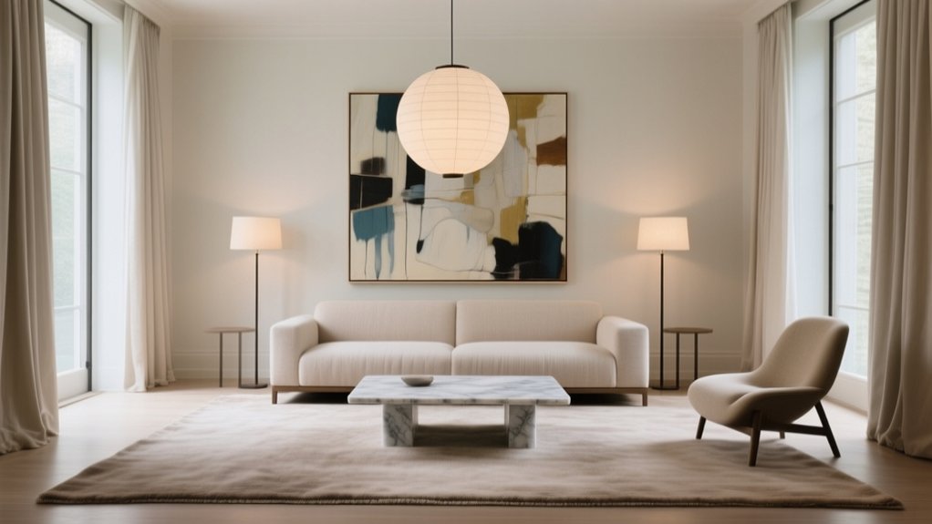

You use scale to size furniture and lighting to the room, ceiling height, and the human body, so circulation and sightlines stay comfortable. You use proportion to balance visual weight, pairing a dominant anchor (sofa, bed, table) with secondary pieces and smaller accents that echo its lines. Keep key walkways about 36 inches, size rugs to catch front legs, and hang art 2/3–3/4 the furniture width. Next, you’ll see simple fixes for common sizing mistakes.
Proportion vs. Scale: What’s the Difference?
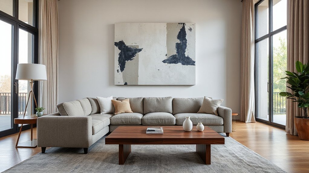
Scale measures how an item relates to the room and to the human body. You assess scale when you choose a sectional that won’t overpower circulation paths, or artwork that reads correctly from typical viewing distance.
When you separate these concepts, you specify furniture, lighting, and millwork with greater accuracy and achieve visual consistency across the entire scheme.
Quick Proportion and Scale Rules of Thumb
Start by balancing large and small pieces so the visual weight reads evenly across the room. Anchor the layout with a dominant element, then counter it with appropriately scaled secondary furnishings and negative space.
Keep the room-to-furniture ratio in check by sizing key items to the floor area and clearances, so circulation stays comfortable and the composition doesn’t feel crowded or under-furnished.
Balance Large And Small
A well-proportioned room depends on how confidently you mix oversized anchors with smaller supporting pieces. Start with one dominant element—sofa, bed, or dining table—then choose secondary forms that echo its lines without competing.
Keep clear negative space around the anchor so its scale reads intentional, not crowded.
Use a simple hierarchy: large, medium, small. Pair a substantial casegood with slimmer side tables, or a bold sectional with lighter chairs. Repeat shapes and finishes to unify the mix, then deploy Decorative accents as the “small” layer—vases, art, and pillows—to fine-tune rhythm.
Lock in Color harmony by limiting accent hues and varying value and texture instead. If one item feels heavy, counterweight it with a cluster of smaller pieces on the opposite side.
Mind Room-To-Furniture Ratio
Because the room sets the baseline, you’ll get a cleaner, more intentional layout when you size furniture to the footprint, ceiling height, and circulation paths rather than choosing pieces in isolation. Start with clearances: keep primary walkways 36 inches, secondary paths 24–30, and maintain visual breathing room around focal points.
Use the room-to-furniture ratio to prevent crowding and underscaling, then layer Color harmony and Material textures to unify the composition without adding bulk.
- In a small living room, pick a tight-depth sofa and leggy chairs to expose floor.
- In tall rooms, raise scale with higher-back seating and full-height drapery.
- Anchor with a rug that fits at least front legs of key pieces.
- Match coffee table height within 1–2 inches of seat height.
Let the Room’s Architecture Set the Scale
Let the room’s architecture set your scale decisions, not the furniture catalog. You should identify structural focal points—fireplace surrounds, built-ins, columns, and major sightlines—and size key pieces to reinforce them.
Then follow the ceiling height and window proportions so your casegoods, drapery, and lighting read integrated rather than underscaled or overpowering.
Highlight Structural Focal Points
When you anchor your layout to the room’s existing architecture, proportion issues resolve themselves faster. Start with structural emphasis: identify the dominant built-in element and let it dictate furniture massing, circulation, and sightlines. You’ll get focal point enhancement without forcing oversized pieces or underpowered accents. Keep scale disciplined by aligning key volumes and negative space to that anchor.
- Center the seating axis on the fireplace surround, then size the rug to frame it.
- Stack a low media console to the same visual weight as adjacent millwork.
- Use paired accent chairs to echo column spacing and stabilize the composition.
- Layer art and lighting to reinforce the primary feature, not compete with it.
Finish by editing accessories so the structural focal point stays legible.
Follow Ceiling And Window Scale
Although furniture drives function, the ceiling height and window proportions should set your scale decisions first. Read the room envelope: tall ceiling height calls for higher backrests, longer drapery drops, and vertically oriented art to maintain visual continuity.
Low ceilings demand lower profiles, slimmer cornices, and fewer stacked layers so the space doesn’t compress.
Use window dimensions as your sizing ruler. Hang drapery close to the ceiling line, extend rods beyond the casing, and match panel fullness to glazing width.
Align headboards, shelving, and mirror tops with window heads when possible, and keep key sightlines clear at sill height. When you size to these architectural benchmarks, every piece feels intentional, not oversized or underweight.
Pick Furniture Scale With Anchors and Clearances
Because scale reads relative to its context, you’ll choose better-sized pieces by starting with anchors and clearances instead of shopping by dimensions alone. Establish your “fixed points” first—rug, sofa, dining table, bed—then size supporting pieces to preserve circulation and sightlines.
Use Furniture placement to define zones, not to fill floor area, and balance bulk with material textures so heavy forms don’t visually crowd the room.
- Anchor a rug under front legs; leave 12–18 inches of perimeter breathing room.
- Maintain 30–36 inches for main walkways; 18 inches between sofa and coffee table.
- Keep dining chair pull-back at 36 inches from walls or casegoods.
- Match casework height to adjacent openings; cap media consoles below sill lines.
Get Lighting Scale Right by Room and Zone
If you scale lighting to each room’s function and each zone’s footprint—not just the ceiling height—you’ll get balanced illumination and fixtures that feel intentional instead of oversized or underpowered.
Start by mapping task, ambient, and accent layers: pendants for work surfaces, recessed or track for general wash, and sconces for vertical light. Size pendants to the surface they serve, not the room; keep the diameter proportional to island or table width, and hang to maintain clear sightlines.
In living zones, build lighting ambiance with dimmable circuits and consistent color temperature.
Prioritize fixture placement: center luminaires over activity zones, align multiples to architectural axes, and space downlights to avoid scallops and hot spots.
Finish with controls that let you tune scenes by time and use.
Size Rugs and Art: and Fix Common Mistakes Fast
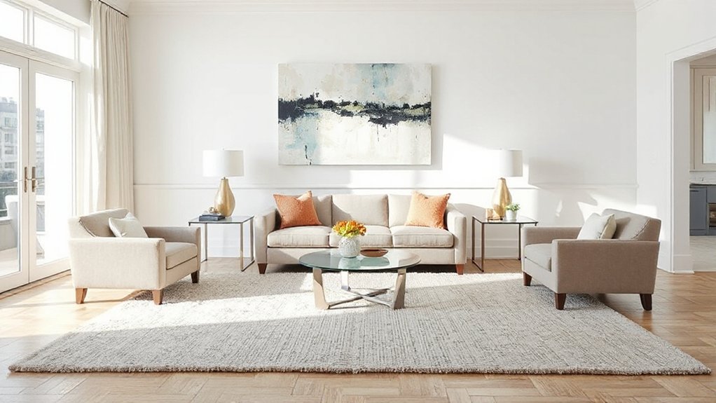
Once you nail rug and art scale, the entire room reads more intentional and expensive, even before you change any furniture.
Start with the rug: it should anchor the seating group, not float. In living rooms, place at least the front legs of every seat on the rug; in dining rooms, extend 24″ beyond the table so chairs stay on it when pulled out. Use Textile textures to add depth, but keep color harmony consistent with your dominant palette.
For art, size to the furniture it relates to: aim for 2/3–3/4 the width of the sofa or console, and hang so the center lands around 57–60” from the floor.
- Undersized rug islanding the furniture
- Art hung too high, breaking sightlines
- Busy pattern fighting the focal wall
- Thin frames that read under-scaled
Frequently Asked Questions
How Do Proportion and Scale Principles Change in Small Studio Apartments?
In small studios, you’ll prioritize compact scale, vertical proportion, and multiuse pieces to control spatial perception. You’ll tighten furniture placement, keep circulation clear, select leggy profiles, and use consistent sightlines to minimize visual clutter.
What Budget-Friendly Tools Help Plan Furniture Scale Before Buying?
Use graph paper, use painter’s tape, use free AR apps to preview Furniture layout. Rely on measurement tools: tape measure, laser measurer, cardboard cutouts, and floor-plan apps. You’ll validate clearances before checkout.
How Do You Balance Mixed Design Styles Without Breaking Visual Harmony?
You balance mixed styles by setting a dominant style, then layering accents. Maintain Color harmony with a tight palette, and manage Texture balance through repeats. You’ll unify via consistent metals, silhouettes, and deliberate negative space.
Can Color and Pattern Compensate for Imperfect Scale in a Room?
Yes, you can’t fix bad scale fully, but you can disguise it. Use Color harmony to anchor focal points, and Pattern coordination to redirect sightlines. Keep motifs consistent, control contrast, and edit clutter.
How Do Accessibility Needs Affect Clearances and Overall Room Proportions?
Like a river needing room to bend, you must size clearances around mobility devices, turning radii, and reach ranges. Accessible design drives wider circulation and doorways; you’ll build spatial flexibility with adaptable layouts and furnishings.
Conclusion
Remember, “measure twice, cut once.” When you balance proportion and scale, you create interiors that feel intentional, not accidental. Let the architecture dictate the baseline, then refine with correctly sized anchors, smart clearances, and layered lighting that matches each zone. Keep rugs large enough to ground seating, and hang art to relate to furniture, not ceilings. If something feels “off,” resize first—don’t over-accessorize to compensate.