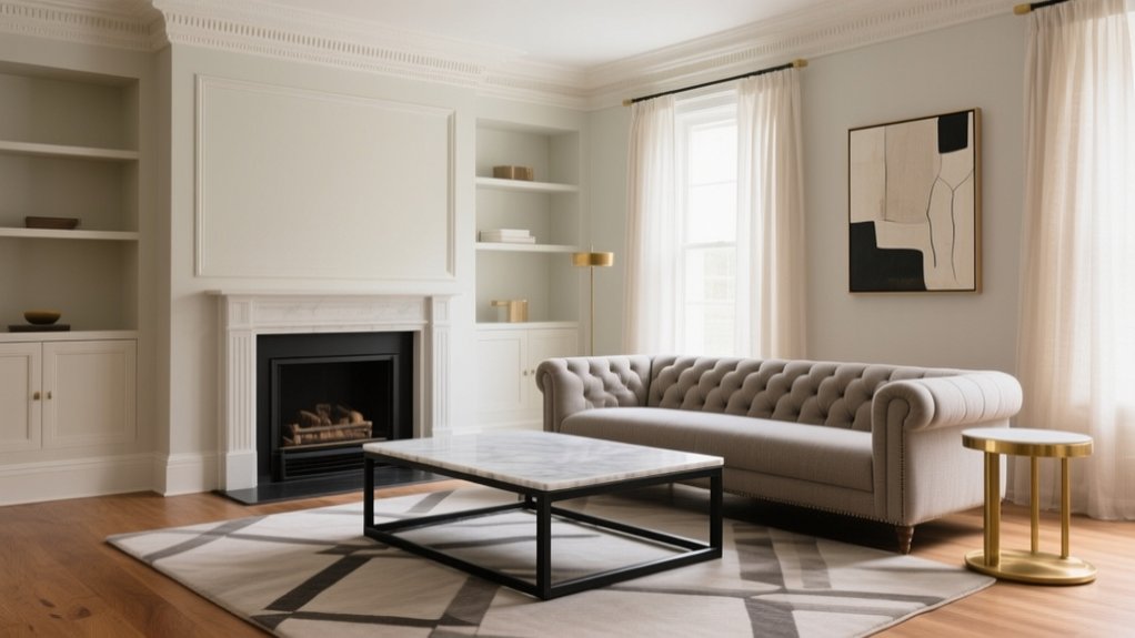

Transitional design helps you balance classic proportions with a cleaner, current feel, so your space looks calm rather than cluttered. You’ll keep profiles streamlined, edit ornament to a minimum, and rely on neutral foundations with tactile textiles, refined timber, and one muted accent colour. You should repeat finishes for cohesion and use warm 2700K lighting to soften contrast. Choose fewer, higher-quality objects and leave breathing room—there’s more to sharpen the look room by room.
Key Takeaways
- Transitional design blends classic proportions with simplified profiles to create calm, current interiors without feeling overly traditional or starkly modern.
- Use a disciplined palette: two neutrals plus one muted accent color, relying on texture for depth instead of many hues.
- Edit ornament and accessories to a purposeful minimum, leaving breathing room and avoiding clutter or era-mixing pastiche.
- Choose timeless materials—refined timber, natural stone, linen and wool—then repeat key finishes (metals, ceramics, glass) for cohesion.
- Balance silhouettes by pairing tailored upholstery with clean-lined pieces, maintaining correct scale and using warm, consistent lighting to unify the room.
What Is Transitional Design (and What It Isn’t)

Where does progressive design sit between traditional elegance and contemporary simplicity? You’ll find transitional design in the disciplined middle: it pairs classic proportions with streamlined profiles, so rooms feel calm, coherent, and current.
You use neutral foundations, refined timber, and tactile textiles, then introduce selective contrast through matte metals, subtle curves, and restrained pattern. It supports Artistic expression without shouting; you curate a few purposeful accents rather than filling every surface.
Cultural influences appear as considered references—heritage ceramics, global weaves, or archival prints—balanced by contemporary spacing and lighting.
It isn’t a random mix of eras, nor a pastiche of period features. You don’t chase extremes, clutter, or gimmicks; you edit, align scales, and let materials and joinery carry the character.
Transitional vs Modern vs Traditional: Key Differences
Now that you know transitional design relies on disciplined editing rather than era-shifting, it helps to set it against modern and traditional styles in practical terms. You’ll spot the differences in line, ornament, and how each treats heritage.
- Traditional: you’ll see richer mouldings, carved detailing, symmetry, and references to established Cultural influences, from Georgian to French provincial.
- Modern: you’ll get clean planes, minimal ornament, sharper geometry, and materials like glass, steel, and polished concrete, prioritising function over nostalgia.
- Transitional: you’ll keep classic proportions yet simplify profiles, pairing tailored upholstery with restrained trim and a calmer mix of finishes, letting Artistic expression come through without visual clutter.
If you’re comparing rooms, check the joinery, silhouette, and decorative density first, then confirm via material choice.
5 Rules for a Balanced Transitional Look
Although transitional interiors look effortless, you’ll only achieve that calm if you follow a few disciplined rules: start with a clear “anchor” style (usually classic proportions), edit ornament to a purposeful minimum, and keep lines consistent across the room so nothing competes.
Prioritise scale: choose one dominant silhouette, then repeat it in smaller pieces to create rhythm.
Maintain colour harmony by limiting finishes to a tight family, then vary texture rather than hue.
Use material contrast deliberately: pair smooth lacquer with oak grain, or linen upholstery with a polished stone top, but keep sheen levels balanced.
Control visual weight; ground the room with sturdier forms and lift it with lighter, open-frame accents.
Finally, curate accessories: fewer, better objects, spaced with breathing room.
Choose a Transitional Color Palette That Lasts
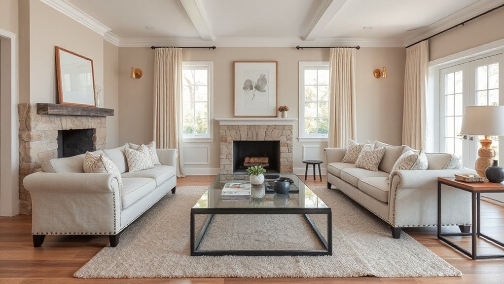
- Pick one accent family (ink blue, sage, or terracotta) and limit it to two strengths.
- Keep contrast deliberate: pair light walls with deeper joinery or a single feature shade.
- Test samples in morning and evening light; adjust saturation before committing.
For Palette longevity, favour muted, complex hues and avoid overly bright primaries that tire quickly.
Warm Materials That Define Transitional Style
Once you’ve set a transitional colour palette that lasts, you’ll lock it in with warm materials that add texture and depth. Choose wood tones and visible grain patterns to soften clean lines.
Then, balance them with natural stone surfaces such as marble, limestone, or honed granite for a restrained, timeless finish. Layer textiles like linen and wool in tailored weaves to bring quiet comfort and continuity across rooms.
Wood Tones And Grains
How do you bring instant warmth to a temporary scheme without tipping into rustic or traditional? You choose wood tones with controlled grain and a clean edge profile, then repeat them sparingly.
Mid-oak, walnut, and smoked ash read current, yet they still deliver rustic charm when you balance them with crisp paintwork and streamlined hardware. Keep boards wider for calm, or go finer-grained for a tailored look.
Prioritise Eco friendly finishes—water-based lacquers and low-VOC oils—so the timber looks rich, not glossy.
- Pick one dominant tone and two accents to avoid muddiness.
- Match grain direction across joinery for a disciplined rhythm.
- Mix matte and satin sheens to add depth without fuss.
Natural Stone Surfaces
Although transitional rooms lean on clean lines, natural stone surfaces give you the warmth and weight that stops the scheme feeling temporary. Use marble, limestone, slate, or honed granite to bridge classic detail with modern restraint. Keep profiles simple: a square-edged worktop, a straight splashback, or a single slab hearth reads crisp yet timeless.
Prioritise Surface durability by matching the stone to the job. Choose granite or quartzite for hard-working kitchen tops; specify honed finishes to disguise etching and daily marks. Seal porous Natural stone properly, then maintain it with pH-neutral cleaners, not harsh sprays.
Let veining and subtle colour variation do the decoration, and pair it with brushed metalware and matte cabinetry for a calm, balanced *passage*.
Textiles Like Linen Wool
While clean-lined joinery keeps gradual rooms disciplined, textiles such as linen, wool, and wool blends bring in the softness, acoustic control, and visual warmth that stop the space feeling stark. You’ll get progressive balance by pairing crisp upholstery with nubby throws and tailored curtains, keeping patterns restrained and tones layered.
Prioritise Textile durability: choose tight weaves for sofas, wool-rich rugs for high-traffic zones, and lined linen for better drape and less fading.
Keep Fabric maintenance straightforward by specifying removable covers, pre-shrunk yardage, and stain-resistant finishes where children or pets are involved.
- Use linen on cushions for breathability and a relaxed hand.
- Choose wool blankets for temperature regulation and resilience.
- Select wool blends for improved wear without losing softness.
Transitional Furniture: Curves + Clean Lines
When you want a room to feel tailored yet welcoming, adaptable furniture delivers by pairing gentle curves with crisp, clean lines. Choose a sofa with rounded arms but a tight, boxy back; it reads refined without feeling rigid. Anchor it with a slim-legged coffee table, then soften the layout with an oval side table to keep circulation easy and sightlines calm.
You’ll get Vintage charm by mixing a gently worn timber console with contemporary, straight-edged cabinetry. For Eclectic fusion, combine a classic wingback in plain wool with minimalist shelving in matte lacquer. Keep proportions disciplined: mid-height backs, consistent seat depths, and a restrained palette of oak, stone, and blackened steel. Finish with well-spaced pieces that leave breathing room.
Transitional Lighting: Classic Shapes, Modern Finishes
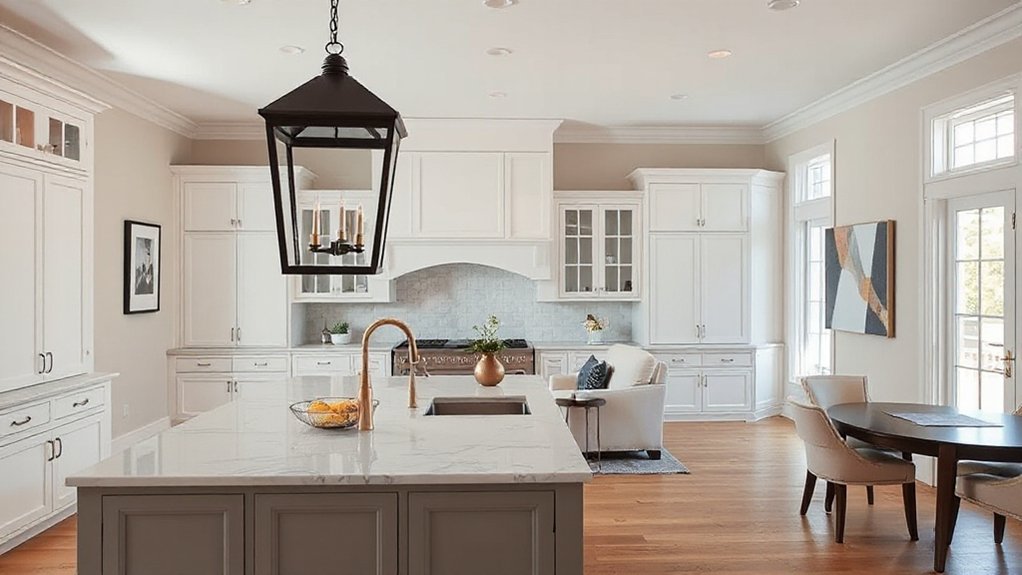
You’ll anchor your scheme with timeless silhouettes—think lantern pendants, globe shades, and tapered sconces—then sharpen the look with updated metals such as brushed brass, satin nickel, or matt black.
You’ll strengthen the shift in style by mixing materials and textures, pairing opal glass with ribbed metal, or warm timber with crisp linen shades.
Keep proportions disciplined and finishes consistent so each fitting reads classic in form yet modern in detail.
Timeless Silhouettes, Updated Metals
Although transitional interiors favour restraint, lighting gives you licence to blend heritage silhouettes with current metalwork. Choose familiar forms—arched sconces, tapered shades, lantern pendants—then sharpen them with refined finishes that feel intentional, not showy. You’ll get Vintage accents without drifting into pastiche, and Eclectic details that still read cohesive.
- Specify aged brass, satin nickel, or blackened steel to modernise classic profiles.
- Keep lines clean: minimal scrollwork, crisp arms, and uncluttered canopies.
- Control contrast by repeating one metal across key fittings, then varying scale.
Prioritise proportion: larger pendants suit open-plan rooms, while slim picture lights elevate corridors. Opt for warm LEDs to flatter metals and keep the ambience calm and composed.
Blended Materials And Textures
Refined metalwork sets the tone; blended materials and textures give shifting lighting its depth. You’ll get progressional balance by pairing classic lamp shapes with modern finishes that feel deliberate, not busy.
Use Material contrast: satin brass with smoked glass, blackened steel with alabaster, or polished nickel against oak. Keep one element calm and let the other add character.
Build Texture layering through shades and diffusers: pleated linen, ribbed glass, and hand-finished ceramic bases soften glare and sharpen silhouette. Choose fittings with crisp joints, tight tolerances, and clean escutcheons so mixed media reads tailored.
If you’re mixing warm and cool metals, repeat each finish twice across the room to anchor the scheme and avoid visual drift.
Millwork and Trim That Feel Transitional (Not Fussy)
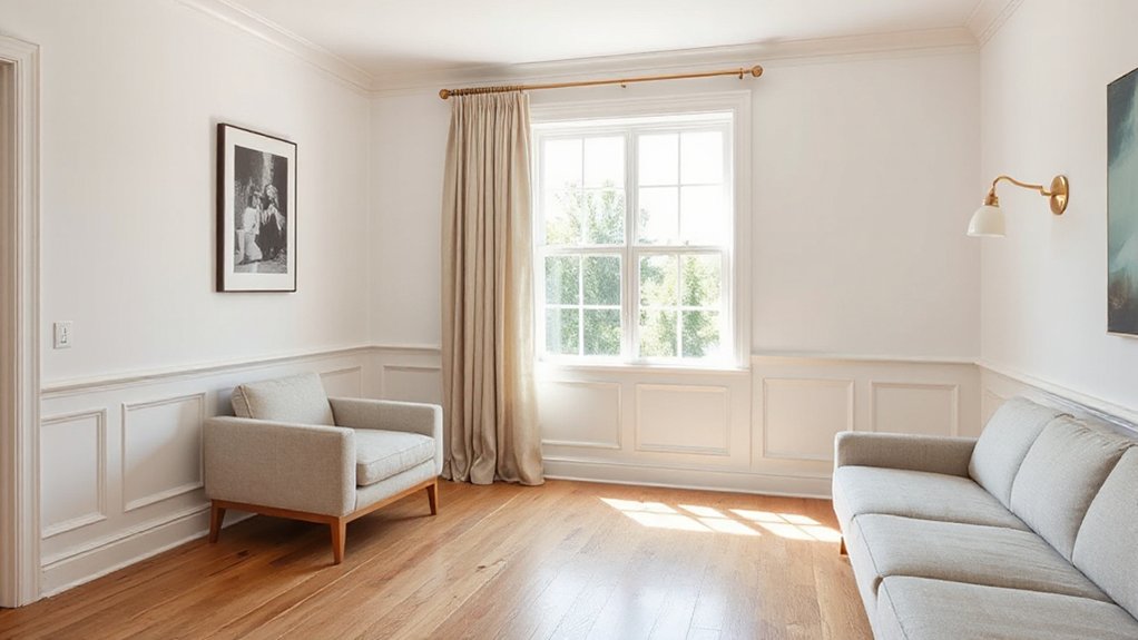
When millwork strikes the right balance, it frames a room with quiet structure rather than showy detail. You’ll get a gradual shift by keeping profiles crisp, proportions consistent, and ornament controlled.
Choose Custom moldings with a shallow ogee or square-edge reveal, and run them cleanly around skirting boards, architraves, and ceiling lines.
- Specify 90–120 mm skirting with a simple shadow gap or bevel, not stacked profiles.
- Use panelled wainscot or a plain picture rail to add rhythm without heaviness.
- Add decorative medallions only where they earn their keep: one centred rose for a pendant, sized to the room, with minimal fluting.
Paint trim in a soft eggshell; match wall colour for modern calm, or go one shade deeper for definition.
Transitional Textiles: Layers, Texture, and Restraint
If you layer textiles with intent, you’ll land that shifting sweet spot: tactile, composed, and never overdone.
Start with a tailored base: wool or cotton-linen upholstery in a quiet, mid-tone neutral.
Add Textile layering through one contrasting weight, not a competing pattern—think a cashmere throw over a crisp percale cushion.
Keep motifs disciplined: a single stripe, a small geometric, or a softened floral, each repeating one colour from the room’s palette.
Prioritise hand-feel over novelty; bouclé, brushed linen, and velvet work when you limit shine and pile.
Use Texture restraint by capping strong textures to two surfaces, balancing them with smooth weaves.
Finish with considered edging: piping, flange, or a narrow tape, never tassels.
How to Decorate Transitional Without Clutter
Although connecting rooms welcome both classic and contemporary pieces, you’ll keep them feeling calm by editing hard before you add soft.
Start with a disciplined palette: two neutrals and one muted colour, then repeat it across paint, upholstery, and timber tones.
Give every object a job, and don’t let “nice to have” items squat on surfaces.
- Choose closed storage (cupboards, baskets) and leave 30% of shelves empty for visual breathing space.
- Limit Vintage accents to one material story—brass, walnut, or cut glass—so they read intentional, not busy.
- Use bold patterns sparingly: one hero rug or pair of cushions, scaled large, with plain textiles elsewhere.
Finish with consistent frame colours and concealed cabling; clutter starts at the skirting.
Transitional Living Rooms: A Simple Formula
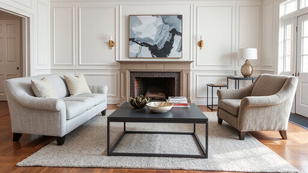
Clear surfaces and a restrained palette set the calm; now you can build a living room that balances period character with clean-lined comfort using a repeatable formula.
Start with one anchoring classic: a fireplace surround, cornice, or panelled wall. Pair it with one modern counterpoint, such as a low-profile sofa with tailored arms.
Keep upholstery in warm neutrals, then add contrast through timber, metal, or stone.
Make furniture placement deliberate: float seating to define a conversational zone, maintain clear walkways, and align key pieces to the focal point.
Layer lighting—ceiling, table, and picture lights—for even illumination and evening softness.
Finish with artistic expression in controlled doses: one overscaled artwork or sculptural vase, plus textured cushions and a wool rug.
Transitional Kitchens and Dining: Cabinets to Chairs
Where do transitional kitchens and dining areas succeed—or fail? You’ll get it right when cabinetry feels tailored, not showy, and seating reads intentional, not mismatched. Choose Shaker-style doors with slim modern pulls, then balance them with a lightly veined worktop and a straightforward splashback.
Keep your palette calm, but introduce Color accents through bar stools, crockery, or a runner—never all at once.
Specify two finishes only: one warm timber, one matte painted tone.
Use layered lighting: pendants over the island, discreet under-cabinet LEDs.
Nail furniture placement: allow clear walkways, centre the table to the pendant, and align chairs evenly.
Finally, keep open shelving sparse and symmetrical; clutter breaks the progression.
Transitional Bedrooms and Baths: Calm, Not Cold
Because you spend the most time here winding down, seamless bedrooms and bathrooms must prioritise softness and order without drifting into sterile minimalism.
Start with layered neutrals: warm greige walls, off-white joinery, and tactile linens that mute glare and absorb sound.
Use Color psychology deliberately—sage for steady calm, inky navy for depth, and a restrained blush to flatter skin tones in the bath.
Specify mixed metals sparingly: brushed nickel taps with aged brass lighting keeps the look balanced.
In bedrooms, anchor the scheme with an upholstered headboard, tailored bedside cabinetry, and a single sculptural pendant.
In bathrooms, pair a classic vanity profile with a thin-edged quartz top and ribbed glass.
Finish with Artistic expression: one framed print, one ceramic vessel, nothing noisy.
Transitional Design Mistakes That Date a Room
Once you’ve settled bedrooms and baths into a soft, orderly rhythm, the next step is spotting the slip-ups that make a movement scheme feel tired rather than timeless. You’ll date a room when you chase extremes: too stark and it reads showroom; too fussy and it feels pastiche. Keep progressions deliberate, with clear sightlines and a measured mix of eras.
- Overmatching sets: identical sofa, tables, and lamps kill Artistic expression and flatten character.
- Ignoring scale: a chunky suite with spindly sideboards, or tiny art on vast walls, breaks proportion.
- Token “global” touches: random motifs without respect for Cultural influences look like borrowed costume.
Edit ruthlessly, layer texture, and let one or two statement pieces lead the scheme, not every surface.
Transitional Shopping List: Splurge vs Save by Budget
Although transitional style looks effortless, you’ll only get that crisp balance if you decide early what merits investment and what you can buy on a tight budget without it showing.
Splurge on the sofa, bed, and main armchair: pick tailored silhouettes, firm cushions, and hard-wearing upholstery in a neutral. Invest in proper window treatments, too; lined curtains hang better and sharpen proportions.
Save on side tables, lamps, and ready-made shelving, provided the finishes match your metals. Use affordable plain rugs, then layer interest with Vintage accents like a framed print, an aged mirror, or brass candlesticks.
Keep Eclectic accessories controlled: repeat one material (ceramic or glass), limit colours to three, and size décor to the scale of the room. Prioritise lighting warmth at 2700K for cohesion.
Frequently Asked Questions
Is Transitional Design Compatible With Mid-Century Modern Pieces?
Yes, you can pair transitional design with mid-century modern pieces if you control the colour palette and refine furniture selection. You’ll balance clean silhouettes with softer textiles, use oak or walnut tones, and avoid clutter.
How Do I Make Transitional Style Work in a Small Apartment?
Less is more: you’ll make seamless style work by keeping tight colour schemes, choosing scaled pieces, and refining furniture arrangement for clear walkways. Use layered lighting, mirrors, and closed storage to reduce clutter and improve proportion.
What’s the Best Way to Blend Inherited Antiques Without Looking Mismatched?
You’ll achieve Antique integration by limiting antiques to a few statement pieces, then repeating their timber tones and metal finishes across the room. Keep Style cohesion with a restrained palette, matching proportions, and cohesive textiles throughout.
Can Transitional Design Be Sustainable Using Reclaimed and Vintage Materials?
Yes, you can: construction creates about 38% of global CO2 emissions. Choose Eco friendly materials like reclaimed timber and salvaged stone, prioritise Vintage reuse; you’ll cut embodied carbon, keep patina, and maintain coherent proportions.
How Do I Keep Transitional Interiors Feeling Personal, Not Staged?
You keep transitional interiors personal by adding a personal touch: display meaningful books, framed photos, and heirlooms. Layer tactile textiles, mix patina with clean lines, and edit thoughtfully. Use warm lighting and scent for cosy ambiance.
Conclusion
You’ve seen how interim design blends classic detail with clean modern lines, so your next step is editing with intent. Stick to a timeless palette, layer warm woods, stone, and tactile textiles, and keep silhouettes simple but not stark. Balance splurges—quality cabinetry, a proper sofa, good lighting—with savvy savings like accessories and rugs. Avoid overmixing eras or chasing fads. Isn’t the best room one that feels current, yet quietly familiar?