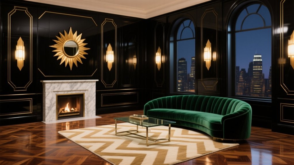

You make an interior feel Art Deco by committing to bold geometry, disciplined symmetry, and high-sheen finishes. Anchor the room with a chevron rug or sunburst mirror, then repeat one hero metal—brass for warmth or chrome for a cooler edge—across lighting and hardware. Keep a tight three-tone palette (black or cream plus a jewel tone), layer velvet or leather, and use bevelled mirrors and glossy lacquer for glamour and depth. Keep going to see easy swaps and pitfalls to avoid.
Key Takeaways
- Anchor the room with bold geometry—chevrons, zigzags, sunbursts, and stepped profiles—kept symmetrical for a crisp Art Deco look.
- Choose luxe, high-sheen finishes like lacquer, mirror, polished brass or chrome, and veined marble to deliver timeless glamour.
- Keep a tight palette: black or cream plus one jewel tone, punctuated with metallic accents for dramatic, cohesive impact.
- Use “jewelry” lighting—opal globes, tiered chandeliers, and angular sconces—to emphasize sightlines and add sparkle without clutter.
- Control patterns and surfaces: one hero motif, two secondary motifs max, balanced by plain walls, strong trims, and clean-lined furniture.
What Makes an Interior Feel Art Deco?
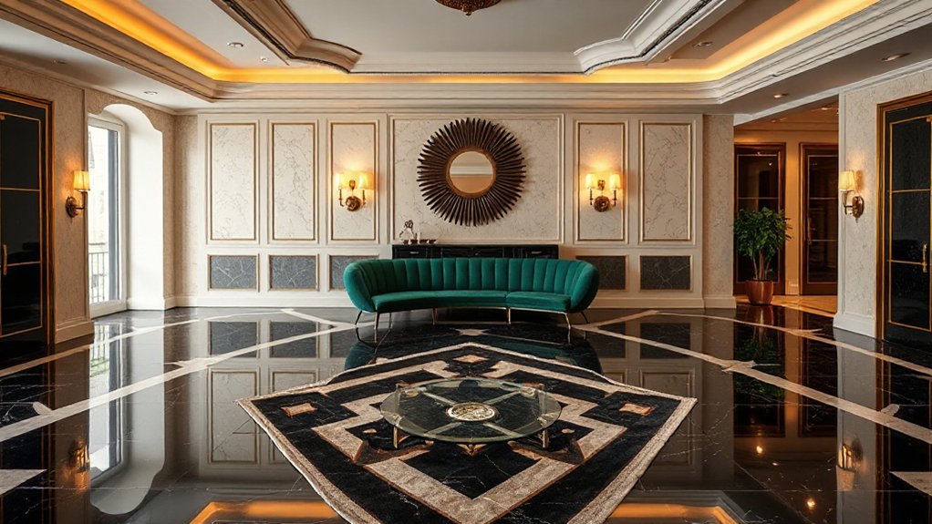
If you want an interior to read as Art Deco, you need a disciplined mix of geometry, luxe materials, and confident contrast. You lead with strong silhouettes: stepped profiles, chevrons, sunbursts, and faceted curves that feel engineered rather than rustic.
You specify high-sheen finishes—lacquer, polished brass, chrome, mirror, and veined marble—then set them against velvets, mohair, or leather for depth.
Colour works best when it’s decisive: inky black, cream, emerald, sapphire, oxblood, with metallic hits to sharpen edges.
Lighting becomes jewellery; globes, uplights, and tiered fittings punctuate sightlines.
Art deco symbolism appears in stylised flora, zigzags, and heroic motifs.
Reference Art deco fashion through pleating, beadwork textures, and graphic trim lines.
A Quick Art Deco Checklist (Do This First)
Before you buy a single “deco” accessory, lock in the fundamentals: start with a bold geometric anchor (stepped headboard, chevron rug, sunburst mirror). Commit to one high-sheen metal (brass or chrome) and one glossy finish (lacquer or mirror). Then choose a tight palette of three tones—typically black/cream plus one jewel colour—so every piece reads intentional rather than themed.
Next, audit scale and symmetry: Deco thrives on matched pairs and clean sightlines. Keep curves controlled, edges crisp, and surfaces reflective but not cluttered. Use these checks before you style:
- Repeat your chosen metal in lighting, handles, and frames.
- Add one “statement” pattern, then ground it with plain velvets.
- Finish with one object that feels like Art deco jewelry—sculptural, faceted, and spare—echoing Art deco fashion.
Art Deco vs. Art Nouveau: How to Tell Them Apart
Although both styles sit under the early‑20th‑century “decorative arts” umbrella, you can tell Art Deco from Art Nouveau by looking at the line work and intent. Art Nouveau influence shows up in sinuous, plant-like curves, whiplash lines, and asymmetry designed to feel grown, not built. You’ll spot it in flowing ironwork, stained glass, and motifs that merge structure and ornament.
Art Deco, by contrast, uses crisp geometry: chevrons, zigzags, stepped forms, and strong symmetry that signals control and modernity. Think streamlined joinery, faceted detailing, and bold, machine-age patterns integrated into panelling, lighting, and furniture profiles.
Keep the historical context in mind: Art Nouveau romanticises nature and craft; Art Deco celebrates progress, speed, and urban glamour.
Art Deco Color Palette: 5 Foolproof Combos
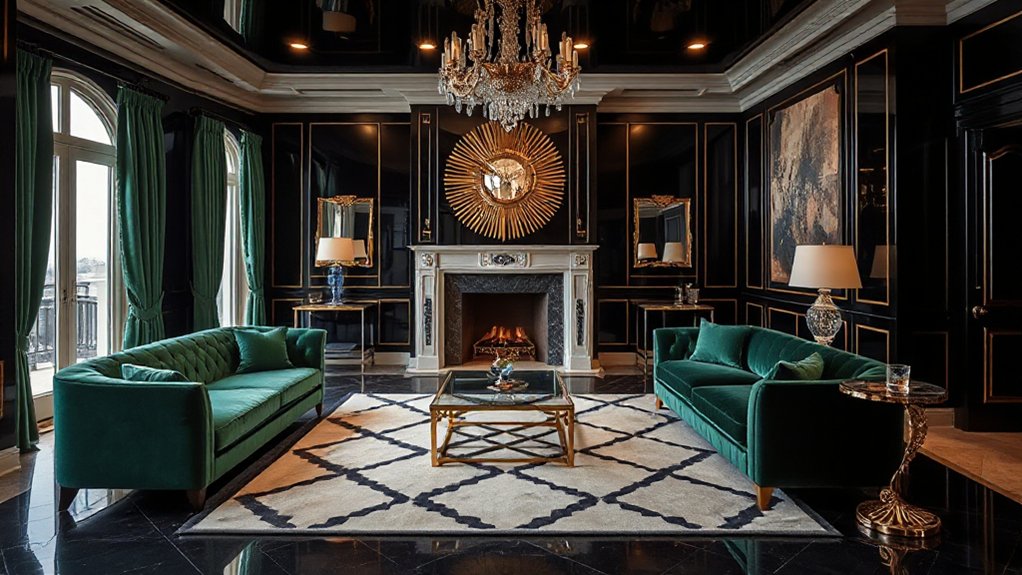
Art Deco’s geometry doesn’t stop at zigzags and stepped profiles—it carries straight into colour, where contrast and polish do the heavy lifting. To get the look, you’ll pair crisp neutrals with metallics, then anchor everything with a confident dark. Start with these five foolproof combos: ivory + chrome + charcoal; dove grey + brass + ink; porcelain white + nickel + teal; sand + copper + bottle green; blush + black + pewter. Keep finishes glossy, lacquered, or mirrored to echo Art deco architecture.
Balance bold blocks of colour with disciplined symmetry so rooms feel tailored, not busy.
- Frame colour on walls with metal trims or picture rails
- Repeat tones in upholstery piping and rugs
- Finish with vintage art deco accessories in glass, marble, or Bakelite
Jewel Tones vs. Black-and-Gold: Which Fits You?
You set the tone of your Art Deco scheme by choosing between saturated jewel tones for plush glamour or a black-and-gold palette for crisp, architectural drama.
If you’re drawn to colour, anchor emerald, sapphire, or ruby with warm neutrals and brass accents, then repeat the hue in velvet upholstery, lacquered cabinetry, and geometric rugs.
If you prefer black-and-gold, keep the base matte and controlled, layer in gold through lighting, mirrors, and inlay, and use high-contrast pattern sparingly for a polished finish.
Choosing Your Color Mood
Whether you lean towards saturated jewel tones or the sharp theatre of black-and-gold, your colour mood sets the entire Art Deco interior’s temperature and intent. Use Color psychology to decide what you want the room to do to you daily: jewel palettes read opulent, enveloping, and social, while black-and-gold feels graphic, controlled, and nocturnal.
You’ll get better mood enhancement when you match colour to function, light levels, and how long you occupy the space.
- Choose jewel tones if you crave warmth, depth, and a luxe, lounge-like atmosphere.
- Choose black-and-gold if you prefer contrast, crisp lines, and a statement-led edge.
- Stress-test your choice against daylight, evening lamp light, and your existing finishes.
Styling Tips For Each
Once you’ve pinned down the colour mood, style it with a tight edit so the scheme reads intentional rather than themed. For jewel tones, anchor the room with one saturated hero—emerald velvet sofa or sapphire rug—then repeat the hue in smaller hits: glassware, piping, a lacquered tray.
Keep metals consistent, favouring brushed brass or nickel, and balance richness with pale stone, cream walls, or smoked oak. Add stepped forms and fluting to echo Art deco architecture.
If you lean black-and-gold, commit to high contrast: inky joinery, matte black paint, and sharp brass inlays. Limit patterns to one geometric, then switch textures—marble, mirror, mohair.
Finish with Art deco fashion cues: fan motifs, beaded lampshades, and graphic silhouettes. Keep negative space.
Art Deco Patterns: Chevrons, Zigzags, Sunbursts
You’ll set the Art Deco tempo with chevron motifs, using strict symmetry to sharpen sightlines and bring order to bold colour.
You can amplify energy with zigzag geometry across rugs, wallcoverings, and inlays, keeping repeats crisp and scaled to the room.
Finish with sunburst accents—mirrors, lighting, or cabinetry detail—to lock in glamour and highlight key focal points.
Chevron Motifs And Symmetry
Although Art Deco celebrates glamour, it’s the discipline of symmetry that gives it real impact, and chevron motifs deliver that structure in one confident stroke. You can use chevrons to set a clear axis, pull the eye through a room, and frame statement pieces without visual noise.
When you balance repeated V-shapes across walls, rugs, or joinery, you amplify Vintage glamour while keeping the scheme crisp and intentional through Architectural symmetry.
- Lay chevron timber flooring along the room’s longest line to extend proportions.
- Centre a chevron marble splashback between cabinetry runs for a tailored, hotel-like finish.
- Echo the angle in soft furnishings, then keep metals and lacquered surfaces calm and aligned.
Hold the palette to two or three tones, and let the rhythm do the work.
Zigzag Geometry In Décor
When zigzag geometry cuts across a scheme, it injects Art Deco energy without sacrificing control. You’ll get pace and direction by running zigs along a corridor runner, stair carpet, or wallpaper panel, keeping the motif scaled to the room’s proportions. Aim for zigzag symmetry across key sightlines so the pattern reads intentional, not chaotic.
You can sharpen joinery and furnishings with inlaid zigzag banding on sideboards, door fronts, and shelving; pair it with lacquer, walnut veneer, or blackened metal for crisp contrast. In soft furnishings, choose a single zigzag note—cushions or upholstery piping—then hold the palette tight to anchor geometric harmony.
Balance the angles with plain surfaces, strong skirting lines, and consistent repeat spacing throughout.
Sunburst Accents And Glamour
Zigzags drive the eye laterally; sunburst accents pull focus to a single point and add that unmistakable Deco glamour. Use Sunburst motifs to anchor a room: centre them above a mantel, behind a headboard, or in a statement mirror that throws light across lacquered surfaces.
Keep the geometry crisp and the palette controlled—brass, black, ivory, and jewel tones read confidently without tipping into pastiche. Pair the radiating pattern with streamlined furniture so the burst feels intentional, not busy.
To channel glamour fashion, layer shine and texture with discipline:
- a gold-leaf wall light or fan-shaped sconce
- a velvet chaise in emerald or midnight navy
- a scalloped rug with metallic thread highlights
Finish with symmetrical placement for that polished, cinematic Deco impact.
Signature Art Deco Materials (Lacquer, Velvet, Marble)
To capture the sleek glamour of Art Deco interiors, you’ll want to prioritise materials that look polished, tactile, and unapologetically luxe. Start with lacquer: use it on cabinetry, console tables, or a statement sideboard to bounce light and sharpen silhouettes. Keep the finish high-gloss and the lines clean, so every edge reads crisp.
Bring in velvet to soften the geometry without losing drama. Choose it for scalloped sofas, channel-tufted armchairs, or padded headboards, then balance it with structured forms.
Finish with marble for visual gravitas—think fireplace surrounds, coffee tables, or vanity tops—favouring strong veining and contrasting inlays. These Signature materials work best when you edit your decorative accents, letting texture and sheen do the talking.
Brass, Chrome, or Gold: Picking the Right Metal
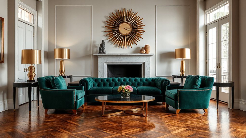
Although Art Deco embraces shine with few apologies, the metal you choose sets the temperature of the whole scheme. Brass reads warm and convivial, ideal when you want glamour that still feels lived-in. Chrome lands cooler and more architectural, sharpening lines and bouncing light in a crisp, metropolitan way. Gold sits between: opulent, but it can tip brash unless you control scale and sheen across your metal finishes.
Use these quick rules to decide:
- Choose brass to soften dark timbers and deepen jewel tones without gloom.
- Choose chrome to modernise marble and lacquer, keeping reflections clean.
- Choose gold when you’ll echo it in repeats, not one-off statements.
Keep material combinations disciplined: pair one hero metal with a quieter secondary, and match undertones across lighting, hardware, and accessories.
Art Deco Furniture: Curves, Symmetry, Bold Scale
When you get the furniture proportions right, Art Deco stops feeling like a theme and starts reading as architecture. Start with one hero piece: a curved-back sofa, a scalloped headboard, or a radiused sideboard. Keep the silhouette smooth, then anchor it with strict symmetry—paired armchairs, twin cabinets, or matching bedside tables—to echo art deco architecture’s ordered façades.
Scale matters: go bold, not busy. Choose low, wide pieces with strong horizontals, or tall cabinets with stepped profiles; you’ll create that cinematic, confident stance. Mix veneers, lacquer, and velvet, but limit patterns to one statement textile so the geometry stays legible.
If you’re using vintage art deco, reupholster in solid colour and repair edges crisply; the style depends on sharp junctions, not patina.
Art Deco Lighting: Globes, Sconces, Chandeliers
Furniture sets the stance; lighting gives Art Deco its gleam and rhythm. You’ll want globes, sconces, and chandeliers that echo Art Deco architecture: stepped silhouettes, strong symmetry, and crisp metalwork.
Choose opal glass globes for a soft halo, then sharpen the scene with angular wall sconces in brass or chrome, positioned to frame mirrors and artwork. Finish with a statement chandelier—tiered, faceted, or starburst—to anchor the room and pull the eye upward.
Keep proportions bold, wiring discreet, and finishes consistent, so the look feels intentional rather than themed. Let Art Deco fashion guide your sparkle: jewellery-like details, lacquered accents, and controlled glamour.
Opal globe pendants for even, flattering light.
Streamlined sconces to sculpt walls.
Tiered chandeliers for drama.
Floors: Terrazzo, Parquet, Geometric Rugs
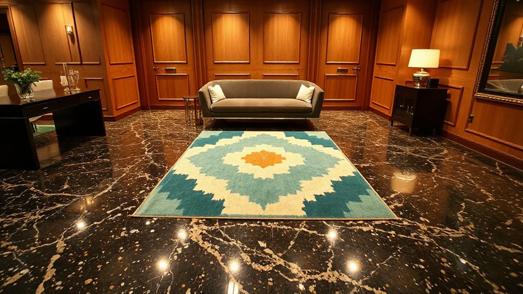
Start at floor level and the whole Art Deco scheme snaps into focus: terrazzo delivers a speckled, high-gloss stage, parquet brings disciplined grain in herringbone or chevron, and geometric rugs add the graphic punch that Deco demands.
Use floor patterns to steer the room: run parquet towards a focal point, or set terrazzo with a brass inlay border to sharpen the geometry. Keep the palette tight—black, cream, bottle green—so the shapes read cleanly.
You’ll get the strongest result by balancing material combinations: hard terrazzo under dining and circulation, warm timber where you linger, and a rug to zone seating without clutter. Choose rugs with stepped motifs, sunbursts, or bold stripes, and size them generously so furniture sits confidently within the frame.
Walls: Paneling, Mirrors, High-Gloss Finishes
Once the floor pattern sets the rhythm, the walls should lock in the Art Deco structure with crisp paneling, strategic mirrors, and high-gloss finishes that catch the light.
Choose timber or lacquered panelling to add order and create confident Wall textures without clutter. Use decorative moldings to frame rectangles, step forms, or shallow arches, then keep profiles sharp to avoid a fussy period look.
Place mirrors to extend sightlines and amplify symmetry; bevelled edges and smoked glass read authentically Deco.
Commit to gloss where you want drama—black, deep emerald, ivory, or oxblood—then balance it with matte paint in adjacent planes for contrast.
- Panelled dados that align with furniture heights
- Mirrored piers to bounce light and depth
- Lacquer or enamel for a sleek, wipe-clean sheen
Windows: Drapery, Sheers, and Standout Trims
Where do you let Art Deco glamour really land—if not at the window? Treat it as a framed elevation: hang drapery high and wide to exaggerate height, and choose weighty cloth with a crisp break—velvet, satin, or wool—so the fold reads architectural.
Pair it with sheers that filter light cleanly, not fussily; a fine voile or organza keeps the geometry sharp while softening glare.
For authentic Window treatments, prioritise symmetry and bold edges. Specify decorative trims: contrasting borders, stepped tape, or metallic braid that echoes brass, chrome, or lacquer elsewhere.
Keep headings tailored—pinch pleats or box pleats—then finish with statement tiebacks or a slim pelmet to sharpen the silhouette.
Art Deco on a Budget: High-Impact Swaps
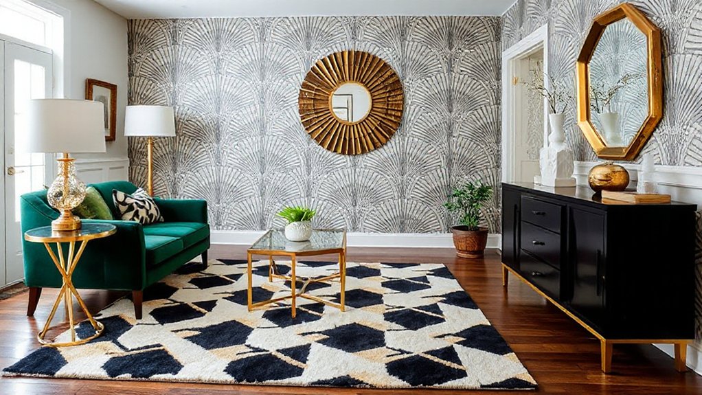
If you want Art Deco impact without the Art Deco invoice, focus on a few swaps that read like architecture rather than accessories. Start with lighting and hardware: they set the room’s “silhouette” the way Art deco fashion shapes a look. Choose warm brass or chrome and let geometry do the heavy lifting.
- Replace a basic pendant with an opal globe or stepped glass fitting; instant period presence.
- Swap plain pulls for fluted, chevron, or fan-shaped handles; your joinery looks bespoke.
- Introduce one large mirror with a bevelled edge or slim metallic frame; it doubles light and drama.
Keep your palette disciplined—ink, cream, jade, tobacco—then add a single accent like art deco jewelry: lacquered tray, onyx box, or sunburst clock.
Common Art Deco Mistakes (and How to Avoid Them)
You can ruin an Art Deco scheme by overdoing geometric patterns until the room reads as visual noise rather than crisp glamour. Keep the geometry purposeful—anchor it to one hero surface and balance it with calm, plain finishes.
You’ll also want to avoid mixing clashing materials; pair metals, timber, lacquer and glass with a controlled palette so the look feels intentional, not chaotic.
Overdoing Geometric Patterns
Although bold geometry sits at the heart of Art Deco, piling on chevrons, zigzags, sunbursts, and stepped motifs in every direction quickly turns a glamorous scheme into visual noise. Geometric exaggeration reads as indecision, and Pattern overload flattens the room’s hierarchy, so your best pieces lose impact.
Keep one hero pattern and let the rest behave as supporting cast through scale, spacing, and restraint. Aim for contrast between busy and calm surfaces, and repeat shapes sparingly to create rhythm rather than chaos.
- Choose one statement pattern for a rug, wallpaper, or headboard.
- Limit secondary motifs to two, and vary their scale dramatically.
- Leave breathing room with plain-painted walls or solid upholstery.
Mixing Clashing Materials
Once you’ve calmed the pattern story, the next way an Art Deco room can unravel is through materials that fight each other rather than harmonise. A Material clash happens when you stack too many “hero” finishes: high-gloss lacquer, busy veined marble, mirrored glass, chrome and shag-pile all competing in one sightline.
You’ll lose the Deco sense of glamour and control, and the room reads chaotic rather than curated. Limit your palette to two dominant finishes and one accent. Pair polished stone with warm timber, or brass with lacquer, then repeat each material at least twice so it feels intentional.
Handle texture mixing with discipline: keep one tactile element—velvet or boucle—then counter it with crisp, reflective surfaces. Choose one metal tone and stick to it across lighting, handles and trims.
Frequently Asked Questions
Where Did Art Deco Originate, and What Historical Events Shaped Its Look?
Art Deco originated in 1920s Paris, propelled by the 1925 Exposition. You’ll see its look shaped by post‑WWI optimism, machine-age modernity, jazz culture, and archaeology, expressed through Art deco symbolism and Art deco craftsmanship.
How Do I Blend Art Deco With Mid-Century Modern Without Clashing?
Blend them by keeping one dominant era, then echo forms across both. Use mid-century silhouettes with Art Deco geometric patterns, and limit luxurious materials to accents. Match warm woods with brass, and unify through a restrained palette.
What Are the Best Art Deco Interior Styles for Small Apartments?
Choose streamlined, vertical-focused Deco: mirrored panels, lacquer, and geometric lighting. Keep Art deco color palettes tight—black, cream, brass—with one jewel accent. Opt for compact Art deco furniture styles: curved settees, nesting tables, slender consoles.
Which Famous Designers and Architects Influenced Art Deco Interiors Most?
You’ll trace Art Deco’s biggest influence to Émile-Jacques Ruhlmann, Eileen Gray, Jean-Michel Frank, and architects like William Van Alen. Like the 1931 Chrysler spire, they drove luxury furnishings and geometric patterns into modern living.
How Can I Ensure My Art Deco Updates Improve Resale Value?
Prioritise authentic, high-quality finishes and keep changes reversible, so buyers see value not risk. Use luxury textiles and restrained geometric patterns, upgrade lighting and joinery, and document provenance, warranties, and professional installation.
Conclusion
Step back and you’ll see it: light skimming across high-gloss walls, a mirror catching every angle, velvet drapery falling in clean, theatrical folds. If you’ve followed the checklist, your room now reads Art Deco—bold geometry, confident contrast, and just enough glamour. Choose jewel tones or black-and-gold, then anchor them with crisp trims and polished metals. Keep swaps deliberate, avoid fussy curves, and let each statement piece feel purposeful.