


Color is your first tool, not your last; you’ll shape mood and flow by choosing a unifying base, then temper it with warm and cool neutrals so every surface feels connected, not boxed in. Decide the vibe first, test in real light, and map accents that echo your furniture and textures. Get the balance right, and the room will tell you what’s missing—until you’re ready to press on and lock in the perfect palette.
Understand the Color Problem: How Palette Choice Shapes Mood and Flow
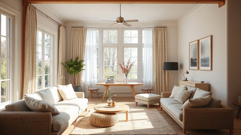
Choosing a color palette isn’t just picking pretty swatches; it’s shaping mood and guiding flow. You approach the problem by listing how hues interact with space, light, and function.
Color psychology explains why cool blues calm a room and warm oranges invite conversation, while saturation amplifies energy or serenity. You map zones: neighborhoods of quiet, channels of focus, and bursts of invitation.
Emotional impact matters as much as hue accuracy, so you weigh associations—nature, sophistication, playfulness—against practical needs like glare control and furniture scale. You test contrasts to create readability and rhythm, ensuring accessibility for all eyes.
Your goal is a deliberate, coherent scheme that supports activity, breathes balance, and respects the room’s intended purpose.
Define Your Room’s Vibe and Style Goals
First, map your Room Vibe to capture the energy you want: calm, bold, cozy, or chic.
Then align your Style Goals with that vibe, ensuring furniture, finishes, and textures reinforce the same message.
Finally, run a quick Palette Personality Check to confirm the look feels you and the space, not just trendy.
Room Vibe Mapping
So, what vibe are you after, and how can your room embody it from the moment you step in? You’ll map vibes by listing core feelings—calm, energetic, cozy, dramatic—and linking them to tangible cues: light, texture, scale, and flow.
Start with a dominant mood, then layer accents that reinforce it. If you crave serene simplicity, lean into monochromatic palette balance with subtle contrasts in value and texture.
For livelier spaces, test complementary color schemes that pulse without shouting. Consider rhythm: repeat a favorite hue in textiles, art, and furniture edges to unify the room.
Your goal is immediate recognition of intent—no guesswork. Keep notes actionable: paint swatches, fabric sways, placement ideas, and lighting cues that reinforce the chosen vibe at first glance.
Style Goal Alignment
Your room’s vibe isn’t just mood—it’s a mission. You define the destination before picking hues, aligning style goals with daily life. Start by articulating the feeling you want: calm focus, energetic warmth, or playful sophistication.
Then map these aims to your space’s functions—lighting, texture, and acoustics—so color choices amplify them, not distract. Color psychology guides you to calibrate saturation and contrast for mood shifts throughout the day.
Consider cultural symbolism to honor meaning without clichés: a single accent hue can signal hospitality, strength, or creativity within your context. Create a concise palette brief: dominant tone, supporting secondaries, and an accent for moments of emphasis.
When goals and colors converge, you’ll enjoy a cohesive, intentional room that communicates your true style.
Palette Personality Check
Your palette should echo the vibe you’ve outlined, turning goals into a tangible moodboard you can live with daily.
In Palette Personality Check, translate your Style Goal Alignment into a specific aura: bold, serene, energetic, or timeless. Define the mood you want occupants to feel at a glance, then map it to practical color choices.
Consider color psychology to predict emotional responses, and pair it with cultural color meanings to respect context and symbolism.
Are you aiming for calm productivity or vibrant sociability? Choose dominant hues, accent sparks, and neutral foundations that reinforce the narrative.
Test combinations with swatches under lighting that mirrors real rooms.
Document reasoning, so decisions stay coherent as you refine furniture, textures, and finishes.
Your room earns coherence, confidence, and a signature personality.
Pick a Unifying Base Color and Two Neutral Supports
Why choose a unifying base color and two neutral supports? A base color anchors the room, creating cohesion across furniture, walls, and textiles. Pick one versatile hue you love in large swathes and let it ground your palette.
Then choose two neutral supports—one warm and one cool—to balance contrast and temperature without stealing focus. Use the base as your constant, the neutrals as adaptable ballast for mood shifts and accents.
This approach respects color psychology: base color shapes perception, neutrals modulate intensity, and accents pop with purposeful intent. Consider cultural influences—some traditions favor muted grounds with vibrant highlights; others embrace subtle harmony.
In practice, test swatches together, observe lighting, and confirm the trio communicates the vibe you intend.
Align Color Temperature With Lighting and Mood
Light sets the story’s tone, so tune your color temperature to match the room’s intent. When you warm the light, you cue cozier, more inviting moods.
Cooler light sharpens focus and clarity. Start by aligning lighting quality with how you want people to feel, then adjust temperature to reinforce that mood.
Lighting’s Color Temperature
Warm temperatures (around 2700–3000K) feel cozy, inviting you to linger; cooler temps (3500–4100K) sharpen focus and reveal detail. For living spaces, blend a base of neutral white with subtle warmth to avoid clash as daylight shifts.
In work zones, lean cooler tones to boost alertness without harsh glare. When you pair ceiling, lamp, and task lights, keep consistency within zones to prevent color cast surprises.
Remember: lighting governs perception, so test samples at actual clock times to confirm your chosen temperature supports the intended mood.
Mood Through Light Quality
Color temperature doesn’t just shape mood; it matches how you feel in a space, hour by hour. You’ll notice that warm tones invite calm, while cool whites sharpen focus. Use color psychology to map tasks to light: soft amber for winding down, crisp daylight for work zones, and neutral white for social hubs.
Align this with your activity rhythm and the room’s purpose, not just its paint. When you select lighting, consider light fixture selection as deliberately as you choose fabric swatches; fixtures determine diffusion, glare, and warmth, influencing perceived color and mood.
Opt for layered lighting—ambient, task, and accent—to flex mood without color overhaul. This strategic approach keeps spaces inviting, functional, and visually cohesive.
Test Palettes in Real Spaces: Quick At-Home Methods
Trying out palettes in real spaces doesn’t require fancy gear—just a few quick, practical steps you can do at home to see how a color feels before you commit.
First, tape swatches on walls at different times of day to observe lighting shifts.
Second, test large patches, not tiny chips, so you experience true coverage and mood.
Third, compare surfaces—paint, fabric, flooring—to watch color interactions in context.
Note color psychology cues: warm tones feel inviting, cool tones calm, neutrals anchor bold accents.
Consider Cultural color meanings that matter to you or your guests, and adjust accordingly.
Finally, photograph each setup for sequence review, and critique with intent: does the palette support room function, traffic flow, and your personal vibe?
Recheck against your overall design goals.
Select Accent Colors for Furniture and Accessories
After you’ve seen how swatches behave in real spaces, shift focus to the furniture and accessories that will carry the palette day to day. Choose accent colors that punch without clashing, using deliberate contrast to highlight focal pieces.
Start with a dominant base and a single or two contrasting accents to avoid chaos. Accent color contrast should guide chair cushions, throw blankets, lamps, and artwork, ensuring each piece supports the room’s rhythm.
Consider the furniture color coordination across seating, storage, and surfaces so textures read as a cohesive story, not competing notes. Use accents to underscore architectural features or artwork, keeping metallics and neutrals in balance.
Remember: subtlety often strengthens impact, and disciplined accents yield timeless, versatile interiors.
Harmonize Finishes, Textures, and Patterns to Finish the Look
Think finishes coordination as the backbone: repeat a subtle metal tone across lamps, picture frames, and hardware to create cohesion. Then layer texture through textiles, rugs, and cushions, pairing a plush weave with a sleek, crisp surface to avoid fatigue.
Pattern plays a supporting role: use one dominant motif and scale it thoughtfully, mixing small and large patterns sparingly. Practice texture blending by varying fibers and textures within a limited palette, ensuring every element reinforces the room’s mood rather than shouting over it.
Conclusion
You’ve mapped mood to shade, and that’s your superpower. When you pick a base, two neutrals, and one or two accents, you craft flow that guides the eye and invites linger. Quick stat to savor: rooms with thoughtful color schemes can feel up to 20% larger thanks to strategic contrast and balanced light. Test in real light, tweak textures, and let finishes harmonize. Now, color your space with purpose, confidence, and a bit of daring.


