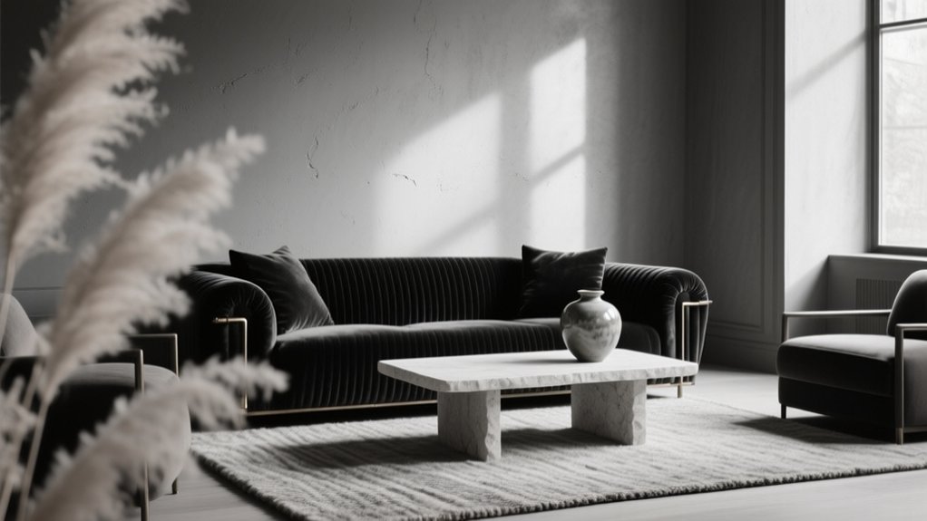

You create depth in a monochrome interior by controlling value shifts: make one dominant tone cover about 60% (walls, big rug), layer a mid-tone at 30% (drapery, secondary seating), then add 10% accents in the lightest or deepest value (hardware, lamps). Repeat each value three times, then swap color for texture—matte paint with velvet, honed stone with brushed metal. Keep one temperature and use warm, layered lighting to carve shadows. Keep going for room-by-room fixes and focal-point tricks.
Key Takeaways
- Build a 60/30/10 monochrome “recipe,” repeating each value three times to create balance and visual rhythm.
- Commit to one temperature (warm, cool, or neutral) and match undertones across paint, textiles, and finishes to avoid muddiness.
- Layer textures and sheen—matte walls, satin trim, glossy accents—to create depth through reflectance, not added color.
- Add tone-on-tone patterns at varied scales, spacing solids between them to keep the room readable and quietly dimensional.
- Use layered lighting (ambient, task, accent) to graze textures, deepen shadows, and highlight focal pieces for drama.
Start With a Simple Monochrome “Recipe
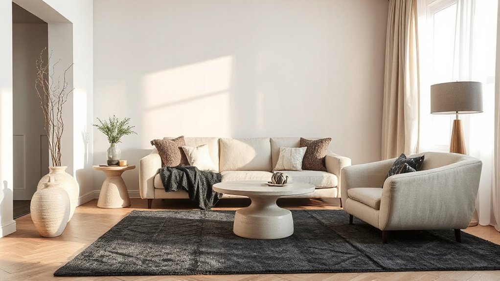
If you want a monochrome room to feel intentional instead of flat, start with a simple “recipe” you can repeat and tweak. Choose one dominant tone for 60% of the space (walls, large rugs, key upholstery), then layer a mid-tone at 30% (drapery, secondary seating, casegoods), and finish with 10% accents in the deepest or lightest value (hardware, frames, lamps).
Lock in color harmony by repeating each value at least three times around the room, so your eye keeps moving.
Build mood enhancement through texture contrast: matte paint with velvet, bouclé with leather, honed stone with brushed metal.
Use one pattern, scaled up or down, to add rhythm without breaking the monochrome read.
Choose One Palette (Warm, Cool, or Neutral)
Once you’ve set your 60/30/10 value “recipe,” commit to a single temperature so the room reads layered, not muddy: warm, cool, or neutral.
Warm monochromes (camel, terracotta, tobacco) feel welcoming and intimate; Color psychology links them to comfort and appetite, so they suit dining rooms and lounges.
Cool monochromes (slate, steel, ink) read crisp and modern, reinforcing focus and calm—ideal for offices and bedrooms.
Neutrals (stone, greige, bone) deliver versatility and a gallery-like backdrop that highlights form and craftsmanship.
Anchor your choice to historical influences: Arts and Crafts favors warm earths, Scandinavian modernism leans cool, and Belgian minimalism lives in nuanced neutrals.
Then keep undertones consistent across paint, textiles, and finishes.
Expand the Tonal Range: Light to Dark
Because monochrome relies on value shifts more than hue, you’ll get real depth by stretching your palette from near-white highlights through mid-tones to inky anchors.
Start by mapping each surface: ceiling and trims stay light to lift volume, walls sit mid-value for calm continuity, and flooring or millwork goes deeper to ground the room.
Use Color psychology intentionally—pale values read airy and optimistic, while charcoal cues privacy and sophistication.
Then reinforce those steps with Lighting techniques: layer ambient, task, and accent so shadows stay controlled and edges stay legible.
Aim sconces across textured plaster, wash curtains with uplights, and use dimmers to keep contrast consistent from day to night.
Keep undertones aligned to avoid muddiness.
Set a Focal Point and a Dominant Surface
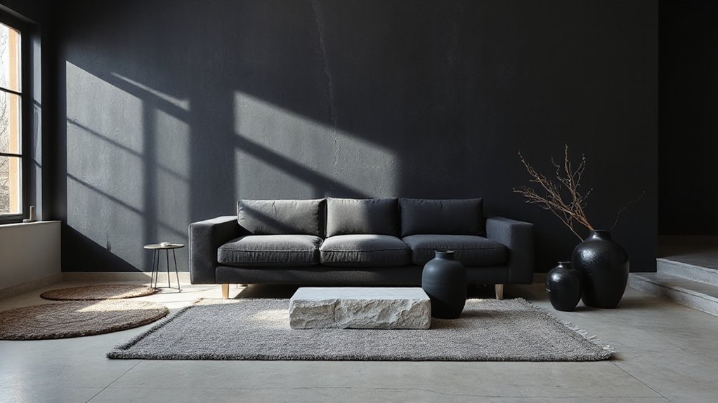
- Anchor the Focal point with one standout piece: sculptural sofa, art, or fireplace.
- Make the Dominant surface broad and uninterrupted: feature wall, ceiling wrap, or built-ins.
- Echo its material or finish in two smaller touches to create cohesion.
- Control sightlines: place the focal element opposite the entry or main seating axis.
Add Contrast With Black, White, and Midtones
Even in a monochrome scheme, you’ll only get real depth when you engineer contrast across black, white, and a disciplined range of midtones. Anchor the room with a clear value map: darkest notes at the perimeter or in key silhouettes (window frames, a console, artwork), brightest notes where you want lift (ceiling, sheers, reflective accents), and midtones to bridge gradation.
Build lighting contrast intentionally. Aim grazers or wall washers across one surface to sharpen shadows, then keep adjacent planes calmer so the eye reads layers.
Add textural variety to prevent flatness: boucle against smooth cotton, ribbed stone beside tight weave, or matte plaster near crisp linen. Keep the palette tight, but vary value in controlled steps for modern, gallery-like dimension.
Mix Matte, Satin, and Glossy Finishes
To keep a monochrome room from reading flat, you’ll need to balance sheen across surfaces—matte on broad walls, satin on trim, and targeted gloss where you want the eye to land.
You can use gloss to spotlight architectural details, hardware, and statement lighting, letting reflections add crisp contrast without changing the color palette.
Balance Sheen Across Surfaces
When your palette stays monochrome, sheen becomes the lever that controls depth, movement, and perceived contrast. You’ll get a richer room by planning sheen variation the way you’d plan lighting: intentionally, and by zone.
Track surface reflection at different times of day, then distribute finishes so nothing reads flat or overly shiny.
- Use matte on large walls and ceilings to calm glare and soften progression.
- Shift to satin on trim and built-ins for gentle edge definition without spotlighting.
- Add gloss in small, repeatable doses on durable touchpoints like doors or cabinets.
- Balance textiles: nubby upholstery, low-luster drapery, and a slightly polished floor.
Keep one dominant finish, one supporting, and one accent, and repeat them consistently across the space.
Highlight Details With Gloss
Because monochrome rooms rely on nuance, you can use gloss as a precision tool that spotlights architecture and craftsmanship without changing color. Paint trim, cornices, and panel moulding in a higher sheen than the walls, and you’ll get crisp Gloss highlights that read like fine outlining.
Use satin on doors and built-ins so they feel tailored, then reserve full gloss for focal details—fireplace surrounds, window frames, or a lacquered ceiling medallion.
Control Surface reflections by aiming gloss toward controlled light sources, not broad daylight glare; place sconces or picture lights to skim profiles and sharpen edges.
Keep the color identical across finishes so the shift feels intentional, modern, and quietly luxe.
Clean prep matters; gloss amplifies flaws, so sand, fill, and prime meticulously.
Layer Textures Using Finish
Even in a single-color scheme, you can build real depth by stacking finishes the way you’d layer fabrics. Layered finishes create subtle shifts in reflectance, so walls, millwork, and furnishings read as distinct planes, not a flat wash.
Aim for Texture contrast: pair light-absorbing matte with softly reflective satin, then punctuate with controlled gloss where you want the eye to land.
- Paint broad surfaces (walls/ceilings) in matte to quiet glare and sharpen shadows.
- Use satin on trim or cabinetry for a tailored, current look that wipes clean.
- Add gloss on small accents—frames, hardware, lacquered tables—to amplify highlights.
- Repeat each sheen at least twice so the mix feels intentional, not random.
Layer Soft and Hard Textures for Warmth
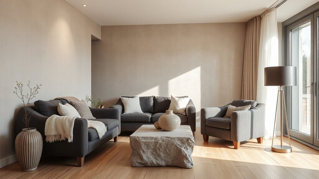
You’ll warm up a monochrome room by balancing plush layers—bouclé, velvet, or a dense wool rug—against sleek elements like lacquered casegoods and slim metal frames.
Keep the palette tight but mix matte with gloss so light moves across upholstery, stone, and painted surfaces with intention.
Then sharpen the look by contrasting natural textures (linen, raw oak, travertine) with polished finishes (marble, chrome, high-gloss cabinetry) for controlled depth.
Balance Plush And Sleek
- Pair a slim-profile sofa with a deep-pile rug underfoot
- Add a boucle or mohair throw to a structured chair
- Introduce leather or lacquer-free wood alongside nubby textiles
- Use oversized pillows in varied weaves, kept within one tone
Mix Matte With Gloss
While a monochrome palette streamlines the room, mixing matte and gloss keeps it from reading flat by creating controlled contrast. Start with a quiet base—matte walls, a low-sheen ceiling, or a chalky cabinet front—so light reads as soft, even, and intentional.
Then add targeted Matte gloss moments where you want edges to pop: lacquered side tables, glossy tile, a satin-painted door, or a glass-topped console. This finish contrast creates depth without changing color, and it guides the eye through the space like subtle wayfinding.
Keep the sheen shifts deliberate: repeat each finish at least twice, and group them by zone. Balance hard shine with tactile textiles—bouclé pillows, wool rugs, and brushed metal—to keep the look warm, not clinical.
Contrast Natural And Polished
Even if your monochrome palette stays perfectly consistent, pairing natural materials with polished surfaces keeps the room from feeling sterile. You create depth by balancing soft, irregular grain against crisp, reflective planes, so light moves and shadows read as intentional.
Prioritize Natural textures where you touch and relax, then counter with Polished surfaces where you want definition and lift.
- Place a linen sofa beside a lacquered side table to sharpen edges.
- Layer a wool rug under a stone coffee table for grounded warmth.
- Add rattan, oak, or travertine near stainless or glass to amplify contrast.
- Finish with aged brass hardware; it bridges raw and refined beautifully.
Keep tones tight, vary texture scale, and repeat each material at least twice for a cohesive, current look.
Use Tone-on-Tone Pattern (Not Extra Colors)
If your monochrome room feels flat, introduce tone-on-tone pattern instead of reaching for another color. You’ll get depth by shifting scale and motif while staying inside the same hue family. Start with Tone on tone patterns like a subtle herringbone wool, a pinstripe linen, or a matte checkerboard tile; keep the contrast in sheen, not pigment.
Build Monochrome layering by stacking patterns at different intensities: micro-texture on walls, a medium repeat on drapery, and a bold-but-same-color print on cushions. Anchor it with disciplined spacing—let solids rest between patterns so the eye can read each layer.
Use high-low finishes (brushed, lacquered, boucle) to make patterns register under changing daylight and lamps, even at night.
Go Oversized With Art, Rugs, and Furniture
In a monochrome room, you create instant depth when you go oversized with a single statement artwork, a dramatic rug, or a sculptural piece of furniture.
You’ll get a cleaner, more intentional look by scaling your area rug up so it sits under the front legs of key pieces and visually expands the footprint.
Then you anchor the space with oversized furniture—think a generous sofa or large-scale chair—so the room feels layered, not flat.
Make A Statement Piece
Why let a monochrome palette play it safe when one oversized piece can give the whole room instant presence? Choose a single hero element—an expansive canvas, a sculptural chair, or a bold credenza—and let it anchor your tonal story. You’ll create crisp focal statements without adding color noise, and you’ll sharpen contrast through silhouette, sheen, and texture.
Keep surrounding pieces quieter so the room reads intentional, not crowded, and use lighting to amplify edges and shadow lines.
- Pick one dominant form with a strong outline
- Layer tactile finishes: boucle, lacquer, matte plaster
- Add statement accents via hardware, trim, or sculptural decor
- Position it on the main sightline from the doorway
Commit to scale, and your monochrome scheme instantly feels dimensional and current.
Scale Up Area Rugs
Once you’ve anchored the room with a hero piece, use oversized area rugs to lock in the palette and make the space feel intentionally expansive. Choose a rug that extends at least 8–12 inches beyond key seating legs or reaches close to the walls, so your floor reads as one continuous field of tone.
To create scale dynamics in a monochrome scheme, lean on contrast in texture and weave: cut-pile against flatweave, plush wool against jute, matte against subtle sheen.
Let rug patterns do the heavy lifting—tone-on-tone geometrics, micro-checks, or striated ombrés add depth without breaking the color story. Keep the border minimal to avoid visual “boxing,” and repeat one rug hue in nearby textiles so the oversized footprint feels deliberate, not accidental.
Oversized Furniture Anchors Rooms
Although monochrome palettes thrive on restraint, the room won’t feel grounded until you scale up the furniture that carries the most visual weight. Choose a deep sofa, a generous sectional, or an oversized lounge chair to create a clear focal mass; it prevents a single-tone scheme from reading flat.
Match Room proportions: in larger rooms, go broader and lower; in tighter spaces, pick one hero piece and keep the rest streamlined.
Dial in Furniture placement so the big piece floats slightly off the wall and aligns with your rug’s edges, creating intentional negative space.
- Overscale the sofa before you add extra chairs
- Use a chunky coffee table to reinforce the anchor
- Keep legs visible for lift, not bulk
- Repeat the silhouette once, then stop
Repeat Shapes and Lines to Feel “Designed
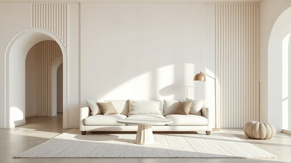
When you repeat a shape or line in a monochrome room, the space stops feeling accidental and starts reading as intentionally designed. Pick one geometry—arched, rectangular, or cylindrical—and echo it at least three times across the room to create a clear visual rhythm without adding color.
Use repeating patterns and consistent lines to connect zones: a fluted cabinet front can mirror ribbed upholstery; thin black window mullions can reappear in a console’s frame and a picture rail. Keep proportions tight: match radii on curves, align edges, and repeat spacing (like 2-inch reveals) so details feel deliberate.
Mix materials within the same silhouette—stone, wood, lacquer—to add dimension while the palette stays calm and controlled.
Sculpt the Room With Layered Lighting
If your palette stays intentionally tight, layered lighting becomes the main tool for carving depth into a monochrome room. Start with a dimmable ceiling source for Ambient glow, then add mid-level fixtures and close-to-surface light to build layered shadows without changing color. You’ll make finishes read differently—matte looks softer, satin looks richer, and texture becomes legible.
Keep color temperature consistent (2700–3000K for most homes) so whites don’t shift and grays don’t go green. Use smart controls to stack scenes for day, evening, and entertaining.
- A soft overhead wash for baseline illumination
- Table lamps to thicken mid-room volume
- Floor lamps to extend height and corners
- LED strips in millwork to reveal depth
Place Lighting to Create Intentional Shadows
Because a monochrome palette doesn’t distract the eye, you can use placement—not color—to engineer shadow lines that add architecture. Aim fixtures, not brighter bulbs: a narrow-beam adjustable downlight can graze a textured wall to reveal micro-relief, while a wider flood softens shift on smooth paint.
Place sconces slightly off-center to cast asymmetric pools, and hang pendants lower over tables to carve a darker ceiling perimeter. Use toe-kick LEDs or low uplights behind seating to float silhouettes and deepen negative space.
Keep sources dimmable and warm-neutral so shadow edges read crisp, not harsh. This is strategic shadowing: you’re directing the viewer’s gaze with intentional light, shaping depth through contrast and controlled falloff.
Add Depth With Trim, Paneling, and Millwork
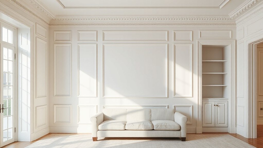
You’ll get instant depth in a monochrome room by contrasting painted trim—shift it a few sheen levels or a half-step in tone to crispen edges without breaking the palette.
Layer wall panel profiles (from flat stock to stepped or reeded details) so light rakes across the relief and adds dimension throughout the day.
Finish with custom millwork shadow lines—tight reveals at baseboards, casings, and built-ins—that create clean, architectural definition in a distinctly current way.
Contrast With Painted Trim
- Choose satin or semi-gloss on trim to catch light.
- Go darker on baseboards to visually “ground” the room.
- Match trim to built-ins for a seamless, tailored look.
- Test undertones under night lighting before committing.
Layered Wall Panel Profiles
Painted trim sets the frame, but layered wall panel profiles build the architecture that makes a monochrome room feel dimensional. Use rail-and-stile grids, picture-frame molding, or applied battens to introduce relief without changing color.
Keep proportions deliberate: align stiles with window casings, center panels on key sightlines, and match reveal widths so everything reads intentional.
Choose a profile hierarchy—flat base panels with a slimmer cap molding, or shallow wainscot below a cleaner upper wall—to control scale.
Layered wall panels also let you tune light behavior: satin paint on panel faces and a slightly higher sheen on trim edges amplifies highlights.
For more depth, pair paneling with textured wall surfaces like limewash, microcement, or grasscloth above, keeping tones consistent for a modern, tonal look.
Custom Millwork Shadow Lines
Even when every surface sits in the same tonal family, custom millwork shadow lines carve out depth by turning light into a design material. You’ll get crisp separation without adding color, and the room reads more architectural.
Specify consistent reveals, align joints to sightlines, and use matte paints so the shadows stay legible, not shiny. Keep proportions disciplined—today’s trend favors thin, precise gaps over bulky trim.
Use custom millwork to frame planes, wrap corners, and create quiet rhythm across long walls.
- Cut 1/4″–3/8″ reveals at panel perimeters for clean shadow lines
- Add stepped baseboards and casings to layer edges without contrast
- Integrate recessed doors, niches, and toe-kicks for floating effects
- Continue reveals across cabinetry and wall paneling to unify elevations
Choose a Rug That Adds Contrast and Texture
Where do you introduce instant depth in a monochrome room without disrupting its palette? Start underfoot. A rug is your fastest way to layer shadow, scale, and tactility while staying tonal.
Prioritize textured fibers—looped wool, ribbed flatweaves, or cut-and-loop piles—that catch light differently as you move through the space. Then add contrast through value, not color: choose charcoal on warm gray, ivory on sand, or a faded tonal ombré to create separation from flooring and upholstery.
Use contrasting patterns strategically: oversized grids, broken stripes, or low-contrast geometrics read modern yet subtle, and they visually expand the room. Size it generously so front legs sit on it; tight rugs flatten everything.
Mix Materials: Wood, Stone, Metal, and Fabric
How do you keep a monochrome space from reading flat without introducing new colors? You mix materials so light hits varied surfaces and creates shadow, sheen, and grain.
Start with wood for warmth—rift-sawn oak or walnut reads rich even in one tone. Add stone for cool density; honed marble or soapstone gives quiet movement.
Layer metal for crisp highlights: matte black steel, brushed nickel, or antiqued brass.
Finish with fabric to soften edges, and choose Upholstery patterns like tone-on-tone herringbone, bouclé, or micro-check to build depth without contrast.
- Wood: visible grain, scaled from floor to casegoods
- Stone: honed finishes, subtle veining
- Metal: Decorative hardware for pinpoint gleam
- Fabric: textured weaves and Upholstery patterns for relief
Fix Flat Monochrome Rooms: Quick Room Guides
Because each room catches light differently and serves a specific job, you’ll fix a flat monochrome scheme faster by tuning contrast, texture, and sheen to the space instead of repainting everything.
In the living room, sharpen depth with one darker anchor (sofa or rug), then adjust furniture placement to open a negative-space lane to the window.
In the bedroom, use Color psychology: matte, mid-tone walls calm, while a higher-sheen headboard and crisp bedding add lift without glare.
In the kitchen, alternate glossy tile with honed stone, and repeat one metal finish at three heights for rhythm.
In the bath, layer micro-contrast—warm gray towels, cool gray grout—and swap to a dimmable, high-CRI vanity light for definition.
Frequently Asked Questions
How Do I Keep a Monochrome Room From Feeling Cold or Sterile?
You keep a monochrome room warm by layering Textural contrast—bouclé, velvet, matte paint, and raw wood—and using Lighting techniques like dimmable warm LEDs, wall washers, and shaded lamps. Add earthy accents, plants, curated art.
What Paint Sheen Works Best for Monochrome Walls in High-Traffic Areas?
Choose satin or eggshell for monochrome walls in high-traffic areas; they resist scuffs and clean easily. You’ll get balanced light reflection without harsh glare. Pair with subtle finish texture to hide flaws and elevate tone.
How Can I Incorporate Plants Without Breaking a Monochrome Color Scheme?
Add plants by choosing tonal pots and repeating their shapes; you’ll keep cohesion while layering plant textures. Studies show indoor greenery can boost productivity 15%. Limit green accents to one hue and consistent placement.
How Do I Transition Monochrome Design Between Open-Plan Rooms Cohesively?
You’ll change cohesively by repeating one base tone, then shifting finishes per zone. Use lighting effects to signal boundaries, and texture layering—rugs, slatted wood, boucle—while keeping consistent black hardware and trim lines.
What Are Budget-Friendly Ways to Update a Monochrome Room for More Depth?
In a $200 refresh, you’ll add peel-and-stick wall panels and a thrifted mirror for instant depth. Layer Accent lighting at eye level, then swap in Textured fabrics—bouclé pillows, ribbed throws—to sharpen contrast.
Conclusion
When you build a monochrome interior with intention, you’ll get depth, not dullness. Stick to one temperature, then push your tones from airy highlights to inky lows. Let one surface lead, and sharpen edges with black, white, and calibrated midtones. Layer trim, paneling, and millwork for shadow lines, then ground it all with a textured, contrast-forward rug. Mix wood, stone, metal, and textiles—because the devil’s in the details.