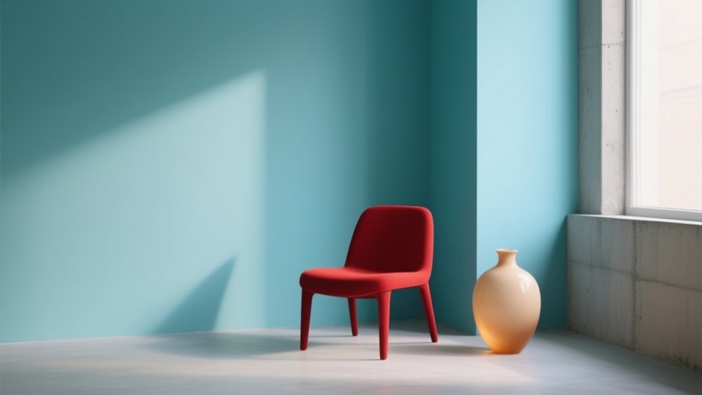

You shape emotion with hue, value, and saturation: warm, high-chroma colours push urgency, while cool, darker tones signal calm and trust. You can’t rely on psychology alone, so you test colours in real layouts, lighting, and scale, then confirm hierarchy with strong luminance contrast. You avoid meaning-by-hue only by adding icons, labels, and patterns, and you validate WCAG contrast plus CVD checks. Keep going to see how culture and brand personality change choices.
Key Takeaways
- Hue, value, and saturation shape mood, legibility, and visual weight; adjust them together to control emotional tone precisely.
- Warm hues signal energy and urgency, while cool hues suggest calm and distance; balance temperature with contrast to guide attention.
- Colour psychology is probabilistic; context, lighting, textures, motion, and personal associations can reverse intended meaning, so test in real layouts.
- Don’t rely on hue alone for meaning; use luminance contrast plus icons, patterns, and labels, and validate with grayscale and CVD simulations.
- Build a consistent brand colour system with core hues, neutrals, and accents; reserve high-chroma accents for urgency and delight, backed by user testing.
Colour Psychology Basics: Hue, Value, Saturation
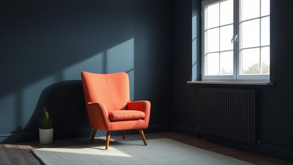
Although colour can feel purely subjective, you can predict a lot of its emotional impact by breaking it down into three controllable attributes: hue (what family it belongs to, like red or blue), value (how light or dark it is), and saturation (how intense or muted it looks).
Start with hue temperature: warm hues push energy and urgency; cool hues cue calm and distance. Next, set value to control weight and legibility—lighter values feel open and gentle, darker values feel serious and grounded. Then tune Color saturation to manage intensity: high saturation reads bold and youthful; low saturation reads refined and restrained.
When you combine them, you steer mood precisely—e.g., a cool, dark, muted blue signals trust and stability, while a warm, light, saturated orange signals friendliness and motion.
What Colour Psychology Can’t Tell You
Even if you know the “rules” of hue, value, and saturation, colour psychology can’t guarantee how people will actually feel or behave. You’re working with probabilities, not laws, because context rewires meaning. A red button reads “urgent” on a checkout page, but “error” in a system alert, and “celebration” in a holiday banner.
You also can’t predict Emotional resonance without accounting for culture, environment, and task. Lighting, surrounding colours, material texture, and motion all shift perception.
Most importantly, people bring Personal associations: a hospital gown can make blue feel clinical, while a childhood bedroom makes it comforting. To close the gap, you should test colour in real layouts, on real devices, with real users, and measure comprehension, not preference alone.
Choose Colours That Match Brand Personality
How do you choose a palette that feels “right” before anyone reads a word? You start by defining your brand’s personality in plain language: bold or restrained, warm or clinical, playful or formal.
Translate those traits into colour attributes—saturation, temperature, contrast, and value—so your choices stay consistent across media.
Audit your current Color branding: logo, UI, packaging, and photography. Note where colour signals a different voice than your copy.
Build a small system: one core hue, one supporting hue, two neutrals, and a limited accent range. Specify exact values (HEX, RGB, CMYK, Pantone) and acceptable tints.
Test the palette against real brand moments—headlines, product shots, customer emails—to confirm emotional resonance without relying on personal taste alone.
Use Colour Psychology to Guide Attention

Because your audience scans before they read, you can use colour psychology to pull their eyes toward the actions that matter—buttons, prices, headings, and key benefits—by assigning “attention” colours with intent. Pick one high-salience hue for primary CTAs, then reserve it; if everything is loud, nothing stands out.
Use warm, high-chroma colours to signal urgency or movement, and cooler tones to support reading and reduce visual stress.
Anchor hierarchy with contrast: set body text in low-saturation neutrals, elevate headings with deeper values, and highlight offers with a single accent.
Reinforce emotional resonance by aligning accents with the mood you want users to feel at decision points. Use colour symbolism consistently across states: hover, active, success, and error, so attention shifts without confusion.
How Colour Meaning Changes by Culture
When you choose colours for a message, you can’t assume their meaning travels unchanged across borders. Cultural symbolism shifts fast, and regional colour taboos can turn a “positive” hue into a mistake in certain markets.
You’ve got to read colour in context—occasion, audience, and setting—so your palette supports the emotion you intend instead of contradicting it.
Cultural Symbolism Shifts
Although colour can feel universal at a glance, its emotional meaning shifts sharply across cultures, and you can’t assume one audience will read a hue the same way another does.
Start by mapping Traditional symbolism in each market: trace how religion, history, and social roles frame key colours in daily life and media.
Then test for Modern reinterpretation, since global brands, pop culture, and politics can recode old meanings quickly.
You’ll design better if you validate perceptions with local reviewers, not just translation teams.
Compare contexts: packaging, uniforms, ceremonies, and digital UI can signal different intent with the same palette.
Build flexible systems—alternate colourways, adjustable accents, and neutral foundations—so your design preserves emotion while respecting cultural reading.
Document decisions and revisit them regularly.
Regional Colour Taboos
Symbolism can shift with time and context, but taboos raise the stakes—get a colour wrong and you won’t just miss the mood, you’ll signal disrespect. Treat Regional colour taboos as non-negotiable requirements, not creative constraints.
In parts of East Asia, white can map to mourning; in many Western markets, black carries grief; in some Latin American contexts, purple can signal funerary traditions; and in several Middle Eastern settings, green may carry sacred resonance, so misuse reads as careless.
Track Historical colour associations tied to religion, royalty, revolution, or caste to predict sensitivity. Before you lock a palette, audit target regions, flag high-risk hues, and define safe alternates for critical UI states, packaging, and uniforms across global rollouts.
Context-Driven Colour Interpretation
Even if you standardize your brand palette, colour meaning still shifts because culture sets the context people use to decode it. You can’t assume Color symbolism travels unchanged: white reads as weddings in many Western markets, but signals mourning in parts of East Asia; red can imply luck, danger, or discounting depending on locale and category.
To protect Emotional resonance, you’ve got to test interpretations in real settings, not just mood boards.
- Map local associations for each core hue and accent.
- Audit competitors’ palettes to avoid accidental mimicry.
- Validate with in-market users across age, gender, and region.
- Localize pairings, typography, and imagery so colour cues align.
When context changes, meaning changes; design for that, or you’ll miscommunicate.
Create Colour Harmony and Keep Strong Contrast
A well-designed palette balances harmony with contrast so your message reads instantly instead of getting lost in visual noise. Start by choosing a tight hue family and control Color blending: limit mid-tone mashups that create muddy edges and weaken hierarchy.
Use Monochrome schemes when you need calm cohesion, then separate elements with clear value steps—light, mid, dark—so structure stays obvious. If you go complementary, keep one hue dominant and push the accent into small, high-impact areas like buttons or key data points.
Define roles for each color: background, surface, text, and emphasis. Test your palette in real layouts, not swatches, and verify contrast at typical viewing sizes and distances for clarity.
Make Colour Accessible Without Losing Emotion
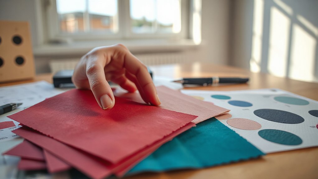
You can keep emotional contrast while meeting accessibility standards by pairing expressive hues with clear value separation and readable text-to-background ratios.
Build inclusive palettes by testing for common colour-vision deficiencies and backing colour cues with shape, icons, or labels so meaning doesn’t vanish.
When you tune saturation and brightness with intent, you preserve a strong feeling without locking anyone out.
Emotional Contrast With Accessibility
While colour can carry powerful emotional weight, it still has to work for every viewer, including those with low vision or colour‑vision deficiency. You can keep emotional resonance by treating contrast as your primary storytelling tool, not a compliance checkbox. Build Accessibility considerations into early mocks, then validate them under real viewing conditions and edge cases.
Use contrast to separate meaning, preserve hierarchy, and keep your palette’s intent intact without relying on hue alone.
- Check text contrast ratios (WCAG) at final sizes and weights.
- Pair hue with luminance shifts so states differ in light/dark value.
- Add non-colour cues (icons, patterns, labels) for critical statuses.
- Test in grayscale and CVD simulators, then adjust before handoff.
Inclusive Palettes, Strong Feeling
Even if your palette starts with a single “hero” colour, you can make it inclusive by building an emotional range across lightness, saturation, and context—not just hue. Start by mapping the hero’s tonal ladder (tints to shades) so every state—default, hover, focus, disabled—meets contrast targets while preserving mood.
Keep saturation purposeful: reserve high-chroma accents for urgency or delight, and use mid-chroma companions for calm continuity. Add non-colour cues (icons, patterns, labels) so meaning survives colour-vision differences.
Test Inclusive palettes in grayscale and with CVD simulators; then verify with real users. Finally, tune emotional resonance through pairing: warm neutrals soften intense reds, cool backgrounds steady energetic yellows, and consistent spacing prevents “loud” colour from overwhelming information.
Test Colour Choices in Real Designs and Spaces
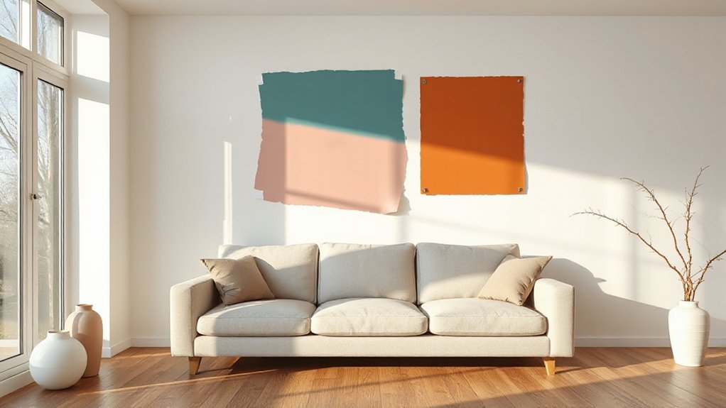
Before you commit to a palette, test it in the exact context where it’ll live—on the materials, under the lighting, and at the scale people actually experience. Digital mocks mislead; pigments shift on paint, fabric, tile, and coated metal. Testing shades on real samples reveals undertones, glare, and contrast errors that can derail emotion and accessibility. Use short trials to validate decisions and guide space customization without expensive rework.
- View samples in morning, noon, and evening light, plus your actual artificial sources.
- Place colours next to fixed elements (flooring, trim, hardware) to check clashes.
- Test at scale: paint a 1m² swatch or hang full-width fabric panels.
- Capture photos and notes, then confirm legibility for signage, screens, and wayfinding.
Frequently Asked Questions
How Do Colour Choices Affect Workplace Mood and Productivity Long-Term?
Your colour choices shape long-term mood and productivity by reinforcing calm, focus, or fatigue daily. Use Color psychology to balance cool focus tones with warm accents, supporting a stable workplace environment, fewer stress triggers.
Can Colour Influence Appetite or Taste Perception in Food Branding?
Yes—you can use colour to influence Food appetite and Taste perception in branding. You’ll boost hunger with warm reds/yellows, signal freshness with green, suggest sweetness with pink, and reduce appetite with cool blues.
What Role Does Lighting Temperature Play in Emotional Colour Impact?
Studies show 80% of people judge ambience by lighting within seconds. You’ll shape emotional colour impact through temperature: Warm lighting boosts comfort and richness; Cool lighting heightens clarity and calm, shifting perceived saturation and mood.
How Can Seasonal Trends Shift Emotional Responses to the Same Colours?
Seasonal trends shift how you read colours: seasonal colour psychology makes warm tones feel cozy in winter but oppressive in summer. You’ll also track cultural colour associations, since holidays and rituals reframe meaning, boosting nostalgia or urgency.
Do Age-Related Vision Changes Alter Emotional Reactions to Colour?
You bet—age-related vision changes do alter your emotional perception of colour. As the saying goes, “seeing is believing.” You’ll perceive less blue, more yellow; boost contrast, increase luminance, and test palettes under varied lighting.
Conclusion
You’re not picking colour to “make it pretty”; you’re shaping how people feel and act. Use hue, value, and saturation to match brand personality, steer attention, and build harmony with strong contrast. Don’t overtrust psychology charts—culture, context, and accessibility change meaning fast. You might worry accessibility will dull emotion, but it won’t: accessible contrast and clear states sharpen impact. Test palettes in real layouts, lighting, and devices before you commit.