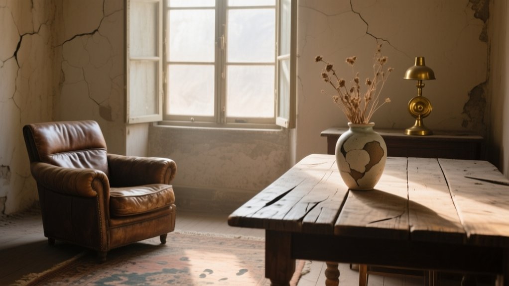

Patina is the mellowed sheen, softened edges, and gentle fading that real materials—oak, brass, leather, lime plaster—earn through years of British light, handling, and daily use. You’ll feel it makes your home look lived-in and confident, not staged. You can spot true patina by its consistent, stable wear, unlike damage such as cracking paint, active rot, or damp staining. Use one hero aged piece against crisp walls and modern lines, and you’ll soon know exactly what to keep, repair, and source.
What Is Patina in Interior Design?
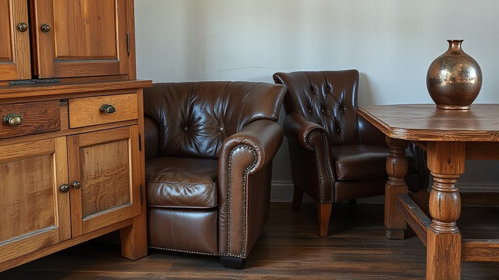
Although people often mistake it for simple wear and tear, patina in interior design is the mellowed surface character that materials develop through age, use, and exposure. You’ll see it in oxidised brass, softened oak grain, burnished leather, and stone that’s gently polished by hands and footsteps. It isn’t damage; it’s a visible record of time that alters colour, sheen, and texture in predictable ways.
To define patina properly, you place it in Historical context: Georgian joinery, Victorian encaustic tiles, and post-war utility finishes all age differently because of their making and maintenance.
You also recognise Cultural influences, from British love of inherited furniture to continental appreciation of aged metals.
You judge patina by integrity, not perfection.
Why Patina Makes a Home Feel Real
Patina matters because it makes a room feel lived-in rather than staged. You can walk into a London terrace or a Cornish cottage and sense the story: softened stair treads, a mellowed oak tabletop, brass that’s dulled by decades of hands. Those traces anchor you, and they stop your home feeling like a showroom set.
You don’t have to reject Modern minimalism to get that authenticity. Pair clean-lined storage with a weathered sideboard, or set Contemporary art against aged plaster and original floorboards. The contrast adds depth and scale, so the space reads as collected, not curated.
When you keep patina, you signal confidence: you value use, memory, and continuity over constant replacement. That’s what makes a home feel real.
Patina vs. Damage: How Can You Tell?
You can tell true patina by consistent, touch-worn sheen on timber, gentle softening on brass, and hairline crazing on old paint that stays stable through the seasons.
You should flag damage when you see active rot, lifting veneer, powdery corrosion, fresh water staining, or cracks that widen and threaten structure.
Once you’ve judged it, you can choose light conservation, targeted restoration, or full replacement where safety, moisture control, or Building Regulations demand it.
Signs Of Natural Patina
With time and daily use, authentic surfaces in a home develop tell-tale changes that look settled rather than sudden. You’ll notice mellowed sheen on oak stair treads, a softened edge on a dresser handle, and gentle fading where sunlight regularly falls.
On brass taps or door furniture, oxidation reads as an even, warm darkening, not a harsh blotch. Leather gains suppleness and a slightly richer tone at contact points, while stone worktops show a quiet, honed track near the sink.
Paint on skirting boards may polish at brush height, revealing underlayers that add Vintage charm. These shifts follow touch, light, and routine, creating Rustic elegance that feels earned in British homes.
Red Flags Of Damage
Although age should read as gradual and coherent, damage shows up as abrupt change that doesn’t match the home’s normal patterns of use. You’ll spot it where materials fail, not mellow: lifting veneer, fresh splits, soft timber, or bubbling paint that suggests trapped moisture.
In UK homes, watch for tide marks on plaster, salt bloom on brick, and skirting boards that crumble when pressed—signs of damp rather than patina.
Check consistency: if a floorboard’s wear tracks don’t align with footfall routes, it’s likely impact or movement. Blackened patches around radiators, sockets, or loft hatches can indicate overheating, leaks, or pests.
Even in Modern minimalism, sudden dents in limestone or scratched glass read as injury, not character, unlike intentional scuffs on contemporary art frames.
Restoration Or Replacement
When patina and damage sit uncomfortably close, the decision turns on whether the change is stable and honest, or active and destructive. You test for movement, moisture and structural loss: press a floorboard edge, probe timber with a bradawl, check metal for pitting, and look for powdery brick or crumbling plaster.
If it’s dry, sound and simply worn, you conserve; if it’s spreading, soft or unsafe, you intervene.
Choose restoration when a fix preserves original fabric: wax rather than sand, stitch leather, re-pin loose veneer, and use breathable lime in period walls.
Replace only when repair won’t last or breaches Building Regs.
In Modern minimalism, keep surfaces calm but authentic; in Contemporary contrasts, let repaired scars read as history.
Where Patina Works Best (Rooms and Surfaces)
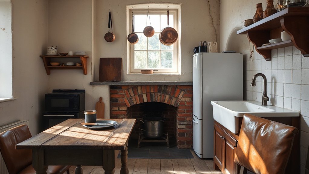
Patina looks its best in rooms and on surfaces that you touch, use, and see up close every day, because genuine wear reads as character rather than neglect. In a hall, your stair handrail, newel post, and door furniture show honest polishing; in a kitchen, timber worktops, pantry doors, and brass taps develop depth, not mess.
Prioritise places with steady, predictable contact: dining tables, chair arms, leather banquettes, and oak floorboards in thoroughfares. In bathrooms, let aged stone, encaustic tiles, and nickel fittings mellow, provided ventilation’s sound.
Bedrooms suit softer patina on painted wardrobes and linen. Patina also grounds modern minimalism and contemporary architecture when you keep it to tactile focal points—fire surrounds, window catches, and built-in joinery—rather than every surface.
How to Mix Patina With Modern Design
To mix patina with modern design, you’ll balance old and new by setting one clear lead—clean-lined joinery or a timeworn piece—then letting the other support it.
You’ll curate contrast with disciplined material pairings, such as oxidised brass against matte black steel, aged oak beside honed stone, and worn leather with crisp linen.
Keep patina as an accent: one statement cabinet, a framed antique mirror, or a single run of reclaimed boards will add authenticity without overpowering the scheme.
Balance Old And New
Although contemporary interiors prize clean lines and crisp finishes, you’ll get far more depth by setting modern pieces against surfaces that show honest wear. Keep the “new” elements disciplined: Contemporary minimalism works best when you limit the palette and let patina carry the story.
Pair sleek countertops with aged floorboards, timeworn brick, or a scuffed farmhouse table, and the room reads intentional rather than themed.
Anchor the scheme with one or two contemporary heroes—an architectural sofa, a slimline pendant, fitted joinery—then offset them with a single inherited or reclaimed piece that earns its place.
Edit hard: if an item doesn’t improve function or proportion, it goes. In UK period homes, you’ll honour original features while keeping day-to-day living crisp and current.
Curate Contrasting Materials
When you mix glossy, factory-fresh finishes with surfaces that have earned their marks, you create contrast that feels designed rather than accidental. You’re aiming for controlled Material contrast: crisp lines against timeworn texture, cool sheen against warm depth. Keep proportions deliberate, so Vintage charm reads as intentional, not cluttered, and let the room’s architecture in a London terrace or Cotswold cottage set the tone.
- Pair a powder-coated steel dining table with a rubbed-oak top; the grain and scuffs steady the clean silhouette.
- Set polished microcement walls beside aged brass ironmongery; the matte plane sharpens the metal’s softened glow.
- Combine a low, modular sofa in performance fabric with a distressed Persian runner; modern comfort meets lived-in pattern.
Edit by tone, not era.
Use Patina As Accent
If you treat patina as an accent rather than a default finish, it sharpens a modern scheme instead of dragging it into nostalgia. Anchor it to one or two hero pieces: a weathered oak sideboard, an aged brass wall light, or a reclaimed door as a headboard.
Keep surrounding surfaces crisp—plaster-white walls, honed concrete, or matte black joinery—so the wear reads intentional, not tired.
Control the palette: pair warm patinated tones with cool greys and clean-lined furniture. Limit textures to avoid visual noise; let Rustic charm sit beside smooth lacquer or glass.
Use lighting to reveal grain, dents, and oxidisation, delivering Timeworn elegance without overwhelming your flat, townhouse, or new-build.
How to Layer Old and New Without Clutter
To layer old and new without clutter, you need a clear hierarchy: let one period lead and the other support. Anchor the room with a single “hero” piece, then edit everything else to a tight, purposeful cast. Modern minimalism helps: you’ll notice patina more when surfaces around it stay calm and spare. Keep circulation clear, and group objects so they read as intentional, not accumulated.
- Place an antique oak dresser on one wall, then hang one large piece of contemporary art above it.
- Pair a worn leather armchair with a slimline British-made side table and a discreet reading lamp.
- Use one tray to corral keys, candles, or finds, leaving the rest of the top bare.
You’re curating, not collecting.
Colors That Flatter Aged Finishes
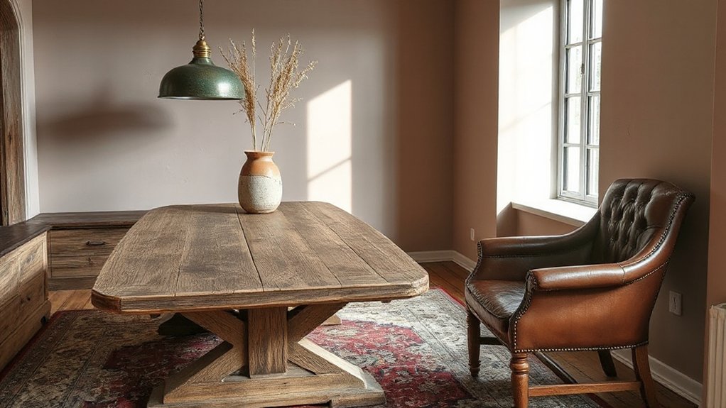
To make aged finishes read as intentional rather than tired, you’ll anchor them with warm neutrals that echo patina—think chalky stone, biscuit, and clay.
You’ll then add deep tones like inky navy, bottle green, or oxblood to sharpen worn oak and rubbed leather without overpowering the room.
You’ll finish with soft metals—aged brass, pewter, and brushed nickel—so the sheen stays muted and the character remains front and centre.
Warm Neutrals And Patina
Because aged finishes already carry their own story, warm neutrals work best when they support that patina rather than competing with it. You’ll get the most believable, lived-in look by choosing tones that echo timber, linen, clay and chalk—quiet colours that let worn oak, rubbed paint and time-softened stone read clearly.
This is how you keep Vintage charm while lifting the room into rustic elegance, especially in British homes with sash windows and changeable light.
- Choose putty, biscuit and oatmeal on walls to steady sun-faded floors and scuffed skirting.
- Add warm off-whites in matt finishes so chips and brush marks feel intentional.
- Layer camel, tobacco and muted terracotta in textiles to deepen patina without darkening the space.
Deep Tones, Soft Metals
Warm neutrals set the stage, but you’ll bring out the real depth in aged timber, rubbed paint and timeworn stone by adding inky, grounded colours and softened metals. Choose Deep hues—ink blue, bottle green, oxblood and soot—on joinery, panelling or a single chimney breast; they sharpen mouldings and make patina read intentional, not tired.
Keep sheens low: chalky matt emulsions, eggshell on woodwork, and a waxed finish where hands will touch.
Then layer Soft metals that look lived-in. In UK period rooms, swap bright chrome for antiqued brass, burnished bronze, pewter, or blackened steel. Use them on switches, cabinet pulls and picture lights so they echo worn edges and mellowed grain without competing.
Lighting That Brings Out Texture and Patina
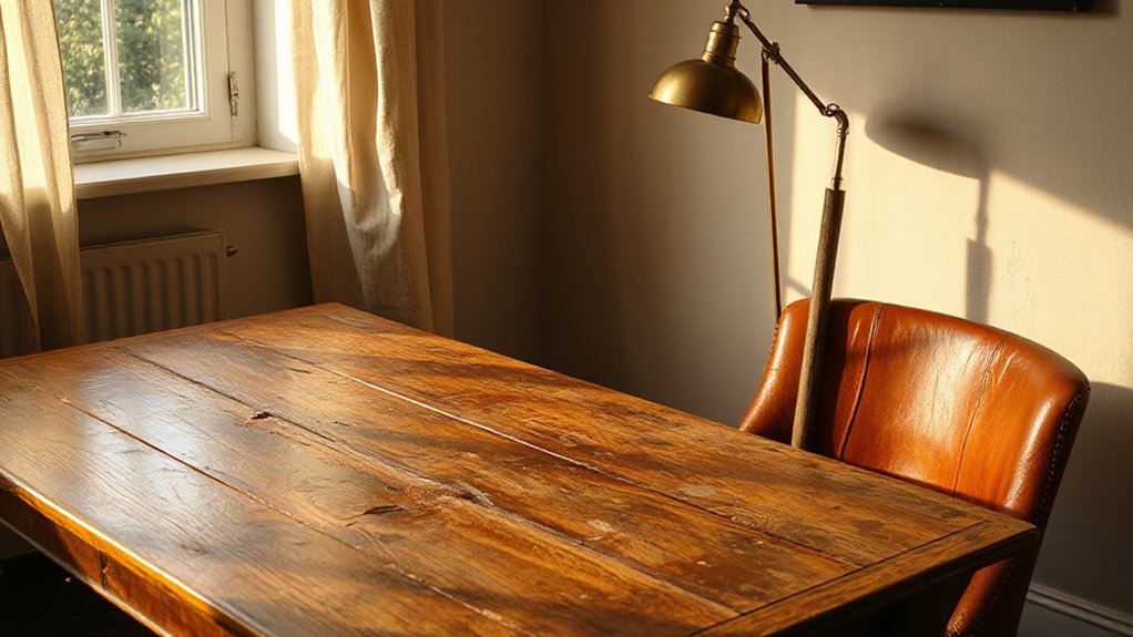
If you want aged timber, worn leather, and old plaster to read as honest rather than tired, you’ll need lighting that rakes across the surface and catches every ridge and scar. Build your lighting ambiance with layered, directional sources, not flat ceiling glare, and choose fixture styles that suit the building’s character.
- Put a narrow-beam wall washer or picture light 150–300mm off the surface to reveal tool marks and hairline cracks.
- Add shaded table lamps at seat height to warm up scuffed armrests and soften shadow fall in the evenings.
- Specify dimmable, high-CRI LEDs (2700K) with deep baffles to cut glare; it keeps patina tactile, not shiny.
Aim for contrast, then dial it back with dimmers.
Aged Wood: The Right Kinds of Wear
Once your lighting shows every ridge and knock, the quality of the timber’s wear becomes impossible to hide. You want honest abrasion: softened edges where hands have passed, burnished drawer fronts, and slight cupping that proves boards have moved with British seasons, not been machined yesterday.
Look for tight, irregular grain and end checks that stop short, not long splits that signal dryness or neglect.
Avoid faux distressing: repeated dents, uniform wire-brushing, and black filler in every pore read as stagecraft, especially beside Contemporary furniture. Instead, choose pieces with repaired joints, visible pegs, and stable, waxed surfaces that won’t shed dust.
In Modern minimalism, a single aged oak table can anchor the room, provided it sits level and feels solid under pressure.
Leather Patina: What to Look For
Although good lighting flatters leather, it also exposes whether the patina comes from use or from a factory finish. You’ll see honest Leather aging in uneven colour shifts, not a uniform tint. Run your hand across high-contact areas; real wear feels supple, with micro-creases that follow how you sit, not a stamped pattern. Check edges and piping for darkened polish and slight rounding, signs of repeated handling. Smell matters too: well-kept hide carries a warm, dry scent, never harshly chemical.
- Look for gentle gradations on arms and seat fronts, where skin oils and daylight work together.
- Notice subtle sheen changes from surface oxidation, especially near windows.
- Inspect scratches: they should soften with conditioning, not reveal a dyed topcoat.
Aged Metals: Brass, Copper, Iron, Chrome
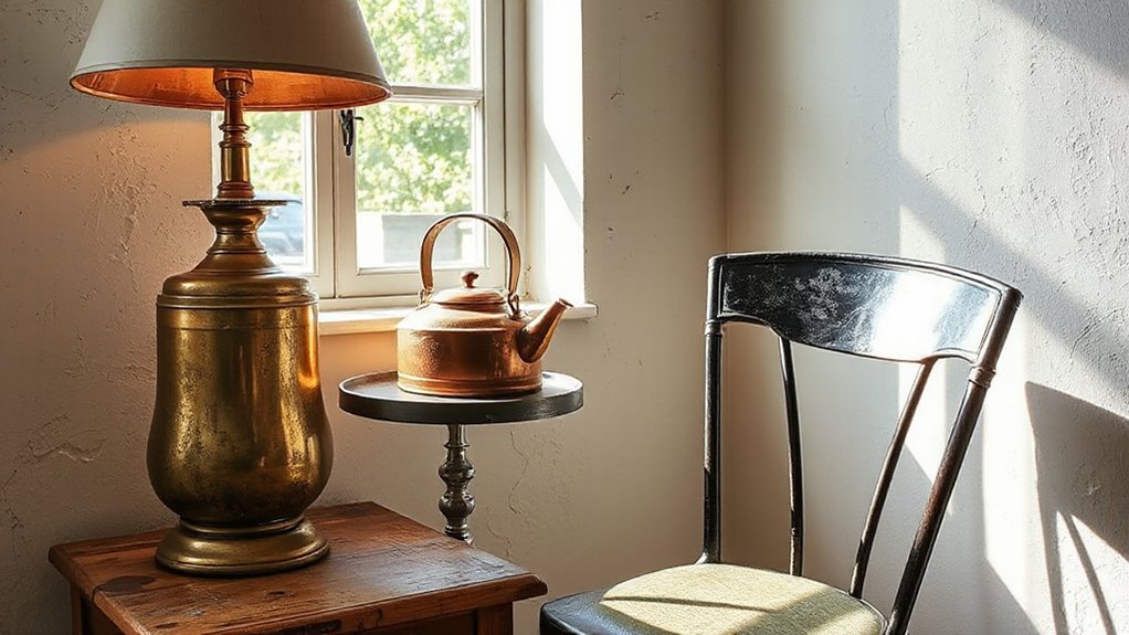
When you choose brass, copper, iron, or chrome, you should prioritise patina-rich finishes—think soft tarnish, rubbed edges, and honest wear rather than uniform factory sheen.
You’ll spot quality in the nuance: warm brass darkening at touch points, copper shifting towards verdigris, iron showing a stable oxide, and chrome losing its mirror in fine micro-scratches.
You can mix these aged tones confidently across taps, handles, lighting, and furniture frames if you repeat one metal as the anchor and keep the rest within the same level of ageing.
Patina-Rich Metal Finishes
Because metal shows every touch and temperature shift, patina-rich finishes give you an authenticity that polished, factory-perfect hardware can’t fake.
In a UK home, aged brass deepens from honey to umber on cupboard pulls, copper mutes into warm penny tones around taps, iron blooms into a soft charcoal at handrails, and chrome dulls to a smoky sheen on vintage fittings.
You don’t need ornament; patina carries the detail, even within Modern minimalism and pared-back Contemporary finishes.
Specify sealed aged metals where splashes are constant, and leave unsealed where hands can write the story.
- Brass: mellowed edges, darker finger-worn centres.
- Copper: heat-marked gradients, softened shine near joints.
- Iron/Chrome: satin wear, subtle pitting, honest dulling.
Mixing Aged Metal Tones
Patina gives each metal its own truth, but the real character comes from letting aged brass, copper, iron, and chrome sit together without looking accidental. You set the hierarchy: choose one dominant tone, then use the others as supporting notes, like hardware to lighting and furniture frames to taps.
In a UK home, pair mellow brass with smoked chrome for bathrooms, and let copper warm a kitchen island pendant while blackened iron anchors stools or shelf brackets. Keep finishes consistent in sheen: if it’s matte and worn, stay there; if it’s lightly polished, repeat that level.
Link disparate metals with repeated forms—knurled handles, slim tubular legs—so the mix reads intentional. Done well, you get Vintage charm and controlled Artistic expression.
Stone, Plaster, and Limewash: Soft Aging
Although it can look stark on day one, stone, plaster, and limewash settle into a softer, truer finish as they breathe with the building and respond to everyday use. In UK homes, you’ll see Patina evolution in the gentle rounding of edges, the easing of trowel marks, and the mellowing of colour under shifting daylight. Choose breathable, mineral-based finishes and you’ll get surface transformation without brittleness or shine.
- Honed limestone in a hallway: heel traffic burnishes paths, while spill marks fade into a calm, matt map.
- Hand-applied lime plaster: hairline crazing stays subtle, catching low winter sun without shouting.
- Limewash on brick or lath: it powders slightly, then hardens, building depth with each careful coat.
Vintage Rugs and Textiles: Fading Done Well
Mineral finishes mellow through touch and light, and vintage rugs and textiles do much the same underfoot and in a sunny bay. You’ll notice how wool piles relax, colours abrade to gentler notes, and patterns blur into a lived-in map of daily routes. That soft fade isn’t failure; it’s Vintage charm with evidence.
Place rugs where circulation is honest, then layer a flatweave to temper wear at thresholds. Rotate seasonally to even exposure from south-facing glazing, and use a good underlay to reduce fibre break.
Keep vacuuming light and consistent, skip harsh beater bars, and blot spills fast with cool water. For textile preservation, support fragile fringes, avoid direct radiator heat, and store folded with acid-free tissue. The result feels British, grounded, and quietly enduring.
How to Shop for Authentic Vintage Pieces
When you shop for authentic vintage, you’ll get better results by treating it like due diligence rather than treasure hunting. You’ll spot quality faster, avoid overpriced “retro,” and build a home with credible history. Start with reputable Vintage markets, specialist dealers, and house-clearance sales where provenance is discussed, not guessed.
- Check construction: dovetails on drawers, solid timber edges, hand-stitching on upholstery, and consistent wear in high-touch areas.
- Verify provenance: ask for invoices, maker’s marks, auction lot notes, or restoration records; photograph labels and compare with catalogues.
- Inspect condition honestly: test joints, sniff for damp, look for woodworm holes, and budget UK delivery, VAT, and any needed conservation.
Authentic sourcing means you buy fewer pieces, but each one carries authority.
How to Add Patina (Without Looking Fake)
If you want genuine-looking patina, you’ve got to earn it through restrained wear and careful finishing, not shortcuts that scream “distressed”. Start with real materials: solid oak, unlacquered brass, tumbled linen, hand-thrown ceramics.
Use pieces as intended—pull handles, set mugs down, let sunlight fade a rug naturally. Where you must intervene, keep it minimal: soften sharp edges with fine wire wool, rub in a wax with pigment matched to the timber, and knock back sheen with a matt topcoat.
Aim for unevenness in high-touch zones only; uniform scuffing reads as faux aging. Layer history through repairs—visible plugs, stitched upholstery, replaced screws—then stop. Good patina preservation means knowing when to leave well alone.
How to Clean, Repair, and Preserve Patina
Patina looks convincing only as long as you don’t scrub it off the moment life happens. Treat it like a finish, not grime: use pH‑neutral soap, soft cloths, and minimal water, then dry immediately to prevent tide marks on oak, brass, and painted joinery common in UK homes.
- Clean lightly: dust weekly, spot-clean spills fast, and avoid abrasives, vinegar, and steam on waxed timber.
- Repair discreetly: consolidate flaking paint with reversible glue, touch in bare wood with tinted wax sticks, and stop rust with a wire brush plus microcrystalline wax.
- Preserve intentionally: seal high-touch areas, felt-pad furniture, and accept small dents as Modern contrast within Minimalist decor.
Frequently Asked Questions
Does Patina Affect a Home’s Resale Value?
Yes, patina can affect your home’s resale value: you’ll often boost appeal in UK period markets if you highlight Vintage charm and Authentic aging; you’ll lose buyers if wear suggests neglect or costly repairs.
Is Patina Compatible With Minimalist or Scandinavian Interiors?
Yes—patina fits minimalist or Scandinavian interiors. You’ll add vintage charm and artistic contrast with restraint: keep one aged oak piece or oxidised brass. In the UK, 62% of buyers favour “character features”, so you won’t alienate.
Can Patina Trigger Allergies, Mold Concerns, or Indoor Air Quality Issues?
Patina itself won’t usually harm indoor air quality, but you can face allergy triggers and mold risks if finishes trap dust or moisture. You should clean, ventilate, fix damp, and use low‑VOC sealers.
What Are Budget-Friendly Ways to Embrace Patina in a Rental?
You can achieve patina on a shoestring: layer removable peel-and-stick film, use thrifted frames, and add brass-effect handles. Budget tips: scour charity shops. DIY tricks: tea-stain linen, wax wood, and swap lampshades.
How Do I Explain Patina’s Appeal to Skeptical Family Members?
Explain that patina adds Vintage charm and Authentic storytelling, showing real use not neglect. You reassure them it’s curated: stable finishes, cleaned properly, paired with crisp textiles. You cite UK antiques’ enduring value.
Conclusion
When you welcome patina, you let your home tell the truth—softly. You’ll spot the difference between honest wear and something that’s simply had a hard time, and you’ll place it where it earns its keep: a hallway console, oak worktop, or timeworn brass in the loo. Mix these seasoned notes with crisp modern lines, choose genuinely faded rugs, shop British dealers carefully, and clean lightly so age stays a quiet asset.