

Want a space that feels larger without adding square footage? Start with light, cool wall neutrals and save color for accents on trim, textiles, and decor to keep cohesion. Use reflective surfaces—glossy cabinetry, mirrors, metal hardware—and position them to bounce light around. Choose slim, multi‑functional furniture with hidden storage, and define areas without walls through rugs and color contrast. Maintain clean edges, minimal patterns, and purposeful decor to preserve airiness; you’ll discover more space tactics as you continue.
Key Takeaways
- Use light, cool wall colors with cohesive accents to create openness and prevent crowding.
- Incorporate reflective surfaces (glossy finishes, mirrors) to boost natural light and perceived space.
- Choose slim-profile furniture and mult Functional pieces to maximize area without bulk.
- Define zones with color, lighting, and rugs rather than walls to preserve flow.
- Minimize clutter with hidden storage and intentional decor to maintain calm, airy surfaces.
How Color Opens Up Small Rooms

Color can make a small room feel larger and brighter. You can harness color psychology to influence mood and perceived space, guiding your choices with intention.
Start with light, cool neutrals on walls to create an airy backdrop that recedes visually. Introduce color through accents—trim, decor, and textiles—to avoid crowding the field of view while maintaining cohesion.
Use color contrast deliberately: pair a pale wall with darker furniture or artwork to anchor the room without shrinking it. Consider the room’s light quality; in shaded spaces, warm undertones can counteract grayness, while sunlit areas benefit from cooler accents that read as expansive.
Plan a restrained palette, then add strategic pops to energize without overwhelming. You’ll achieve perceptual openness while preserving practicality and style.
Use Light-Reflecting Surfaces to Expand Space
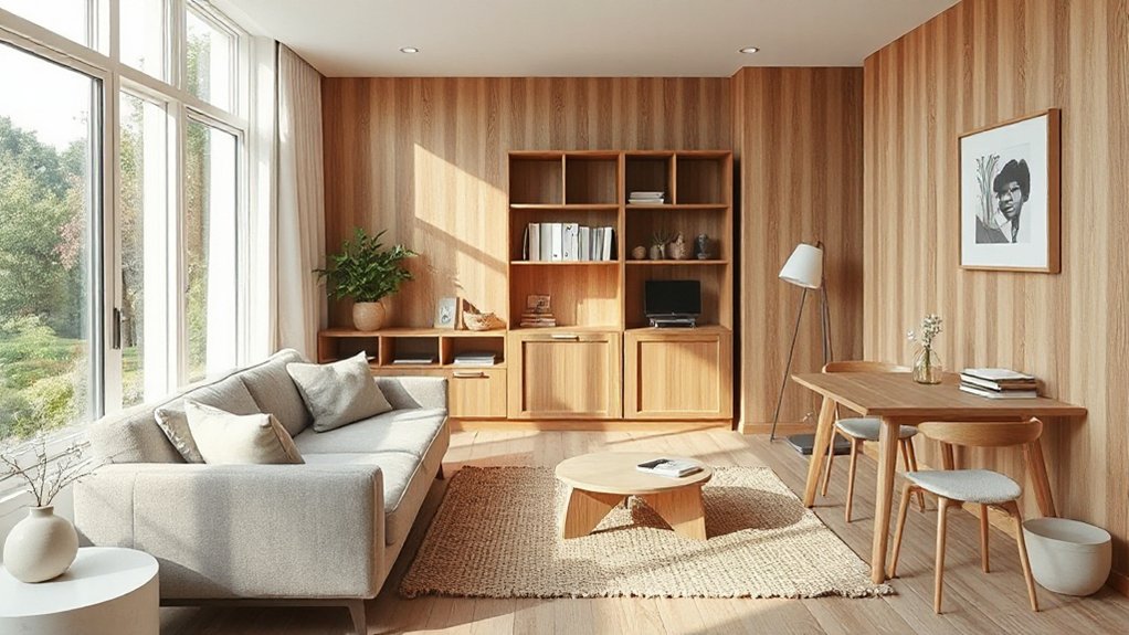
To make a small space feel larger, choose surfaces that reflect light. Start with bright, glossy finishes on cabinetry, countertops, and backsplashes to bounce daylight across the room. Pair these with light‑colored, smooth walls that don’t soak up brightness.
Mirrors are your instant expansion tool; position them to double natural light without creating a cluttered feel. Consider reflective accents like metal hardware, glass lamps, or high‑gloss tiles that amplify light rather than compete with it.
Use light enhancing materials for textiles—sheer curtains, satin rugs, and satin‑finished cushions—to keep surfaces airy. Avoid heavy, matte surfaces that absorb illumination.
The goal is a cohesive, luminous palette with Reflective surfaces guiding depth and openness throughout the space.
Multi-Functional Furniture for Narrow Homes
You’ll maximize every square inch with foldable work surfaces that rise only when you need them. Hidden storage solutions keep clutter out of sight, so you can enjoy a cleaner, calmer room.
Convertible seating options transform a compact area into multiple use spaces without sacrificing comfort or style.
Foldable Work Surfaces
In tight layouts, these surfaces transform corners into focused work zones without sacrificing floor space. Choose options with rounded edges and cable cutouts to keep traffic fluid and clutter minimal.
When finished, stow it flat or tuck it against a wall to preserve airflow and sightlines. For best results, pair foldable work surfaces with a compact workspace layout that minimizes reach and distractions.
Hidden Storage Solutions
Hidden storage isn’t a luxury in narrow homes—it’s a necessity you can embrace with multi-functional pieces that tuck away clutter without stealing square footage. Choose furniture that serves more than one purpose, like ottomans with lift lids or coffee tables with built-in shelves.
Look for hidden compartments in bed frames, ends of consoles, and benches, so everyday items stay out of sight but within reach. Secret drawers tucked under seating or inside armrests maximize every inch without crowding the room.
Opt for slim profiles that still offer depth for storage, and avoid filler pieces that create visual noise. Organize by zone, labeling bins and baskets for quick access, so your space remains calm, usable, and deceptively roomy.
Convertible Seating Options
Convertible seating isn’t just a gimmick—it’s a smart way to maximize a narrow home. You’ll prioritize pieces that pull double duty without crowding sightlines. Look for versatile sofas that switch from lounging to sleeping with ease, and opt for compact, modular units you can rearrange by day.
Choose hidden-storage ottomans or benches to stash magazines, blankets, and tech accessories, keeping surfaces uncluttered. When you need extra guests, a sofa bed or daybed expands seating without compromising floor space.
Select light-toned upholstery and slim arms to preserve openness, then mix in compact chairs or nesters that tuck away. Prioritize durable fabrics and easy-clean finishes for your everyday routine.
With convertible seating, you gain function, flow, and a calmer, more versatile living zone.
Define Spaces Without Walls: Smart Zoning
Smart zoning uses visual cues and functional lines to define distinct areas without building walls. You create clear separation by pairing furniture placement with rug edges, lighting, and color contrasts, so each zone feels intentional rather than random.
In open floorplans, think of a living area anchored by a sofa facing a conversational cluster, while a compact desk nook signals work time without crowding the flow.
Use acoustic zoning tactics—soft textiles, area rugs, and bookcases with open backs—to dampen noise between spaces. Choose low-profile storage to delineate boundaries without visual bulk.
Keep color palettes cohesive yet shifted by a shade or two to cue different uses. Consistency in materials and height cues sustains a harmonious, spacious feel while preserving function.
Silhouette Tricks for an Airier Feel
Silhouette tricks matter when you’re aiming for an airier room. You’ll leverage height and line to minimize bulk, letting shapes breathe across the space. Opt for furniture with slim profiles and exposed legs to create visible air gaps, then pair them with ambient light to elongate shadows.
Shadow Play matters: light sources positioned low cast longer, softer silhouettes that blend into walls rather than overwhelm them. Use contrast strategically: dark accents against pale walls emphasizes space without crowding it.
Keep window treatments simple—sheer fabrics or none—so natural light can silhouette furnishings softly. Mirror placements should reflect open areas, not crowd corners.
Finally, avoid clutter in view lines; a concise arrangement enhances silhouette clarity, delivering a calm, airy vibe you can actually maintain daily.
Hidden Storage That Keeps Surfaces Clear
Hidden storage essentials help you reclaim surface space without sacrificing style. By pairing surface-clearing techniques with smart dual-use furniture, you gain practical, clutter-free zones that look purposeful.
Start with compact, multi-purpose pieces and scalable storage ideas to keep surfaces consistently clear.
Hidden Storage Essentials
When you’re decorating a small space, clear surfaces matter, and hidden storage is the quiet hero that makes them possible. Hidden storage essentials keep everyday items out of sight while staying within reach, so your surfaces stay calm and organized. You’ll rely on smart, adaptable solutions that blend with décor, not compete with it.
Consider hidden compartments and concealed containers for a clean, cohesive look that feels larger. Use multifunctional furniture to store a range of belongings without bulk. Prioritize accessible interior space and durable finishes that resist daily use.
Finally, plan for expansion, so storage grows with you.
- Hidden compartments in ottomans or benches
- Concealed containers under beds or shelves
- Discreet wall niches with pull-out drawers
- Seamless lifts in coffee tables
- Behind-panel storage in entryways
Surface Clearing Techniques
You can keep surfaces calm and usable by choosing storage ideas that stay out of sight yet within easy reach. Surface clearing techniques focus on smart placement, not extra furniture. Think slim baskets, wall-mounted bins, and under‑console drawers that blend with decor.
Prioritize surface organization by assigning a dedicated spot for everyday items and returning them after each use. Use vertical space with hooks and magnetic strips to reduce countertop clutter. Choose containers with uniform lids to simplify stacking and visibility.
Implement hidden storage that feels intentional, not temporary. Maintain clutter minimization by reviewing contents weekly and removing what’s unnecessary. Keep cords tucked and cables managed with discreet clips.
The result is a cleaner surface that supports focus, efficiency, and room feel without sacrificing function.
Dual-Use Furniture Ideas
Smart, dual‑purpose furniture blends function with style, giving you concealed storage that keeps surfaces clear without inviting clutter. You’ll choose pieces that hide essentials while remaining visually calm, so every surface serves as a clean stage for living.
- Ottomans with lift‑top storage that hides remotes, books, and blankets
- Bed frames with built‑in drawers for seasonal wardrobe changes
- Coffee tables with hidden tills or drawers for cords and adapters
- Storage benches at entryways that double as seating
- Wall‑mounted desks that fold away, freeing floor space
These options illustrate dual purpose furniture and multi use storage at work, letting you maximize square footage without sacrificing design. Practical, polished, and purposeful, they keep rooms feeling breathable and organized.
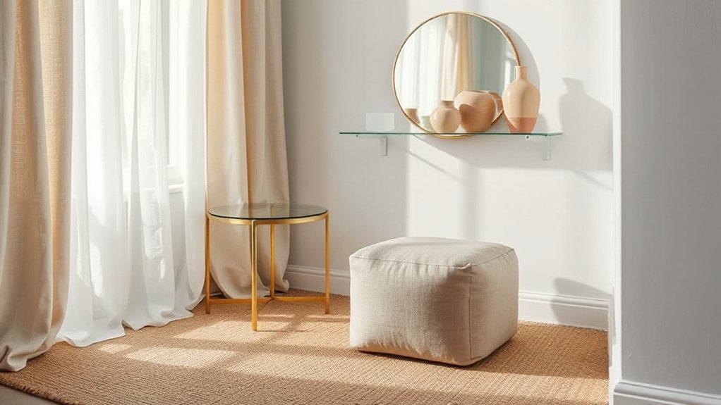
Mirror Placement for Depth and Light
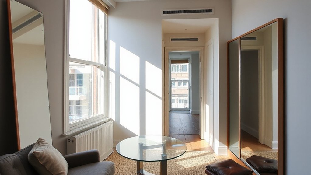
Mirror placement can dramatically expand a room’s perceived depth and bounce light to brighten corners. You’ll want mirrors that reflect open space rather than clutter. Hang a tall mirror opposite a window to maximize daylight without glare, or lean a large one against a wall to create a sense of continuity.
For visual depth, stagger mirrors at varying heights in a hallway or narrow foyer, which draws the eye inward. In tight living areas, mount a slim vertical mirror beside a sofa or dining bench to double visual acreage without crowding the floor.
Use frameless or thin-framed options to minimize weight and keep reflections clean. Regularly clean mirrors to maintain crisp light and accurate reflections.
Minimal Decorating: Just-Right Accents
You can make a statement with subtle, well-placed accents that enhance, not overwhelm, a small space.
Keep ornamentation balanced so each piece earns its place and supports the room’s flow.
Use a restrained color palette to guide focus and rely on intentional, purposeful choices rather than quantity.
Subtle Yet Impactful Accents
Subtle accents can make a room feel intentional without shouting for attention. You choose quiet enhancements that shape mood without overpowering space. Focus on restraint, then let textures and light do the talking.
Textured fabrics add depth and warmth without bulk, while statement lighting draws the eye to key zones rather than clutter. Small, thoughtful gestures—pillows, a throw, a single sculptural piece—create focal points without crowding surfaces.
Keep color palettes cohesive; contrast arrives through texture and glow, not loud prints. Balance is your ally: one standout item per area, grounded by neutrals.
When in doubt, pause and test scale against furniture to preserve airiness and flow.
- Use textured fabrics to add depth without heaviness
- Let one statement lighting piece anchor each zone
- Choose a single sculptural item per shelf or console
- Pair neutral backgrounds with careful, subtle color pops
- Refresh accents seasonally for renewed impact
Balanced Ornamentation Principles
Favor objects with a clear purpose and a refined silhouette, so every piece earns its place. Keep scale in mind: items should feel proportional to the room and to each other, supporting, not competing with, architecture.
Practice ornamental balance by distributing visual weight evenly—pair larger forms with lighter accents and group items in odd numbers for rhythm.
Limit textures to a quiet quartet of finishes to maintain calm, not chaos. This approach yields personality through restraint, letting your space breathe while expressing your taste.
Intentional Color Sparing Use
Intentional color sparing means using color as a deliberate punctuation rather than a constant chorus. In small spaces, restraint guides attention to form, texture, and light, creating calm and perceived openness. You’ll rely on color psychology to evoke mood without overwhelming the room, pairing soothing neutrals with purposeful accents.
Choose paint finishes that feel tactile yet refined—matte for walls to soften glare, satin or eggshell for trim to balance shine and wear. Apply color sparingly in areas that benefit from focus, like a single wall, a built-in, or a niche. The result is cohesive, not fussy, and easier to live with day to day.
Prioritize balance, scale, and reflection over quantity, and let small pops tell the story.
- Use a single, purposeful color as the accent
- Limit busy patterns; favor solid, refined surfaces
- Consider warm vs. cool undertones for harmony
- Select finishes that support function and mood
- Tie accents to natural light and architectural features
Vertical Solutions for Upward Momentum
Vertical solutions make the most of every inch by drawing the eye upward and multiplying storage without widening your footprint. You’ll convert blank walls into organized layers, using shelves, hooks, and magnetic boards that keep essentials within easy reach.
Vertical planting brings life without crowding floors, while ceiling lighting reduces table clutter by pairing ambient glow with focused task light. Think tall bookcases, slim cabinets, and wall-mounted pegs that offer flexible storage zones for keys, chargers, and tools.
Choose modular units you can reconfigure as needs shift, ensuring accents remain cohesive. Use color and texture to emphasize height—light hues on upper surfaces, darker tones below.
Maintain balance by leaving air spaces and aligning stems, cords, and frames to create a streamlined, breathable vertical rhythm.
Rug Strategies to Extend Space Cohesively
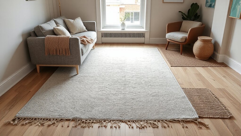
To visually extend a small space, start by choosing rugs that elongate lines and echo the room’s dominant hues. Use cohesive patterns or solid tones that scale with furniture so the rug feels like an extension, not a separate layer.
Aim for proportion and harmony by matching rug size to seating areas and keeping patterns consistent across zones.
Extending Space Visually
Rugs can visually expand a room by guiding the eye beyond walls and toward cohesive lines. You’ll create flow with size, shape, and placement that unify furniture zones without clutter. Use low-profile floors and continuous rug runs to elongate layouts, and tailor color progressions to emphasize vertical and horizontal sightlines.
Urban gardens inspire verdant pauses that feel tucked in yet expansive; mirror that balance with natural textures and restrained palettes. Acoustic treatment, integrated with rugs, dampens echoes while preserving openness, so voices stay clear rather than bouncing around.
Layer rugs thoughtfully to avoid busyness, keeping one dominant field and strategic accents. Keep edges aligned with architectural cues, and let negative space breathe between zones.
- Size proportions that extend boundaries
- Shape harmony across seating areas
- Color continuity for seamless progressions
- Texture contrast without visual clutter
- Acoustic-friendly rug-inclusive layouts
Cohesive Rug Patterns
Repeat that motif in runners, area rugs, and connection mats to create seamless textile coordination. Align pile heights and edge treatments near doorways to minimize abrupt stops, while keeping color relationships consistent with furniture and textiles nearby.
Prefer complementary tones rather than exact matches to avoid monotony, and use subtle texture differences to define zones without shouting separation. When done well, cohesive rug patterns unify your layout, expanding perceived space while maintaining practical, refined style.
Proportion and Scale Harmony
As you extend the idea of cohesive rug patterns into the next layer of design, proportion and scale become your primary tools for visual harmony. You’ll shape rooms by aligning rug size with furniture footprint, ceiling height, and traffic flow, creating an effortless balance.
Focus on proportion balance to avoid crowded edges or oversized gaps, so each zone reads as intentional.
Scale harmony emerges when pattern density, color weight, and textile textures relate to the room’s overall silhouette, not just individual pieces.
- Pair large-area rugs with proportionate seating to ground the space
- Choose mid-scale patterns that echo architectural lines
- Align rug edges with furniture groupings for cohesion
- Use rug color to extend perceived space without overpowering
- Vary texture to preserve depth while maintaining harmony
Window Treatments That Lighten and Lengthen
Lighten and lengthen a small space with window treatments that draw the eye upward and bring in more natural light. You’ll gain immediate height by hanging rods closer to the ceiling and selecting long, unbroken panels. Choose curtain styles that streak your view upward—think vertical lines and simple, clean edges rather than heavy swags.
Drapery fabrics should be light to medium weight, like linen blends or voile, to diffuse sunlight without dulling the room. Opt for pale neutrals or soft pastels to amplify brightness and create a seamless backdrop.
Keep the width generous—fabric beyond framing—so windows appear larger. Minimal hardware, flat-mitted tracks, or concealed rods reduce visual clutter, and repeating color or texture from adjacent textiles ties the space together.
Flow-Enhancing Hallway Layouts
- Opt for continuous lighting along the length of the hall
- Align furniture and decor for clear sightlines
- Use a unifying color or texture
- Position artwork placement strategically at eye level
- Choose a slim console or wall-mount storage to minimize bulk
Texture Without Bulk: Lightweight Surfaces
Texture isn’t about adding weight; it’s about surface behavior. When you choose lightweight surfaces, you preserve airiness while still delivering tactile interest. Think thin marble or glass, wire-backed chairs, and high-contrast textures that read as texture without bulk.
Your goal is textural contrast that reads visually rich from a distance and up close, without crowding the space. Opt for materials that reflect light, like polished metals or translucent laminates, and pair them with fabrics that feel substantial but aren’t heavy to move.
Use lightweight accents—potted greenery, woven placemats, or a single textured throw—to punctuate a simple palette. Keep edges clean, avoid repetitive patterns, and let negative space do the work so the room feels open and intentional.
Hidden Storage Ideas for Clutter-Free Surfaces
Hidden clutter isn’t a fate you have to accept; smart storage can vanish it from view without sacrificing style. You’ll surprise yourself with simple moves that free surfaces while keeping rooms polished. Use vertical solutions to multiply spots for decor and essentials, so surfaces stay clean and calm.
Decorative vignettes stay intentional when you tuck away extras behind doors or inside drawers, not on display. Put function behind form with slim storage benches, wall-mounted shelves, and mirror-backed cabinets that reflect light and feel larger. For personality, pair hidden bins with crafted accents.
Let statement wall art anchor a clutter-free focal point, while nearby containers hide odds and ends.
- Recessed shelving with doors
- Under‑sofa storage trunks
- Floating cabinets beside seating
- Jewelry boxes in a decorative tray
- Hidden cord organizers behind electronics
Open-Feel Small-Kitchen Styling
Even in a small kitchen, you can create an open feel by prioritizing light, air, and smart organization. Begin with a neutral palette and expansive window treatments to maximize daylight.
Choose compact, efficient kitchen appliances that perform well without crowding counters, and tuck under-counter models when possible to keep surfaces clean.
Opt for minimalistic hardware and uninterrupted cabinetry to boost perceived space.
For countertop materials, favor light-colored, scratch-resistant options that reflect light and resist staining. Consider integrated sinks and seamless backsplashes to reduce visual clutter.
Keep tasks grouped in a single station, with a mobile cart that can roll away when not in use.
Finally, install open shelving sparingly to display essentials, avoiding bulk items that weigh the room down.
Bright, Efficient Bathroom Makeovers
- Plan around routines for efficiency
- Wall-mounted storage and fixtures
- Bright, even lighting
- Greenery for freshness
- Vintage touches with modern practicality
Color Blocking and Zonal Color for Spatial Clarity
Color blocks guide how you define zones, so you can assign purpose to each area with confidence. Use clear color blocks to reinforce function, and pair with zonal color techniques to keep traffic flow intuitive.
Together, these spatial clarity methods help you make a compact space feel organized rather than cluttered.
Color Blocks Strategy
If you want to create clear zones in a small space, use color blocks to define each area with purpose. Color blocks guide flow, reinforce function, and reduce visual clutter. This approach relies on thoughtful color psychology to cue activity and mood, while color coordination keeps your palette cohesive and calm.
Use contrasting blocks to signal changes, and softer tones within each zone to prevent fatigue. Keep finishes matte to soften reflections and preserve depth. Pair bold accents with neutral ground to avoid overloading the eye, and test swatches on walls and furniture before committing.
The result is a spatial map you can read at a glance, with intentional boundaries that feel natural, not forced.
- Define zones with purpose using distinct color blocks
- Use color psychology to cue activities
- Maintain color coordination for cohesion
- Balance bolds with neutrals to prevent fatigue
- Test swatches before committing plan
Zonal Color Techniques
Use color psychology to choose accents that reflect mood: energize a compact kitchen with warm citrus, calm a lounge with muted blues, or ground a dining nook with earthy greens.
Implement monochromatic schemes across furniture, walls, and textiles to extend space, swapping intensity rather than hue to differentiate zones. Keep progressions clean—align ceilings, trim, and flooring to unify areas while letting one zone wear a slightly saturated version of the base.
This strategy yields calm, cohesive flow without visual clutter or cramped feels.
Spatial Clarity Methods
When you want spaces to read as distinct rooms within a single footprint, color blocking and zonal color are your strongest tools. These methods create instant delineation without walls, guiding traffic and defining zones with tone, saturation, and contrast.
Color blocking uses bold, intentional blocks to anchor furniture groups, while zonal color applies palettes to specific areas to imply function and flow. Used together, they mimic architecture, elevating urban landscapes by making compact layouts feel purposeful rather than cramped.
Add vintage accents to soften edges and reinforce character without overwhelming space. The result is clarity, cohesion, and a perceived expansion that stays practical.
- Define zones with contrasting blocks that relate to furniture silhouettes
- Apply cohesive color cues to rugs, walls, and built-ins
- Use lighter tones for primary areas, deeper hues for focal zones
- Introduce vintage accents as punctuation, not clutter
- Balance bold blocks with airy surfaces to preserve flow
Quick Wins for Immediate Small-Space Transformation
Start with a plan that fits your daily routine: declutter first, then optimize with multifunctional pieces and smart storage. Quick wins concentrate on immediacy, not overhaul.
Begin by prioritizing furniture placement to open sightlines: float a sofa away from walls, tuck bulky chairs to create flow, and use stacking tables for flexibility.
Emphasize vertical storage—shelves, hooks, bins—to reclaim surface real estate without cramping vibes.
Choose multipurpose pieces: ottomans with hidden compartments, beds with drawers, or a console that doubles as a desk.
Light matters: layer lighting to expand depth and boost mood, focusing on seating areas and task zones.
Finally, introduce mirrors strategically to reflect space and enhance lighting ambiance.
Small tweaks, noticeable impact, and a room that feels larger tonight.
Frequently Asked Questions
How Can I Schedule Changes for Ongoing Small-Space Updates Without Clutter?
Yes—schedule changes with a simple system: map tasks to days, batch updates, and use multifunctional furniture and vertical storage to keep clutter away. Prioritize one project at a time, review progress weekly, and adjust as needed.
Which Colors Clash Best in Ultra-Tight Layouts to Avoid Crowding?
Color harmony helps you avoid crowding; you should avoid bold clashes. Choose analogous or complementary tones, test gently, and balance with neutrals for Clash avoidance, ensuring depth without overwhelming ultra-tight layouts. You’ll keep spaces feeling calm and cohesive.
What’s the Quickest Test to Measure Perceived Room Height Improvement?
You can measure perceived room height by noting how tall objects feel when you stand at eye level and look up; use angle, not distance. This room height illusions trick, ceiling height tricks, quickly proves impact before redesigns.
How Do Textures Influence Space Perception Beyond Color and Light?
Textural contrast enhances space perception by giving your eyes varied surfaces without adding color; you’ll notice depth as light interacts differently. Use tactile layering to pair smooth with rough, matte with glossy, creating dimensional balance you’ll feel.
What Budget-Friendly Hacks Yield the Most Dramatic Room Expansion?
Smart theory suggests smaller spaces feel bigger when you test ideas; you’ll confirm it. Use multi functional furniture and vertical storage solutions, because budget-friendly hacks dramatically expand feel by freeing floor space and improving organization.
Conclusion
You’ll notice how small tweaks align with your daily rhythm—color, light, and smart layouts whisper bigger spaces into existence. Coincidentally, the very things you reach for now—bright surfaces, compact storage, open sightlines—often solve more than you expect, almost as if your room’s limits were always a mirror of your habits. Embrace practical choices, and the space grows with you, quietly proving that thoughtful design and lived-in ease aren’t distant goals but everyday realities.

