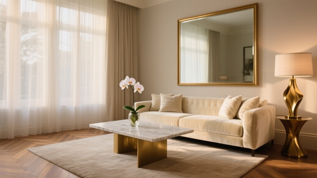

Create a luxury feel by choosing a calm, glam, or quiet-luxury look, then do a 10-minute reset to clear clutter and wipe one key surface. Tighten everything to a three-colour palette and add one dark anchor for depth. Edit displays to fewer, weightier pieces and style in tidy “hotel” triples on a tray. Upgrade the small finishes—pulls, switch plates, taps—and lay a generous wool rug. There’s more to refine next.
Key Takeaways
- Define a cohesive luxury aesthetic and repeat a controlled three-color palette across finishes, furnishings, and accessories.
- Declutter daily and edit decor, keeping fewer, higher-quality statement pieces with generous breathing space on surfaces.
- Layer warm, dimmable lighting (2700K) using overhead, task, and accent sources to create depth and a hotel-like glow.
- Mix rich, intentional textures and finishes—linen, wool, matte ceramics, warm woods, and satin metals—repeating each texture for cohesion.
- Upgrade soft goods and details: feather-filled cushions, tailored curtains hung high and wide, and refined hardware for a bespoke, polished look.
Define Your Luxury Look: Calm, Glam, Quiet
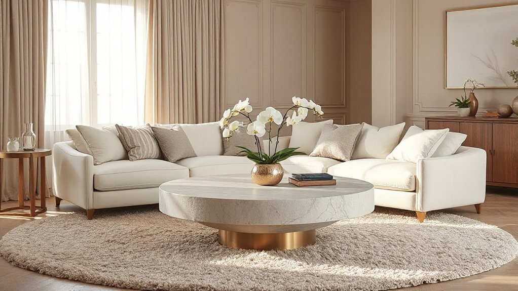
Before you buy a single cushion or tin of paint, decide what “luxury” looks like to you—calm, glam, or quiet—because that choice will steer every finish, colour, and texture.
If you crave calm, lean into warm neutrals, soft matt walls, and natural fibres; keep patterns subtle and lighting layered.
If you want glam, commit to high-contrast tones, polished metals, and a statement pendant; add elegant accessories such as a marble tray or cut-glass vase, but limit duplicates.
If you prefer quiet luxury, choose tonal schemes, refined joinery, and tactile fabrics like wool or linen; let craftsmanship do the talking.
Whichever route you pick, repeat two to three finishes across the room to create cohesion and a consistent luxury ambiance.
Do a 10-Minute Declutter Reset First
Once you’ve pinned down your luxury look, clear the visual noise so those finishes and textures can actually shine. Set a timer for ten minutes and do a quick sweep: mugs back to the kitchen, post into a tray, chargers coiled, throws folded, shoes lined up by the door. Work clockwise, starting at the entry point, so you don’t dither.
Use one “relocate” tote for anything that belongs elsewhere, then empty it straight away to avoid shifting clutter from room to room. Wipe one key surface with a microfibre cloth for an instant uplift.
This simple routine builds organisational habits and reinforces a decluttering mindset: you’re not “tidying later”, you’re resetting the space now, daily. Repeat before guests, or every evening for calm.
Edit Decor: Keep Fewer, Better Pieces
Although it’s tempting to fill every surface, luxury reads best when you edit hard and let each item earn its place. Aim for minimal clutter by clearing side tables, mantelpieces, and shelves until you can see breathing room around what remains.
Keep one strong object per zone: a sculptural vase, a framed print, or a well-made tray that corrals essentials. Swap trinkets for materials that feel weighty—stone, brass, thick glass—and retire anything chipped or fad-driven.
Repeat shapes rather than adding more. If you’re unsure, remove it and live without it for a week.
Finish with statement lighting: a confident table lamp or pendant instantly elevates the room, so you can own fewer accessories without it feeling bare. You’ll feel calmer and more refined.
Choose a Tight 3-Color Palette
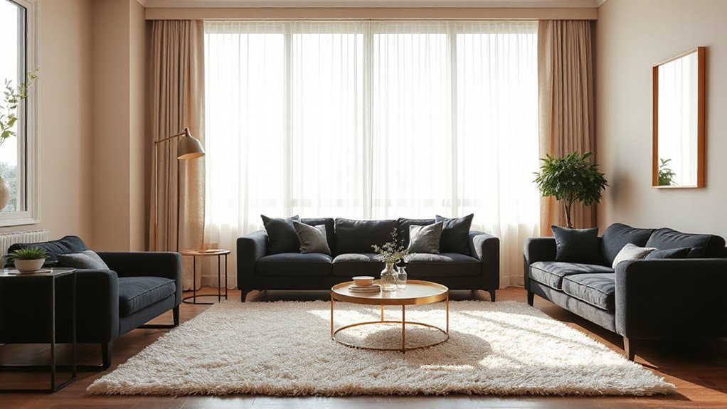
Choose a tight three-colour palette to make your room feel intentional and quietly luxurious. Start with a core neutral, introduce one accent hue for lift, then use a third supporting shade sparingly for balance.
Repeat those colours consistently across paint, soft furnishings, and accessories so everything reads as considered rather than cluttered.
Define A Core Neutral
If you want a space to feel quietly luxurious, start by defining one core neutral and building a tight three-colour palette around it. Pick a shade you can live with daily: warm stone, soft greige, chalky white, or deep taupe. Color psychology matters here; Neutral tones signal calm, order, and confidence when they’re consistent.
Test your chosen neutral across walls, trim, and key upholstery to see how it shifts in morning and evening light.
Then choose two supporting colours in the same temperature and undertone, so everything reads intentional rather than busy. Keep contrast controlled: think matte paint with subtly different depths, not competing shades.
Finally, repeat your core neutral across large surfaces to create a seamless backdrop that makes finishes look more expensive.
Add One Accent Hue
Once you’ve locked in your core neutral and two supporting tones, introduce a single accent hue to give the scheme presence without disturbing its calm.
Pick a shade with depth rather than brightness: bottle green, oxblood, inky navy, saffron, or aubergine. You’re aiming for a note of intention, not a clash.
Choose the Accent hue by testing it against your neutral in daylight and lamplight; luxury rooms look composed in both.
Limit it to one clear family, and keep undertones consistent so it doesn’t read muddied.
Use it where the eye naturally lands—an armchair, a lampshade lining, artwork, or a cushion—so the color accent feels deliberate.
If you can’t name it in one word, it’s too complicated.
Repeat Colors Consistently
Although you’ve only got a few colours in play, luxury comes from repeating them with discipline across the room, so everything looks intentional rather than “matched”. Pick a tight three-colour palette: a base neutral, a supporting tone, and one accent. Then commit.
Color harmony appears when each hue turns up in several places, at varied scales and finishes, creating calm visual repetition without looking staged. Aim for three to five touchpoints per colour, and keep saturation consistent.
- Echo your base neutral in walls, rug, and lampshades
- Repeat the supporting tone in upholstery, curtains, and artwork
- Thread the accent through cushions, a vase, and book spines
- Mix textures: velvet, linen, lacquer, brushed metal
- Edit extras; if it doesn’t fit the palette, rehome it
Add Contrast With One Dark Anchor
To lift a tight three-colour palette, you’ll want one dark anchor that draws the eye and adds instant polish. Choose a deep focal point—such as a charcoal sofa, inky feature wall, or blackened wood sideboard.
Then keep the rest of the scheme lighter to prevent it feeling heavy. This contrast gives the room depth, so your brighter tones read as intentional and luxe rather than flat.
Choose A Dark Focal Point
Ever notice how the most luxurious rooms never feel flat? You can achieve that richness by choosing one dark focal point that anchors everything else. Pick a single statement piece, then let it quietly command attention while the rest of the scheme stays calm.
Use luxury lighting for elegant accentuation, so the dark element looks intentional, not heavy.
- A charcoal feature wall behind the sofa
- An ebonised sideboard in the dining area
- A deep navy headboard that frames the bed
- A blackened steel fireplace surround
- A dark marble coffee table as a centrepiece
Keep the dark tone consistent, and repeat it once or twice in small details, like picture frames or a lampshade trim. You’ll create instant polish without clutter or fuss.
Balance Light With Depth
When you balance airy light tones with one dark anchor, the whole room gains depth without feeling gloomy. Choose a charcoal armchair, ebony sideboard, or inky rug, then keep surrounding walls and upholstery in warm whites, oat, or pale greys. You’ll create a crisp focal point that reads intentional, not heavy.
Let daylight do the work: place the anchor near a window so natural shadows fall across it and add dimension. Repeat the dark note sparingly—picture frames, a lamp base, or hardware—so it feels curated.
Build richness with layered textures: linen curtains, wool throws, ribbed glass, and matte ceramics. Finish with one reflective accent, such as a brass tray or mirror, to lift the contrast and keep the scheme light.
Layer Lighting: Overhead, Task, Accent
A few well-chosen layers of light can make even a modest room feel quietly luxurious. Start with overhead lighting for an even Ambient glow, then add task lights where you actually read, cook, or work, and finish with accents to create purposeful shadow play. You’ll get depth without clutter, and the room will feel considered from every angle.
- Use a central pendant or discreet downlights to anchor the scheme
- Place a reading lamp beside the sofa or bed for focused comfort
- Fit under-cabinet lights in the kitchen to sharpen worktops
- Add picture lights or a slim wall washer to lift art and texture
- Tuck a small lamp on a console to soften corners and improve flow
Switch to Warm Dimmable Bulbs (2700K)
Swap your bulbs for warm 2700K and you’ll instantly soften the room with that hotel-lobby glow. Keep every lighting layer dimmable, so you can shift from bright and practical to low and intimate in seconds.
Fit quality dimmer switches to prevent flicker and buzzing, and you’ll get smooth, consistent control.
Choose 2700K Color Temperature
Although it’s easy to focus on furniture and finishes, lighting temperature often makes the bigger difference to how luxurious a room feels. Choose 2700K bulbs to create flattering, golden light that softens edges and lifts your lighting ambiance without glare. This warmth also improves color harmony, helping woods, textiles, and paint tones read richer and more cohesive.
- Pick 2700K for living rooms and bedrooms to mimic candlelight.
- Use warm-white lampshades to keep the glow consistent.
- Match all bulbs in one room so whites don’t clash.
- Check the CRI (90+ preferred) for true, premium-looking colours.
- Test at night: warm light should make skin tones look healthy, not sallow.
Use Dimmable Lighting Layers
When you layer dimmable lighting, you can shift the room from bright and functional to soft and indulgent in seconds. Start with warm, dimmable 2700K LED bulbs so every fitting keeps a flattering glow as you lower the level, rather than turning cold or patchy.
Build layered illumination with three zones: overhead for general light, table or floor lamps for mid-level warmth, and a focused task light where you read or cook. Keep shades, diffusers, and lamp positions consistent to avoid glare and harsh shadows.
Use wall-washers or picture lights to add gentle sparkle on artwork and textured paint. As evening falls, reduce the top layer first, then let lamps carry the room into a calm, dimmed ambiance.
Install Quality Dimmer Switches
Layered lighting only feels luxurious if it dims smoothly, so install quality dimmer switches and pair them with warm, dimmable 2700K bulbs. Cheap plates often cause flicker, buzzing, or a dead zone at low levels, which instantly cheapens the room. Choose reliable dimming technology matched to your lamp type, and you’ll get a soft, candle-like glow for effortless mood lighting.
- Check compatibility: LED-rated dimmers with your chosen bulbs
- Prefer trailing-edge dimmers for quieter, smoother LED control
- Replace mismatched lamps so each circuit dims evenly
- Set the minimum trim to prevent flicker at low output
- Use brushed metal or matte plates for a tailored finish
If you’re unsure, book a qualified electrician to fit and test everything safely.
Mix Rich Textures: Wood, Metal, Linen, Velvet
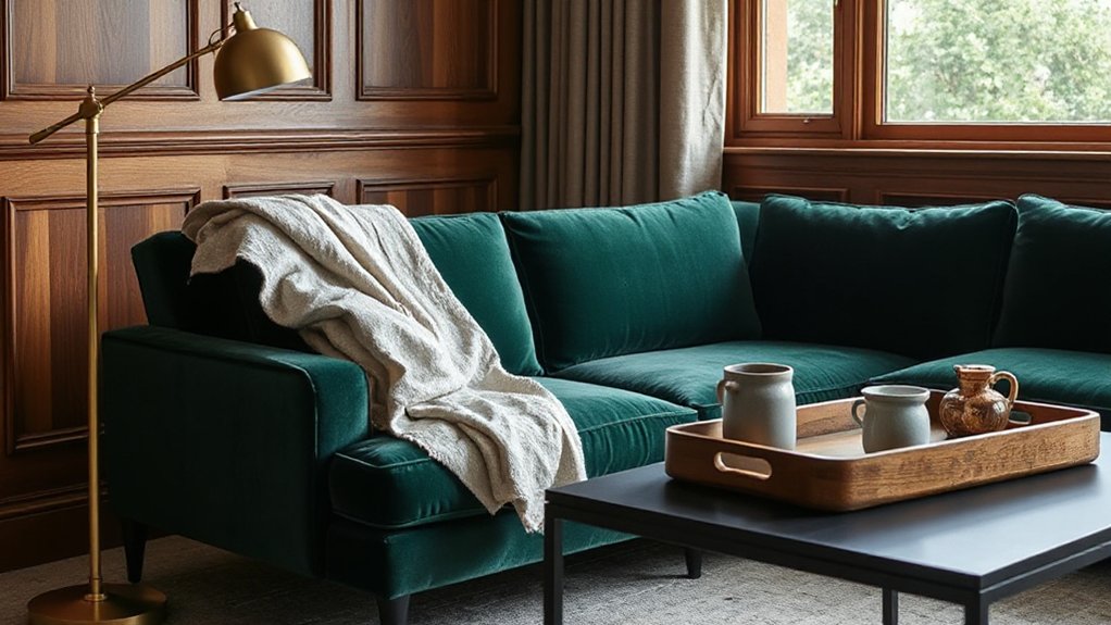
To create a luxury feel without overhauling the whole room, mix rich textures that play off each other—warm wood, cool metal, crisp linen, and plush velvet. Aim for Textural contrasts and smart Material combinations: a walnut sideboard beside a brushed brass lamp, or an oak table grounded by blackened steel legs.
Keep finishes intentional—matte timber, satin metal, and tightly woven linen look considered rather than busy. Use velvet sparingly as an accent on a chair or headboard so it reads opulent, not fussy.
Repeat each texture twice for balance, and vary scale: broad wood grain with fine metal lines. Finally, edit ruthlessly; too many competing surfaces can flatten the effect and ruin the calm, high-end look.
Upgrade Soft Goods: Pillows, Throws, Bedding
Upgrade your soft goods by layering plush cushions and throws, so the room feels instantly more inviting and considered. Choose high-end fabrics—think feather-filled pillows, wool or cashmere throws, and crisp cotton or linen bedding—for a tailored finish.
Keep your colour coordination tight by working within a restrained palette and repeating tones across pillows, throws, and bedlinen.
Layer Plush Textures
Even if your furniture is fairly simple, plush soft furnishings can instantly make the room feel more luxurious. Aim for textural contrast and tactile layering, so the space looks considered, not cluttered. Keep a tight palette, then vary pile and weight to add depth. Arrange pieces with intention: odd numbers, deliberate folds, and one standout cushion to anchor the scheme.
Refresh seasonally by swapping placements rather than buying more.
- Stack two cushions in front, one behind, for height
- Drape a throw over the sofa arm, not the back
- Fold a second throw at the foot of the bed
- Layer a lumbar cushion to sharpen proportions
- Mix sizes: 50cm squares, then smaller accents
Choose High-End Fabrics
A handful of high-end fabrics can shift a room from “nice” to quietly luxurious without changing the furniture. Start with cushions: choose feather inners and covers in linen, wool bouclé, or cotton velvet for rich fabric textures that hold their shape.
Add a throw in cashmere blend or merino, finished with a neat hem rather than tassels that shed.
For bedding, upgrade what you touch: long-staple cotton percale for crispness, sateen for a gentle sheen, or pure linen for breathable drape.
Check the details—tight stitching, hidden zips, and proper weights—so everything looks tailored, not flimsy.
Stick to a small edit and rotate seasonally; fewer, better pieces read as luxury textiles and feel better daily.
Elevate Color Coordination
Once you’ve chosen quality fabrics, you’ll get the luxury look by tightening your colour coordination across soft goods. Treat cushions, throws, and bedding as one palette, not separate purchases. Use Color psychology to set the mood: calm neutrals for rest, deep jewel tones for drama, warm terracotta for welcome.
Lean on hue symbolism to signal intent—navy reads tailored, ivory feels clean, olive looks grounded. Keep contrast deliberate, and repeat key tones at least three times so the scheme looks curated rather than accidental.
- Choose one dominant, one supporting, one accent shade
- Match undertones (cool with cool, warm with warm)
- Mix solids with one refined pattern for depth
- Use piping or edging to echo your accent colour
- Refresh with seasonal covers, not new inserts
Hang Curtains High and Wide
Although it’s tempting to mount curtains directly above the window frame, you’ll get a far more luxurious look by hanging them high and wide. Raise the pole close to the ceiling line and extend it well beyond the sides, so the fabric stacks off the glass and daylight pours in.
For smart curtain placement, aim for full-length drops that just kiss the floor, or barely puddle for a softer finish. Choose generous widths so the curtains look substantial even when drawn back.
This window framing trick makes the opening feel taller and broader, and it also hides awkward reveals and uneven plaster. Keep brackets level, use proper wall plugs, and press the hems—crisp folds read bespoke, not bargain.
Your room instantly feels calmer and more considered.
Go Bigger With Art (and Frame It Right)
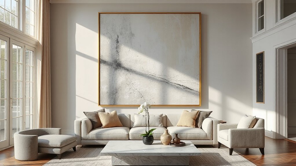
After you’ve lifted the window line with high, wide curtains, set the same confident scale on the walls with oversized art. A large piece anchors the room, makes ceilings feel taller, and looks intentional rather than filled-in.
If you prefer Gallery walls, keep the collection tight and sized to the furniture below so it reads as one statement.
- Choose one hero artwork per zone, then support it with quieter pieces.
- Hang centres at eye level, or align tops for a tailored look.
- Use generous mounts; they add breathing space and a gallery finish.
- Match Frame styles to your architecture: slim black for modern, oak for relaxed, gilt for classic.
- Keep glazing consistent (all non-reflective, or all standard) for polish.
Style Surfaces in “Hotel” Triples (Tray + Book + Object)
When a coffee table or console looks a bit adrift, give it an instant five-star finish by styling it in a simple “hotel” triple: a tray, a book, and one considered object. Choose a tray that suits your scheme—lacquer, rattan, brass, or marble—and use it to corral everyday bits neatly.
Next, add a hardback with a calm cover; stack one or two if you need height. Finish with a single object that feels curated: a bud vase, paperweight, small sculpture, or lidded pot. Keep colours restrained, and vary textures for depth.
Leave breathing space around the grouping so it reads intentional, not cluttered. This sort of surface styling delivers that effortless hotel aesthetic, even in a busy home.
Add One Statement Piece per Room
If your room feels pleasant but a little forgettable, add one statement piece to anchor the whole scheme. Choose one hero item with confident scale and a refined finish, then let everything else support it.
Statement pieces work best when you edit ruthlessly: repeat one colour, one metal tone, or one curve so the room reads intentional, not busy. Use focal accents sparingly around the hero to guide the eye, not compete with it.
- An oversized mirror with a slim frame
- A sculptural pendant light over the table
- A velvet armchair in a deep jewel tone
- A large-scale artwork with generous white space
- A bold rug that defines the seating area
Keep clear sightlines and give it breathing room.
Refresh Hardware: Pulls, Switch Plates, Faucets
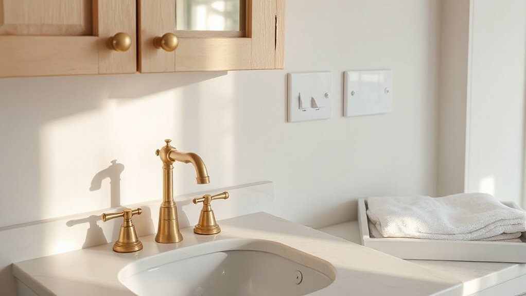
Although they’re small, pulls, switch plates, and taps set the baseline for how expensive a room feels, so swap anything flimsy, mismatched, or overly ornate for well-made pieces in a consistent finish.
Start with Hardware upgrades that you’ll touch daily: cupboard handles, door knobs, and light switches. Choose solid brass, stainless steel, or quality plated metal, and keep the sheen uniform—brushed nickel, aged bronze, or polished chrome, not a mix-and-match.
Replace plastic switch plates with slim metal ones, and align them neatly.
In kitchens and bathrooms, prioritise fixture refinement: fit a weighty mixer tap with smooth action, and match it to towel rails and hooks.
Measure hole centres before buying pulls, and you’ll avoid awkward gaps and rushed drilling.
Make Floors Look Expensive: Rugs and Runners
Even in a well-finished room, tired flooring drags the whole look down, so use rugs and runners to add polish fast. You don’t need new luxury flooring; you need smart coverage, correct sizing, and confident rug textures that read intentional.
- Choose a large rug that sits under front legs of sofas and chairs.
- Layer a flatweave with a plush topper to add depth without bulk.
- Run a narrow runner in halls and kitchens to protect high-traffic routes.
- Pick wool or a wool blend; it wears well and looks richer than synthetics.
- Match tones to your flooring, then add contrast through pattern, not colour chaos.
Finish with a quality underlay so edges lie flat and footsteps feel secure.
Polish the Finish: Symmetry, Scent, and Silence
Once you’ve sorted the big-ticket pieces, the room starts to feel genuinely luxe when you control the finishing cues: symmetry, scent, and silence.
Start with balance: pair lamps, cushions, or framed prints so each side of a sofa or bed feels intentionally matched. Keep lines tidy—straighten throws, centre the coffee table, and align stools beneath a counter.
Next, curate scent for a calm sensory ambiance. Choose one signature note (cedar, bergamot, or clean linen) via a quality candle or reed diffuser, and keep it subtle.
Finally, protect quiet. Add lined curtains, a thick rug, and felt pads under chairs to soften echo and scrape. These finishing touches make everything feel considered, not cluttered.
Frequently Asked Questions
What Are Affordable Ways to Add Luxury Without Renovating?
You can add luxury cheaply by styling with elegant accessories, layering cushions and throws, and using statement lighting. Swap hardware, add a large mirror, upgrade linens, and declutter. Finish with fresh flowers and fragrance.
How Do I Make a Rental Feel High-End Without Permanent Changes?
Like a tailored suit, you’ll elevate a rental with removable upgrades: swap in Elegant lighting, layer plush textiles, add Luxury accessories, style cohesive artwork, and hide clutter with smart storage. Use peel-and-stick fittings.
Which Paint Finishes Look Most Luxurious on Walls and Trim?
Choose Matte finishes for walls; they’ll look velvety and hide flaws. Use Satin textures on trim, skirting boards, and architraves for a refined sheen. Opt for durable, wipeable formulas, and sample under your lighting first.
How Can I Make a Small Room Feel More Upscale and Spacious?
Streamline, simplify, soften: you’ll make a small room feel upscale and spacious. Stick to calm colour palettes, add layered lighting techniques with dimmers and wall lights, hang full-length curtains, and place a large mirror.
What’s the Best Approach to Mixing Vintage Pieces With Modern Luxury?
Start with one standout vintage piece, then frame it with Modern accents in clean lines and luxe finishes. Keep a tight palette, repeat metals, and balance scale. You’ll achieve Vintage contrast without cluttering the room.
Conclusion
Luxury doesn’t come from stuffing a room; it comes from editing it. Start by defining your look, then do a quick declutter reset so every piece can breathe. Stick to a tight three-colour palette, add one dark anchor, and choose a single statement per room. Swap tired hardware, lay a proper rug or runner, and finish with symmetry, a subtle scent, and quiet. Think of your home as a well-tailored suit: precise, calm, and made to last.