

You create sophisticated spaces by committing to a tone-led palette—light, mid, or moody—then anchoring it with one dominant neutral and two supporting hues in the same undertone. Keep proportions steady: 70% base, 20% secondary, 10% accents repeated three times. Layer tactile contrast with soft textiles, nubby weaves, and natural wood or stone, then balance matte planes with selective shine. Finish with ambient, task, and accent lighting plus curated art and objects—there’s more ahead.
Pick a Tone-Led Color Palette (Light to Moody)
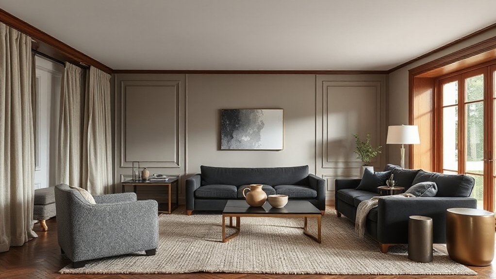
Where do you start when layering so it looks intentional rather than chaotic? You start by choosing a tone-led color palette and committing to its value range—light, mid, or moody-dark. Anchor the room with one dominant neutral, then add two supporting hues that share the same undertone (warm, cool, or balanced). This keeps progression clean even when you introduce contrast.
Use Color psychology to set intent: pale, low-contrast tones read airy and restorative; deeper, desaturated shades feel grounded and intimate. For mood enhancement, control saturation—muted colors calm, clearer accents energize.
Finally, map color by proportion: 70% base, 20% secondary, 10% accent. Repeat accents at least three times to create rhythm, not clutter.
Layer Textures: Soft, Nubby, Smooth, and Natural
Once your palette’s locked, texture becomes the tool that makes it feel lived-in instead of flat. Build Textural contrast by pairing soft textiles with nubby weaves, then grounding everything with smooth, tactile surfaces and honest naturals like wood, stone, and leather.
You’re not decorating; you’re choreographing how the room feels underhand and underfoot, so every layer earns its place.
- Slip a bouclé or chunky knit over a tailored sofa—comfort shows up instantly.
- Add a tight-woven wool rug to quiet the space and make conversations feel closer.
- Bring in raw oak, linen, or travertine for Material harmony that reads calm, deliberate, and timeless.
Keep the mix intentional: two to three hero textures, then supportive neutrals that let them breathe.
Mix Matte and Shine for Balanced Finishes
Texture sets the tactile mood; finish sets the visual rhythm, and that’s where matte and shine earn their keep. Use matte on broad planes—walls, large cabinetry, upholstery—to calm glare and let form read cleanly.
Then introduce shine as controlled punctuation: satin lacquer on a console, polished stone edging, brushed metal hardware, glazed ceramics. This Surface contrast sharpens silhouettes and prevents flat, one-note rooms.
Keep sheen consistent within each material family; mix finishes across categories instead, so oak stays honest while metals vary from burnished to chrome.
Prioritize Material durability: choose washable matte paints for high-traffic zones, and reserve high-gloss for surfaces you can wipe easily.
When you balance reflectivity, your palette feels deeper, richer, and intentionally composed.
Layer Ambient, Task, and Accent Lighting
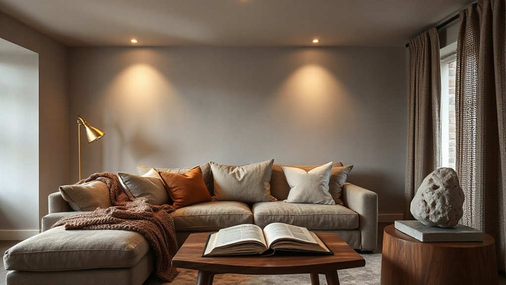
Even if your furnishings and finishes feel dialed in, lighting determines whether the room reads layered or flat. Start with ambient light that fills shadows evenly—recessed, a central fixture, or cove—then refine with precise lighting placement so corners don’t cave in and faces don’t go dull.
Add task light exactly where your hands work: pendants over a prep zone, a focused reading light, under-cabinet strips. Finally, use accent light to carve depth, graze texture, and pull the eye through the space.
- Ambient makes you exhale—everything feels calm and intentional.
- Task makes you confident—nothing strains or squints.
- Accent makes you curious—the room gains drama and direction.
Use smart lighting to dim, tune warmth, and preset scenes without visual clutter.
Style in Layers: Art, Books, and Objects
After you’ve shaped the mood with layered lighting, lock in the room’s personality with layered styling—art, books, and objects that read intentional rather than scattered.
Start with anchor art: one oversized piece or a tight grid, hung at eye level, then support it with secondary works that echo a color or line weight.
Build shelves in thirds: vertical stacks, horizontal runs, and negative space.
Use Artistic juxtaposition to keep it sharp—pair matte ceramics with glossy frames, or a vintage lithograph beside a contemporary photo.
Edit accessories like you’re curating: repeat materials, vary scale, and keep a consistent palette.
Finish with Object storytelling: display one travel find, one heirloom, and one sculptural form per surface.
Rotate seasonally, not constantly.
Frequently Asked Questions
What’s the Best Way to Layer in Small Spaces Without Clutter?
Layer small spaces by limiting pieces, repeating materials, and sticking to strict color coordination. You’ll prevent clutter with deliberate furniture placement: float one anchor, keep clear pathways, and add only two accent layers—textile, lighting, or art.
How Do I Layer Textures When I Have Kids or Pets?
You layer textures by pairing plush with performance: wool-look rugs against wipeable leather. Choose kid proof textures, then add pet friendly layering—washable slipcovers, tight weaves, low-pile rugs, and matte finishes that hide scuffs.
What Budget-Friendly Swaps Create a Layered Look Without Major Renovations?
You’ll get a layered look by swapping in affordable textiles—linen-look curtains, textured throws, mixed pillows—then adding DIY wall art, plug-in sconces, and peel-and-stick wallpaper. Rotate thrifted rugs, upgrade hardware, and reframe prints.
How Can I Layer Effectively in Open-Plan Rooms With Multiple Zones?
Think of your open plan as a composed symphony: define zones with intentional furniture placement, anchor each with a rug, then apply color contrast via pillows, art, and lighting. Keep finishes consistent for cohesion.
Which Materials Are Easiest to Maintain While Still Looking Sophisticated?
You’ll get the easiest upkeep with porcelain tile, engineered quartz, performance velvet, and sealed hardwood—high Material durability, low fuss. Follow Maintenance tips: pH-neutral cleaners, prompt blotting, felt pads, and periodic resealing for lasting polish.
Conclusion
You’ve built your room like a modern-day Athena—wise, intentional, and quietly powerful. When you choose a tone-led palette, stack soft against nubby, and temper matte with shine, the space stops looking “decorated” and starts feeling designed. You’ve guided light the way a cinematographer does: ambient first, then task, then accent. Finish with layered styling—art, books, objects—and you’ll get depth that reads effortless, yet unmistakably sophisticated.

