


In a quiet room, light threads across your desk like a precise map for focus, setting an orderly stage you can rely on. You’ll want a neutral foundation with low-sheen finishes to minimize glare, then carefully calibrate blues for concentration and greens for calm. Warm accents and consistent lighting keep energy steady without distraction, while coordinating accessories complete the palette. If you tune these elements right, your workspace will consistently support clarity—yet there’s more to optimize beyond the basics.
Calming Neutral Foundations for Focus
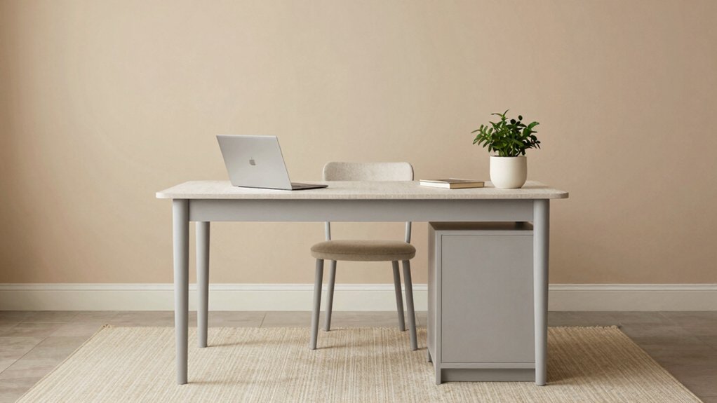
Calming neutrals form the backbone of a focus-friendly home office. You select neutral wall tones—grays, beiges, or greyscale whites—that reduce visual noise and support sustained attention. Use matte finishes to minimize reflections, preventing glare that disrupts concentration.
Integrate controlled accents through furniture, storage, and textiles to avoid chromatic overload while maintaining cohesion. In color therapy terms, calming neutrals set a baseline for mood enhancement by stabilizing arterial responses and reducing cognitive load during work tasks.
You balance contrast with natural or cool undertones to preserve perceived room depth without triggering overstimulation. Lighting should be calibrated for task accuracy, favoring daylight-mimicking sources.
Maintain consistency across surfaces, and apply minimal, purposeful color pops to reinforce focus zones without compromising the neutral foundation.
Blues That Boost Concentration
Blue hues can sharpen focus by influencing perceived energy and task engagement. In this section, you examine how specific blues modulate cognitive load and steady performance. Use cool mid-tones to minimize visual noise while preserving legibility, avoiding saturated accents that provoke distraction.
Implement monochrome illusions by sustaining consistent luminance across surfaces, which reduces panning and search costs during detail work. Employ color blocking techniques to delineate work zones: a primary blue for screens and paperwork, a slightly lighter shade for reference materials, and a darker trim to anchor boundaries.
You should calibrate lighting to prevent glare and guarantee accurate color perception, maintaining contrast for essential data. Regularly review ambient contrast ratios and material finishes, updating hues to maintain ideal concentration over long sessions.
Maintain consistency; adjust purposefully.
Greens That Promote Calm and Clarity
Greens that promote calm and clarity rely on balanced chroma and low-saturation tints to reduce visual fatigue while preserving legibility. In practice, you select greens with hue proximity to mid-range chroma (around 12–22) and luminance around 40–60 for sustained focus.
Avoid high-saturation emeralds or yellow-greens that provoke distraction under artificial lighting. Opt for matte or low-gloss finishes to minimize glare on screens and documents.
You should calibrate wall tones with task lighting, ensuring subtle contrast against whiteboards and shelves. Furniture arrangement supports this effect by creating clear, unobstructed sightlines and defined work zones.
Maintain consistent color temperatures across fixtures to prevent perceptual shifts. This approach stabilizes attention without sacrificing depth, enabling steady processing and reduced cognitive load during long sessions.
Warm Accent Pops for Energy
Building on the calm, low-saturation greens previously recommended, introduce controlled warm accents to inject energy without overwhelming the workspace. You select these accents as deliberate, high-contrast punctuations within your color system, not as indiscriminate flashes. Implement warm pops using a restrained palette—muted terracotta, amber, and soft coral—placed at key focal points to guide attention and sustain productivity.
You calibrate their intensity against your baseline greens, ensuring visual hierarchy remains stable under artificial lighting. Apply consistent color sequencing to prevent cognitive load from increasing, mapping warm touches to task zones and time-of-day shifts. Monitor luminance balance, maintaining chromatic neutrality elsewhere.
This approach preserves serenity while delivering perceptual cues that support focus, decision speed, and sustained engagement without introducing distraction.
Lighting Effects on Color Perception
Lighting color perception hinges on how spectral content and luminance interact with ambient and task lighting. You assess how light spectra shift perceived hues as you switch between LED, fluorescent, and incandescent sources. Relative intensity and color temperature alter chromatic accuracy, so you calibrate monitors and walls to minimize deltas.
You consider ambient shadows that form where light falloff creates uneven color, and you compensate with balanced task lighting to avoid color bias on fabrics and finishes. Reflective surfaces distort color cues through specular highlights and inter-reflections, requiring controlled angles and matte midtones to stabilize perception.
You document target color tolerances, measure with calibrated instruments, and apply scene-referenced white balance for consistent rendering. This approach enhances decision reliability without sacrificing perceptual neutrality.
Natural Materials and Texture Pairings
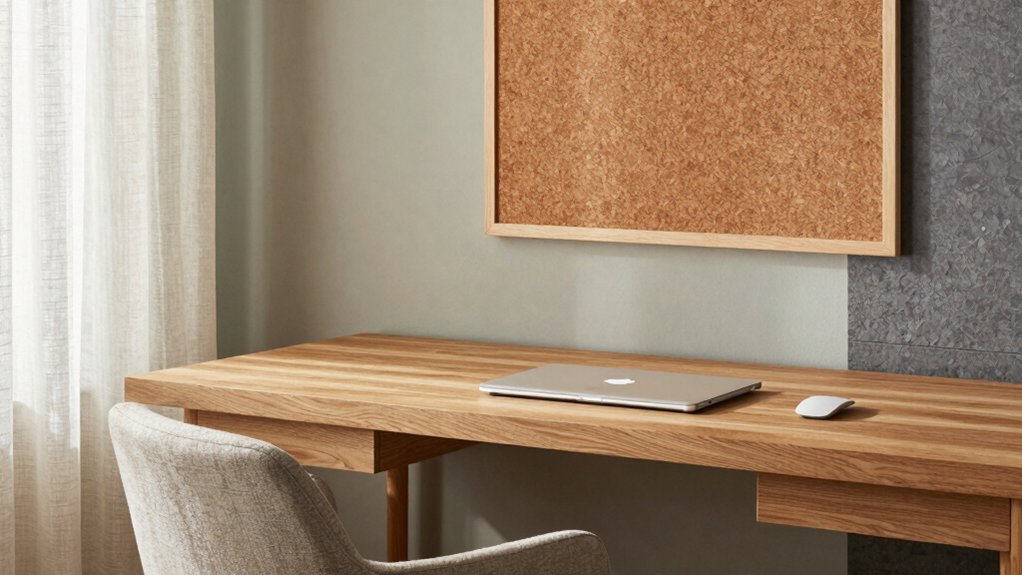
Natural materials define tactile depth and visual warmth, guiding how you pair textures like wood, stone, and textiles to achieve cohesive interiors. You assess material weight, grain, and finish to guarantee harmony with your color palette, prioritizing durability where you work.
Texture reads through contrast: pairing matte surfaces with subtle sheen, and balancing coarse textures with refined ones to avoid visual fatigue. You apply textured accents strategically to emphasize focal areas, such as work surfaces or storage fronts, while preserving legibility of lighting and acoustics.
Natural fabric pairings should align with climate and occupancy, selecting textiles that resist wear and minimize glare. Documented guidelines ensure repeatable results, enabling consistent application across furniture, wall panels, and accessories without compromising performance.
Space-Saving Color Strategies for Small Areas
Small spaces demand color strategies that maximize perceived space while preserving function. You implement this by selecting high-contrast trim, light walls, and midtone work surfaces to create depth without clutter. Use color to delineate zones: a brighter desk backdrop signals focus, while a softer surrounding field reduces perceived boundaries.
Limit saturated accents to small, controlled areas to avoid visual overwhelm. Opt for semi-gloss finishes on cabinetry and walls to reflect ambient light, enhancing brightness without increasing glare. Furniture placement matters: orient the desk for direct line of sight to natural light, and position storage to minimize footprint while preserving accessibility.
Acoustic treatments should remain visually lightweight, such as fabric-wrapped panels or perforated surfaces, to absorb sound without adding bulk.
Color Planning for Lighting Conditions
You’ll balance natural light with your color choices to maintain accurate perception of work materials and reduced glare.
Fine-tune artificial lighting to complement daylight, ensuring white balances and contrast stay consistent throughout the day.
Consider color temperature and luminance levels that support focus, readability, and comfort in varying lighting conditions.
Natural Light Balance
Achieving a balanced natural light palette requires evaluating how daylight shifts across hours and seasons, then selecting paints and finishes that preserve true color under those changes. You’ll calibrate color temperature and reflectance to maintain perceptual stability from morning through afternoon, accounting for window orientation and glazing.
Choose mid-range luminance values that minimize glare while enhancing contrast for text and screens. In practice, test swatches under real daylight at different times, documenting color shifts and selecting formulas with low chromatic drift.
Prioritize color therapy concepts by fostering calm, focus, and subtle energy without oversaturation. Consider paint durability alongside stability, selecting finishes that resist yellowing, fading, and environmental fading from humidity.
Maintain consistency across adjacent surfaces to avoid visual discontinuities that disrupt productivity.
Artificial Light Tuning
Artificial Light Tuning frames color decisions around how synthetic illumination interacts with room surfaces and tasks. You assess how LED lighting reveals surface textures, reduces glare, and supports visual hierarchy across work zones.
You choose color temperature to align with task type: cooler temps for focus, warmer hues for brainstorming or reading areas, balancing ambient and accent layers to prevent perceptual fatigue.
You calibrate luminance levels to maintain consistent white point under varying daylight influence, ensuring chromatic stability on screens and print materials.
You treat fixtures as color-influencing tools, selecting high-CRI sources to preserve true hues.
You document thresholds for temperature shifts, document maintenance schedules, and reassess quarterly to preserve accuracy, efficiency, and ergonomic comfort in long-duration work.
Palette Examples for Different Work Styles
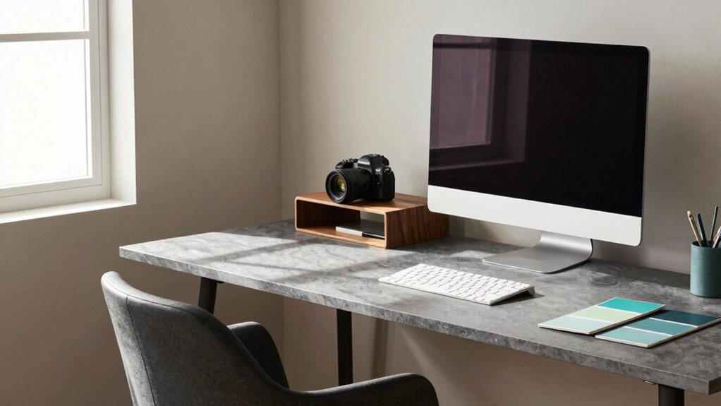
You’ll explore bold palette pairings for high-focus workflows and calming tones for long, contemplative tasks, tailoring contrasts to your work style.
These examples prioritize legibility, hierarchy, and emotional neutrality to support sustained attention. Use precise color relationships to define zones, accents, and accessories that align with your daily routines.
Bold Palette Pairings
Bold palette pairings deliver immediate visual impact by aligning high-contrast hues with functional lighting needs. You select dominant tones that meet task demands, then balance them with supporting accents to prevent glare and fatigue.
In practice, pair charcoal or navy walls with bold pops of amber, teal, or crimson, ensuring contrast ratios favor legibility for on-screen work and print tasks. Consider artificial lighting placement to maximize texture perception and color fidelity; direct lamps should reinforce focal areas without creating hotspots.
When evaluating wall textures, choose matte surfaces to reduce specular reflections while allowing subtle color depth to read under varied light. Document color coordinates and diffusion characteristics, verifying consistency across screens and printers.
This disciplined approach yields decisive, scalable results for diverse work styles.
Calming Tone Combinations
Calming Tone Combinations offer a restrained, supportive backdrop for varied work styles, balancing visual comfort with sustained focus. You select palettes with low to moderate color saturation, prioritizing perceptual stability over novelty.
In practice, you align hue families to minimize chromatic conflicts, reducing cognitive load during long tasks. You evaluate artificial lighting, ensuring consistent luminance and avoiding glare that raises distraction. Pair warm neutrals with cool accents only as needed to guide attention without overwhelming memory.
Consider wall, furniture, and accessory tones in a cohesive continuum, using incremental contrast to delineate zones without visual fatigue. Monitor ambient brightness and adjust with dimmable fixtures to sustain a noninvasive aesthetic. This approach preserves concentration while enabling quick cognitive resets when transitions occur.
Budget-Friendly Refresh Ideas
A budget-friendly refresh for a home office can yield noticeable impact without a major investment. To maximize effect, focus on strategic accents and durable finishes rather than full redecorations.
Begin with color saturation by selecting one walls’ midpoint shade and pairing it with two neutral tones for balance. This ensures visual depth without overwhelming the space. Prioritize paint durability by choosing low-odor, washable finishes that resist smudges from daily use.
Reallocate funds to quality hardware, such as ergonomic desk lamps and durable shelving, which improve perceived professionalism and longevity. Implement simple swaps: replace switch plates, add magnetic or cork boards, and install cable-management tracks to reduce clutter.
Document hue coordinates, test light interaction, and commit to a concise palette. This method delivers measurable productivity benefits with controlled expenditure.
How to Test Color Choices in Your Space
Testing color choices in your space requires a systematic approach that confirms how hues perform under real-world conditions. You start with color testing in the room itself, not on a swatch alone. Place paint samples on large, representative wall areas, avoiding small patches that misrepresent perception.
Observe under both daylight and artificial lighting across morning, noon, and evening. Note surface interactions, such as glare, contrast with furniture, and how saturation shifts with reflections.
Track a controlled sequence: test, record, compare, then rotate samples if needed. Use neutral angles and consistent viewing distances to reduce bias.
Document color names, manufacturer codes, and batch numbers for reproducibility. Only after thorough evaluation should you finalize selections and confirm the palette with final paint samples.
Finishes and Sheen for Productivity
Ultra-matte finishes minimize glare and stabilize perceived space, promoting focus.
Higher sheens reflect more light and can elevate energy in brief tasks.
Consider color psychology alongside finish choice to align mood with work type, from calm focus to quick decision-making.
Balance light reflection with room size and natural light to optimize visibility and reduce eye strain across both wall and furniture surfaces.
Ultra-Matte Vs Sheen
When selecting wall finishes for productivity, ultra-matte and sheen options offer distinct light diffusion and glare characteristics that impact concentration.
Ultra-matte surfaces minimize specular reflections, reducing eye strain and allowing longer focus on text and screens. They generally exhibit higher color depth with softer contrasts, which can support sustained tasks without abrupt visual shifts.
Sheen finishes reflect more ambient light, enhancing perceived brightness in small or dim spaces, but may introduce hotspots and distractions if glare isn’t controlled.
Surface durability varies: ultra-matte tends to be more prone to showing smudges and fingerprints, while higher-sheen coatings resist marking better but reveal imperfections.
For productivity, balance color saturation and durability to maintain legibility, reducing refresh rate on monitors while preserving a calm, consistent work environment.
Color Psychology Impact
Color psychology shows that finishes and sheen modulate perceived focus and task efficiency by altering color tone, luminance, and contrast without changing actual material properties. You choose finish levels to tune perceptual cues that guide attention, reducing visual fatigue and stabilizing work tempo.
Matte surfaces minimize glare, promote steady concentration, and support sustained typing or reading tasks. Low-sheen sheens can preserve color depth without amplifying reflections. Semi-gloss finishes may enhance contrast for fine-detail work without overwhelming the eye when used sparingly.
Color symbolism and emotional associations influence mood responses; blues can impart calm, greens sustain balance, and neutrals support neutrality in complex workflows. Align finish strategy with psychological cues to reinforce purposeful, error-minimizing behavior.
Light Reflection Balance
Light reflection balance is critical for productivity because the right level of sheen reduces glare without sacrificing detail, enabling steady focus across tasks.
You should select finishes with moderate gloss, around semi-gloss to satin, to minimize hotspots on screens and paper. Flat paints hide texture but can amplify diffuse reflection, while high-gloss surfaces cause harsh highlights; balance achieves consistent luminance.
Consider room geometry and wall orientation when charting finish distribution. Natural light varies by time of day and season, so you’ll want duller sheen on walls facing direct sun and slightly higher reflectance where light is scarce.
Artificial lighting must be integrated with surface reflectivity to avoid color shift and glare. Test combos under typical work tasks to confirm stable, accurate rendering across materials.
Coordinating Accessories With Your Palette
Accessories should reinforce your palette with deliberate restraint rather than compete with it; choose pieces that echo the dominant hues or introduce a subtle complementary contrast. In this context, accessory coordination relies on deliberate placement, material consistency, and tonal alignment to support focus without distraction.
Prioritize items that share underlying chroma values—neutral bases, muted accents, or the same saturation level—as this strengthens palette matching across surfaces and textiles. Avoid contrasting beyond the established scheme, and limit metallics to a single finish to prevent visual overload.
Evaluate scale and function: desk objects, storage bins, and tech accessories should reflect the same hue family, with surfaces kept coherent and low-reflectivity where possible. Consistent alignment enables perceptual harmony, reducing cognitive load during tasks.
Seasonal Color Adjustments for Mood
Seasonal color adjustments optimize mood by aligning the environment’s hues with natural biological cues, such as daylight quality and circadian rhythms. You adjust temperature and intensity to reflect seasonality, using cooler, desaturated tones in winter and warmer, saturated accents in summer.
This practice leverages color psychology to modulate alertness, focus, and perceived comfort, ensuring continuity of productivity across varying daylight conditions. You should study light exposure patterns: longer daytime in spring and summer supports higher activity levels, while shorter days in autumn and winter warrant subtle warmth to sustain motivation.
Implement targeted palette shifts rather than broad overhauls, isolating key surfaces for seasonal accents. By tracking subjective responses, you refine complementary contrasts that preserve visual harmony, maintaining consistent cognitive performance through predictable seasonal mood dynamics.
Practical Steps to Implement Your Scheme
Begin by selecting the right palette that aligns with your work needs and lighting. Then, balance wall color with key decor to support focus and function.
Next, outline practical implementation steps: secure the chosen palette, test with swatches in representative lighting, and phase the rollout to avoid disruption.
This discussion covers Choosing the Right Palette, Wall and Decor Balance, and Practical Implementation Steps to guarantee a coherent, actionable plan.
Choosing the Right Palette
What palette will actually work for your space? Begin with objective measurements of light exposure, room size, and furniture tones. Establish a baseline you can justify: choose two dominant hues and one accent for contrast.
Use a controlled decision process: test chips under different lighting, observe for a full week, and document perceived warmth or coolness. Prioritize color relationships via a triadic or analogous scheme aligned to your brand or task zones.
Guarantee accessibility by providing sufficient contrast for reading and screens. Plan paint application steps with a clear sequence—priming, seaming, and finish types that minimize glare.
Consider color durability across seasons, and account for maintenance cycles to sustain the palette’s accuracy and cohesion.
Wall and Decor Balance
With your palette defined, balance wall surfaces and decor by aligning proportion, texture, and luminance to support legibility and rhythm. Begin by assigning dominant wall colors to large planes, medium tones to secondary areas, and accents to focal objects, ensuring visual weight preserves desk-centered focus.
Use texture contrast—matte walls with satin furnishings—to generate depth without increasing glare. Control luminance across surfaces to minimize eye strain; maintain a consistent contrast ratio between work zones and peripherals.
Integrate color psychology insights to reinforce purpose: cooler hues for focus areas, warmer tones for breaks, with subtle progressions to prevent cognitive dissonance.
Consider lighting effects—position task lamps to reduce shadow footprint and harmonize with wall reflectance. Verify that decor scale and placement support uninterrupted workflow and minimal distraction.
Practical Implementation Steps
To implement your color scheme effectively, translate the palette into concrete room-level actions and measurable targets. Begin with spatial zoning: dedicate color-coded zones for focus, collaboration, and rest, then assign quantifiable metrics such as illumination levels, wall surface coverage, and furniture turnover rates.
Select office furniture with materials and finishes that reflect your scheme, ensuring glare control, ergonomic standards, and durability. Establish storage solutions that align with color cues, labeling systems, and accessibility, reducing search time and clutter by a defined percentage.
Implement a phased timeline: pilot one workspace, review performance, and scale to others. Document changes, enforce maintenance checks, and recalibrate lighting, color saturation, and contrast quarterly.
Verify outcomes against productivity, mood, and flow benchmarks to confirm alignment with objectives.
Frequently Asked Questions
How Long Does It Take to Notice Color Effects on Productivity?
Color effects on productivity become noticeable within days to weeks, depending on exposure and tasks. You’ll observe changes through color psychology and visual perception as you adjust lighting and decor, enabling measurable shifts in focus, efficiency, and mood consistently.
Can Color Choices Impact Sleep Quality in a Home Office?
Color choices can impact sleep quality in a home office, and color psychology stresses cool tones to calm arousal; optimize your sleep environment by avoiding bright, high-contrast hues that disrupt circadian rhythms during late hours.
Do Window Treatments Affect Color Performance and Perception?
Yes, window treatments affect color performance and perception. You’ll notice shifts in intensity, contrast, and warmth. Consider window treatment variety and color coordination strategies to optimize accuracy, glare control, and ambient mood for precise, reliable workspace visuals.
Which Colors Work Best for Different Types of Work Tasks?
You’ll optimize tasks by color psychology: blues boost focus for analytical work, greens ease creativity, and neutrals reduce distraction. Match tasks to color coordination, adjust lighting, and cycle hues to maintain consistency and minimize cognitive load.
Are There Color Myths That Hinder Productivity Improvements?
Color psychology debunks myths that hinder progress, so you should challenge common beliefs and test outcomes. Design misconceptions fade as you measure impact, iterating with data to guarantee your workspace truly supports focused, efficient work.
Conclusion
You’ve got a reliable framework to optimize your home office: calm neutrals as a quiet backbone, blue for focus, green for eye comfort, and warm accents to spark alertness, all under steady lighting and low-sheen finishes. Implement gradually, test under typical work sessions, and adjust. For example, a remote worker shifted from stark white to a muted grey with a blue desk chair, reporting 15% fewer distractions and smoother extended-work hours within two weeks. Iterate, measure, improve.


