
Statement features instantly elevate your interior aesthetic by anchoring the design with a bold, built‑in element and guiding rhythm through proportion, placement, and texture. Pair this anchor with luxe lighting, layered materials, and restrained color to emphasize refinement without shouting. Use large-scale pieces to establish dominance, then echo them with complementary elements for harmony. Introduce reflective surfaces and subtle metallics to lift ambiance, while focusing on cohesion across ceiling, floor, and art. Want to explore more insights?
Key Takeaways
- Use a bold built-in anchor piece (arch, wallpaper, sculpture) to ground the space and set scale, tone, and rhythm.
- Layer ambient, task, and accent lighting to create balanced glow and refined depth without shouting.
- Pair textures and materials (matte, glossy, metal, vintage textiles) to add tactile interest while maintaining cohesion.
- Establish a dominant color with sparing accents, using proportions and contrast to guide the eye and create perceptual balance.
- Curate purposeful art and subtle metallic/reflective surfaces to elevate elevation, harmony, and visual narrative.
What Makes a Statement Feature Transform a Room
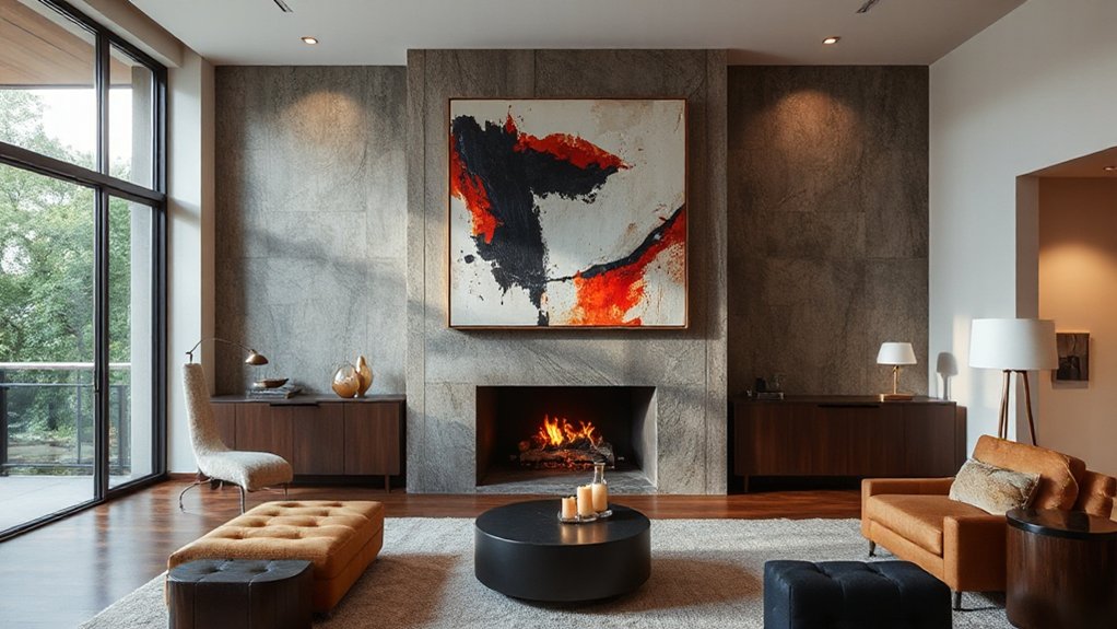
A statement feature instantly transforms a room by serving as a focal point that anchors the design. You leverage it to establish character, balance, and rhythm, guiding how other elements relate.
The feature’s impact hinges on proportion, materiality, and finish, ensuring it commands without overwhelming. Think bold sculpture, architectural detail, or a striking backdrop that defines the space’s axis.
You pair it with subtle, deliberate surroundings to let it breathe. Focal points set visual tempo, directing movement and perception as you enter the room.
Color accents reinforce this hierarchy, echoing the feature’s tone in accessories, textiles, and lighting for cohesion.
You choose materials that tolerate attention—polished metal, rich wood, or glossy surface—then calibrate scale to maintain harmony and sophistication.
How to Identify Lighting That Feels Luxe, Not Loud
You can spot luxe lighting by its quiet presence: it lights evenly, with a soft glow that doesn’t shout.
Look for fixtures with refined materials, clean lines, and balanced brightness that enhances the space without dominating it.
Prioritize subtle upgrades—warm undertones, controlled glare, and thoughtful scale—to achieve a Luxe, not loud, effect.
Luxe Lighting Qualities
There are three hallmarks of luxe lighting: a warm, even glow; thoughtful layering that blends task, ambient, and accent roles; and fixtures that feel precise yet understated. You identify luxe lighting not by glare, but by balance.
Choose sources that render skin tones naturally and textures richly, avoiding harsh shadows or blown highlights. Layer light with purpose: a dimmable ceiling fixture, directional wall lamps, and a subtle under-cabinet glow that supports, not competes with, artwork.
Vintage fixtures can anchor a scene with personality, while remaining restrained through clean lines and muted finishes. Go for materials that age gracefully, like brass or bronze, and pair them with statement artwork to guide focus.
The effect is refined, cohesive, and unmistakably elegant without shouting.
Quiet-Statement Illumination
Seek an ambient glow that wraps spaces softly, avoiding harsh glare or hotspots. Look for fixtures whose glow feels intimate, not overpowering, guiding attention with restraint.
Fixture focus matters: choose luminaires that emphasize texture, material, and shade over loud silhouettes.
Aim for balanced distribution, layering light—ambient, task, and accent—so each tone supports the room’s mood.
Color temperature should remain cohesive with your palette, leaning toward warm whites that read luxe yet inviting.
Test dimming behavior to guarantee smooth progressions.
When in doubt, favor minimalism and proportional scale; true opulence resides in restraint, not excess.
Texture Mixing: Pair Materials for Depth and Warmth
Texture mixing starts with deliberate pairings: combine layered materials for tactile interest, like a smooth stone with a soft textile, to establish depth.
You’ll gain warmth by balancing rugged and refined surfaces, such as timber with matte metal or woven fiber against crisp glaze.
Aim for contrasts that read as intentional design, guiding the eye through varying textures without clutter.
Layered Material Pairings
Begin with a base of neutral fabrics, then introduce a tactile counterpoint: rugged wood against sleek ceramic, or soft linen beside glazed surfaces. Aim for balance rather rather than uniformity—vary scale, sheen, and weight to avoid monotony.
Vintage textiles bring patina and character, while Contemporary ceramics offer crisp form and modern restraint; use them deliberately to anchor color stories without overpowering the room.
Keep gaps intentional, allowing light to travel and air to breathe between elements.
Finally, maintain cohesion through repeated motifs, ensuring the palette remains unified despite textural variety.
Warmth Through Texture
Rich, tactile pairings instantly warm a room by inviting touch and shaping light with depth. You’ll orchestrate Textural contrast and Material layering to create a welcoming, layered atmosphere that reads as thoughtfully curated.
- Prioritize contrast between matte and sheen to amplify warmth without shouting.
- Layer fabrics and surfaces at varying thicknesses, inviting both movement and coziness.
- Combine organic textures with refined ones to balance rugged charm and polish.
This approach grounds your space, giving it depth and a lived-in richness. You’ll notice how subtle differences in texture catch light differently, guiding the eye and enhancing comfort. The goal is clear: craft warmth through tactility, not ornament. Maintain restraint, let material choices speak, and keep the palette cohesive to sustain refined, lasting impact.
Depth Via Contrasting Surfaces
Back to warmth, you’ll pair contrasting surfaces to add depth without clutter. You create tension by mixing materials with intention: a matte plaster wall against a lacquered wood, a soft textiles layer over a smooth stone surface, or metal accents paired with warm fabric textures.
Let vintage textiles echo through cushions, rugs, or throws to introduce tactile rhythm without overpowering the space. Architectural moldings act as architectural punctuation, framing areas and drawing the eye to texture variations.
Balance is key: keep a restrained palette and repeat one or two surfaces to maintain cohesion while depth unfolds. Prioritize scale and finish, not quantity; then the room reads as refined, layered, and grounded, with subtle warmth that invites lingering.
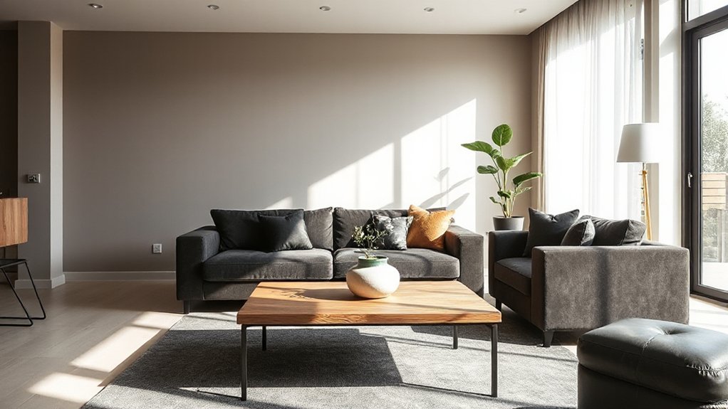
Choose a Built-In Anchor: One Piece That Defines the Space
What single piece anchors a room more effectively than a statement piece that defines the space? You choose a built-in anchor, a single element that grounds every other decision. It sets scale, tone, and rhythm, guiding furniture, color, and texture with quiet authority.
Embrace a feature that can be appreciated from every angle and remains timeless as trends pass. Let architectural arches or statement wallpaper do the heavy lifting, then let everything else align around that core.
- Establishes a recognizable focal point that commands attention without shouting
- Shapes proportion and flow, ensuring seamless progression between zones
- Serves as a reference for color, texture, and accessory choices, preserving harmony
Color Levers: Small Swatches, Big Room Impact
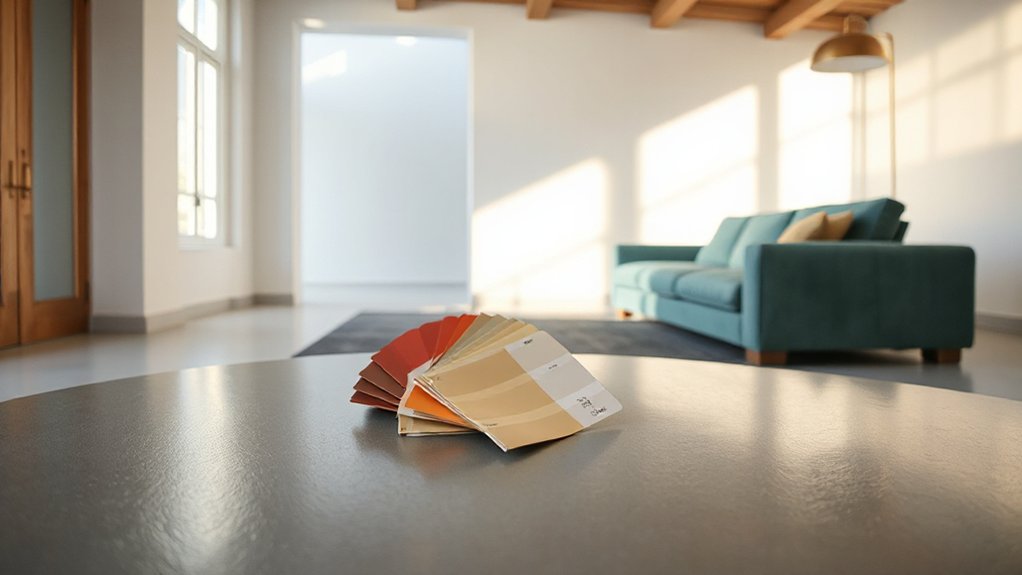
Swatch size matters: even small chips can steer the room’s vibe without overpowering it.
Let hue proportions guide your balance, ensuring the dominant color reads cleanly while secondary tones support it.
Apply an accent color strategically, so a single, deliberate splash ties the palette together.
Swatch Size Matters
Small swatches may seem trivial, but they’re powerful color levers: they guide how a room reads and feels. You’ll notice that tiny samples push you toward or away from color harmony, and they set expectations for furniture placement throughout the space. Use size to cue scale, not just shade.
- Observe small swatches against large surfaces to calibrate tonal balance.
- Reserve root hues for dominant areas, then let accents echo them sparingly.
- Test in context—lighting and furniture placement reveal true saturation and mood.
This disciplined approach keeps your palette cohesive, precise, and intentional, avoiding noise. You gain clarity, confidence, and control over how the room communicates your design intent.
Hue Proportions Play
Hue proportions are the quickest route to perceptual balance in a room. You harness small swatches to shape a cohesive system, guiding the eye with deliberate ratios. Color psychology informs these choices: the dominant tone establishes mood, while secondary hues modulate energy and warmth.
You measure impact not by coverage alone but by proportion, ensuring every element reinforces overall intention. Keep the largest area anchored by the primary color, then introduce a precise set of accents to reinforce statement symmetry.
Subtle shifts—warm versus cool, light versus dark—create depth without visual chaos. The result is refined clarity: a room that feels intentional, harmonious, and calibrated.
Mastery lies in restraint, repetition, and consistent tonal hierarchy.
Accent Color Strategy
Accent colors act as precision levers, turning a cohesive base into a dynamic statement. You’ll use small swatches to anchor personality without overwhelming space, letting larger elements breathe. The right hue elevates walls, textiles, and textures, while keeping continuity intact.
Focus on contrast, not saturation, to avoid visual noise. You’ll pair wall mounted art and area rugs with color notes that repeat across the room for cohesion and impact.
- Establish a single focal accent and repeat it in lighting, textiles, and a key accessory.
- Vary intensity across surfaces to guide the eye while preserving harmony.
- Test scale with samples in daylight, then adjust until the color feels deliberate, not decorative.
This approach delivers deliberate mood, control, and lasting polish.
Balancing Light and Dark Without Jarring Contrast
Striking a balance between light and dark doesn’t require stark contrast or heavy-handed contrast tricks; instead, aim for a layered approach that lets each tone breathe.
You cultivate harmony by distributing light and shadow across textures, surfaces, and focal points, not by forcing a single dramatic moment. Use soft gradations—baked light on plaster, shade under architectural ledges—to create natural progression.
Choose materials that respond differently to illumination: matte walls, glossy accents, and subtle metallics can coexist without jarring leaps. Integrate artistic framing to guide the eye, framing dark niches and luminous surfaces as complementary rather than conflicting elements.
Employ shadow play to add depth without weight, ensuring contrast remains refined and purposeful. This discipline yields a cohesive, timeless interior.
Scale and Proportion: The Large Accent That Fits
Scale and proportion aren’t about size for size’s sake; they’re about making one large accent feel native to the room. You’ll align scale with the space, so the chosen piece anchors the moment without overpowering surrounding elements.
Precision in proportion keeps every detail coherent, from furniture scale to artwork proportions, creating harmony you can feel.
- Choose a singular oversized focal that resonates with the room’s rhythm, then echo its presence with complementary, scaled accents.
- Balance height, width, and depth, ensuring you can navigate the area comfortably while the feature remains dominant.
- Use color and texture to unify the large accent with the backdrop, avoiding competition through careful contrast.
Result: a purposeful statement that grows with the space, never crowding it.
Art as Your Signature: Curated Pieces With Personal Meaning
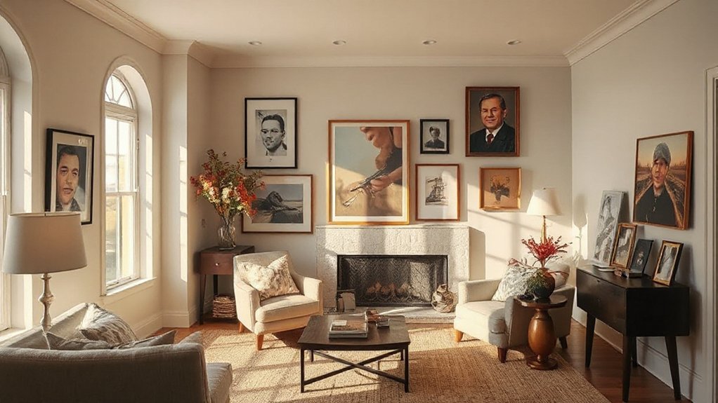
Art as your signature isn’t about filling walls with objects; it’s about selecting pieces that echo your story and lifestyle. When you curate, you distinguish between filler and meaning, ensuring each work communicates purpose.
Start with a personal collection mindset: prioritize artworks that resonate, not merely decorate. Seek pieces that align with your environment, whether a dramatic statement, intimate portrait, or quiet abstraction, and secure a coherent throughline across rooms.
Consider scale, provenance, and consistency of mood to maintain an intentional gallery feel. An Art installation can redefine a space, but it should enhance function, not distract from daily use.
Your signature collection should evolve, guided by curiosity and restraint, reflecting taste, values, and memory. Let the pieces speak for you, authentically.
Subtle Metallic Accents: Shine That Elevates
Subtle metallic accents instantly elevate a room without overpowering it. You’ll introduce shimmer through measured metal finishes and reflective surfaces that catch light, not dominate space. Use these choices to define chic without noise:
- Metal finish anchors: a sleek lamp, tray, or frame in brushed nickel or antique brass.
- Reflective surfaces: a mirror, glass table, or metallic backsplash that amplifies ambient light.
- Intentional pairings: balance cool and warm tones to maintain harmony and depth.
In practice, choose one focal metallic element and complement with understated accents. The effect is refined, not flashy, inviting focus on form and texture. You gain visual cohesion, a sense of elevation, and an interior that feels thoughtfully curated.
Spatial Rhythm: Placement That Guides the Eye
Spatial rhythm guides the eye by deliberate placement and directional cues that create a natural flow. You choreograph sightlines through furniture groups, art positions, and lighting arrays that establish a deliberate sequence.
Think regarding balance, repetition, and contrasts that your space can sustain without crowding. Use anchor pieces at key thirds, then rotate nearby accents to guide attention along a curated path.
Color psychology informs these steps: cool hues create calm progressions, warmer tones emphasize focal nodes, and restrained neutrals maintain cohesion.
Maintain spatial harmony by aligning furniture edges, rug scales, and art heights to invisible lines that your eye follows effortlessly. Your intent should feel seamless, purposeful, and uncluttered, enabling movement and perception to unfold naturally.
Ceiling and Floor Drama: Ground- and Sky-Height Details
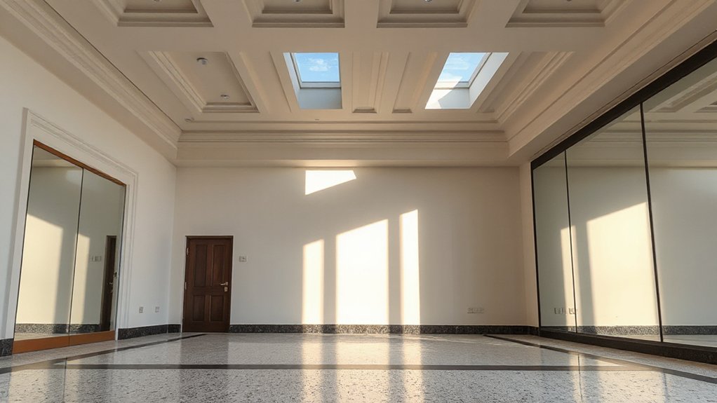
Ceiling and floor drama hinges on deliberate contrasts that frame your space from above and below. You harness impact by pairing bold ceilings with grounded surfaces, guiding perception through height, shade, and pattern.
Consider these elements:
1) Ceiling murals that invite gaze upward, creating a narrative focal point.
2) Floor patterns that echo or offset ceiling motifs, yielding visual tension.
3) Strategic finishes and color transitions that enhance depth without shouting.
Applied with precision, this approach crafts cohesion between sky and ground, elevating the room’s rhythm.
You’ll notice how subtle shifts in scale or contrast deepen intimacy and ceremony, even in everyday spaces. The result is a polished, deliberate environment where Ceiling murals and Floor patterns coordinate to elevate mood, clarity, and perception.
Greenery as Texture: Life and Structure in a Single Feature
Integrate plants as a single, textured element that anchors both form and atmosphere; this approach blends energy with architecture, delivering tangible structure without clutter.
You implement greenery as texture by selecting a compact, cohesive plant family and using it as a unifying feature across rooms. Treat foliage as architectural material: repeat shapes, tones, and leaf textures to sculpt the space’s rhythm and depth.
Pair it with clean containers and intentional spacing to maintain order while offering visual intrigue. Embrace urban jungle concepts to create momentum without overcrowding, ensuring pathways remain clear.
Employ botanical layering to add dimension—vary heights, leaf forms, and surface textures for a sophisticated, breathable aesthetic. This strategy delivers life with restraint, clarity, and purposeful design.
Quick Customization Checklist: Vetting Features for Your Space
To vet features quickly and confidently, start with a concise criteria checklist that captures function, form, and fit. You’ll assess whether a feature serves daily use, aligns with your aesthetic, and fits your space’s proportions and traffic flow. Apply this filter to every option before design intent—no guesswork.
1) Art installations: confirm they enhance the narrative, avoid visual clutter, and balance with adjacent pieces.
2) Furniture arrangements: guarantee sightlines remain open, cushions and surfaces are ergonomic, and scale harmonizes with room size.
3) Finishing details: verify materials, textures, and colors reinforce cohesion without competing.
This quick checklist keeps decisions intentional, precise, and polished, elevating your space with deliberate, impactful features.
Frequently Asked Questions
How Can I Assess a Statement Feature for My Room’s Vibe?
You assess your room’s vibe by testing color coordination and material texture against a focal piece, ensuring harmony. Compare swatches in various light, adjust contrasts, and trust your instincts to refine mood, balance, and cohesion.
Which Features Best Anchor a Small Space Visually?
You should anchor a small space visually with a cohesive color palette and pronounced texture contrast. You’ll achieve depth quickly, using bold accent pieces alongside soft neutrals, so your room feels larger, balanced, and intentionally curated. Keep scale in check.
What Keeps a Bold Feature From Overpowering a Room?
A bold feature stays from overpowering a room when you balance color contrast and material texture with rest of the scheme, maintaining restraint. You anchor it with subdued tones and scale, letting the focal element breathe and harmonize.
How Do I Balance Cost With Lasting Impact?
You balance cost with lasting impact by prioritizing budget considerations and material durability, choosing pieces that endure and evolve. You compare materials, invest thoughtfully, and opt for timeless finishes that resist trends while delivering enduring, refined presence in your space.
Can a Single Feature Transform Multiple Rooms Consistently?
Yes, a single feature can translate across rooms if you choose it wisely. You’ll leverage color contrast and texture mixing to unify schemes, ensuring consistent momentum while adding depth and polish throughout the space.
Conclusion
A single statement feature can redefine a room’s mood without overhauling its bones. When you choose one bold anchor, you guide the eye, set rhythm, and harmonize textures, color, and light. Did you know spaces with a clear focal feature report up to 26% higher perceived design quality? Lean into intentional contrast—maximize texture, scale, and decor quality around that piece. Keep it purposeful, balanced, and refined, so the feature elevates, never overwhelms, your everyday living.

