


You’ll create a home that feels like you by mapping the people, places, and pivotal moments that shaped you, then translating them into repeatable choices—1–2 themes per room, a consistent wood tone or metal finish, and 2–3 “memory colors” used as small accents. Set “keep rules” before you buy, and curate meaningful objects with negative space so they stand out. Mix vintage and modern with one unifying thread, and design layouts around your daily routines. Keep going for the exact rules, layouts, and styling formulas.
Map Your Story: People, Places, Moments
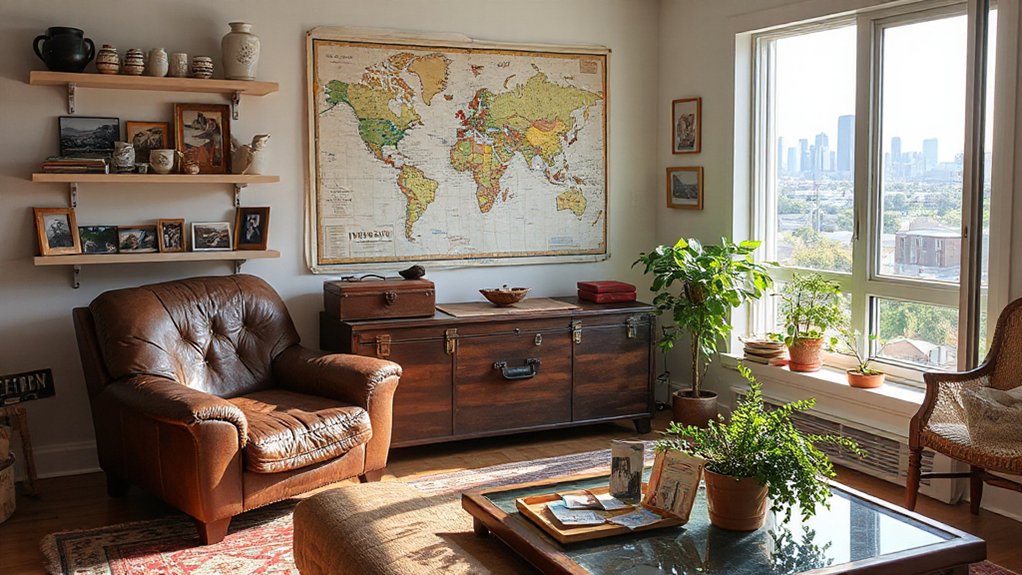
Start by mapping your story in three layers—people, places, and moments—so every decor choice has a clear origin instead of feeling like a random trend haul.
List the people who shaped your taste: mentors, grandparents, friends, partners. Pull out objects tied to them, especially Family heirlooms, and note what they signal—craft, humor, restraint, or bold color.
Next, chart places that formed you: hometown streets, a first apartment, a coastal trip, a city you studied in. Gather Travel souvenirs with provenance (where, when, why), then edit for quality and display potential.
Finally, pinpoint moments—milestones, losses, wins—and assign a sensory cue: texture, material, or scent. You’ll create a disciplined inventory that guides intentional purchases later.
Choose 1–2 Themes for Each Room
Two themes per room is the sweet spot: enough structure to keep your story legible, not so much that the space reads like a mood-board collision. Start by naming a primary theme (place, era, or craft) and a secondary one (color discipline, material, or motif). Then translate them into repeatable decisions: one signature finish, one recurring shape, one controlled pattern scale.
Use Personal symbols as punctuation, not wallpaper—think a framed map, heirloom bowl, or textile that cues a chapter of your life. Build Emotional anchors through sensory consistency: the same warm wood tone, a scent, or a reading lamp you always gravitate to.
Trend-aware doesn’t mean trend-led; let current curves, earthy palettes, or mixed metals support your themes, not replace them.
Set “Keep” Rules Before You Decorate
Before you buy a single pillow or pull a paint swatch, set clear “keep” rules for what already lives in the room, so your narrative doesn’t get buried under visual noise. Decide what earns its footprint: anchor pieces with function, provenance, or daily use. Everything else must justify itself against your room’s 1–2 themes, not nostalgia alone.
Write three nonnegotiables: keep, relocate, release. Use Personal boundaries to protect surfaces and sightlines—one curated shelf, one display zone, no overflow on the floor.
Then lock Budget management: you won’t “fix” clutter by shopping. Measure storage, count hangers, and cap duplicates (two throws, one tray, four frames). When you’ve set limits, new additions stay intentional, not impulsive.
Pick Memory Colors (Then Use Them Sparingly)
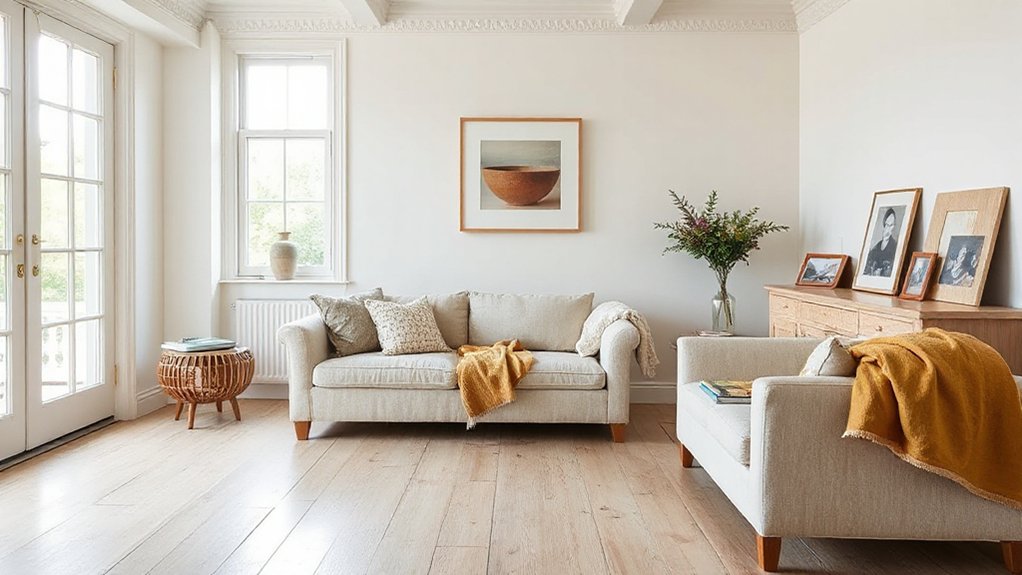
Choose a tight “memory palette” by naming 2–3 colors that instantly remind you of a place, person, or era, then match them to specific finishes (matte, satin, lacquer) for consistency.
Use those shades as controlled accents—pillows, art mats, a single painted niche, or a small rug—so they read intentional, not themed.
Keep the base neutral and repeat each memory color no more than twice per room to stay current and visually calm.
Identify Your Memory Palette
Although trends cycle from dopamine brights to muted “quiet luxury” neutrals, your most convincing color story starts with memory: identify a small set of hues that instantly anchors you to a place, person, or season.
Start by listing three moments—your grandmother’s kitchen, a coastal trip, a favorite fall hike—and pull one dominant hue from each. Then test them as a tight trio: one warm, one cool, one neutral-leaning.
Check Color harmony by comparing undertones (blue-based vs yellow-based) under daylight and warm bulbs.
Next, map each hue to furniture placement: where do your largest volumes sit, and which sightlines repeat? Your palette should support circulation and focal points, not fight them.
Keep names specific: “brick ochre,” “ink navy,” “linen greige.”
Add Accents With Restraint
When you treat your memory palette like a spice rack rather than a paint deck, the room reads intentional instead of themed.
Choose one to three “memory colors” from your story, then assign them roles: one hero, one supporting, one occasional cameo.
Keep large surfaces quiet—walls, rugs, and sofas in grounded neutrals—so the accents carry meaning, not noise.
Deploy Minimalist accents with discipline: a single lacquered tray in your childhood blue, piping on a chair, or a framed matchbook grid.
Repeat each color no more than three times, and vary scale so it feels designed.
Save your Bold statement for one move only—an art piece, lamp, or door—then let negative space do the storytelling.
Mix Old and New Furniture on Purpose
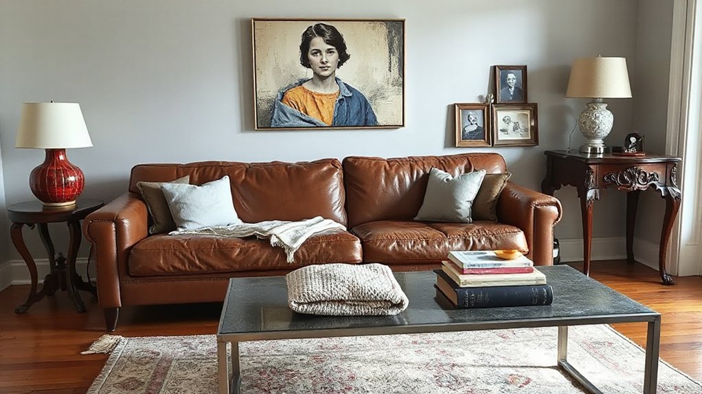
When you mix old and new furniture, you’ve got to choose a unifying thread—finish, wood tone, hardware, or a repeat textile—so the story reads cohesive, not chaotic.
Balance scale and proportion by pairing visual weight thoughtfully (a low modern sofa with a tall vintage cabinet, not two bulky anchors competing).
Then curate contrast with intention: let one or two standout era clashes lead the look, while the rest supports a clean, current line.
Define A Unifying Thread
If you want vintage finds and modern pieces to feel intentional instead of accidental, you’ve got to define a unifying thread first. Choose one anchor: a repeatable finish, a design era cue, or a material story like warm oak, blackened steel, or bouclé.
Then apply color theory to tighten the mix—repeat a dominant hue, echo a secondary accent, and keep undertones consistent so woods and metals don’t clash. Use furniture placement to reinforce the narrative: pair contrasting silhouettes in deliberate vignettes, align sightlines so statement pieces read as curated, and let negative space frame your “hero” item.
Finish with small repeats—matching hardware, trim color, or textiles—so the room feels edited, not eclectic by accident. This keeps the room coherent and personal.
Balance Scale And Proportion
Although your vintage credenza and that clean-lined sofa may share a palette, they’ll still look “off” unless you balance scale and proportion. Start by measuring key heights and depths: keep seat heights within a couple inches, and avoid pairing a low, airy sofa with a tall, bulky case piece.
Aim for Scale harmony by matching visual weight—chunky legs need equally grounded companions, while slender profiles want lighter neighbors.
Create proportion balance through spacing and grouping. Float larger pieces with breathing room, and anchor them with a rug that extends at least 8–12 inches beyond front legs.
Use a consistent “mass” rhythm: one dominant piece, two medium supports, and smaller accents. Your mix feels intentional when each item relates in size, not era.
Curate Contrast With Intention
Even with scale and proportion dialed in, your room can still read flat unless you curate contrast with intention. Mix eras the way stylists do: anchor the space with one dominant period, then punctuate it with a deliberate counterpoint. Pair a streamlined sofa with a carved vintage console, or set a midcentury credenza beneath contemporary art—this furniture pairing reads collected, not random.
Use material tension to sharpen the story: lacquer against patina, boucle beside worn leather, chrome next to oiled oak. Control it with color blocking—repeat one hue across old and new pieces to keep the composition tight.
Limit statement items to two per zone, and let quieter forms support them. You’ll create depth, character, and narrative cohesion.
Use Heirlooms Without Making It Feel Dated
When you treat heirlooms as intentional accents rather than default decor, they’ll read collected and current instead of dated. Start by editing: choose one or two standout pieces per room, then give them breathing space. Pair a carved chest with a crisp, low-profile sofa, or set antique brass beside matte black hardware to balance eras.
Prioritize heirloom preservation with discreet upgrades—rewire vintage lamps, add UV-filtering glass to framed textiles, and repair joints instead of refinishing character away.
Control the palette: repeat one modern neutral across walls, rugs, and window treatments so the heirloom’s Vintage charm becomes the focal point.
Finally, style with restraint: one contemporary vessel, one stack of books, and nothing more than what supports the story.
Turn Travel Finds Into Everyday Decor
You don’t need a suitcase of souvenirs—you need a tight edit of travel pieces with a clear story, like one handwoven textile or a ceramic bowl you’ll actually use.
Style each find with purpose by giving it a functional role and a clean backdrop: frame that market print, corral keys in that tray, or stack books beside a carved figurine.
Blend cultures cohesively by repeating colors, materials, and shapes across rooms so the mix reads curated and current, not cluttered.
Curate Meaningful Travel Pieces
How do a few well-chosen travel finds turn into decor that feels intentional rather than cluttered? You curate with a curator’s eye: fewer pieces, higher story value. Start by editing your Travel mementos into categories—textiles, ceramics, art, small objects—then keep only what signals place, craft, and memory at a glance.
Favor items with maker marks, regional materials, or traditional techniques; they read authentic, not touristy. Scale matters: choose one statement piece per room, then support it with quieter companions. Track provenance in a simple label or photo note so the narrative doesn’t fade.
Aim for Cultural fusion through shared colors, repeated motifs, or complementary finishes, creating cohesion across rooms without erasing origins. Keep storage nearby for rotating pieces seasonally.
Style Souvenirs With Purpose
Although souvenirs often end up in a catchall bowl, they’ll feel purposeful if you assign them a job in your home. Mount a woven market tray as an entry drop zone, or use a hand-thrown cup to corral keys on a console. Frame transit maps or museum tickets in a tight grid for a clean, gallery-like moment.
Turn textiles into working layers: a scarf becomes a table runner; a small rug anchors a reading chair. Edit hard—limit Sentimental collectibles to one surface per room, then repeat one material (brass, teak, ceramic) to keep it current.
Build Purposeful displays by pairing each item with a practical need: lighting, storage, or tabletop protection. Rotate seasonally so nothing fades into visual noise.
Blend Cultures Cohesively
Once your travel pieces earn their keep, the next step is making them play well together so your home reads curated, not costume-y. Start with a tight palette pulled from your architecture—warm whites, walnut, iron—then let global accents pop in controlled doses.
Anchor the room with one hero object (a Berber rug, a Japanese tansu, Talavera lamp) and repeat its colors in smaller touches to signal intention.
Edit by material, not region: pair hand-thrown ceramics with linen and raw wood for seamless Cultural fusion. Keep patterns to two scales—one bold, one quiet—and leave negative space so each item breathes.
Finally, label meaning through placement: group pieces by journey or family line for Heritage storytelling that feels lived-in, not staged.
Display Meaningful Objects, Not Clutter
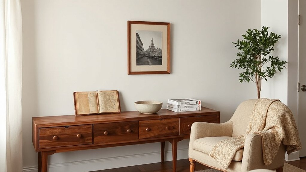
Even in a maximalist moment, your rooms read more intentional when every visible object earns its place. Start by editing with purpose: keep pieces that mark milestones, represent heritage, or support daily rituals. If an item can’t answer “why am I here?” it’s décor noise.
Aim for organizational clarity by assigning each category a home—keys in one tray, candles in one box, papers in one file—so surfaces stay legible.
Protect visual harmony by repeating finishes and tones, then limiting “loud” accents to a few standouts. Use negative space as a design tool; it frames what matters and makes even budget finds look curated.
Rotate lesser-loved pieces into storage and reassess seasonally.
Style Shelves Like Mini Story Chapters
You’ll style each shelf like a mini chapter by curating a tight edit of objects that carry real meaning, not filler.
You’ll layer heights and textures—stacked books, a matte ceramic, a framed photo, a small sculptural accent—to create depth that feels current and intentional.
Then you’ll arrange the sequence by story arc: opening statement, supporting moments, and a clean visual “ending” that lets the eye rest.
Curate Objects With Meaning
Because shelves sit at eye level and collect attention fast, they’re the ideal place to curate objects that carry real meaning—then arrange them like mini story chapters rather than random decor.
Start by editing ruthlessly: choose 7–11 pieces that earn their spot through memory, craftsmanship, or provenance. Let sentimental objects lead, but balance them with one or two contemporary anchors so it feels current, not dusty.
Build heirloom displays with intent: pair a grandparent’s brass compass with a framed travel sketch, then add a small stone from that coast.
Keep categories tight—one shelf for journeys, one for makers, one for family—so the narrative reads instantly.
Use discreet labels or photo backs if you’ll forget names and dates later.
Layer Heights And Textures
Once you’ve edited down to meaningful pieces, make them read like a sequence by layering height and texture, not lining everything up like a showroom. Build Layer heights in threes: a tall anchor (vase or framed print), a mid object (ceramic bowl), and a low base (stacked books).
Offset edges so silhouettes overlap slightly; this creates depth and a lived-in, collected feel that’s current with gallery-style styling.
Use Texture combinations to keep neutrals from going flat: matte clay beside glossy glass, aged brass near raw wood, linen-backed frames against stone. Repeat one finish twice for cohesion, then introduce one deliberate contrast for tension.
Leave negative space around your most personal item so it reads first, without competing clutter or overstyled symmetry.
Arrange By Story Arc
Three beats make a shelf feel intentional: an opening “hook,” a middle “developing scene,” and a closing “signature.” Start with one object that sets the premise (a travel photo, inherited vase, or framed ticket). Support it with two to four related pieces that deepen the theme through material or motif (maps, ceramics, a small sculpture). Then end with a distinct closer that signals you, not the store (a quirky found object or book spine that names the place).
Keep spacing disciplined; negative space reads as confidence. Use a Minimalist approach: edit to essentials, repeat one color, and vary scale for rhythm. Choose Sustainable materials—reclaimed wood risers, recycled-glass vessels, linen-bound books—to align the story with current values.
Finish by angling one piece forward like a final line.
Make Family Photos Look Intentional
Even if your family photos span different years, cameras, and color tones, you can make them feel like a deliberate design choice by editing and displaying them with a consistent visual rule. Pick one treatment—warm black-and-white, muted matte, or true-to-life color—and apply it across your set so everything reads cohesive.
Standardize scale: crop faces to similar proportions, keep horizons level, and choose one aspect ratio. Then commit to a repeatable presentation: matching mats, a single frame finish, and even spacing.
For Family portraits, use Intentional framing by placing eyes on the upper third and leaving consistent negative space. Mix close-ups with one wider anchor shot, but keep brightness aligned so no image shouts. You’ll get polish without erasing authenticity.
Hang Collected Art Like a Life Timeline
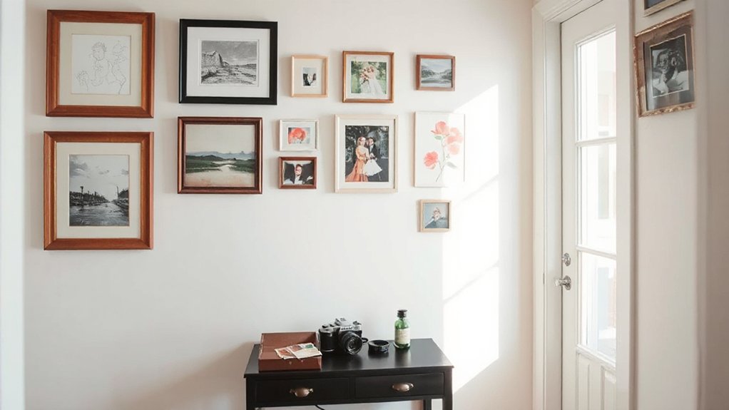
If you’ve been collecting art over time—prints from travels, thrifted originals, kids’ drawings, postcards—you can hang it as a visual timeline that reads curated, not chaotic. Start by sorting pieces by era or place, then map a loose chronology across one wall or down a hallway. Keep art placement consistent: align centers at eye level, maintain even gaps, and repeat frame finishes so the story feels edited.
Use color schemes to connect mismatched media—pull two or three recurring tones (ink black, warm wood, a single accent) and echo them in mats or frames. Mix sizes, but anchor each “chapter” with one larger piece. Leave breathing room for future finds. Label dates on the back, not the wall.
Layer Textures That Feel Lived-In
While a room can look “finished” on paper, it won’t feel personal until you build in texture that shows touch, time, and use. Start with textural layering: pair a nubby wool rug with smooth oak, then add a linen sofa cover you can wash, wrinkle, and keep. Mix matte and sheen—plaster walls, glazed ceramics, brushed metal—so the space reads intentional, not themed.
Choose materials that age well: vegetable-tanned leather, solid wood, stone, and cotton that softens. Add one handmade element—woven basketry, stitched quilts, hand-thrown bowls—to signal craft over catalog.
Finish with small contrasts: a boucle pillow against crisp percale, or raw silk next to denim. You’ll get sensory depth that feels lived-in, not staged, every day.
Use Lighting to Support Your Daily Rituals
Texture gives a room its tactile story, but lighting sets the daily rhythm that makes it feel truly lived in. Start by mapping light layers to the way you move through your day: overhead for clarity, wall sconces for soft orientation, and task beams where focus matters. Put everything on dimmers so you can shift from crisp to calm without changing fixtures.
Choose warm LEDs (2700–3000K) for an ambient glow in living areas, and slightly cooler tones (3500K) where you need accuracy. Use smart schedules to mirror natural daylight, reducing harsh evening blue for better wind-down.
Highlight meaningful objects with narrow-beam picture lights, not spotty ceiling cans. This controlled, low-glare approach delivers mood enhancement while staying quietly timeless and trend-aware.
Design Around Routines (Coffee, Reading, Hosting)
Because your home works hardest in the moments you repeat every day, design each zone around the routines you actually keep—morning coffee, evening reading, and weekend hosting—then let the layout, surfaces, and storage do the heavy lifting.
For Coffee rituals, anchor a compact station near water and power, add a wipeable counter, and store mugs, beans, and filters at hand-height so you don’t hunt before caffeine.
Create Reading nooks with a chair that supports your posture, a tight side table for book-and-cup parking, and layered lighting aimed at pages, not eyes.
When you host, prioritize a clear traffic loop, flexible seating, and a landing strip for bags and bottles. You’ll feel intentional, not staged.
Personal Storytelling on Any Budget
Even if your budget’s tight, you can tell a clear, personal story with a few intentional choices instead of a full-room overhaul. Start by naming your narrative in three words—“coastal academic,” “heritage modern,” “quiet maximalist”—then edit purchases to match.
Shop your home first: cluster meaningful books, frame a postcard from a formative trip, or surface a handmade object where you’ll see it daily.
For Budget friendly design, upgrade what you touch: swap hardware, add a dimmable warm LED bulb, and choose one tactile textile (linen pillow, wool throw) in a signature color.
Use thrift and marketplace finds strategically—solid wood, vintage frames, ceramic lamps—then unify with consistent finishes.
Personal storytelling lands when each item earns its spot.
Edit Seasonally Without Erasing Yourself
As the weather shifts, you can refresh your rooms without rebooting your identity by treating seasonal updates as a controlled layer—not a new storyline. Anchor the space with your year-round “signature set”: art you love, heirloom wood, a core rug, and the palette that reads like you.
Then rotate only the flexible pieces: pillow covers, throws, tabletop linens, stems, and one small accent lamp shade.
For seasonal renewal, choose materials that echo climate changes—linen in spring, cotton in summer, wool in fall, velvet in winter—while keeping shapes consistent. Use one new color per season, pulled from existing artwork, so it feels intentional.
This is personal evolution: you’re editing the atmosphere, not rewriting the plot. Keep a labeled bin system to swap fast.
Mistakes That Make a Home Feel Generic
When you decorate by template instead of by taste, your home loses its voice and starts reading like a showroom. You don’t need chaos to feel personal, but you do need choices anchored to memory, craft, and use. The most common “generic” tells are predictable, yet fixable.
- You default to neutral palettes without contrast, patina, or a signature color; add one bold note or material with meaning.
- You buy matching sets and big-box art; swap in one heirloom, local piece, or framed photo series.
- You mistake clutter reduction for stripping everything; edit repeats, not stories, and keep tactile objects you actually touch.
Layer lighting, vary scale, and let imperfections show—those details read like you.
Frequently Asked Questions
How Do I Blend Roommates’ or Partners’ Stories Into One Cohesive Home?
Blend roommates’ or partners’ stories by choosing a shared palette, repeating forms, and zoning displays. Use Personal symbolism and Cultural influences in curated vignettes, then unify with consistent textiles, lighting temperatures, and a modern edit.
What Are Renter-Friendly Ways to Add Narrative Without Permanent Changes?
You’ll layer narrative with peel-and-stick wallpaper, removable hooks, and lighting. Like my friend’s 30-minute gallery swap, you’ll rotate Personal memorabilia, use Color symbolism via textiles, and add thrifted frames—no holes, deposits safe.
How Can I Make an Open-Plan Space Feel Like Distinct Story Zones?
Define zones with Color schemes and furniture placement: float rugs and sofas to frame “chapters,” aim lighting to spotlight moments, and repeat one material throughout. You’ll guide sightlines with shelving, screens, and art clusters.
How Do I Design a Narrative Home That Also Appeals to Future Buyers?
Design for resale by blending personal symbols with flexible, neutral foundations—like adding a signature scarf to a tailored suit. Highlight cultural influences through removable art, textiles, lighting. Keep layouts efficient, finishes timeless, storage ample, and upgrades documented.
When Should I Hire a Designer, and How Do I Communicate My Story?
Hire a designer when you’re renovating, stuck, or need cohesive resale appeal. Communicate your story by sharing mood boards, rituals, heirlooms, and “must-keep” pieces; align Personal style goals early in the Design process.
Conclusion
You don’t need the latest micro-trend to make your home feel current—you need clarity. Map your people, places, and defining moments, then translate them into one or two room themes, tight “keep” rules, and restrained memory colors. Mix inherited pieces with modern anchors, and design around how you actually live: coffee rituals, reading zones, hosting flow. Edit seasonally like you’re curating a museum, not swiping on a rotary phone. Avoid sameness.


