
You shape interior identity by balancing stone, wood, and metal for mood, performance, and symbolism. Stone reads cool, stable, and formal; its density damps vibration, and finishes like honed or flamed tune slip resistance and patina. Wood adds warmth, quieter acoustics, and tactile comfort through grain and low-gloss oils or satins. Metal delivers precision and energy via controlled reflectance, from matte diffusion to polished highlights. Next, you’ll see how ratios, joints, and room function lock it in.
Key Takeaways
- Stone conveys permanence and calm formality, while its mass, texture, and finish control coolness, stability, and acoustics.
- Wood signals care and warmth; grain direction, species tone, and satin or oiled finishes increase comfort and extend dwell time.
- Metal communicates innovation and precision; small accents with controlled reflectance sharpen geometry, boost brightness, and energize circulation areas.
- Interior identity strengthens when one material dominates and others support it, using consistent joints, aligned reveals, and tactile edge profiles.
- Function-driven specifications—slip resistance, moisture, UV, abrasion, and cleaning chemistry—ensure the material language stays durable and coherent.
How Stone, Wood, and Metal Set Mood
Although layout and lighting shape how a room functions, the material palette often determines how it feels because you’re responding to measurable cues—surface temperature, reflectance, texture, and acoustic absorption.
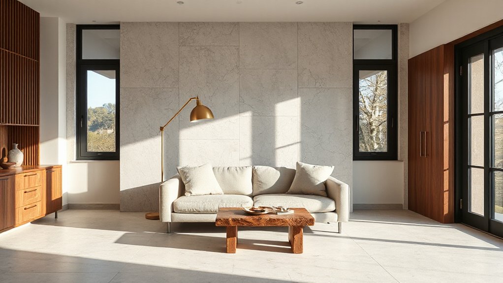
When you specify stone, you typically increase perceived coolness and visual stability; higher thermal effusivity and lower glare tolerance can read as calm, formal, and grounded.
When you choose wood, you usually raise apparent warmth and comfort; mid-range reflectance and fine-grain diffusion support a quieter sensory experience and longer dwell time.
When you introduce metal, you sharpen contrast and precision; specular highlights and higher sound reflectance can energize circulation zones.
You harness Material symbolism too: stone signals permanence, wood signals care, metal signals innovation.
You can calibrate mood by balancing these cues across touchpoints and sightlines.
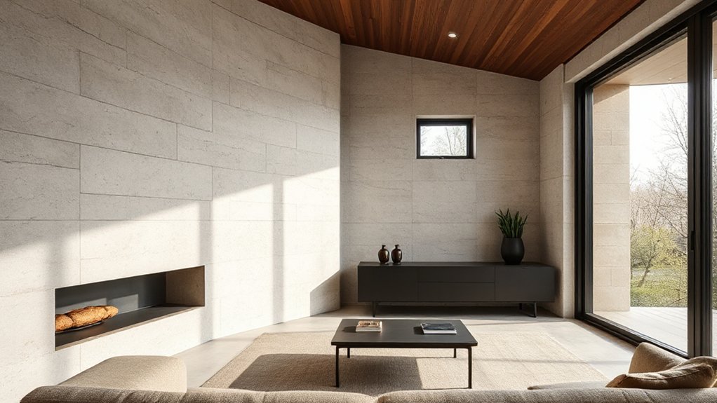
Stone in Interiors: Texture, Weight, Durability
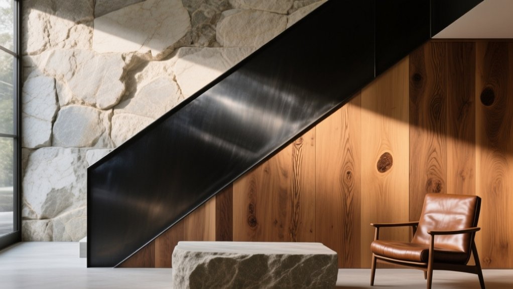
When you bring stone into an interior, you’re specifying a material that telegraphs performance through texture, mass, and wear behavior. You can calibrate slip resistance by choosing honed, flamed, or bush-hammered finishes, and you’ll create Textural contrast when you pair a matte field with polished edges or inlays.
Density matters: heavier stones damp vibration, feel acoustically “quiet,” and anchor furniture loads without creep.
Durability follows mineral structure. Granite and quartzite resist abrasion and etching; marble and limestone show acids quickly, so you’ll need sealers, drip detailing, and maintenance protocols.
You should also specify thickness, backing, and movement joints to control cracking. Done right, stone delivers Material longevity with predictable patina, not premature failure.
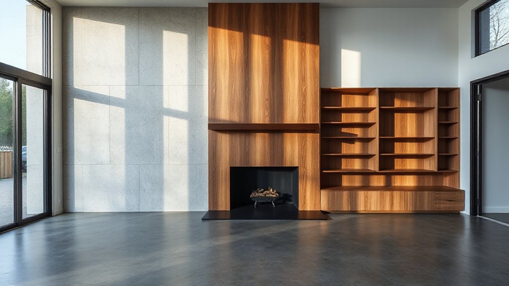
Wood in Interiors: Warmth, Grain, Softness
When you specify wood, you’re selecting a material whose grain pattern encodes species, cut, and growth conditions, giving surfaces repeatable character and visual directionality.
You’ll also leverage warm undertones and higher light scattering than stone, which can increase perceived thermal comfort and soften overall ambience.
Under hand, wood’s lower thermal conductivity and slight elastic compliance reduce contact coldness and micro-impact, so you can build comfort into floors, rails, and touchpoints.
Grain Patterns And Character
Because wood’s grain records the tree’s growth conditions, it gives you a measurable way to tune both warmth and visual “softness” in an interior. You can specify tight, even growth rings for calmer fields, or cathedral grain for higher contrast and directional movement.
Quarter-sawn oak minimizes cupping and yields ray fleck, so you get predictable stability plus a distinct figure you can align across panels. Rift-sawn cuts reduce medullary flare, supporting cleaner, more uniform elevations.
When you bookmatch veneers, you control symmetry and perceived order; when you slip-match, you favor continuity.
Historical influence matters: regional joinery traditions codified preferred cuts. Cultural symbolism also shapes choices, linking species and figure to craft, status, and authenticity cues.
Warm Tones And Ambience
- Warm species: walnut, teak, cedar
- Clearcoat sheen controls glare
- Align hue with CCT (2700–4000K)
- La* matching prevents discord
- Certification and low-VOC specs
Soft Touch And Comfort
Although wood’s visual warmth often gets the attention, its tactile performance largely determines whether a space feels genuinely comfortable. You register Tactile comfort through surface temperature, microtexture, and elasticity.
Because wood has low thermal effusivity compared with stone or metal, it draws less heat from your skin, so it feels warmer on contact and reinforces Sensory warmth. You also benefit from grain: open pores and earlywood/latewood bands create controlled friction, reducing slip without feeling abrasive.
When you specify finishes, you shape touch directly—oil and hardwax preserve texture and a “dry” grip, while thick film lacquers raise smoothness but can feel colder and plasticky. You’ll get the best results by pairing stable species with satin sheens and rounded edges.
Metal in Interiors: Shine, Contrast, Precision
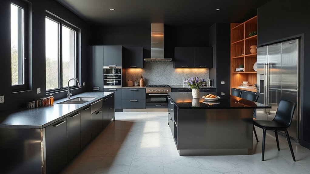
You control a room’s mood by choosing metal finishes with known reflectance: polished surfaces amplify luminance and perceived spaciousness, while brushed or matte metals damp specular glare and read calmer.
You can then use metal accents to sharpen contrast, setting cool, high-precision edges against porous, low-sheen materials to increase visual definition.
If you place these accents strategically at light paths and touchpoints, you’ll get highlight cues that guide attention and reinforce a crisp, engineered aesthetic.
Reflective Finishes And Mood
When you introduce reflective metal finishes into an interior, you immediately change how light distributes across surfaces and, in turn, how the space feels. You can predict mood by mapping glare, luminance, and specular highlights to sightlines and task zones. Polished stainless amplifies brightness and perceived cleanliness; brushed aluminum softens it by diffusing micro-reflections.
Your surface textures control scattering, so choose them based on whether you need alertness or calm. Reflective qualities also reshape spatial legibility: higher reflectance increases edge detection and makes volumes read sharper, while satin sheens reduce visual fatigue.
Manage reflections with measured incident angles, fixture shielding, and matte-adjacent coatings to keep contrast within comfortable ratios.
- Mirror polish: high specular, high stimulation
- Brushed: controlled sparkle, balanced comfort
- Bead-blast: diffuse, subdued mood
- Anodized: stable hue, low glare
- Patinated: reduced reflectance, softer ambience
Metal Accents And Contrast
Because metal reads as a high-frequency material—crisp edges, tight tolerances, and strong value shifts—small accents can drive contrast more effectively than large surface applications. You’ll get sharper figure-ground separation with thin brass reveals, blackened-steel frames, or chrome pulls than with full cladding, because specular highlights spike luminance and define geometry under both daylight and 2700–3000K artificial light.
Use placement strategically: align metal lines to sightlines and joints, so reflections reinforce proportion rather than scatter attention. To control glare, choose brushed or bead-blasted finishes (lower gloss units) on large pieces, reserving polished edges for punctuation.
Pair warm metals with open-grain timber for rustic sophistication, or combine matte steel with stone for industrial elegance. Keep metal tolerances consistent; misalignment reads immediately.
How to Mix Stone, Wood, and Metal
Although stone, wood, and metal sit at different ends of the tactile and thermal spectrum, they mix cleanly if you control three variables: dominant surface area, finish reflectance, and edge detailing.
Start with Material pairing by assigning one primary plane (floor, wall, or millwork) and letting the other two read as secondary and tertiary.
Drive Texture integration through repeatable junction logic: align reveals, control thickness transitions, and keep edge radii consistent so the eye reads a single system, not three.
Use proportion rules and viewing-distance checks to prevent visual noise and to stabilize contrast across daylight cycles.
- Choose a dominant material (60–70% coverage)
- Limit secondaries to 20–30%
- Reserve metal for 5–10% highlights
- Match edge profiles at touchpoints
- Repeat one joint detail throughout
Finishes That Warm or Sharpen These Materials
Once you’ve set dominance, reflectance hierarchy, and consistent joints for stone, wood, and metal, the finish schedule becomes the lever that either warms the palette or sharpens contrast without changing the material mix.
To warm, you’ll lower gloss and raise chroma: honed limestone, oiled oak, and brushed brass reduce specular highlights, increasing perceived softness and masking micro-scratches. Pair these with Color combinations that sit close on the Munsell value scale to compress contrast.
To sharpen, you’ll do the opposite: polished stone, clear-coated timber, and satin stainless elevate edge definition by boosting reflectance and shadow readability. Use high/low value pairings and cooler undertones to separate planes.
Historical influences matter: patinated metals and limewashed stone reference pre-industrial finishes, while anodized aluminum signals modernist precision.
Stone, Wood, and Metal by Room and Wear
If you map materials to rooms by abrasion, impact, moisture, UV, and cleaning chemistry, you’ll specify stone, wood, and metal for performance first and aesthetics second. You’ll treat traffic paths, splash zones, and touchpoints as measurable wear regimes, then choose assemblies that resist etching, denting, and corrosion while aligning with Historical influences and Cultural symbolism.
- Entry floors: dense stone or porcelain; honed to hide scratches, sealed for de-icing salts.
- Kitchens: stainless or brass at handles; stone tops rated for acids, wood kept off wet edges.
- Baths: non-porous stone or tile; corrosion-resistant fasteners, minimal end-grain exposure.
- Living areas: wood with harder species and repairable finishes; metals limited to low-impact trim.
- Sunrooms: UV-stable metals, thermally broken frames; wood needs pigmented protection.
Material Ratios That Control the Room’s Vibe
When you treat a room as a weighted mix of hard and soft surfaces, you can predict its perceived warmth, formality, and visual noise with surprising accuracy. Start by estimating visible area: floor, major casework, large wall planes, and dominant furniture faces.
If hard materials (stone, metal, glass) exceed ~60%, you’ll read higher reflectance, longer reverberation, and sharper edges, which heighten sensory perception of coolness and precision. Bring it back with wood, textiles, and matte paint until soft surfaces reach 45–55% for balanced absorption and tactile comfort.
Keep stone to 10–20% as an anchor, not a takeover. Use metal at 5–10% for highlights. Material symbolism then stays legible: metal signals rigor, wood signals ease, stone signals permanence.
Frequently Asked Questions
What Are the Typical Costs for Stone, Wood, and Metal Interior Finishes?
You’ll typically pay $40–$200/sq ft for stone, $8–$50/sq ft for wood, and $25–$150/sq ft for metal finishes installed. Costs track Material aesthetic, Design versatility, substrate prep, edge detailing, and labor rates.
How Do I Maintain and Clean Stone, Wood, and Metal Surfaces Safely?
Treat stone, wood, and metal like guardians: you’ll use pH‑neutral cleaners on sealed stone, damp microfiber and mild soap on wood, and nonabrasive wipes on metal. These Cleaning techniques protect Material durability; you’ll avoid acids, bleach.
Which Materials Are Best for Allergy-Sensitive or Low-Voc Interiors?
You’ll get the best results with stone, tile, and glass, plus solid wood sealed with Allergy friendly finishes and VOC free materials. Choose low-emitting metal and powder coats; avoid carpets, MDF, and solvent paints.
How Sustainable Are Stone, Wood, and Metal Options, Including Sourcing Certifications?
You’ll find wood often most sustainable: forests cover ~31% of Earth, so certified regrowth can scale. Prioritize Eco friendly sourcing and Certification standards—FSC/PEFC for timber, recycled-content steel/aluminum, and responsibly quarried stone.
Can I Use These Materials in Rentals Without Permanent Modifications?
Yes—you can, if you choose Temporary installation methods and Rental friendly finishes. Use peel-and-stick stone veneer, clip-on metal shelving, freestanding wood panels, and felt-backed pads. Avoid drilling; rely on removable anchors and adhesives.
Conclusion
When you choose stone, wood, and metal, you’re tuning interior identity like an instrument. On a retrofit audit, one lobby jumped from ~0.6 s to ~1.2 s reverberation time after we swapped upholstered panels for honed stone; the space felt “grand,” but voices smeared. You can steer that effect: let stone anchor mass, let wood add hygroscopic warmth and tactile damping, and let metal define edges and reflectance—then balance ratios to match use and wear.

