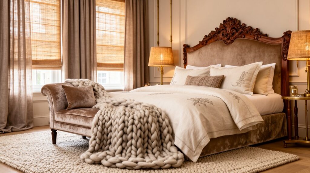

Opulent bedroom interiors hinge on layering natural textures to convey quiet luxury. You blend velvet for a focal shimmer, boucle for architectural interest, and linen for softness and breathability, then temper with warm woods in amber or chestnut. Veiled metallics add subtle glamour, while tactile bedding—from plush throws to Euro shams—anchors the palette. Keep lighting layered and adjustable to sculpt texture without glare. If you keep exploring, you’ll discover how to elevate these elements into a cohesive, enduring sanctuary.
Opulent Natural Textures: What They Do in a Bedroom
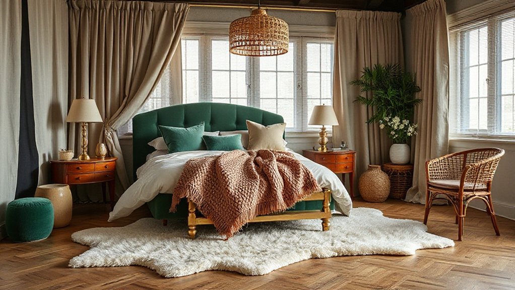
Natural textures in a bedroom do more than catch the eye; they ground the space. You choose natural textures to create depth, warmth, and a tactile anchor for rest.
Natural fibers form a quiet backbone—linen, cotton, wool, and jute—each carrying subtle variation that speaks of craft and sustainability. You’ll notice how these materials interact with light, casting soft shadows that shift with the hour.
Eco friendly finishes enhance longevity without compromising air quality, ensuring you breathe easy as you unwind.
The textures guide your senses toward calm, reducing visual noise while elevating perceived value. By integrating layered surfaces with restrained color, you preserve a refined opulence that feels both timeless and intentionally sourced.
In short, texture becomes the room’s quiet luxury.
Velvet, Boucle, and Linen: Layering Textures for Depth
Velvet brings undeniable richness, inviting you to layer it with complementary textures for depth.
Boucle adds tactile interest through pattern and structure, creating contrast when paired with smooth linens.
Linen offers subtle quiet, balancing the opulence of velvet and the coziness of boucle to finish a refined, multi-dimensional look.
Velvet’s Richness Layering
Layering velvet with boucle and linen elevates the room’s depth by balancing sheen, texture, and color, so you get a tactile, nuanced landscape rather than a flat palette. You harness Velvet textures to create focal points, while boucle adds structure and linen offers breathable contrast.
This approach emphasizes Natural layering, ensuring each fiber contributes to a cohesive whole without competing glare. You’ll notice how light interacts with pile, creating subtle shifts in tone that enrich the overall mood.
Choose a dominant velvet piece as a grounding anchor, then layer with complementary textures for depth and longevity.
- Establish a velvet anchor with restrained sheen
- Pair boucle for architectural texture
- Add linen for daylight softness
- Balance color through tonality and proportion
Boucle Texture Combinations
Textured pairings create a tactile hierarchy that guides the eye and the touch: boucle provides architectural structure while velvet delivers depth, and linen tempers both with breathable softness.
You orchestrate this trio to build room rhythm: boucle as a sculptural base, velvet as a pocket of opulent shadow, linen as a calm veil that reduces glare. Choose boucle for headboard panels or seating frames to anchor the composition, then layer velvet in cushions or a throw to intensify mood without overpowering the scheme.
Introduce linen on drapery or bedding to soften contrasts and regulate light. Attend to Boucle maintenance with gentle brushing and spot cleaning to preserve its nap and sheen.
Boucle fashion informs your approach: disciplined textures, restrained color, and deliberate pairings.
Linen for Subtle Depth
Linen adds subtle depth by diffusing light softly and tempering stronger textures without competing for attention. You’ll balance sheen and matte, allowing velvet, boucle, and linen to coexist without clash.
Linen serves as a calm backbone, grounding metallic accents and soft embroidery. Silk embroidery punctuates with refined detail, while linen’s matte surface keeps the room from feeling busy.
Faux fur accents can tuck into the edges of the scheme, adding tactile warmth without overwhelming the palette. You’ll pair linen with tonal variations to create dimension: pale stone, warm taupe, and ivory layers read as a single, cohesive field.
Focus on proportional lighting and texture rhythm to maintain sophistication and depth.
- Balance matte and sheen for depth
- Layer tonal neutrals strategically
- Introduce silk embroidery as a focal point
- Use faux fur accents sparingly for warmth
How to Select Wood Types, Finishes, and Warm Tones
When you choose wood types, consider how grain, weight, and durability set the room’s mood and longevity.
Combine finishes and textures to create contrast or harmony, from matte oaks to burnished walnut, ensuring tactile interest without overcrowding.
Pair warm tones thoughtfully—amber, honey, and chestnut—so they support your textiles and lighting, guiding a cohesive, luxuriously calm palette.
Wood Type Guide
Choosing the right wood types, finishes, and warm tones is essential to crafting a bedroom that feels cohesive and inviting. You’ll balance function and mood by selecting species that resist wear while echoing your design.
Opt for medium-density tones to avoid overpowering spaces, and pair with finishes that enhance natural grain without glare. Consider grain direction and cut for visual rhythm, and align wood with hardware and textiles for a unified feel.
Artistic expression and technological integration meet when you choose finishes that highlight character without compromising durability.
- Choose species with stable grain for longevity
- Match tones to textiles and lighting for harmony
- Use low-gloss finishes to reduce glare and age gracefully
- Integrate smart hardware and panels that reveal natural texture
Finishes and Textures
Warmth comes from intimate contrasts: a walnut bed with soft linen upholstery, ash floors with wool rugs, or maple accents paired with brass hardware. Color psychology guides the palette, aligning mood with intent—calming neutrals for rest, richer tones for drama, muted greens for subtle renewal.
Plan your furniture arrangement to maximize accessibility and flow, ensuring each piece complements others without crowding, preserving air, balance, and visual breathing room.
Warm Tone Pairings
Warm tones anchor a bedroom in inviting, durable luxury, and selecting the right wood, finish, and hue is a precise exercise in balance. You pair warm woods with cool accents to avoid heaviness, letting light reflect from polished surfaces and eco friendly fabrics.
Choose oak or maple for structure, then apply a low-sheen finish to preserve grain while softening glare. Favor honey, amber, or chestnut hues that support modern minimalist design without overpowering space.
Test stains on samples, ensuring continuity from headboard to floors. Avoid glossy veneers that shout; embrace matte or satin sheens for calm resilience.
Align textiles, hardware, and décor to sustain cohesion and longevity.
- Material pairing: warm wood + subdued textiles
- Finish guidance: low-sheen, durable
- Textile note: eco friendly fabrics
- Design aim: modern minimalist design
Veiled Metallics: Subtle Glam Without Glare
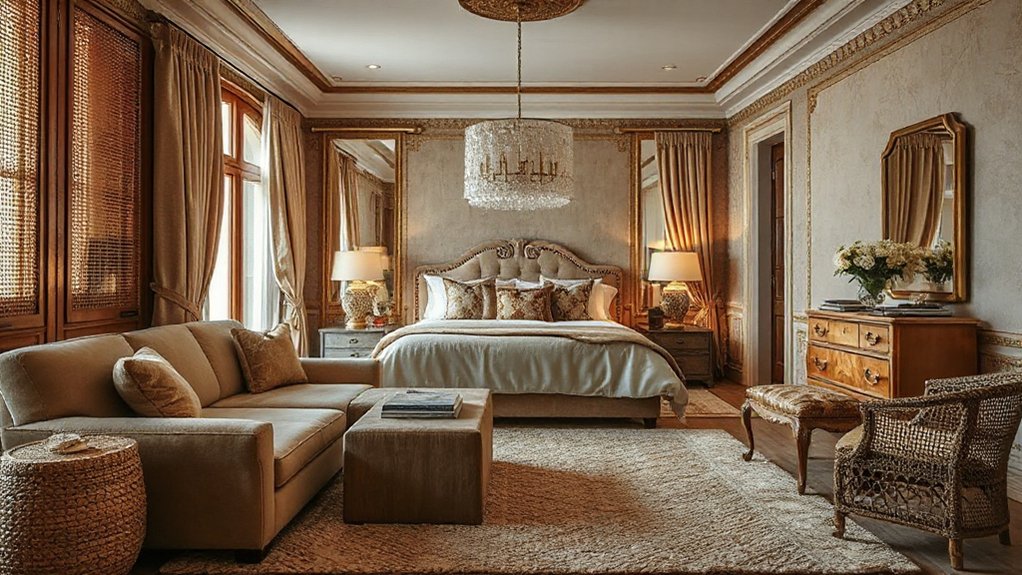
Veiled metallics offer a whisper of glamour that steadies with restraint, balancing luxe sheen against soft surroundings. You choose finishes that read as refined rather than flashy, letting light play without glare.
Pair subtle metal accents with matte textures—linen, wool, or satin—so the glow feels intentional, not loud. In lighting, favor dimmable sources and lamps with frosted diffusers to diffuse brilliance into a gentle aura.
When you apply veiled metallics, keep ratio deliberate: one or two focal pieces, plus understated hardware, create cohesion without shouting Subtle glam.
Consider palette coherence: brushed brass, antique nickel, and champagne tones harmonize with warm woods and muted textiles. The result is timeless sophistication that remains serene, contemporary, and deeply inviting.
Veiled metallics elevate, never dominate.
Texture Mapping: Where to Layer Rugs, Drapes, and Upholstery
Layering rugs, drapes, and upholstery starts with deliberate textural contrast: align rug pile and weave with the fabric’s weight to anchor the room.
Pair textured drapery with a complementary rug pattern and scale, so you weave depth without competing elements.
Focus on placement: center the rug under key furniture, allow drapery to frame windows, and let upholstery provide tactile punctuation.
Layered Rug Placement
- Establish dominant base rug size
- Add a secondary rug for zones
- Align piles for smooth shifts
- Vary textures without competing patterns
Textured Drapery Pairing
Texture mapping in opulent bedroom interiors hinges on pairing textiles that balance weight, sheen, and depth. Start by treating drapery, rugs, and upholstery as a coordinated system rather than isolated pieces. You should read the room as a single textile field, ensuring drape weight anchors the scene while rugs inject ground and scale.
Choose drapes with a slightly matte or satin finish to create textural contrast against glossy furniture and a lush, medium-to-heavy curtain for depth. Pattern mixing is deliberate: pair a subtle, tonal print with a solid upholstery base, then offset with a secondary motif in pillows rather than the drapery.
Maintain restraint by limiting colors to a cohesive palette, letting textures define contrast and sophistication.
Luxurious Wall Surfaces: Wallpaper and Paneling Ideas
Wallpaper and paneling can transform a bedroom’s mood and scale, so choose surfaces that unify color, pattern, and light. You’ll blend tactile depth with disciplined restraint, letting texture guide elegance. Favor wallpapers with subtle metallic sheens or tactile vinyls that echo natural fibers, then pair with paneling that reinforces structure without crowding space.
Vintage accents and Modern minimalism meet here: a restrained damask in a soft pewter paired with clean-lined beaded wood panels creates refined contrast. Use warm undertones to center the room, and avoid busy junctions by aligning patterns at the crown and chair rail.
The result feels cohesive, luxurious, and enduring, rather than fussy.
- Coordinated metallic sheen wallpaper with linear paneling
- Subtle damask on a neutral backdrop
- Light-reflecting surfaces for depth
- Integrated, low-contrast trim and molding
Bedding With Tactile Drama: Headboards, Throws, and Covers
To create bedding that delivers tactile drama, start with a bold headboard as a visual anchor and pair it with throws and covers that invite touch. You’ll orchestrate texture through layering: a plush, chenille throw over a silk-washed cover, a quilted panel, and a tactile Euro shams arrangement that emphasizes depth.
Consider materials that yield immediate feedback—velvet, bouclé, nubby cotton, and brushed linen—so every movement feels deliberate. Integrate cultural influences by blending global textiles—Ottoman suzani, Japanese sashiko-inspired stitching, or Moroccan kilim motifs—into throws or pillow fronts for subtle narrative.
Seasonal decor matters; swap lighter, sun-washed hues in summer with richer, saturated tones in winter, preserving coherence with the headboard. Finish with precise stitching and tailored edges to maintain disciplined silhouette and refined drama.
Lighting That Elevates Texture and Serenity
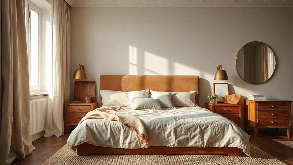
Lighting isn’t an afterthought here; it’s the essential tool that reveals texture and sets calm. In this space, you’ll pair glow with material depth, using layered lighting to sculpt nuance rather than wash surfaces.
Smart lighting adapts to mood with precise brightness and color warmth, highlighting textures in fabric, wood, and stone. Integrate unobtrusive fixtures that illuminate textiles without glare, letting shadows emphasize depth.
Balance ambient, task, and accent layers to create a serene, opulent atmosphere. Consider smart storage lighting for hidden drawers and shelves, keeping lines clean while revealing tactile details.
Timed scenes, motion sensors, and app control ensure serenity remains constant, not reactive. Your strategy centers on cohesion, control, and clarity, so texture breathes, and serenity feels effortless.
- Smart lighting
- Smart storage
- Layered ambient, task, and accent
- Discreet fixtures and controlled shadows
Color You’ll Love: Natural, Opulent Palettes
Natural, opulent palettes emerge by marrying warmth with depth, so your bedroom feels both inviting and grand. You’ll blend rich neutrals with jewel-toned accents to create contrast that reads sumptuous, not loud.
Let color psychology guide your choices: calming blues and soft greens cool spaces for rest, while warm terracotta and amber invite coziness. Balance saturated hues with lighter takeoffs—creamy whites, alabaster grays—to avoid heaviness.
Introduce metallic cues—brass, antique gold—as midtones that reflect light and add sophistication. Lighting effects matter: layered illumination enhances color perception, so use warm LEDs at 2700–3000K for cohesion, and a strategic focal lamp to highlight textures.
Keep patterns restrained, allowing textures to narrate opulence. Trust subtle shifts in tone to influence mood without overwhelming the senses.
Sustainable Choices: Natural Materials That Endure
Sustainable choices begin with select, proven materials that endure, perform, and age gracefully. You’ll choose timeless textures and durable substrates that resist wear, yet soften with patina.
Prioritize low-impact sources, certified fibers, and responsible finishes that reduce toxins without compromising beauty. Eco friendly finishes prove that longevity and aesthetics can coexist, while organic color schemes ground the room in natural harmony.
Your selections should be documented, testable, and, when possible, locally sourced to limit embodied energy. With careful planning, you create a serene, resilient haven that ages with you.
- Reclaimed hardwoods with water-based sealants
- Low-VOC paints and natural linings
- Bamboo or cork flooring, responsibly sourced
- Organic fabrics in neutral palettes and softly textured weaves
From Concept to Reality: A Step-by-Step Luxe Plan
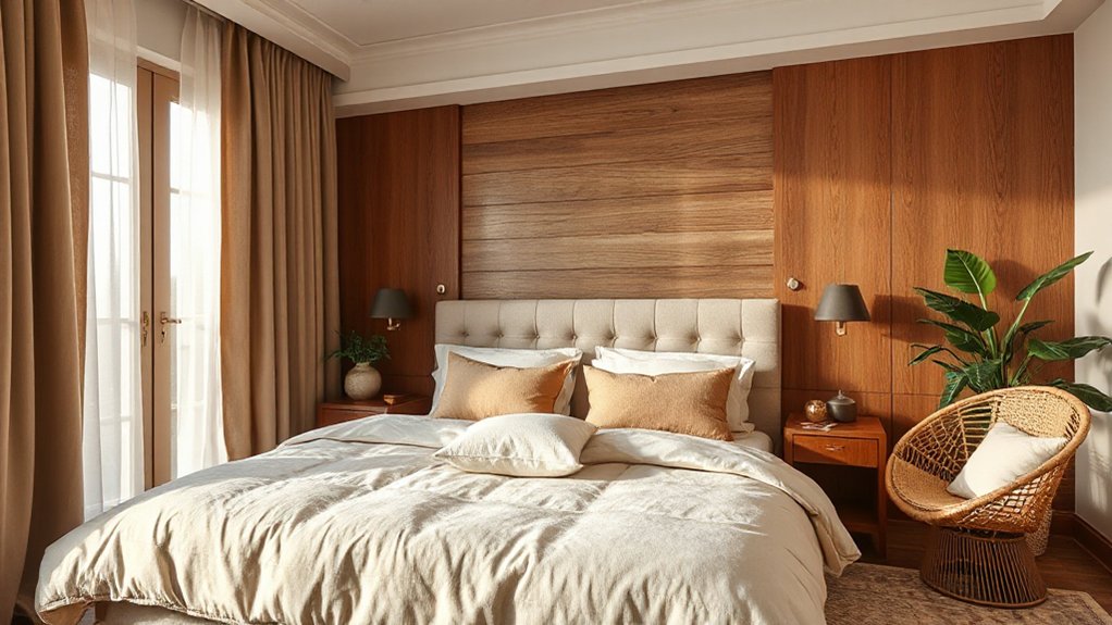
You’ve selected timeless, durable materials; now it’s time to translate those choices into a concrete, luxe plan. Begin with a precise mood board, mapping textures, tones, and proportions to your space’s scale.
Prioritize Eco friendly finishes on surfaces, selecting low-VOC paints, sealants, and waxes that endure with minimal maintenance.
Outline core pieces first: a sculptural headboard, a frame-supported bed, and storage built to disappear behind layered textiles.
Layer comfort zones thoughtfully—sleep, dressing, and retreat—then add Vintage accents to tell your story without crowding the room.
Draft a lighting scheme that alternates ambient, task, and accent layers, balancing warmth and glare.
Set a budget with phased milestones, and document decisions to guarantee every item aligns with your luxe, durable vision.
Frequently Asked Questions
How Do Textures Influence Room Acoustics in a Luxe Bedroom?
You’ll find textures control acoustics: soft textiles boost sound absorption, reducing echoes, while hard surfaces reflect. Choose layered fabrics for Sound absorption and strategic decor for Acoustic enhancement, balancing liveliness with calm, luxe comfort in your space.
Which Natural Fibers Age Best in High-Traffic Spaces?
You’ll want natural fibers like hemp and jute, which age best in high-traffic spaces. Durability considerations aside, you’ll also weigh Environmental impacts to choose resilient, low-maintenance options that maintain texture and appearance over time.
Can Layering Textures Boost Perceived Room Size Effectively?
Did you know rooms with varied textures can feel 20% larger? Layering textures boosts perceived space by creating Textural contrast and Visual harmony, so you’ll notice depth without adding floor area, as you optimize light, shadows, and balance.
What Lighting Blends Best With Matte Natural Finishes?
Smart lighting blends best with matte natural finishes, delivering gentle ambient illumination that highlights texture without glare. You should choose dimmable LEDs, warm-to-neutral temps, and subtle fixtures to preserve depth while maintaining precise, authoritative, meticulous ambiance.
How to Maintain Opulence While Staying Budget-Friendly?
You can maintain opulence on a budget by prioritizing timeless pieces, smart DIY accents, and versatile textiles. Use luxury decor staples strategically, and apply budget tips like layering textures, sourcing refurbs, and elevating with curated accessories for lasting impact.
Conclusion
To finish your opulent bedroom, you’ll blend velvet, boucle, and linen with measured wood tones and veiled metallics, layering rugs, drapes, and upholstery for tactile depth. Harness soft lighting to enhance texture, not glare, and choose a natural palette that feels timeless. Prioritize durable, sustainable materials and thoughtful placement—from rug anchors to drape fullness—to craft serenity with style. As the adage goes, slow and steady wins the race, delivering a room that ages gracefully with you.