
You can transform a compact layout from a pinch point to a smooth, everyday flow by tightening traffic paths, reducing visual clutter, and choosing multi-functional pieces. Start with sightlines thatexpand openness, hide storage in plain sight, and position zones for seamless use. Keep lighting practical and color restrained to push perceived space. It’s a steady, purposeful approach—enough to notice the difference, and just enough to push you to test the first tweak.
Key Takeaways
- Map traffic patterns and minimize bottlenecks to create clear, unobstructed routes in cooking, dining, lounging, and work zones.
- Use lighter wall colors, continuous lighting, and reflective surfaces to lengthen corridors and enhance perceived space.
- Integrate hidden, purpose-driven storage (pull-outs, toe-kick bins, lift-up bases) to keep surfaces clutter-free.
- Employ modular, multi-use furniture and wall-mounted pieces that can reconfigure without tools.
- Align sightlines with strategic lighting and minimal hardware to maintain calm, breathable layouts.
Start Here: Assess Your Compact Layout for Optimal Flow
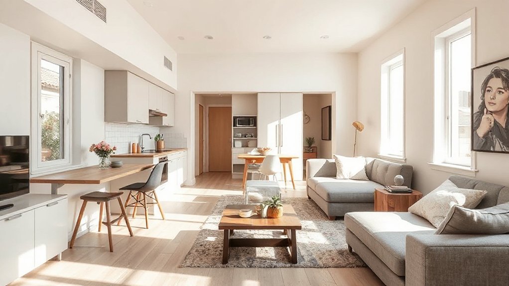
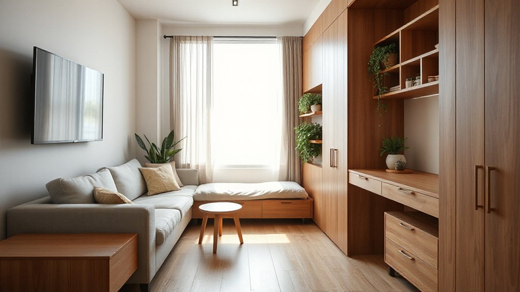
Start by taking a hard look at how your space actually flows. You’ll map traffic patterns, noting where people pause, stumble, or crowd a doorway. Identify bottlenecks, like a table that blocks a main passage or a sofa edge that forces detours.
Assess zones: cooking, dining, lounging, and work, ensuring each area has a clear, unfettered approach. Prioritize layout optimization by minimizing wasted steps and unnecessary progressions.
Swap bulky furniture for slim-profile or multiuse pieces to improve circulation without sacrificing function. Consider furniture placement that aligns sightlines and natural light, keeping walkways at least 36 inches wide where possible.
Finally, test changes with placeholders or temporary arrangements, then measure whether space efficiency improves, and adjust accordingly.
Visual Breathing Room: Grow Corridor Sightlines and Openness
Visual breathing room starts with a clear line of sight down every corridor. You’ll immediately notice how sightlines affect space perception, so prioritize unobstructed routes from entry to end uses. Keep doorways minimal and align doors with wall planes to prevent visual breaks.
Use continuous lighting, recessed fixtures, and low-profile sconces to guide the eye rather than competing textures. Choose lighter wall colors and a restrained palette to reflect light further, making corridors feel longer.
Avoid bulky furniture or tall storage at the threshold; instead, float accents away from walls to preserve openness. Mirror strategic locations at ends of halls to multiply perceived length, and trim clutter so visual breathing room stays consistent.
This focus strengthens corridor sightlines and enhances overall flow.
Hidden Storage That Feels Built-In and Accessible
Hidden storage should feel seamless, not like an afterthought. You design with purpose: drawers and panels that vanish into cabinetry, floors, and walls.
Start by choosing hidden compartments that don’t read as gimmicks—think pull-out benches with built-in totes, toe-kick drawers under appliances, and hollow stairs that store seldom-used items.
Concealed storage thrives where you already spend minutes daily, so align access with routine moments: a kitchen island lid that opens to a shallow recycle bin, a bed base that lifts to reveal seasonal gear, or a wardrobe with a silent, soft-close trap beneath.
Use uniform hardware and finishes so concealed storage reads as intentional, not accidental. Make sure labels stay minimal and exits stay accessible for quick retrieval, maintenance, and safety.
Flexible Zones: Turn Plans and Furniture Into Multi-Use Spaces
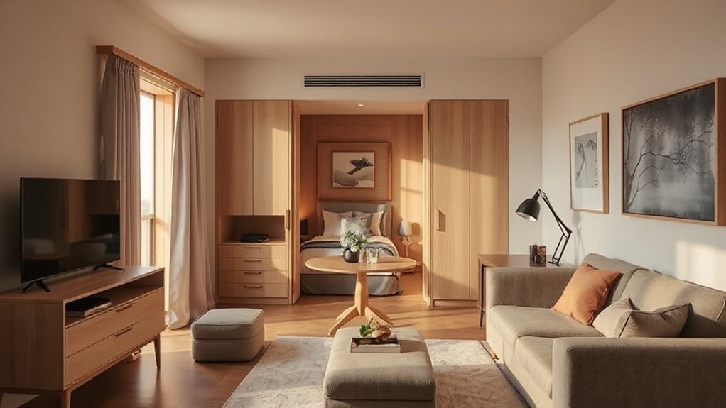
Flexible zones hinge on intentional design that morphs plans and furniture to fit daily life. You’ll fuse spaces by prioritizing flow, sightlines, and easy passages, so a living area doubles as an workspace or guest zone without clutter.
Embrace multi use furniture and modular layouts to preserve square footage while expanding function. Zone flexibility means clear boundaries when needed and seamless overlap when tasks align.
Implement smart sightlines, portable screens, and liftable surfaces to reconfigure instantly. Your aim is intent, not excess.
- Choose modular pieces that rearrange without tools
- Use screens or rugs to redefine zones on demand
- Opt for concealed storage to keep surfaces clear
Floating Furniture to Free Up Real Floor Space
Floating furniture lets you reclaim floor space without shrinking your footprint. Start with low-profile pieces that tuck under windows or between seating zones.
Use wall-mounted shelves to keep surfaces clear. Consider placement tricks like floating consoles or rail-mounted desks to maintain flow while maintaining accessible lines of sight.
Floating Furniture Tactics
Ever wish you could reclaim floor space without sacrificing style? Floating furniture tactics let you do just that, keeping surfaces usable while visually expanding the room. You’ll balance form and function, selecting pieces that tuck neatly along walls or hover above the grid of your layout.
Use wall-mounted consoles, bed frames with integrated storage, and shelves that extend above seating to create multi functional surfaces without crowding the floor.
- Clamp or wall-mount desks that fold flat when not in use.
- Choose platform beds with drawers or under-bed bins for hidden storage.
- Install slim, floating consoles that double as room dividers or laptop surfaces.
This approach prioritizes stable, accessible storage, clean sightlines, and deliberate scale.
Space-Saving Placement Tricks
You’ve got more floor left than you think when you place floating pieces smartly. Begin with wall mounted solutions to keep sightlines clear and floors unfettered. Choose floating consoles, beds, and shelves that tuck under windows or along mid‑wall zones to create defined zones without crowding.
Pair multi purpose furniture with built‑in storage so every surface earns a function while staying slim. Secure shelves high on the wall to hold frequently used items within reach, leaving lower spaces open for movement.
Use leg‑less sofas or chairs on rug edges to imply seating without footprint. Anchor tables to the wall to avoid tipping hazards and to free space for traffic.
Plan around door swings and appliance footprints to maintain flow and usability.
Built-Ins and Niches That Multiply Usable Area
Built-ins and niches aren’t decorative luxuries; they’re strategic moves that reclaim square footage. You’ll gain usable space by integrating storage into walls, beds, and desks, instead of adding freestanding clutter. Focus on clean lines, accessible heights, and dual-purpose surfaces that stay tidy with daily use.
Here are practical ideas you can implement today:
- Built-in storage under stairs or at alcoves, hidden behind doors or panels for a sleek look.
- Niche design for bathrooms and living areas that holds essentials without protruding, using adjustable shelves.
- Multi-use cabinets with pullouts, charging spots, and seating that doubles as storage.
These tactics maximize footprint while maintaining style, reducing visual bulk and improving organization.
Kitchen Tweaks: Make It Feel Bigger With Smart Geometry
You’ll shape a kitchen that feels bigger by mastering compact geometry, smart visual space tactics, and proximity workflow tricks.
Start with tight cabinet layouts, recessed lines, and mirrored or light-reflecting surfaces to visually expand every inch.
Keep circulation clear and tasks adjacent, so you sense more room without adding square footage.
Compact Kitchen Geometry
What hidden tricks can transform a compact kitchen into a smarter, more liveable space? You’ll leverage compact kitchen ergonomics and spatial efficiency with purposeful geometry, aligning work zones to minimize steps and fatigue.
Start by mapping a functional triangle between sink, stove, and fridge, then scale island size to retain clear circulation. Use continuous countertops, shallow cabinet depths, and corner optimizers to reduce dead space. Employ vertical storage and standardized drawer heights for faster access, and choose doors that swing without colliding with appliances.
- Define a tight work triangle with consistent counter heights
- Install shallow-depth cabinets and vertical organizers
- Use a narrow, multipurpose island that preserves flow
These moves keep workflows efficient, tactile, and visually uncluttered.
Visual Space Tactics
Ever wondered how small visual cues can make a kitchen feel dramatically larger? You’ll harness visual space tactics by smartly guiding sightlines and reflections. Start with cabinet and counter alignment that creates uninterrupted flows, minimizing visual clutter and echo.
Use light-reflective surfaces—high-gloss finishes or polished stone—to bounce daylight across work zones, doubling perceived depth. Introduce material contrast purposely: lighter cabinetry against a slightly darker countertop, or matte backsplashes with glossy shelves, which defines zones without heavy borders.
Consider outdoor integration where windows or doors blur indoors with the outdoors, extending the room’s boundaries. Keep hardware simple and uniform to avoid visual hiccups.
Choose recessed lighting in key tasks, avoiding bulky fixtures that compress space. End with clean edges, deliberate gaps, and breathable layouts that feel expansive without sacrificing function.
Proximity Workflow Tricks
Proximity shapes can redefine workflow as much as layout. You optimize the kitchen by aligning zones so every movement counts, not every step adds up. Small shifts in distance cut trips, boost space perception, and speed tasks, reinforcing space optimization and workflow efficiency.
- Zone adjacency: place prep near the fridge and sink to minimize fetches and backtracks.
- Counter primacy: keep the main work surface within arm’s reach of all stations, reducing reach time.
- Doorway flow: tuck doors and drawers to avoid jams; a clear corridor speeds transitions between tasks.
This approach demands deliberate placement, durable finishes, and a habit of re-evaluating routes after minor changes. You’ll gain measurable gains in clutter control and daily cadence.
Lighting and Color to Expand Perceived Space
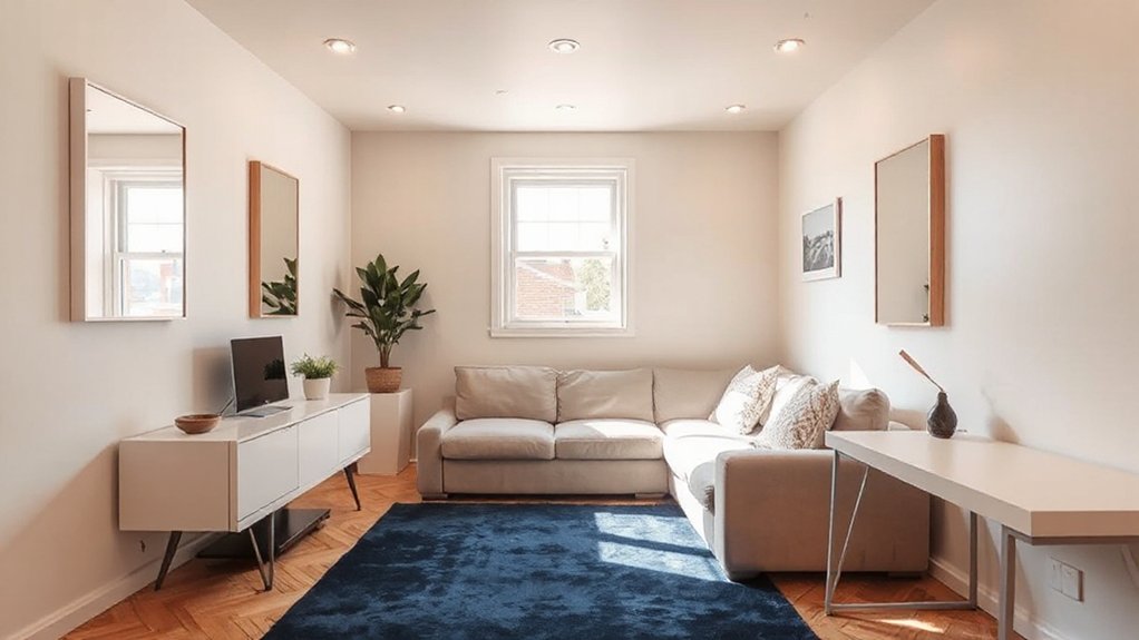
Lighting and color are your most powerful tools for making a space feel larger, and using them with purpose pays off quickly. In tight rooms, choose light sources that deliver an even ambient glow without harsh hotspots. Prioritize diffuse fixtures, recessed lighting, and wall washes to bounce light across surfaces, widening perceived depth.
Keep ceilings white or near-white to reflect more light upward, which visually lifts the room. Use a cohesive color palette with low-contrast gradations; avoid heavy, saturated accents that break the line of sight. Employ color psychology by selecting airy hues—off-white, pale blues, soft greens—that soothe and visually expand.
Test color samples in natural light for several days before committing, and document how brightness shifts with time. Practical tweaks beat flashy statements for lasting spaciousness.
Task Lighting and Adaptive Zones for Daily Life
Task lighting isn’t an afterthought in a well-designed space—it’s a processed, daily tool. You’ll gain efficiency by defining adaptive zones that shift with your routine, not against it. Place fixtures where you stand to perform tasks, then layer ambient light to reduce glare. The goal is clarity without fatigue, so you’ll want dimmable options and color temperatures that suit each zone.
Create task lighting near work surfaces, reading nooks, and kitchen prep areas to prevent shadows.
Implement adaptive zones with wall sconces, under-cabinet strips, and floor lamps that can be silenced or brightened as needed.
Use smart controls and sensors to automate transitions between work, cooking, and relaxing modes.
task lighting, adaptive zones keep daily life smooth and focused.
The Collapsible and Fold-Away Furniture Playbook
When space is at a premium, collapsible and fold-away furniture becomes a daily efficiency tool, not a gimmick. You’ll prioritize pieces that transform without effort: a dining table that folds into a wall panel, a sofa that converts to a bed, and ottomans that stash flat trays or seasonal gear.
Look for solid mechanisms, quiet hinges, and reliable latches that don’t rattle. Favor multifunctional furniture with built-in storage, so every inch earns a second life.
Design notes matter: clearances around folded forms, smooth glide drawers, and labeled positions reduce guesswork. Choose compact desks with wall-mount options and beds with underframe storage.
This is space efficient design in practice—lean, durable, and ready for daily reconfiguration. Your room stays calm, organized, and ready for action.
Finishing Touches: Lighting, Acoustics, and Climate for Comfort
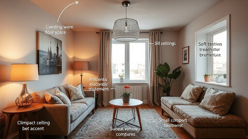
Ever wonder how the right lighting, acoustics, and climate tweaks can turn a space from functional to comfortable in minutes? You’ll balance sources, control glare, and set a steady, breathable environment.
Focus on ambient ambiance with warm, dimmable light layers and task lighting where you read or work. Achieve acoustic comfort by using soft furnishings, rugs, and plants to reduce echoes.
Monitor temperature with a smart thermostat, zoned heating, and breathable fabrics that prevent stuffiness.
1) Light layering and control: dimmers, color temperature, and placement
2) Sound management: soft textures, strategic speaker or white-noise placement, and door seals
3) Climate harmony: consistent heat/cool cycles, humidity balance, and air movement
These tweaks keep compact homes livable without clutter.
Frequently Asked Questions
How Can I Prioritize Flow Without Sacrificing Storage?
You should prioritize flow by choosing multi functional furniture that tucks away storage and creates clear sightlines, shaping routes with visual continuity.
Use integrated zones—sofa with hidden drawers, bed nooks with shelves—so you don’t lose square footage.
Keep doorways and pathways unobstructed, and mirror walls or same-toned surfaces to knit spaces together.
Aim for consistent finishes, compact scales, and furniture that folds or stacks, ensuring every piece earns its keep.
What Scale Should Furniture Be for Narrow Rooms?
For narrow rooms, aim for furniture around 0.6 to 0.8 of the room’s width in major pieces. Then use lighter, cantilevered silhouettes.
Prioritize vertical storage and slim profiles to preserve flow. Focus on furniture proportions that keep sightlines open, and choose scale balance between seating and tables so you don’t crowd the space.
You’ll get better circulation when you test scale with a tape measure and room templates.
How Do I Maintain Acoustics With Concealed Storage?
You maintain acoustics with concealed storage by lining walls with soundproof panels and sealing gaps with acoustic caulking. Picture a quiet storm cellar: sturdy panels absorb, caulked seams seal every breath.
Choose dense materials, mount panels behind cabinetry, and guarantee doors have soft-close mechanics to minimize slams.
Add decoupled shelves to break sound paths, and vent gaps with acoustic foam baffles.
Regularly check seals, reapply caulk, and balance air exchange to keep rooms calm.
Can Lighting Tricks Mislead Room Height Perception?
Yes, lighting tricks can mislead room height perception. You’ll notice ceiling illusions work best when you balance brightness and shadows: use brighter ceiling lighting and softer wall light to push the eye upward.
Or employ recessed lighting along the edges to elongate walls. Use lighting techniques that avoid harsh contrasts, and keep fixtures slim.
In practice, test angles, measure glare, and adjust trims until the space reads higher without glare or flatness.
What Budget-Friendly Materials Maximize Perceived Space?
Choose budget-friendly materials like light-colored paints, laminate, and vinyl that reflect light and feel bigger, while keeping costs low.
Use a cohesive color palette with soft neutrals and pops of color in decorative accents to create depth without clutter.
Opt for mirrors and glossy surfaces to bounce daylight.
Prioritize slim-profile furniture and multi-functional pieces.
Install simple, affordable molding or trim to elevate space perception.
You’ll maximize perceived space without overspending.
Conclusion
You’ve learned the tricks, now wield them like a wizard with a budget. When your hallway breathes, your coffee table vanishes into perception, and every fold-away clue hides more than it reveals, you’ll swear the square footage grew a ghostly inch. So yes, keep lines clean, zones flexible, lights wicked smart, and storage smugly invisible. If a compact home can act like a mansion, congratulations—you’ve achieved architectural cosplay with a sensible bill of materials. Enjoy the illusion, responsibly.