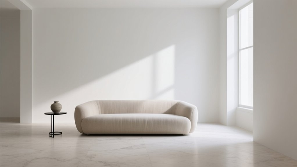

Negative space is the intentional “breathing room” you keep around furniture, along sightlines, and through circulation, so your home feels calm, curated, and high-end. You’re not leaving rooms empty—you’re controlling proportion and focus, which matters in compact UK layouts. Keep walkways clear (aim for 900mm), pull key pieces off walls, and leave margins around hero items so marble, oak, limewash, and brass stand out. Next, you’ll see simple rules to judge exactly how much is enough.
Key Takeaways
- Negative space is deliberate breathing room that improves proportion, balance, and sightlines, creating calm, elevated interiors rather than “empty” rooms.
- It frames hero materials and sculptural pieces, producing gallery-like contrast and a curated, minimal look associated with quiet luxury.
- Maintain clear circulation and thresholds with at least 900mm walkways, keeping entry-to-window sightlines open for effortless flow.
- Balance visual weight by spacing furniture intentionally: 10–20cm around small items and about 60cm around primary pieces.
- Use lighting to articulate voids: dimmable washes soften corners, concealed LEDs trace architecture, and tight-beam spots highlight focal objects.
What Is Negative Space in Interior Design?
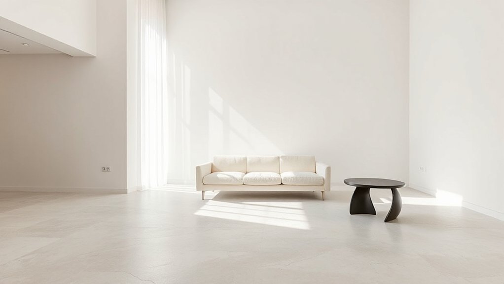
Where does a room’s calm, considered feel actually come from? It comes from negative space: the deliberate areas you leave unfilled so furniture, light, and architecture can breathe. You create it with clear circulation routes, generous margins around key pieces, and restraint in accessories.
It isn’t “empty”; it’s a tool that controls proportion, balance, and sightlines, especially in UK homes where compact plans and period features compete for attention. Use Color psychology to support it: quieter neutrals and softened contrasts make gaps feel intentional, while saturated tones demand more breathing room.
Acknowledge historical influences too—Georgian symmetry, Victorian layering, and modernist clarity all frame how you perceive space today. Define what stays out, and everything you keep reads better.
Why Negative Space Looks High-End
How does a room instantly read as “expensive” even when it isn’t packed with statement pieces? You control the eye with Negative space, giving key forms room to breathe and land with confidence. That restraint signals curation, not compromise, which is why high-end schemes feel calm, not cluttered.
In UK homes, where footprints are often tight, you’ll get a premium look by editing hard: fewer silhouettes, stronger proportions, and cleaner sightlines.
Let materials do the talking—veined marble, oak, limewash, brushed brass—then frame them with gaps and margins. You’ll also heighten contrast: one sculptural chair against an open wall reads like a gallery.
This is artistic minimalism at its most persuasive, and it photographs brilliantly too.
Negative Space vs. Empty Rooms: The Difference
That high-end calm only works when the “space” you leave behind feels deliberate, not like you’ve just not finished the room. Negative space is composed: it frames a hero piece, controls sightlines, and lets materials breathe, so your eye lands with purpose.
An empty room, by contrast, reads as unresolved; proportions feel off, acoustics turn harsh, and the Emotional impact becomes flat or anxious rather than serene. You create negative space through considered scale, balance, and placement, not by removing furniture at random.
In the UK, where many homes run compact, intentional restraint signals confidence, while emptiness can highlight awkward corners or poor storage planning. Cultural interpretations matter too: some clients equate spareness with luxury, others with lack—so you must design the “gap” as a feature.
Quick Rules for “Enough” Negative Space
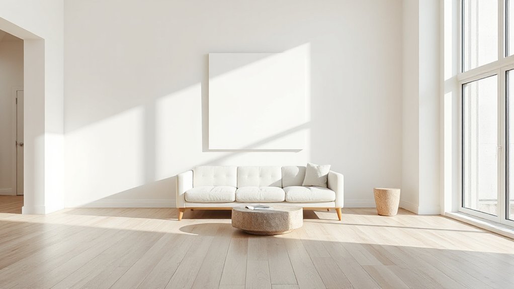
You’ll know you’ve got enough negative space when the room’s visual weight feels balanced, not lopsided by one bulky zone or overstuffed corner.
Give your key pieces room to breathe—so the sofa, dining table, or hero armchair reads as intentional rather than crammed.
Keep sightlines clear from doorways and main walkways, and the space will feel calmer, bigger, and more premium in typical UK room proportions.
Balance Visual Weight
Three quick checks will tell you whether you’ve left enough negative space to balance visual weight. You’re aiming for aesthetic balance and visual harmony, not emptiness. Use these fast tests before you buy another accessory or repaint.
- Squint at the room: if one side “pulls” harder, reduce pattern, contrast, or cluster size there.
- Photograph from the doorway: if the focal zone reads instantly, you’ve distributed weight well; if not, simplify the busiest quadrant.
- Track heights: balance tall items with lower, longer silhouettes so your eye doesn’t snag at one level.
- Mind colour value: dark finishes (walnut, black metal) weigh more; offset them with lighter walls, rugs, or glazing.
In typical UK terraces and flats, keep circulation lines clear so the layout reads calm.
Let Key Pieces Breathe
When a room starts to feel “full” rather than finished, it’s usually because the key pieces don’t have enough breathing room. Give your hero items—sofa, dining table, bed, statement chair—clear perimeter space so they read as intentional, not squeezed in.
Aim for 10–20cm around occasional pieces and at least 60cm around primary furniture where you’ll stand, pull out chairs, or open drawers.
Keep one focal surface per zone largely empty: a sideboard, console, or mantel should carry one strong object, not five small ones.
Use a Minimalist approach to styling: edit to the best, then stop. Treat clutter reduction as a design decision—add concealed storage, and keep accessories in odd numbers with generous gaps.
Keep Clear Sightlines
Space around hero pieces sets the stage, but clear sightlines make the whole room feel calm and coherent. In UK homes—often narrower terraces and compact new-builds—your layout must protect view corridors from door to window and between key zones. A minimalist approach isn’t about emptiness; it’s about uninterrupted flow and legibility.
- Keep main walkways at least 900mm, and don’t let furniture pinch them.
- Align taller pieces (wardrobes, bookcases) to one wall so they don’t interrupt lines of vision.
- Choose low-profile sofas and open-base tables to keep floor and window views open.
- Edit surfaces: one tray on the console, one object on the coffee table, nothing in between.
If you can scan the room in one glance, you’ve nailed clear sightlines.
How Negative Space Reduces Visual Stress
Although bold colours and layered textures can look striking, too many competing elements force your eye to work overtime, which is exactly where negative space earns its keep. When you leave breathing room around furniture, art, and lighting, you reduce visual noise and let proportions read clearly, especially in compact UK terraces and modern flats.
You’ll notice the effect immediately: open wall sections, uncluttered surfaces, and generous floor reveal create a calmer rhythm as you move through a room. Negative space stops you from slipping into mindful clutter, where every shelf becomes a display and nothing feels resolved.
It also supports sensory calming by lowering contrast points and giving your gaze places to rest. Keep colour and material changes deliberate, and allow repetition to do the heavy lifting. Your space feels quieter, cleaner, and more elevated.
Plan Focal Points Before You Add Space
Before you add negative space, you’ve got to define the room’s primary anchor—often the fireplace, a key window, or the sofa wall in UK layouts.
Then you map secondary visual stops, so artwork, lighting, and occasional pieces lead the eye without competing.
Finally, you balance circulation and sightlines, keeping walkways clear and views intentional so the space feels calm, premium, and functional.
Define The Primary Anchor
If you want negative space to feel intentional rather than empty, you’ve got to define a primary anchor first. Choose the one element that earns visual priority, then let everything else breathe around it. This aligns with core Design principles: hierarchy, proportion, and balance.
Use Color psychology to control emphasis—warm tones advance, cool tones recede, and high contrast commands attention. In UK homes where rooms often run compact, a clear anchor stops open space reading as “unfinished” and keeps sightlines calm.
- Pick one hero: fireplace, statement sofa, or artwork.
- Fix its position first, ideally on a strong axis.
- Set a tight palette so the anchor dominates without clutter.
- Allocate clear margins around it—your negative space becomes the frame.
Map Secondary Visual Stops
Once you’ve locked in your primary anchor, map two or three secondary visual stops so your negative space guides the eye rather than leaving it to wander. Choose stops with clear hierarchy: a sculptural side table, a single artwork, or a tall plant that punctuates a quiet wall.
Keep each moment distinct in scale and material so it reads instantly in UK homes where rooms often work hard and run compact.
Use creative spatial arrangements to place these accents on implied lines from the anchor, not randomly. Then apply minimalist design principles: limit colour repeats, edit accessories, and let voids frame the object.
You’ll create rhythm without clutter, and every pause will feel intentional, premium, and calm.
Balance Circulation And Sightlines
Although negative space reads as “nothing,” it only feels premium when you plan the room’s focal points around circulation and sightlines. You’re not “adding emptiness”; you’re directing movement and attention, so every pause looks intentional.
Build spatial awareness by plotting routes from entry to seating, then anchoring views to one hero element—fireplace, artwork, or a sculptural pendant—without blocking the line of travel. In UK homes where rooms run tighter, keep door swings, radiators, and bay windows in the layout, not as afterthoughts.
Design simplicity lands when you edit obstacles before you edit objects.
- Mark primary walkways at 900mm minimum.
- Place focal points on axis with doorways.
- Keep furniture below key sightlines.
- Leave a “breathing zone” around statement pieces.
Use Negative Space to Frame Focal Points
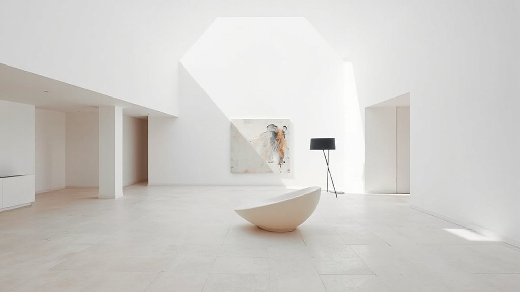
When you give a focal point breathing room, it reads as intentional rather than accidental. Pull surrounding furniture back and let one hero element—fireplace, statement sofa, or art—own the composition. This is how you achieve Minimalist aesthetics without making a room feel sparse.
Control spatial hierarchy by reducing competing objects and tightening what remains. Centre the feature, then frame it with symmetry or deliberate imbalance: two slimmer side tables, a single sculptural chair, or a clear wall plane. Use contrast to sharpen focus—matte plaster behind brass, pale oak against inky paint, textured boucle on clean-lined seating.
In UK homes, where rooms can be compact, edit accessories and scale up one piece; the void around it becomes your luxury.
Open Up Walkways With Negative Space
You can use negative space to keep circulation paths clear, so moving from hallway to living area feels effortless in a typical UK layout.
Pull furniture back from door swings and pinch points, and you’ll create uncluttered passageways that guide you naturally through the room.
When walkways stay open, the space reads larger, calmer, and more considered.
Clear Circulation Paths
Because circulation dictates how a room actually performs day to day, negative space becomes your most reliable tool for keeping walkways clear and intuitive. In UK homes, where footprints can be tight, you’ll get a more elevated feel by editing furniture placement, not adding more storage.
Let open floorplans breathe by protecting a consistent passage line between key points, and use hidden niches to pull necessities off the route without crowding it.
- Keep at least 900mm clear where people pass most.
- Float sofas and tables off walls only if you preserve a straight line.
- Angle armchairs away from routes; don’t force sidesteps.
- Choose slim-profile pieces and wall-mounted lighting to free floor area.
You’ll move naturally, guests won’t hesitate, and the room reads calmer.
Uncluttered Transition Zones
Clear circulation sets the main route; uncluttered passageways keep the supporting spaces—doorways, landings, and the gaps between seating and dining—from becoming bottlenecks. Treat these transition zones as intentional negative space, not leftover floor. You’ll move better, and the whole plan will read calmer and more premium.
Use a Minimalist approach: remove console tables that pinch hall widths, keep radiators and shoe storage flush, and wall-mount lighting to free surfaces. Maintain clutter free zones by limiting décor to one focal piece and routing cables out of sight.
In UK homes, where terraces and flats run tight, aim for clear sightlines and a consistent 900mm+ walkway where possible. Let thresholds breathe, and every room feels larger.
Right-Size Furniture for Negative Space
Although negative space can look effortless, it only works when the furniture is scaled correctly to the room’s footprint and ceiling height. Nail furniture proportions and you’ll preserve spatial proportion without your home feeling sparse or undersized.
In UK terraces and new-build flats alike, choose pieces that visually anchor the room while leaving clear, intentional gaps around them.
- Pick a sofa depth that suits your room: deep seats can swamp compact lounges.
- Match coffee-table width to seating so it reads deliberate, not lost.
- Use taller storage in high-ceilinged rooms to avoid a “floating” look.
- Keep leggy, lighter-profile pieces for smaller spaces; they maintain air and sightlines.
Measure before you buy, and prioritise fewer, better-scaled items over extra add-ons.
Layout Moves That Create Instant Breathing Room
Once you’ve got furniture that fits the room’s proportions, the next win comes from how you place it. Pull key pieces off the walls and float them to define zones, leaving clean perimeter circulation that reads calmer in typical UK room footprints. Keep a clear sightline from doorway to window; it boosts Spatial perception and makes even a compact terrace feel longer.
Anchor seating to a rug, but let at least 20–30 cm of floor show around it to signal intentional negative space. Edit pathways to one strong route rather than multiple meanders, and align edges—sofa, coffee table, sideboard—for visual order.
Finally, group functions: reading, dining, working. Strong zoning reduces clutter, sharpens purpose, and heightens Emotional impact instantly.
Give Art and Objects Room to Breathe
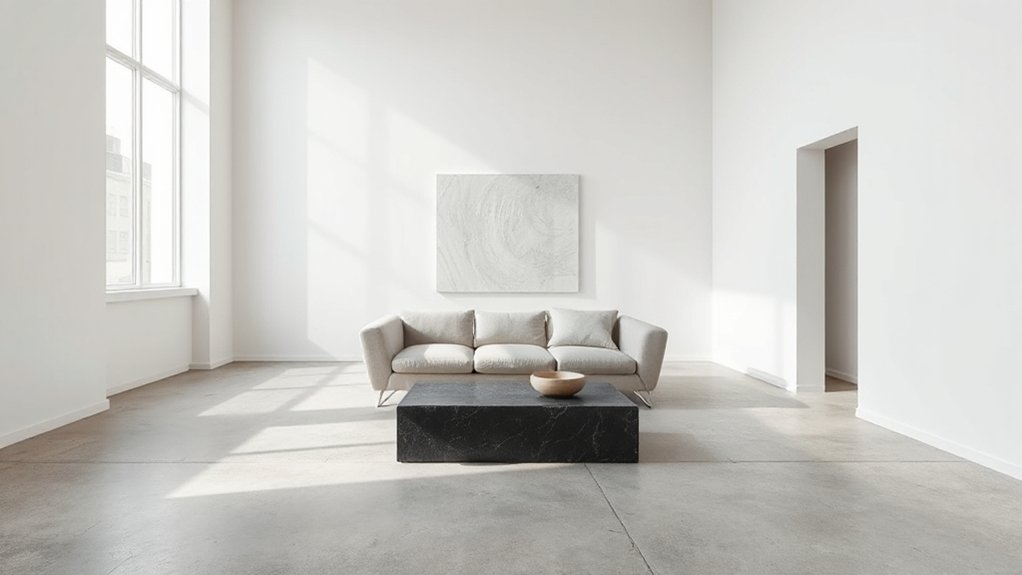
When you give art and objects proper negative space, they stop reading as clutter and start functioning as focal points. You curate, rather than decorate, and your room feels calmer, more intentional, and closer to artistic minimalism without looking sparse.
Use these moves to keep spatial harmony while showcasing what you own:
- Hang one statement piece per wall zone and leave a clean margin around it.
- On shelving, group objects in odd numbers, then stop—don’t “fill the gap”.
- Give sculptures and lamps their own surface area; avoid sharing side tables.
- Edit regularly: if it doesn’t earn attention, store it or swap it out.
In UK homes where rooms run tight, this restraint makes every artwork look more premium.
Let Materials Stand Out With Negative Space
After you’ve given art and objects room to breathe, apply the same restraint to your finishes so the materials can do the talking. Choose one hero surface—veined marble, brushed oak, honed limestone—and keep surrounding planes quiet. When you limit competing patterns, you’ll notice depth: the grain shift in timber, the soft chalkiness of limewash, the warmth of aged brass.
Use negative space to frame joins and proportions, not to strip character. Specify slimmer grout lines, cleaner skirting details, and continuous floor runs so natural textures read as intentional, not busy.
Keep decorative accents deliberate and sparse: a single sculptural handle, one refined rug, or a restrained splashback. In UK homes where square footage is precious, this approach makes rooms feel calmer, richer, and more architectural.
Use Lighting to Activate Negative Space
Although negative space looks like “nothing,” lighting turns it into an intentional part of the scheme. You control what recedes and what reads as featured by shaping Ambient shadows and establishing clear Spatial hierarchy.
In UK homes, where daylight shifts fast and rooms run compact, layered lighting keeps the ‘quiet’ areas purposeful rather than dead.
- Use dimmable ceiling wash to soften corners, so walls breathe without going flat.
- Add concealed LED in coves or joinery to trace voids and sharpen proportions.
- Place a tight-beam downlight to halo a single object, letting surrounding space stay calm.
- Introduce a warm table lamp on a sideboard to pull depth through the room after dusk.
Keep glare low and angles deliberate.
Use Color Contrast to Strengthen Negative Space
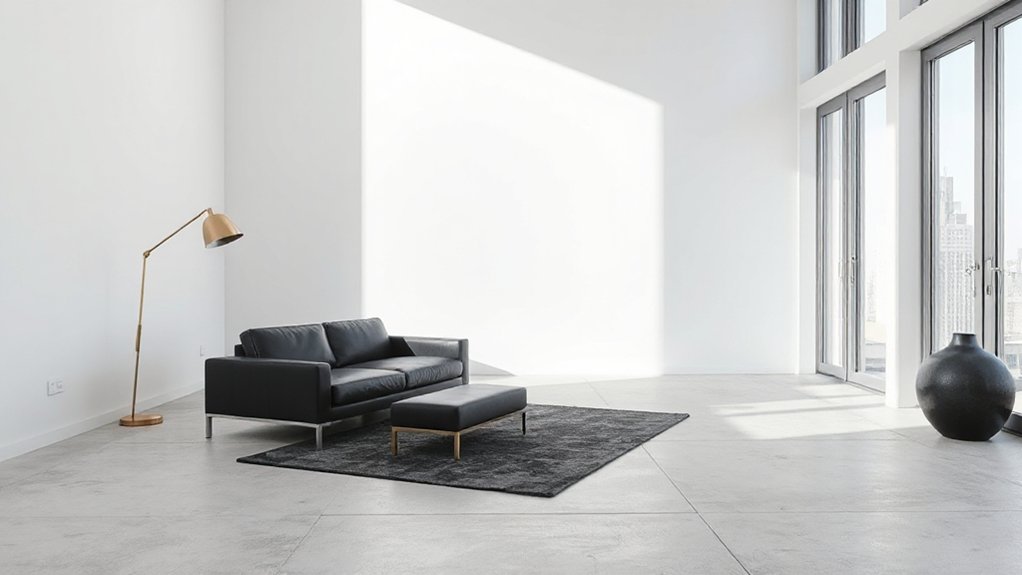
You can sharpen negative space by using high-contrast colour pairings—think ink black against crisp white—to lock the eye onto what matters.
If you prefer a calmer UK-ready scheme, keep it monochrome and introduce one bold accent to define pauses without clutter.
Control the dark–light boundary with disciplined paint lines, joinery breaks, and soft furnishings so the void reads intentional, not empty.
High-Contrast Color Pairings
When you pair light and dark with intention, negative space stops feeling like “empty” and starts reading as a crisp design element.
In UK homes where daylight shifts fast, high-contrast pairings help rooms hold their shape from morning glare to evening lamplight, and colour psychology lets you steer mood without clutter.
- Use chalky off-white walls with inky joinery to frame voids around doors and alcoves.
- Put warm black against pale oak; the Material contrast makes gaps look deliberate, not accidental.
- Balance a deep navy sofa with a light wool rug so circulation zones stay visually open.
- Keep edges sharp: matte paint beside satin lacquer, or plaster next to metal, so the “breathing space” reads intentional.
Monochrome With Bold Accents
A monochrome base—think warm whites, soft greys, or deep charcoals—creates clean negative space that reads calm in changeable UK light. Then a single bold accent gives it structure. Choose one confident note—cobalt velvet, oxblood lacquer, or a mustard armchair—and repeat it sparingly so the voids stay intentional, not empty.
Use Color psychology to steer mood: blue sharpens focus in a home office, red energises a dining nook, and yellow lifts north-facing rooms. Keep saturation high but quantity low; you’re designing pauses as much as objects.
Build Texture contrast into the monochrome field—matte paint against brushed metal, boucle beside smooth stone—so the accent doesn’t have to shout. Finish with tight sightlines and edited surfaces.
Dark-Light Boundary Control
Although UK daylight shifts hour by hour, crisp control of the dark–light boundary keeps negative space reading deliberate rather than flat: set bright walls against deeper joinery, specify high-contrast skirting and architraves, or frame a pale sofa with a charcoal rug so edges stay legible. You’re not chasing drama; you’re sharpening proportion and calm.
Use contrast harmony so the eye rests on what matters, not on muddled passages. Keep finishes matte or eggshell to avoid glare in south-facing rooms, and deepen tones in north light to stop whites looking chilly.
Try:
- Pair warm white with inky blue cabinetry.
- Run a dark dado to anchor tall ceilings.
- Add black metal details to outline voids.
- Use layered lamps to tune the boundary.
Negative Space Checklist (Living, Bed, Kitchen, Bath)
If you want negative space to feel intentional rather than accidental, you need a room-by-room checklist that turns “less” into a clear set of design choices. Use negative space psychology: you’re reducing visual load so the eye can rest, and key pieces read as premium—just like negative space in outdoor spaces frames planting and patios.
Living: keep one clear sightline from entry to window; float the sofa, and limit accessories to one grouped vignette.
Bedroom: leave two bedside surfaces bare; choose wall lights to free tabletops; keep 600mm circulation each side.
Kitchen: edit worktops; store small appliances; maintain one uninterrupted run of cabinetry, handleless if possible.
Bathroom: specify recessed storage, wall-hung WC/vanity, and one statement tile zone only.
Frequently Asked Questions
How Do I Maintain Negative Space in a Home With Kids?
You maintain negative space by zoning play areas, using closed storage, and editing weekly. Apply child proofing minimalism with wipeable finishes and rounded edges. Implement clutter control strategies: labelled baskets, rotation toys, clear surfaces.
Can Negative Space Work in Maximalist or Eclectic Interiors?
Yes, negative space can thrive in maximalist or eclectic interiors if you curate with intent. You’ll avoid Balancing clutter by grouping collections, keeping clear sightlines, and ensuring Visual breathing via margins, calm walls, and edited vignettes.
What Are Budget-Friendly Ways to Create Negative Space Without Renovations?
Declutter, curate, breathe: you’ll create negative space cheaply by editing surfaces, grouping décor, and leaving gaps. Aim for minimal clutter and strategic placement. Use trays, relocate surplus to storage, and repaint with tester pots.
How Does Negative Space Influence Home Staging and Resale Value?
You’ll boost staging and resale value by using negative space to make rooms feel larger, calmer, and premium. Apply colour psychology and spatial balance to guide buyers’ focus, photograph better, and support stronger UK offers.
Which Interior Design Styles Benefit Most From Negative Space?
Minimalism, Scandinavian, Japanese, and contemporary styles benefit most; test the theory and you’ll see rooms feel larger, calmer, premium. You’ll lean on Minimalist color palettes and Open floor plans—ideal for UK terraces and flats.
Conclusion
Negative space doesn’t mean you’ve under-furnished; it means you’ve edited with intent. You trade clutter for calm, noise for nuance—so your oak grain, marble veining, and brushed brass read like luxury, not leftovers. In a London flat or a Cotswolds cottage, you let circulation breathe and light travel, turning “nothing” into presence. Keep one clear focal point, leave generous margins, and you’ll make every piece look considered, costly, and quietly confident.