
You’ll blend old and new seamlessly by choosing one anchor piece—an antique sideboard or modern sofa—and letting its scale, finish, and doorway sightline set the rules. Keep a timeless palette: two neutrals (stone, taupe, grey) plus one accent (navy, green, oxblood), repeated three times. Use 60/30/10 to control eras, and repeat 2–3 materials like oak, brass, and linen. Balance visual weight, then unify with a single dominant rug, centred art, and layered lighting. Keep going to refine the mix.
Key Takeaways
- Choose one anchor piece that sets the tone, then echo one detail like finish, color, or hardware in supporting items.
- Build a restrained palette of two neutrals plus one accent, repeating the accent in three places for cohesion.
- Balance scale and proportions across eras by matching visual mass, leg heights, and aligning key lines like rails or cornices.
- Use the 60/30/10 rule to control mixing: base layer, secondary era pieces, then small punchy accents.
- Repeat materials and textures—limit to two metals and three woods—then layer linen, wool, and ceramics to unify old and new.
Choose Your Anchor Piece (Old or New)
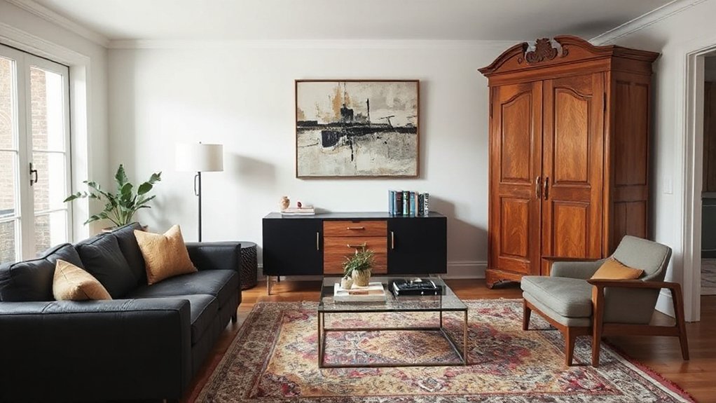
Whether you start with a vintage find or a brand-new buy, choose one anchor piece that sets the tone for the entire room and build everything else around it. Anchor selection works best when you pick a high-impact item you’ll keep: a Victorian sideboard, a mid-century sofa, or a crisp contemporary dining table from a UK maker. Judge it by scale, function, and sightline from the doorway, not just charm.
Then lock in its finish and silhouette as your reference point for every later choice. Create controlled Style contrast by pairing old timber with clean-lined upholstery, or a modern lacquer piece against worn brass and patina. Keep the anchor dominant, and let supporting pieces echo one detail—colour, leg shape, or hardware.
Use the 60/30/10 Rule to Mix Eras
Once you’ve set your anchor piece, stop mixing by instinct and give the room a clear ratio: 60/30/10. Treat 60% as the dominant era—often your big-ticket furniture in the sitting room.
Use 30% to introduce a second period through supporting pieces, such as a Victorian sideboard with a contemporary sofa, or a mid-century credenza beside a Georgian mirror.
Keep the final 10% for punchy accents that deliver timeless elegance without visual noise, creating eclectic harmony.
- 60%: Base layer—sofa, rug, curtains, main lighting.
- 30%: Secondary era—occasional chairs, tables, bookcases.
- 10%: Accents—art, cushions, ceramics, hardware, objets d’art.
Pick a Color Palette That Spans Time
Start with a timeless neutral foundation—chalky whites, warm greys, stone, or soft taupe—so Victorian mouldings and sleek contemporary lines sit comfortably together.
Then choose era-bridging accent colours such as inky navy, heritage green, oxblood, or muted ochre to connect antiques with new pieces without making the room feel themed.
Keep the palette tight and repeat accents across paint, textiles, and artwork so you’re blending decades, not competing styles.
Timeless Neutral Foundations
Because trends cycle faster than most redecorating budgets can keep up, you’ll get the most seamless blend of old and new by anchoring the room in timeless neutrals. Choose tones that feel at home in a Georgian terrace or a new-build flat, and you’ll avoid a dated finish.
Look to British Historical context—limewash, stone, and putty shades—and respect Cultural significance by echoing the restrained palettes seen in period joinery and heritage plasterwork. Keep undertones consistent across walls, woodwork, and larger upholstery so disparate pieces read as one scheme.
- Warm off-whites (chalk, ivory) to soften modern lines.
- Greiges and fawn to bridge oak, walnut, and painted timber.
- Charcoal and inky taupe for visual structure without heaviness.
Era-Bridging Accent Colors
While your neutral base does the heavy lifting, you’ll get a convincing old-meets-new look by choosing accent colours that have appeared in British interiors across decades rather than in one fleeting trend cycle. Favour heritage tones that read well against both Georgian mouldings and contemporary joinery: oxblood, navy, racing green, saffron, and muted teal.
Apply Accent colors with discipline—repeat one in three places (cushions, lampshade lining, framed print) so it feels intentional, not themed. Use era contrast by pairing a classic shade with a modern finish: high-gloss navy on a sleek sideboard, or matte oxblood on a traditional panelled door.
Keep metals coherent—antique brass with warm colours, chrome with cool—and limit yourself to two accents plus one wild card.
Repeat 2–3 Materials for a Cohesive Look
If you want a room that feels intentionally blended rather than pieced together, repeat just two or three key materials across both your vintage and contemporary pieces. Choose anchors that suit British homes: oak, brass, and linen work from Georgian terraces to new-build flats.
Keep Material textures consistent—say, matte timber, warm metal, and woven cloth—then let silhouettes vary without visual noise. Use Pattern mixing with discipline: echo one motif scale or colour family, but ground it in the same cloth or finish.
- Timber: match an antique sideboard to a modern shelf in similar grain tone.
- Metal: repeat aged brass in taps, picture frames, and lighting.
- Textile: carry linen or wool through curtains, cushions, and an upholstered chair.
Balance Scale and Visual Weight
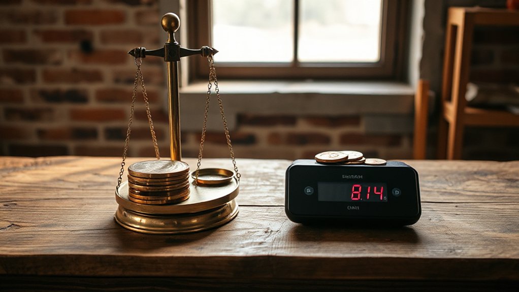
Balance scale and visual weight by matching visual mass across eras, so a hefty Victorian sideboard is countered with an equally substantial contemporary sofa or joinery.
Repeat key proportions—leg height, cornice lines, or picture-rail alignment—so old and new read as one considered scheme.
Anchor the room with clear focal points, such as a period fireplace or a modern pendant, and let everything else support it rather than compete.
Match Visual Mass
Even when you’re mixing eras, you need the room to feel evenly anchored, so match visual mass as deliberately as you match colours or finishes. Start with historical context: a hefty Victorian sideboard can carry a sleek contemporary pendant, but only if you counter its weight elsewhere. Use design symmetry as a guide, not a rulebook, so the space reads composed rather than staged.
- Map the heavy hitters: fireplaces, bookcases, and deep sofas; then offset them with a pair or a grouped cluster opposite.
- Balance height and footprint: a tall armoire needs a broad, low run nearby—think benching or a wide rug.
- Control contrast: dark timber, dense upholstery, and chunky silhouettes demand lighter counterparts in glass, pale paint, or open-leg pieces.
Repeat Key Proportions
Once you’ve matched the room’s visual mass, keep it feeling cohesive by repeating key proportions across old and new pieces. Track Proportion ratios: if your Victorian sideboard is long and low, choose a modern media unit with a similar width-to-height relationship, even if the detailing differs. Echo leg thicknesses, arm depths, and tabletop overhangs so nothing looks out of scale.
You’ll get Scale harmony by standardising heights: align lamp shades with picture rails, keep sofa backs near existing sill lines, and repeat chair seat heights around the table. Use a tape measure, not guesswork, and note centimetres.
Where you mix eras, keep one dimension consistent—width, height, or depth—so the room reads intentional, not accidental.
Anchor With Focal Points
- Set one primary anchor: fireplace, bay window, or statement artwork; give it breathing room.
- Add a secondary counterweight: a modern floor lamp, bold rug, or sideboard to steady proportions.
- Finish with tertiary accents: brass, books, and ceramics that echo materials without competing.
Layer Textures to Blend Vintage and Modern
While a vintage sideboard and a sleek new sofa might clash at first glance, layered textures will make them feel like they belong in the same room. Start with a grounded base: a wool or jute rug in a muted British palette to bridge eras.
Then layer textures through upholstery and soft furnishings—think boucle on the modern piece, linen on dining chairs, and a velvet cushion to echo antique polish.
Add Vintage textiles such as a Welsh tapestry throw or a reworked suzani, keeping colours tied to one tight scheme.
Introduce contrast with metal and glass: a brushed brass lamp beside aged oak, or a smoked-glass vase on marble.
Finish with tactile ceramics and matte paint for calm cohesion.
Edit Ruthlessly: Avoid Cluttered “Collected” Rooms
If you want old and new to sit comfortably together, you’ve got to curate, not collect. Decide what earns pride of place, then edit the rest so every piece has breathing room.
Define a clear focal point in each room—mantel, artwork, or a statement sofa—and keep everything else supporting it, not competing.
Curate, Don’t Collect
Although a “collected” look feels effortless, it only works when you curate with intent—so treat your room like an edit, not a dumping ground. Start by auditing every piece for purpose, condition, and proportion. If it’s chipped, wobbly, or never used, it’s not “character”; it’s noise.
Let Antique furniture earn its place through craftsmanship, patina, and scale, then use Modern accessories to sharpen the mix without multiplying objects.
- Set a strict palette: two neutrals plus one accent, and stick to it.
- Limit repeats: no more than three woods, two metals, and one dominant pattern.
- Edit seasonally: box surplus decor, then rotate like a gallery.
You’ll get restraint, not randomness, and a room that reads considered.
Define Clear Focal Points
Where does your eye land the moment you walk in—on a hero piece, or on a scatter of “nice bits”? Decide your Focal point first, then make every other choice support it. In a UK sitting room, that might be a restored Victorian fireplace, a bold modern sofa, or a single large artwork.
Build a clear Design hierarchy: one primary anchor, two secondary supports, then quiet background. Edit ruthlessly. If a side table, lamp, and vase all compete, remove one and scale up another.
Group smaller antiques on a tray; don’t pepper them across every surface. Keep sightlines clean around doorways and bay windows. Limit mixed metals and timber tones to two dominant finishes so old and new read intentional, not accidental.
Use Rugs and Art to Unite the Room
How do you make a Georgian sideboard and a sleek contemporary sofa look like they belong in the same room? You anchor both with a considered rug and disciplined art placement. Start with textile layering: a wool flatweave under a softer pile, scaled so front legs sit on it, instantly linking eras.
Then apply color coordination: pull two to three tones from the sideboard’s timber and the sofa’s upholstery, and repeat them in the rug border and artwork.
- Choose one dominant rug, then add a smaller accent rug to define a reading nook.
- Hang art at 145 cm centre-line, and echo frames across old and new pieces.
- Use a gallery wall to mix etchings with contemporary prints, keeping spacing consistent.
Update Vintage Pieces With Modern Hardware or Paint
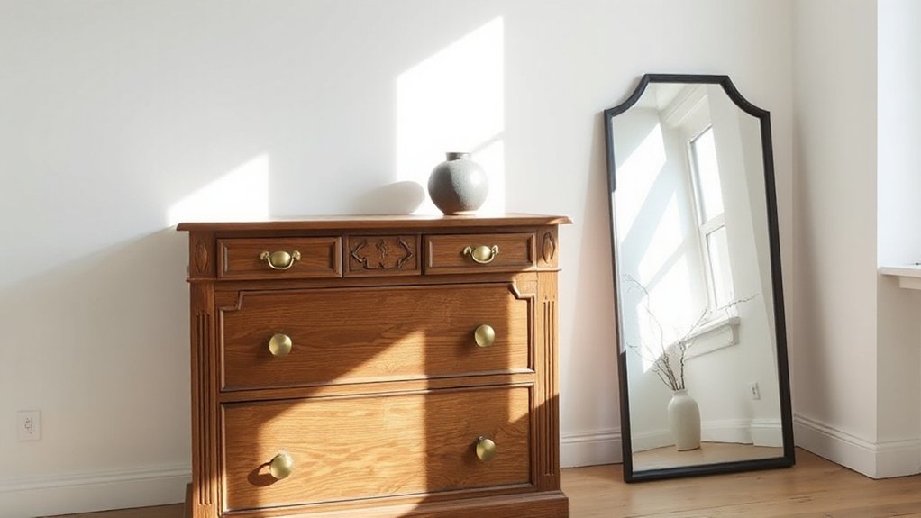
Once your rugs and art have tied the room together, bring the furniture itself into the same conversation by updating vintage pieces with modern hardware or paint. Swap tired brass for matt black or brushed nickel pulls, keeping proportions similar so drawers still sit neatly.
On Georgian or mid-century sideboards, choose slim bar handles to sharpen lines without erasing Vintage charm.
If paint’s the better fix, prep properly: degrease with sugar soap, key surfaces with 120–180 grit, then use a bonding primer. Finish with durable eggshell or satinwood for a contemporary UK look, and paint interiors a tonal contrast for controlled Modern updates.
Keep original feet, locks, or maker’s stamps where possible, so the piece reads authentic rather than “upcycled” from scratch.
Modern Lighting: The Fastest Way to Freshen a Space
Certainly, nothing refreshes a room faster than modern lighting, because it changes both the mood and the way every finish reads. In UK homes, you’ll get the cleanest upgrade by layering light: ceiling, task, and accent, all on separate circuits where possible.
Choose LED fittings with high CRI so timber, brass, and painted surfaces look true, not flat. Prioritise Energy efficiency with A-rated lamps and dimmable drivers to cut running costs without sacrificing warmth.
Add Smart technology via app-controlled scenes, occupancy sensors, and tunable white to shift from crisp morning work light to relaxed evening glow.
Focus on proportion: slimmer pendants over tables, discreet spots on beams, and wall lights that graze textured plaster.
- Statement pendant
- Layered dimming
- Smart scenes
Common Old-Meets-New Mistakes (and Quick Fixes)
Even if you’ve picked the right mix of period and contemporary pieces, a few predictable missteps can still make the room feel like a showroom clash rather than a deliberate blend. First, don’t scatter Antique furniture like museum props; group two or three pieces and anchor them with one modern item, such as a slimline sofa or steel-legged coffee table.
Second, stop letting mismatched patterns fight for attention. Keep one hero print, then repeat its key colour in two quieter textiles (think cushions and a wool throw) to create rhythm.
Third, avoid scale errors: a delicate Georgian side table beside an oversized sectional looks lost—swap in a taller lamp or larger artwork to balance height.
Finally, unify finishes: choose one warm metal (aged brass) or one cool metal (chrome) throughout.
Frequently Asked Questions
How Do I Authenticate a Vintage Piece Before Buying It?
You authenticate a vintage piece by checking provenance, maker’s marks, materials, and wear, then comparing against catalogues. For Vintage authentication and Antique verification in the UK, request invoices, consult a reputable dealer, and get appraisals.
What’s the Best Way to Insure Valuable Antiques in a Modern Home?
Get specialist UK home and contents cover with agreed value, itemised schedules, and professional valuations, updating annually. Prioritise Antique preservation and Modern integration by fitting alarms, locks, and humidity control, then document condition and storage.
How Can I Childproof or Pet-Proof Fragile Vintage Furniture?
In UK homes, 1 in 5 A&E visits involve children—so anchor vintage pieces, add corner guards, and fit anti-slip pads. For Child safety and Pet protection, use museum wax on ornaments and protective throws.
Are There Tax or Appraisal Considerations When Selling Inherited Antiques?
Yes—you’ll face Estate tax and valuation issues, so complete the Appraisal process first. You’ll need written provenance, condition notes, and auction comparisons. Declare gains using probate values; keep HMRC-ready records and invoices for liabilities.
How Do I Handle Lead Paint or Asbestos Risks in Older Furnishings?
Assume hazards until tested: arrange a UKAS-accredited survey, avoid sanding or drilling, and follow Lead safety guidance. If asbestos is suspected in linings or boards, stop work and book licensed Asbestos removal professionally.
Conclusion
When you blend old and new, you’re curating, not decorating. Start with one anchor, then use the 60/30/10 rule to keep the mix disciplined. Stick to a time-spanning palette and repeat two or three materials—oak, brass, linen—to make the room read as one. A dealer in Portobello once told me the best rooms feel like a well-cut blazer: heritage cloth, modern lining. Swap in contemporary lighting and you’ll instantly sharpen everything else.