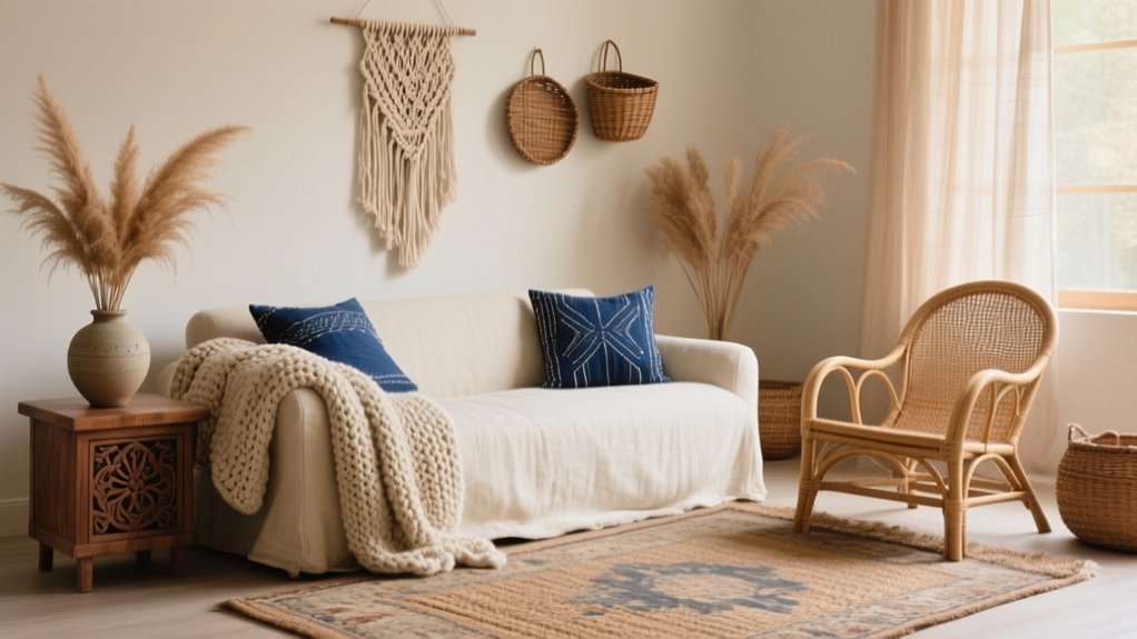

Start by locking in 2–3 base textures—soft linen/cotton, structured rattan/oak, and grounded jute/wool—then keep a warm-neutral palette (cream, sand, taupe) with 2–3 earthy accents repeated across textiles. Layer piles and patterns with control: one large-scale anchor, one medium motif, and small accents, mixing flatweave, loop, and plush. Balance finishes using a 60/30/10 smooth-nubby-chunky ratio, and echo leather, wood, and aged metal twice. Next up, you’ll see common mistakes to avoid.
Key Takeaways
- Choose 2–3 base textures (linen/cotton, rattan/oak, jute/wool) to anchor every later layer and keep the space cohesive.
- Build a warm neutral palette, then repeat 2–3 earthy accent tones across textiles to create depth without visual clutter.
- Mix pile heights and weaves—flatweave, loop, plush—while limiting patterns to one geometric and one global print in coordinated colors.
- Layer rugs with a large neutral base and a smaller statement top rug, keeping the top edge 8–12 inches inside for intentional zoning.
- Balance finishes using 60/30/10 (smooth/nubby/chunky) and repeat each texture at least twice to avoid a chaotic, overlayered look.
Pick Your 2–3 “Base” Textures First
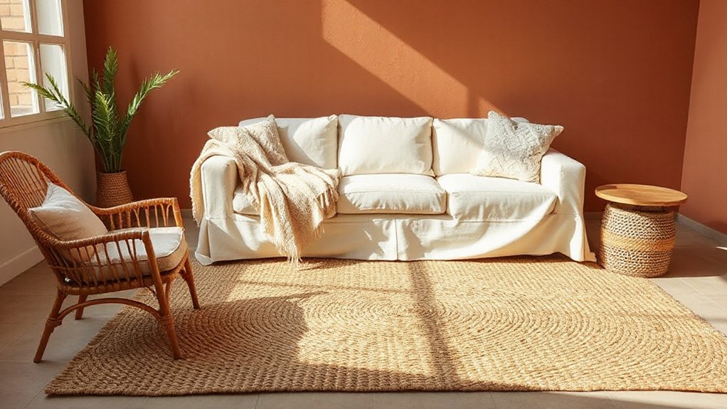
Before you start piling on pattern and color, lock in 2–3 base textures that will carry the room: one soft (like washed linen or cotton), one structured (such as rattan, cane, or light oak), and one grounded (think jute, wool, or a low-pile vintage-style rug).
Treat these as your spec, not decoration, so every later choice reads cohesive. Use Color contrast to keep the bases legible: pair pale linen with honey oak, or creamy cotton with darker jute.
Then align furniture selection to those anchors—choose a sofa with a matte, tactile weave, a coffee table with visible grain, and a rug with a tight, durable loop.
You’ll get depth without visual noise and simplify sourcing across brands.
Learn the Simple Boho Texture-Layering Formula
Start with natural fibers—linen, cotton, jute, rattan—because they set a breathable, modern-boho baseline and keep the palette grounded.
Then you’ll layer in pattern via a limited motif mix (like one geom + one global print) so the look reads curated, not chaotic.
Finish by mixing piles—flatweave, loop, and plush—across rugs, throws, and cushions to build depth and contrast without changing your color story.
Start With Natural Fibers
When you build a boho room around natural fibers—jute, sisal, linen, cotton, rattan, cane—you get a texture base that reads intentional rather than messy.
Start at floor level with a flatweave jute or sisal rug to set grip and scale, then echo that fiber in a rattan chair, cane-front cabinet, or woven basket so the room feels coherent.
Choose linen or cotton slipcovers for breathable performance and a relaxed drape that still looks tailored.
To keep it trend-right and responsible, prioritize sustainable textiles: organic cotton, European flax linen, or recycled-fiber blends with low-impact dyes.
Check rub counts for upholstery, and use tight weaves in high-traffic zones.
Finally, balance rough with smooth by adding one matte ceramic or raw-wood surface.
Mix Patterns And Piles
Even if you keep your palette tight, you can make a boho space feel rich by stacking patterns and piles with a simple ratio: anchor + secondary + accent. Choose one large-scale anchor (e.g., a kilim rug), add a medium motif secondary (striped throw), then finish with small accents (embroidered pillows) for controlled pattern pairing. Keep two patterns geometric and let one go organic to avoid visual noise.
Now dial in pile arrangement: place the lowest pile underfoot (flatweave), add mid-pile seating texture (bouclé or woven pouf), and top with high-pile touches (shag cushion, faux shearling).
Stagger pile heights within arm’s reach, not room-wide, so the layers read intentional, not chaotic. Repeat one color across all three tiers for cohesion.
Choose a Boho Color Palette That Supports Texture
Start with grounding neutrals—warm white, sand, taupe—as your base so your woven, nubby, and carved textures read clean and intentional.
Then layer earthy accents like terracotta, olive, rust, or clay to add depth without overpowering the tactile mix.
Keep a pattern-friendly balance by limiting bold hues to small doses and repeating 2–3 key tones across textiles so prints stack without visual noise.
Grounding Neutrals First
Although boho style loves color, you’ll get the most impact from texture if you anchor the room with grounding neutrals first—think warm whites, oatmeal, sand, clay, camel, and soft taupe in a tight, cohesive range. This neutral foundation keeps layered materials from reading chaotic and lets weave, pile, and grain do the visual work.
Pick one dominant neutral for walls and large upholstery, then assign one to two supporting tones for rugs, drapery, and casegoods. Use undertones as your control variable: keep them consistently warm so linen, boucle, rattan, and oak don’t clash.
For clean color coordination, standardize sheen levels too—matte walls, low-luster textiles, and softly burnished metals—to prevent sparkle from competing with texture. Photograph swatches together in natural light before committing.
Earthy Accents For Depth
Once your neutral base is locked in, layer in earthy accents—terracotta, rust, ochre, olive, and deep umber—to add depth without flattening the textures you’ve built. Use them as calibrated hits: a clay table lamp, aged-brass hardware, or a cognac leather pillow that warms up linen and boucle.
Keep saturation medium and finishes matte to softly absorb light and emphasize relief. Repeat each tone 2–3 times across heights—floor, midline, and eye level—so the room reads intentional, not scattered.
Prioritize organic materials like terracotta, jute, walnut, rattan, and stone; their natural variation makes color feel dimensional. If a shade feels heavy, shift it to smaller objects or a single anchor piece, then balance with lighter neutrals nearby.
Pattern-Friendly Color Balance
For pattern coordination, cap your accent colors at two and standardize undertones (all warm or all cool). Use one high-contrast motif as the lead, then scale down to mid and micro patterns in adjacent tones.
If you want trend-forward boho, add a muted jewel (oxidized teal or dusty plum) in small doses via pillows, ceramics, or art.
Finish by matching black/bronze lines to unify mixed weaves and prints throughout.
Balance Chunky, Nubby, and Smooth Finishes
When you mix chunky, nubby, and smooth finishes with intent, your boho space reads curated instead of chaotic. Start by assigning each finish a job: Chunky finishes anchor, Nubby textures add mid-level visual noise, and smooth surfaces create breathing room.
Aim for a 60/30/10 ratio—smooth as the dominant field, nubby as the secondary layer, chunky as the accent.
Distribute texture by sightline: place chunky low (tables, stools, baskets), keep nubby at touch height (pillows, throws), and reserve smooth for high-visibility planes (walls, large casework) so light can bounce.
Repeat each finish at least twice, then cap the mix with one consistent sheen level to avoid glare.
Mix Soft and Structured Boho Materials
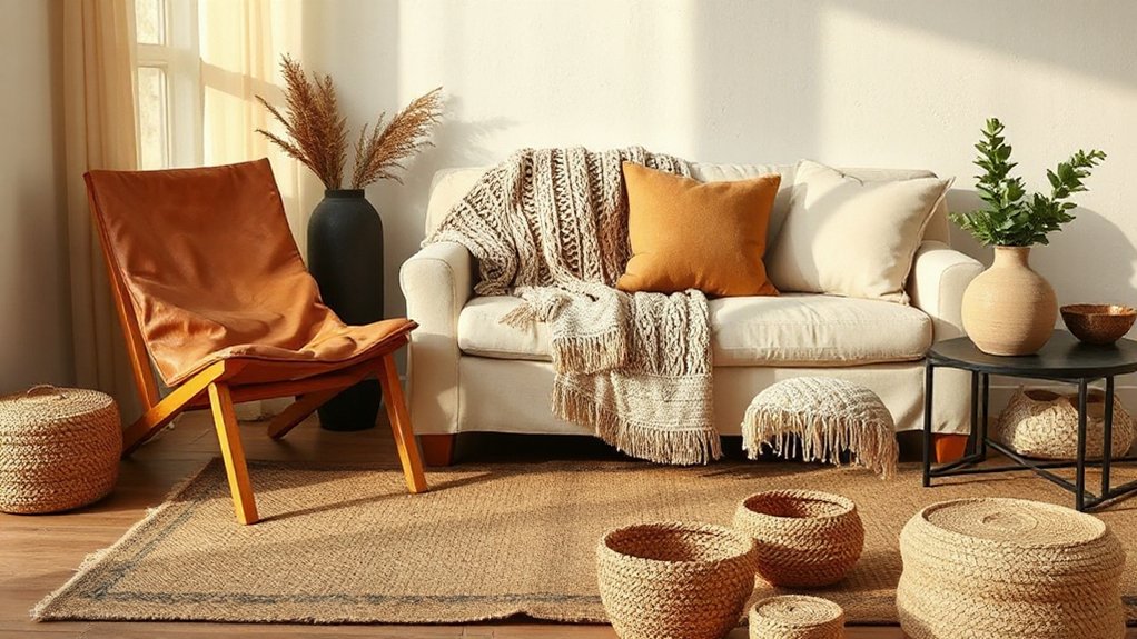
Although boho style leans relaxed, you’ll get a more intentional look by pairing soft, drapey materials with structured pieces that hold a clean silhouette. Start with a tailored anchor—like a boxy linen sofa, cane chair, or clean-lined oak bench—then add movement using gauzy curtains, slub cotton throws, or a relaxed slipcover.
Use contrasting fabric textures deliberately: boucle against smooth leather, velvet next to raw canvas, or macramé over crisp percale. Keep your palette tight so the texture contrast reads modern, not messy.
Practice layering material weights: place heavier weaves low (bench cushions, seat upholstery) and lighter textiles higher (shams, window panels). Finish with structured accents—ceramic lamps, woven baskets, or metal side tables—to keep edges defined.
Layer Rugs for Instant Boho Depth
Structured furniture and mixed fabric weights set the foundation; rug layering locks in the boho depth underfoot. Start with a large, low-pile neutral as your anchor, then add a smaller statement rug to introduce textural contrasts without visual chaos. Keep the top rug’s edge at least 8–12 inches inside the base rug so the stack reads intentional, not cramped.
Use layering techniques that solve real layout problems: define zones in open plans, soften acoustics, and correct scale under seating.
- Pair flatweave jute with a vintage-style printed wool for high/low texture balance.
- Offset the top rug to break symmetry and guide traffic paths.
- Match tones across rugs, but vary pattern density to avoid moiré.
Add Pillows and Throws in Varied Weaves
If you want the room to feel collected rather than decorated, build your softness layer with pillows and throws in varied weaves. Mix a nubby bouclé, a slubbed linen, and a low-pile velvet to create micro-contrast without changing your color story.
Keep Pillow patterns in the same palette but vary scale: pair a tight stripe with an oversized block print and one solid to rest the eye.
For Throw textures, stack weights intentionally—light cotton gauze for drape, chunky knit for loft, and a flatwoven wool for structure.
Aim for a 60/30/10 distribution across solids, mid-patterns, and bold accents.
Finish by rotating pieces seasonally and keeping two backups to swap fast, cleaning on schedule.
Use Curtains and Bedding for Airy Texture
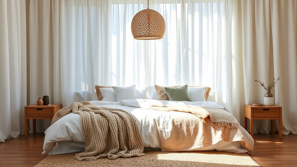
You’ll get an instant airy layer by pairing sheer curtains with a second, heavier panel—think gauze or linen sheers under cotton canvas—to control light diffusion and privacy without visual weight.
For bedding, mix lightly textured staples like a washed-linen duvet, a matelassé coverlet, and crisp percale sheets so the bed reads dimensional but still breathable.
Keep the palette tight and let the weave contrast do the work, which is on-trend for modern boho.
Sheer Curtain Layering
Although sheer layers look effortless, they work best when you treat them like a lighting tool: hang floor-to-ceiling sheers on a double rod so they sit behind a heavier panel and diffuse glare without killing the view.
For Sheer curtain layering, choose a weave that matches your room’s sun path—voile for soft north light, linen gauze for hotter exposures—so fabric transparency stays intentional, not washed out.
Mount the rod 4–6 inches above the frame and extend it 8–12 inches past each side to prevent light leaks and widen the window visually.
Aim for 2x fullness for a relaxed boho ripple, then heat-set hems for a crisp drop.
Light control without blackout heaviness.
Privacy by day while keeping depth.
Movement that animates neutral palettes.
Lightly Textured Bedding Mix
When your curtains already filter light into a soft wash, let bedding carry the same airy texture so the room reads layered, not busy. Choose textured bedding with low-relief weaves: washed linen, cotton matelassé, or a waffle blanket. Keep the base smooth (percale or sateen) so tactile pieces register without feeling heavy.
Build fabric layering in three weights: sheet, coverlet, and throw. Match undertones to your sheers—warm ivory, sand, or muted clay—then add contrast through stitch density, not loud prints. Use a quilted sham or two, but skip overstuffed euro pillows; they block the “floaty” look.
Finish with a lightly fringed lumbar and a gauzy bed scarf to echo curtain drape while staying breathable.
Bring In Rattan, Jute, and Other Natural Fibers
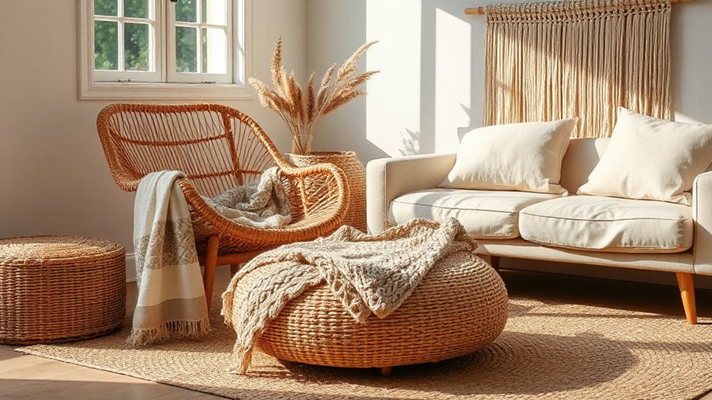
To ground a boho-inspired room with tactile warmth, mix in natural fibers like rattan, jute, seagrass, and cane, which add visible weave and low-sheen texture without introducing extra color noise.
Anchor the floor with a tight-loop jute rug, then layer open natural fiber weaves in baskets and shade fixtures to create depth across planes.
Choose rattan furniture with clean silhouettes so the pattern reads modern, not themed, and keep gaps between pieces for visual breathability.
Prioritize performance by selecting tightly bound weaves in high-traffic zones and looser weaves where hands touch less.
- Use repeated weave scales to keep the mix cohesive
- Offset hard lines with rounded cane and seagrass forms
- Let fibers do the contrast; keep textiles neutral and matte
Add Leather, Wood, and Aged Finishes
Where can you add instant depth without piling on patterns? Start with Leather accents: a saddle-toned lumbar pillow, a sling chair, or wrapped drawer pulls. Leather’s low-sheen surface reads warm and grounded, and it bridges woven fibers with harder materials.
Next, layer wood in mixed grains—walnut, oak, or mango—keeping undertones consistent (warm with warm, cool with cool). Use one dominant wood, then add smaller pieces for contrast, like a carved stool or floating shelves.
Finish with aged finishes to bring that collected, boho-craftsman edge: distressed brass, blackened steel, or weathered frames. Place them at touchpoints—lamp bases, hardware, mirror rims—so the patina shows up in everyday sightlines and feels intentional.
Avoid These Boho Texture-Layering Mistakes
Leather, mixed woods, and aged metals add instant depth, but boho texture goes sideways fast if you layer without a system. Don’t stack three loud weaves in one sightline; balance high-pile with flatweave and leave one “rest” surface, like plaster or linen. Keep your palette tight, then vary sheen and scale so the room reads intentional, not chaotic.
Watch your proportions: one hero textile per zone, two supporting textures max. Use Vintage art as an anchor; if everything competes, nothing lands. Metallic accents should punctuate, not dominate—think thin frames, hardware, or a single hammered tray.
- Contrast pile, scale, and reflectance
- Repeat one material every 6–8 feet
- Edit by removing the noisiest layer first
Frequently Asked Questions
How Do I Layer Boho Textures in a Small Apartment Without Clutter?
Layer boho textures by limiting to three key materials, using Textural contrasts in rugs, throws, and baskets, and keeping negative space. Use Color coordination via a tight palette, and swap seasonal accents, not piles.
What’s the Best Way to Layer Boho Textures on a Tight Budget?
You win on a tight budget by foraging like a fox: thrift, swap, and DIY. Prioritize Layered textile accents (throws, rugs) and add Textured wall art (woven hangings). Limit to three materials, repeat colors, and rotate seasonally.
How Do I Make Boho Texture Layering Work With Minimalist Furniture?
Make boho texture layering work with minimalist furniture by keeping silhouettes clean and adding modular textiles. Use Textural contrast via woven throws, jute rugs, rattan accents. Maintain Color coordination with a tight neutral palette, matte finishes.
How Can I Layer Textures While Keeping the Space Easy to Clean?
You keep it easy to clean by choosing washable, closed-weave textiles, slipcovers, and modular rugs. Like a traveler packing light, you curate textural contrast and fabric combinations—performance linen, leather, jute—then vacuum fast, spot-clean often.
How Do I Incorporate Boho Textures if I Have Pets or Allergies?
You’ll incorporate boho textures by choosing Pet friendly fabrics like tightly woven cotton, leather, or performance velvet, plus Allergen free materials like washable wool alternatives. Use low-pile rugs, removable covers, HEPA vacuuming, and frequent laundering.
Conclusion
You’ve got all the tools to layer boho textures like a pro: start with 2–3 base finishes, follow a simple mix of chunky + smooth + airy, and keep your palette tight so texture does the talking. Blend soft textiles with structured pieces, then anchor it with rattan, jute, leather, wood, and aged patina. Think of each layer like a well-tuned playlist—different tones, one vibe. Skip overstuffing and mismatched scales.