


Timeless interior design hinges on principles, not fads. You prioritize function, balance, and a calm, durable backdrop built on neutral foundations, with warmth from thoughtful textures and strategic contrast. Anchor spaces with well-proportioned furniture, align with clean lines, and use age‑worthy materials that gain character over time. Layer lighting, respect sightlines, and define zones for flow. Personalize with restrained accents and vintage touches that add meaning. If you want deeper guidance, you’ll uncover more practical steps below.
Key Takeaways
- Prioritize function and enduring materials; let purpose anchor design beyond trends and allow materials to age gracefully.
- Use neutral, calm backdrops with selective contrast from warm woods and textured fabrics for timeless depth.
- Maintain balanced scale, sightlines, and a visual triangle to create serene, cohesive interiors.
- Layer lighting and textures, align fixtures with architecture, and avoid ornamentation that distracts from honesty of materials.
- Personalize with restrained, meaningful accents, while regular maintenance preserves space integrity and calm.
What Makes Design Timeless: Core Principles Over Fads
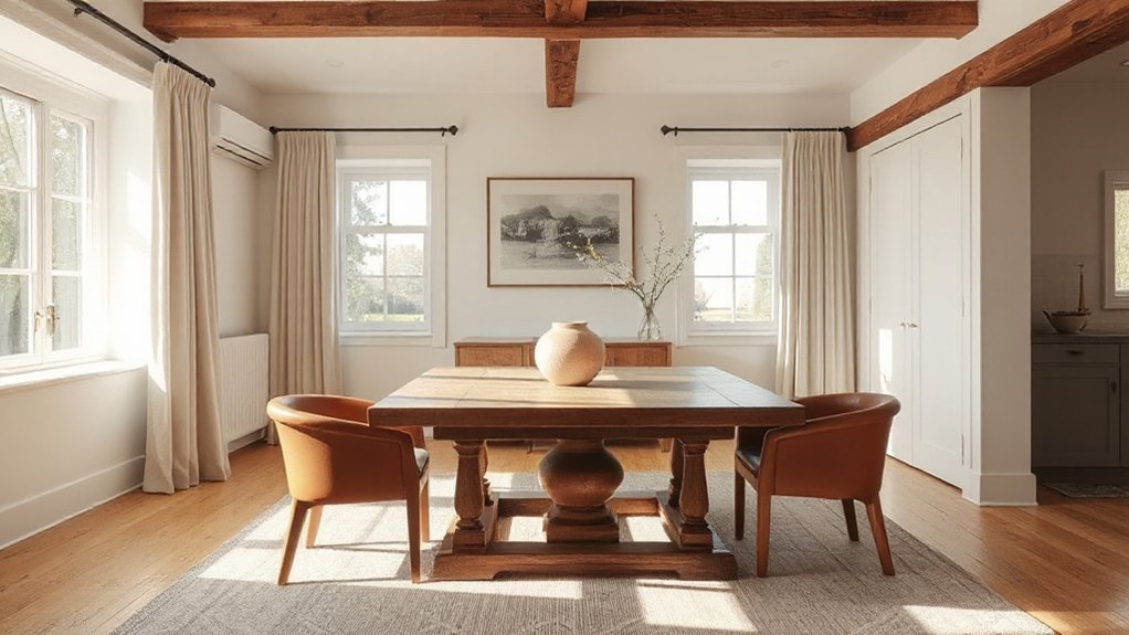
Timeless design isn’t luck; it’s the result of enduring principles that outlast trends. You anchor spaces with clarity, balance, and purpose, ensuring each element serves function before form.
Prioritize proportion, scale, and rhythm, so you create a cohesive, breathable environment. Materials should age gracefully, patina or polish supporting the room’s character without shouting.
Vintage charm can appear, but only where it reinforces meaning and quality, not as a gimmick. An eclectic mix works when items share line, texture, or tone, creating compatibility rather than clash.
Avoid fads that demand constant replacement; opt for durable, versatile pieces that adapt to changing needs. Precision in placement, repeatable motifs, and thoughtful lighting sharpen focus, guiding the eye and sustaining timeless appeal.
Mastering Scale and Proportion for Calm Rooms
To create calm rooms, you’ll master scale so each piece reads in proportion to the space and to your needs.
Use proportion with purpose by aligning furniture, textures, and grids to support flow and function.
Maintain balance for calm by distributing visual weight thoughtfully, ensuring no single element overwhelms the room.
Scale Beyond Measure
How do you balance size and space to create calm rooms? You do it by enforcing a clear scale hierarchy and deliberate size contrast across furniture, textiles, and architectural features.
Begin with your focal piece—an oversized sofa, columnar lighting, or a bold art statement—and anchor the room with smaller surrounds that recede in visual weight.
Maintain proportional rhythm: repeat similar silhouettes at varying heights, avoid a crowd of mid-size items, and leave deliberate negative space to breathe.
Ground large pieces with low furniture and ample grounding textures, while elevating accents at eye level for impact.
Use color, texture, and material differences to reinforce hierarchy without shouting.
Calibrated scale yields serenity, cohesion, and effortless refinement.
Proportion With Purpose
Measure distances to maintain comfortable sightlines, so textures feel cohesive rather than crowded. Use proportion to create rhythm: consistent intervals, repeat patterns, and calculated gaps reduce visual noise.
Consider Historical influences to ground your choices in timeless form, then blend Cultural symbolism with restrained accents to honor meaning without overwhelming space.
Keep furniture footprints aligned to human scale, avoid oversized clutter, and allow negative space to breathe, delivering calm, purposeful rooms.
Balance For Calm
Balance isn’t about symmetry for its own sake; it’s about an even, calm distribution of visual weight that lets a room breathe. You master scale and proportion by sizing elements to support function, not flourish, ensuring every piece feels intentional.
- Use varied but cohesive sizes to create a steady rhythm
- Place focal points at eye level and balance with secondary accents
- Pair Vintage patterns with solid solids to avoid overload
- Integrate Artistic sculptures as anchors, not clutter
- Leave breathing room around furniture for easy flow
Apply restraint: larger pieces carry weight, smaller items reinforce balance. Test by walking the room and noting visual pulls. If one area dominates, shift a cushion, lamp, or plant until the composition reads calm and unified.
Achieving Balance: Weight, Symmetry, and Harmony
Achieving balance in a space means more than matching sizes or aligning edges; it hinges on weight, symmetry, and harmony working together. You strategize by distributing visual heft thoughtfully, so heavier pieces anchor without overpowering lighter accents.
Symmetry provides predictability, but you’ll gain interest with deliberate asymmetry that preserves balance. Harmony emerges when textures, colors, and forms repeat with intention, creating a cohesive tempo throughout the room.
Practice weight by pairing a substantial sofa with lighter side chairs and a grounded rug. Use symmetry for focal zones, then break it slightly with varied heights or unexpected details to maintain energy.
Consider Vintage charm and Cultural influences as balance cues, integrating them through proportionate scales, balanced motifs, and consistent finishes. This precision yields calm, functional spaces that endure.
Color Foundations: Neutral Palettes With Strategic Accents
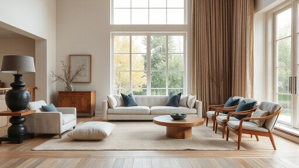
Neutral palettes form the backbone of a calm, cohesive space, so you’ll start with a restrained base that stays flexible over time.
Use strategic accent techniques—color, texture, or finish—sparingly to create focal moments without overpowering the room.
Consider timeless color choices and how subtle shifts in accessories can keep the scheme feeling fresh while preserving a lasting, practical appeal.
Neutral Palette Foundations
A neutral palette builds a calm, versatile backdrop you can layer with strategic accents to shape mood and function. You establish balance by choosing base tones that read as calm and timeless, then add depth with texture, light, and scale. Your goal is cohesive flow—from flooring to ceilings—so every element feels intentional.
- Build contrast with warm woods and cool textiles to avoid flatness
- Use matte neutrals with subtle shine for visual interest
- Layer fabrics in varying textures to create tactile depth
- Introduce vintage textiles and eclectic accessories for character
- Keep a restrained color wheel, letting accents appear deliberately
This approach guarantees longevity, effortless mixing, and focused emphasis without overpowering the space.
Strategic Accent Techniques
Use muted neutrals as your base, layering texture and material rather than more color, so accents read intentional, not flashy. Place accents where daily routines notice them most—entryways, seating, and artwork nooks—so visual pulses feel purposeful.
Balance is essential: limit bold tones to 5 percent of a space, and cluster them to form a singular moment rather than scattered pops. Your choices should reflect artistic expression and cultural influences, ensuring each accent communicates a thoughtful narrative while preserving timeless restraint.
Temporal Color Timelessness
When you build a timeless palette, you anchor color in neutrals and let deliberate accents define rhythm. Temporal Color Timelessness centers on neutrals as a dependable base, with strategic pops that breathe life without dating the room.
You align seasonal color trends with enduring foundations, ensuring updates feel intentional rather than disposable. Cultural influences guide accent choices, rooting spaces in context while preserving flexibility.
- Use restrained neutral foundations as your canvas
- Choose accents that echo seasonal trends without overcommitment
- Let cultural influences inform texture, not chaos
- Rotate small accessories to refresh rhythm seasonally
- Pair warm and cool neutrals to maintain balance and longevity
Using Light as a Design Tool: Daylight, Lamps, and Mood
Natural daylight shapes rooms as a design tool, guiding how you choose color, texture, and furniture placement to achieve balance and mood. You control daylight exposure by room orientation, window treatments, and glare management, so use these to set a baseline tone.
Pair natural illumination with layered lighting: ambient, task, and accent, ensuring consistent color temperature to prevent visual fatigue. In daylight, lean toward cool whites for clarity; as evening approaches, shift to warmer tones to foster coziness.
Lamps should be scalable, offering dimming for mood and focus, with shade choices that soften glare without dulling form. Place task lighting where you read or cook, and accent lighting to highlight architecture.
Balance brightness across surfaces, avoiding hotspots while preserving depth and harmony.
Texture for Warmth: Layering Materials With Purpose
As daylight sets the pace, you can turn cool, flat surfaces into inviting interiors by layering materials with intention. Texture for warmth proves practical: combine tactile elements to reinforce atmosphere, not clutter. Use layered textures to create depth, while maintaining clarity through deliberate material contrast.
- Pair soft textiles with solid surfaces for balance
- Mix natural fibers with sleek finishes to modulate light
- Layer rugs and throws to define zones
- Introduce matte and gloss contrasts for interest
- Use texture to guide function without overpowering form
Apply consistently: emphasize purpose over ornament, ensuring every layer supports mood, acoustics, and scale. This approach yields warmth via material contrast that remains timeless, cohesive, and easy to maintain.
Furniture Proportions: Choose Pieces for Enduring Readability
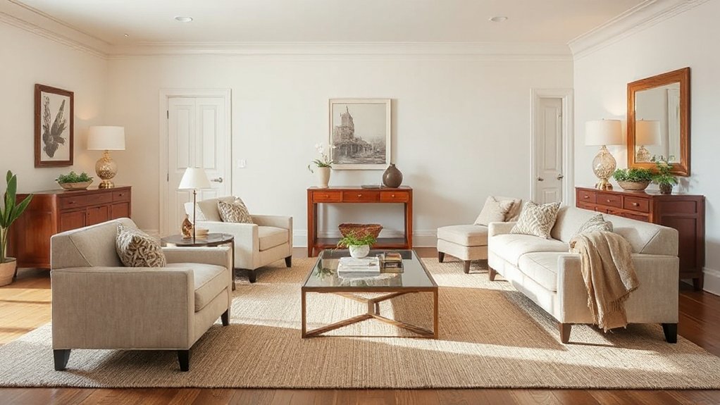
Scale and balance establish readability at a glance, so start by sizing furniture to the space and to each other. Aim for proportional harmony by pairing pieces with similar mass and rhythm, avoiding abrupt size contrasts.
This sets a clear, enduring framework you can build on without clutter.
Scale and Balance
How do you guarantee every piece in a room reads clearly? Scale and balance hinge on proportion, placement, and rhythm. You craft readability by pairing furniture that relates to the room’s dimensions, avoiding extreme over- or under-sized silhouettes. Use a visual triangle to anchor seating and tables, then balance weight with lighter elements to prevent a top-heavy feel. Consistency in height differences creates a calm, legible space.
- Align seating to create intimate conversation zones
- Mix mid-century and classic forms with restrained scale
- Ground rooms with a solid rug that fits without crowding
- Introduce Vintage textiles and Eclectic accessories as accents
- Verify sightlines stay open from every perch
Apply these checks thoughtfully; readability strengthens with deliberate proportion and mindful balance.
Proportional Harmony
Proportional harmony means selecting furniture that remains legible and comfortable over time. You prioritize pieces sized for the room’s proportions, avoiding oversized statements or puny silhouettes that disrupt flow.
Begin with a dominant scale in the space and pair it with complementary items that share visual weight, not competing focal points. Consider seating with depth and back height that invite neighbors to converse without crowding.
Tables, consoles, and casegoods should align in proportion to surrounding planes, creating a cohesive rhythm. Introduce vintage accents sparingly to reinforce timelessness without clutter.
Favor furniture with clean lines and functional forms, yet allow organic shapes to soften the composition. This disciplined approach preserves readability, enhances comfort, and supports adaptable, enduring interiors.
Simple Detailing: Clean Lines Over Fussy Ornamentation
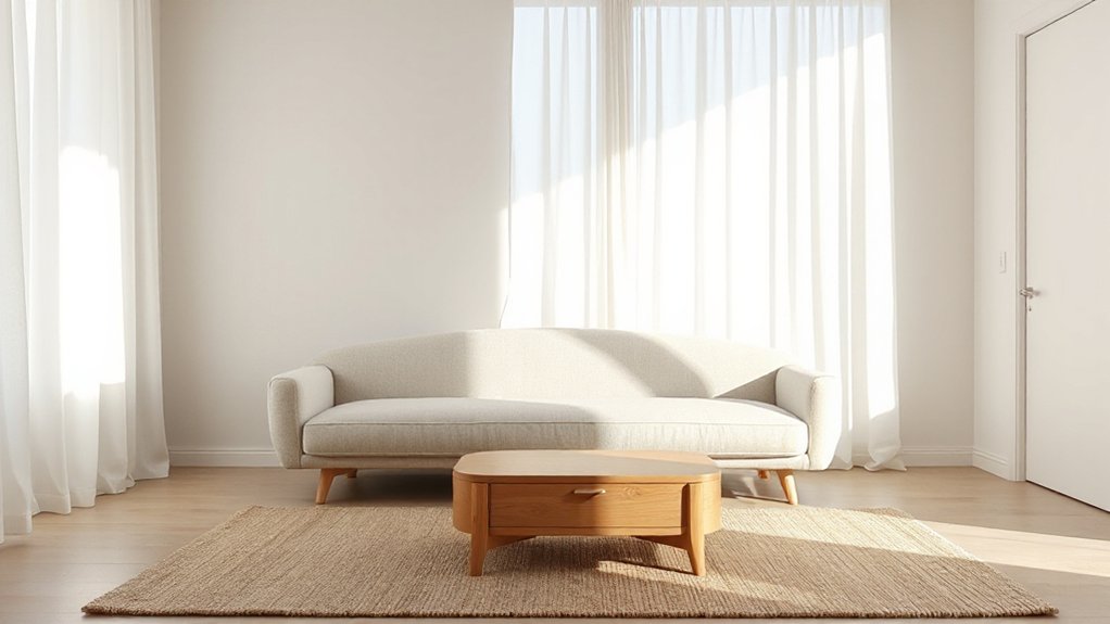
Clean lines deliver clarity and calm, so avoid clutter that competes with the core geometry of a room. You pursue simple detailing by prioritizing form, material honesty, and restrained ornamentation variations that reinforce structure, not overwhelm it. Focus on silhouette, joinery, and finish to convey quality through restraint rather than excess.
- Emphasize uninterrupted horizontal and vertical lines
- Choose materials with honest grain and refined edges
- Minimize decorative moldings and busy hardware
- Align fixtures with architectural joints for cohesion
- Let negative space define proportion and rhythm
Your approach highlights detailing intricacies without distraction, enabling a timeless vibe. Maintain consistency across ceilings, walls, and furniture, ensuring every element supports the room’s frame.
This discipline prevents fussy ornamentation and sustains clarity, permanence, and ease of maintenance.
Function-First Layouts: Timeless Spatial Principles
Function should drive arrangement: spaces organize habits, flows, and functions before decoration. You design rooms by prioritizing use over appearance, aligning circulation with activity. Start with clear zones that support daily tasks, then layer comfort and aesthetics.
In open concept layouts, define progressions with subtle cues—furniture placement, color shifts, and lighting—so that movement remains intuitive rather than chaotic. Choose multifunctional furniture to maximize flexibility without sacrificing clarity.
A living area can pair seating with workspaces, while dining and lounge zones share ambient lighting and acoustic separation. Guarantee sightlines support safety and interaction, keeping pathways unobstructed.
Plan storage where it serves function, not as afterthought. By centering function, you achieve timeless spatial harmony that adapts to changing needs.
Durable Materials That Stay Stylish
Durable materials anchor both performance and style, so you should prioritize surfaces that resist daily wear while proving timeless appeal. You’ll choose resilient textures and finishes that age gracefully, balancing practicality with a refined look.
When you plan, consider how materials respond to sunlight, moisture, and traffic, then opt for those that endure without losing character. Incorporate vintage textiles for warmth without sacrificing longevity, and favor eco-friendly finishes that minimize environmental impact while maintaining polish.
This approach keeps interiors cohesive and low-maintenance.
- Choose hard-wearing surfaces (stone, tile, solid wood) for high-traffic zones
- Pair durable fabrics with tight weaves and protective treatments
- Integrate vintage textiles as accents, not anchors
- Prefer eco-friendly finishes on cabinetry and hardware
- Test color and patina over time to ensure lasting appeal
Personalize With Purpose: Timeless, Clutter-Free Details
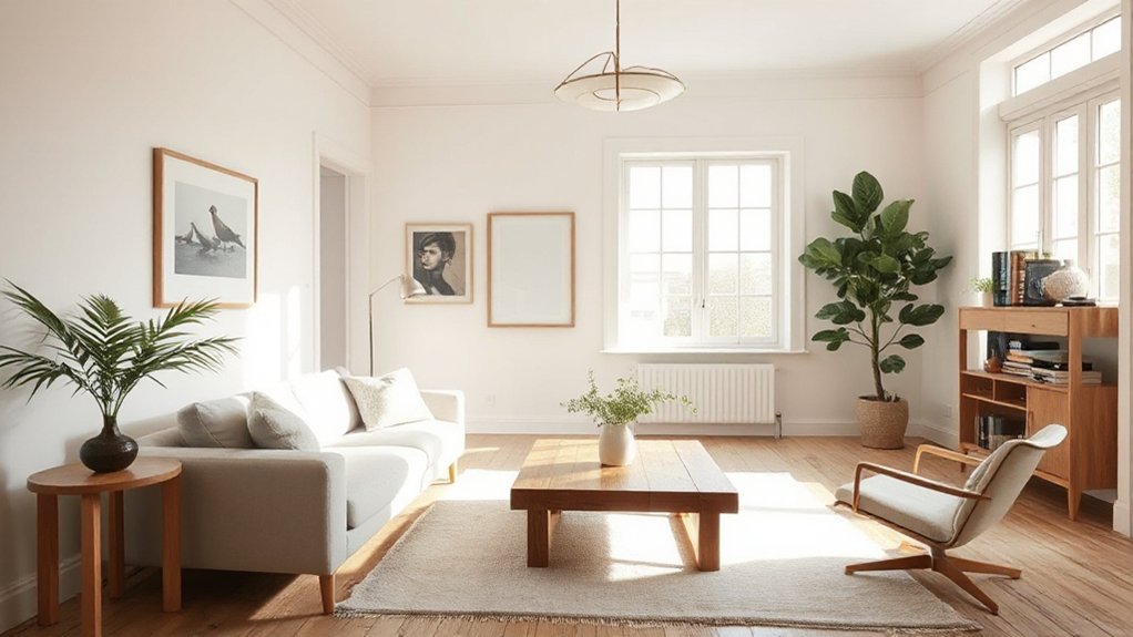
Personalize with purpose by choosing timeless, clutter-free details that quietly elevate a space without shouting. You shape a room through deliberate choices that reveal your intent without clutter.
Start with a restrained palette, then layer meaning with pieces that earn their place daily. Prioritize functional aesthetics: items should perform well, feel durable, and look refined.
Show your personal expression through well-considered accents, textures, and art that align with the space, not overwhelm it. Keep surfaces clear; store items thoughtfully to maintain calm.
Use proportional scales, clean lines, and quality materials to ensure longevity. Remember, purpose governs selection: every object must earn its keep and contribute to legibility, comfort, and cohesion.
Client-fastidious detail yields a space that remains relevant and serene.
Maintenance for Fresh, Timeless Spaces
A timeless space stays so through disciplined upkeep that preserves its calm and clarity. You keep it fresh by scheduling routine checks, cleaning surfaces, and guarding balance between form and function.
Prioritize high-traffic areas and adjust artificial lighting to maintain consistent mood without glare. Align decorative accessories with a restrained palette, rotating pieces seasonally to prevent stagnation. If a piece feels dated, swap it out rather than cluttering the room.
Regular maintenance extends its lifespan and enhances perceived value.
- Schedule monthly dusting, vacuuming, and wipe-downs for all surfaces
- Inspect lighting levels; replace bulbs to maintain warmth and consistency
- Rotate decorative accessories to refresh without overwhelming
- Patch scratches, tighten loose hardware, and balance furniture alignment
- Declutter thoughtfully, keeping only items that reinforce calm, timeless appeal
Frequently Asked Questions
How Do Timeless Designs Adapt to Changing Trends Without Losing Integrity?
You adapt by balancing classic elements with current finishes, preserving authenticity while embracing subtle updates. You mix vintage charm with modern elegance, reconfiguring layouts and textures to stay relevant, yet maintain integrity, coherence, and timeless appeal for every room.
Can Small Rooms Feel Timeless With the Right Scale?
“Keep it simple,” you’ll learn: yes, small rooms feel timeless with proper color palettes and furniture proportions. You adjust scale, maximize light, and choose enduring textures so space reads calm, cohesive, and purposeful rather than cramped.
What Role Does Lighting Play in Lasting Interior Style?
Ambient lighting defines mood and depth, shaping lasting style. You should prioritize fixture selection that complements scale and architecture, delivering even, functional illumination. Choose timeless finishes, dimmers, and layering to maintain cohesion while adapting to evolving spaces.
Which Textures Best Endure Across Decades of Decor?
Textures that endure are Vintage fabrics and Natural materials; you’ll see them age gracefully. Use them thoughtfully, mix with simple lines, and you’ll create lasting appeal. But heed balance—avoid overpowering patterns to preserve timeless impact.
How Can Personalization Stay Refined and Uncluttered Over Time?
Personalize with restraint: curate Personal touches that echo your life, but edit regularly to avoid clutter. Respect Cultural influences by selecting meaningful pieces, rotating accents seasonally, and keeping surfaces clear to preserve a refined, timeless feel.
Conclusion
Timeless design isn’t luck; it’s a disciplined approach you can apply today. Prioritize scale, balance, and neutral foundations, then layer with purposeful accents and quality materials that mature with you. Use daylight and well-placed lighting to shape mood, and keep layouts uncluttered for effortless flow. An interesting stat: rooms refreshed with 60% fewer decorative items feel calmer and read as more timeless. Stay flexible, maintain surfaces, and let function guide every thoughtful detail.


