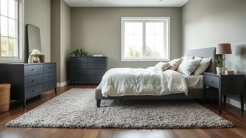

Sage and grey bedrooms pair calm, sophisticated neutrals with depth, creating a versatile backdrop for texture and light. Start with sage as the dominant 60–70% base, using grey as a neutral binder and reserving 10–15% for each accent. Layer lighting with ambient, task, and accent options, favoring dimmable, high-CRI fixtures. Tie the palette with matte and subtle sheen textures, muted whites, and warm woods. Curious how to tailor this mix to your space? Explore more tips below.
How Sage-Grey Sets the Bedroom Mood
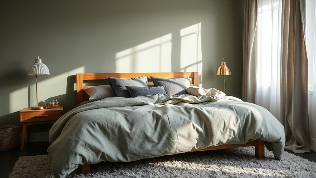
Sage-gray blends calm with sophistication, creating a versatile base for a bedroom palette. You’ll feel a balanced atmosphere when this tone pairs with cool neutrals and warm textures.
In practice, sage-gray reduces glare, enhancing focus on practical elements like bedroom furniture and wall art. You should prioritize clean lines and low-sheen finishes to preserve the legibility of color shifts under different lighting.
Use the hue as a backdrop for accent tones—muted greens, taupes, and crisp whites—to maintain cohesion without overstimulation. Consider LED-neutral lighting to preserve true color rendering for textiles and surfaces.
Placement matters: larger pieces anchor walls, while scaled accessories add depth. This approach supports flexibility, easy updates, and a contemporary, timeless mood in your sleep space.
How to Choose Sage-Grey Ratios That Work
To land effective sage-grey ratios, start with a dominant base and layer in accent tones that read as deliberate, not accidental. You’ll prioritize a primary sage base around 60–70%, then introduce grey as a neutral glue to mute intensity.
Add accent colors sparingly at 10–15% each to maintain color harmony without tipping into distraction. Choose undertones that align with your room’s lighting: cool greys for north light, warmer sage for south light.
Test ratios under multiple conditions, noting perceptual shifts as you switch bulbs. Maintain visual balance by distributing accents across the space—art, textiles, and small furniture—rather than clustering them.
Keep contrast intentional: deep charcoal or black for depth, and soft white for airiness. This disciplined approach prevents clutter and preserves calm.
Texture and Materials to Tie Sage and Grey Together
Texture-driven sage pairings guide how you layer fabrics and finishes for a cohesive look. Combine grey-tinted materials with matte surfaces and subtle sheen to balance depth and light.
Expect crisp definitions from layered surface combinations, like weave, nap, and texture, that keep the palette unified yet tactile.
Texture-Driven Sage Pairings
Texture and materials can make sage and grey feel cohesive without blending into sameness. Start by pairing tactile elements that emphasize contrast, like a matte plaster wall with a high-gloss lacquer on furniture. You’ll balance warmth and restraint by selecting surfaces with intentional texture variance and predictable reflectivity.
Use textured textiles—woven throws, nubby cushions, and brushed velvets—to amplify depth without shouting color. Incorporate wall textures that read as architectural, such as ribbed panels or micro-mine finishes, to ground the palette.
For accessories, choose decorative accessories that repeat the sage-grey rhythm in metallics, ceramics, and wood tones. Keep layout clean: let negative space frame texture shifts, ensuring the room remains calm, coherent, and purposefully modern.
Grey-Tinted Material Mix
Grey-tinted materials anchor Sage and Grey by pairing matte and reflective surfaces with subtle warmth. You’ll mix textures to control light and depth, prioritizing material honesty over ornament.
Introduce textiles with restrained color blocking to define zones without loud contrast, then balance with smooth surfaces to keep the palette cohesive. For textile patterns, select low-contrast weaves and subtle ribbing that read as tactile rather than graphic, ensuring Sage’s green undertone remains present.
Consider a satin or brushed fabric on seating to echo the grey’s cool edge while a textured weave on drapery adds dimension. Surface materials should vary in porosity and sheen, enabling soft glare control.
The goal: a calm, modern bedscape where color and texture synchronize, not shout.
Layered Surface Combinations
Layered surface combinations blend Sage’s green undertone with Grey’s cool edge by coordinating multiple textures and finishes that read cohesively from distance to detail.
You align matte paint, satin hardware, and natural stone to create a restrained palette with tactile contrast. Introduce layered bed linen in soft cotton or linen blends to emphasize airiness without sacrificing depth. Pairing textured weaves with subtle sheen prevents visual fatigue as light shifts through the room.
For wall decor, select low-contrast frames and fabric-wrapped canvases to maintain cohesion while adding dimensionality. Consider a stone or concrete headboard or accent panel to anchor the bed without overpowering the color scheme.
Make certain transitions between surfaces are deliberate, preserving a calm, unified aesthetic across the sage-grey spectrum.
Lighting for Sage and Grey Rooms
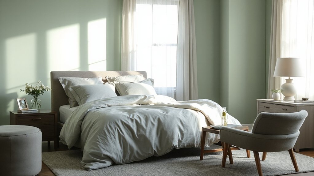
To optimize Sage and Grey rooms, start with lighting layering that adds depth without washing out the palette.
Balance Sage Gray tones by pairing warm and cool sources to maintain true color and mood, using adjustable fixtures to fine-tune brightness.
Consider how mood and tone shift with intensity, direction, and color temperature to keep the room feeling cohesive yet dynamic.
Lighting Layering Tips
A well-lit sage or grey room relies on deliberate lighting layers: ambient, task, and accent, each calibrated to enhance color and mood without overpowering the space.
You should map layer purpose to function: ambient provides even base illumination; task targets desks, mirrors, or reading zones; accent highlights architectural features, textures, or art.
For sage and grey palettes, leverage natural light as a primary planner, then supplement with layered fixtures to maintain color fidelity after sunset.
Choose ambient fixtures with dimming to shift tone from bright daytime to cozy evenings.
Use task lighting with adjustable angles to reduce glare on reflective surfaces.
Accent lighting should subtly pop key elements with low-contrast, directional beams, avoiding overpowering hue shifts.
Prioritize compatibility, color temperature consistency, and energy efficiency across sources for a cohesive, modern space.
Sage Gray Balance
Sage-gray rooms demand a precise balance between cool and warm cues, so adjust lighting to preserve the subtle chromatic shift between green-tinged sage and neutral gray. You’ll optimize color rendering with a neutral-to-warm spectrum, favoring 3000K to 3500K for general tasks and 2700K bedside accents when appropriate.
Use high-CRI fixtures (CRI 90+) to maintain true greens and grays under artificial light, avoiding green cast shifts. Layer light with dimmable ambient, task, and accent sources to modulate perceived color warmth as rooms shift from day to night.
Consider directional fixtures to avoid glare on glossy surfaces and to highlight subtle hue transitions. This approach aligns with color psychology insights and interior design trends, delivering a balanced, versatile, and cohesive sage-gray environment.
Mood and Tone Lighting
Balancing mood and tone in sage and grey rooms hinges on lighting that preserves the subtle green-gray chroma while shaping atmosphere. In practice, you’ll combine artificial lighting with daylight strategies to keep color accuracy and depth intact.
Use layered luminaires—ambient, task, and accent—to control intensity without washing out the palette. Favor fixtures with high CRI (90+) to render sage and grey as intended, and opt for tunable white between 2700K and 3500K to shift warmth with the time of day.
Natural sunlight should be diffused with sheer window treatments to prevent harsh contrasts. Implement dimmers to modulate mood without altering hue, and position light sources to reveal texture—linen, wool, and plaster—without creating unwanted color shifts.
Consistency in color temperature reinforces a calm, cohesive atmosphere.
Best Accent Colors and Patterns for Sage-Grey
Sage-grey walls serve as a calm, versatile base, so the right accents must pop without overpowering. You’ll maximize contrast with muted whites, charcoal, and warm timber finishes to maintain balance.
For textiles, choose bold patterns sparingly—think a single geometric throw pillow or a striped blanket—so the room reads cohesive rather than cluttered. Floral accents can soften the palette when used as small, repeating motifs in curtains or upholstery, keeping formality intact.
Metals like brushed brass or matte black handles add edge without stealing attention from the sage-grey ground. Avoid overly busy prints on large surfaces; instead, pair solid blocks with one accent pattern to guide the eye.
Prioritize longevity: select durable, washable fabrics and low-maintenance finishes for daily use.
Sage-Grey by Room: Practical Combinations for Everyday Living
When choosing sage-grey for different rooms, practical pairs focus on function and daily wear. In bedrooms, pair sage-grey with cool neutrals to enhance serenity, then ground the space with sturdy bedroom furniture in matte wood or steel. Prioritize durable finishes that resist scuffs and fingerprints, and select wall decor that adds contrast without overpowering the palette.
For living areas, combine sage-grey with lighter whites for a breathable backdrop, and use wall decor as a focal point—think bold metal accents or framed textile art—while keeping seating and tables in durable fabrics.
In kitchens, temper sage-grey with warm timber and matte hardware to maintain a cohesive flow. Always test lighting, since bulbs shift tone; adjust with accent textiles accordingly.
Frequently Asked Questions
How to Maintain Sage-Grey Colors With Kids and Pets?
To maintain sage-grey colors with kids and pets, you should child proofing furniture and use pet safe paint options, plus washable finishes. Apply stain-resistant fabrics, seal surfaces, rotate decor, and clean spills promptly to prevent staining and tracking.
Will Sage-Grey Work in Small or North-Facing Rooms?
Yes, sage-grey works in small or north-facing rooms. It reads as calm, expands perceived space, and pairs well with bright accents. For bedroom accent ideas, coordinate a restrained color palette to avoid heaviness.
Can Sage-Grey Clash With Warm-Toned Wood Floors?
Yes, sage-grey clashes with warm-toned wood floors if you overdo it. Use green accents and grey bedding strategically to balance warmth, avoiding heavy contrast; opt for muted greens and understated textures to maintain a cohesive, trend-aware look.
What Ceiling Colors Pair Best With Sage-Grey Walls?
You should choose ceiling colors like soft white or pale greige to harmonize; ceiling paint options include matte or satin sheens. Accent with ceiling color accents such as crisp trim. You’ll maintain balance while keeping the room contemporary and cohesive.
How Do I Incorporate Sage-Grey in Rental Spaces?
You can incorporate sage-grey in rentals by choosing removable décor, like decorative accessories and wall art options, while balancing with neutral accents. It reads modern and technical, satire aside, and you’ll implement trend-aware, practical guidelines quickly.
Conclusion
Conclusion: You can trust the sage-grey pairing to stabilize mood and elevate space, but the theory holds only if you treat it as a system, not a sketch. When you balance materials, textures, and lighting, the color duo reinforces calm with subtle contrast. If you chase bold statements, you’ll override the theory’s restraint. The trend is iterative: test swatches, adjust ratios, and layer accents until the room reads purposeful, breathable, and adaptable.