

Great design feels effortless because you align three invisible forces: flow, function, and feeling. You use flow to guide attention and action with clear hierarchy, consistent patterns, and helpful signposts that cut hesitation. You build function by making every feature earn its place, staying fast, reliable, and accessible for real-world users. You shape feeling through tone, spacing, and micro-feedback that create trust, calm, and earned delight. Keep going to learn how to balance them.
Flow, Function, Feeling: The Core Design Trio

Whether you’re shaping a website, a room, or a product, great design starts with three interlocking priorities: flow, function, and feeling. You balance them from the first sketch to the final polish, because each choice affects the others.
Function keeps you honest: it defines the job, removes friction, and makes every feature earn its place.
Feeling makes it memorable: you use tone, texture, spacing, and light to build Emotional resonance that matches your audience’s needs and values.
Flow ties your decisions together at a high level, so the experience reads as one coherent whole.
When you align these priorities, you create aesthetic harmony—clean, confident, and purposeful—so people trust it, use it, and want to return.
Flow in Design: What It Is and Why It Matters
You create design flow when every element leads the eye and hand to the next best step without hesitation.
You guide user movement with clear hierarchy, intuitive paths, and timely cues that make progress feel natural.
You reduce cognitive friction by removing needless choices and interruptions, so people stay focused, confident, and in control.
Defining Design Flow
How does a design guide someone from first glance to final action without friction? That ease is design flow: the continuous, coherent experience that makes every element feel inevitable. You create it when aesthetic harmony supports purpose, and visual hierarchy clarifies what matters most without shouting.
Flow isn’t a trend or a flourish—it’s the quiet logic that connects layout, spacing, typography, and interaction into one readable system. When flow is strong, you reduce hesitation, prevent misinterpretation, and keep attention steady. You also signal competence: the work feels considered, not accidental.
Define flow by checking consistency across screens, aligning patterns with user expectations, and removing needless decisions. If you can’t explain why an element exists, it’s interrupting flow.
Guiding User Movement
Strong flow doesn’t just make a layout feel coherent—it steers attention with intent. You guide user movement by shaping a clear Visual hierarchy: lead with a decisive focal point, support it with secondary cues, and finish with an unmistakable next step.
Use scale, contrast, and spacing to create a path the eye naturally follows, then reinforce it with alignment and directional elements like lines, images, or angled shapes.
You also choreograph pacing. Place moments of emphasis where decisions happen, and give key content room to breathe so it lands with confidence.
When your sequence matches a user’s goals, the experience feels effortless and purposeful. That’s where Emotional resonance appears: people sense craft, clarity, and momentum—and they trust what comes next.
Reducing Cognitive Friction
Where does flow break down? It breaks when you make people think too hard—when labels feel vague, choices feel endless, or layouts shift without warning.
Reduce cognitive friction by naming actions plainly, grouping related content, and keeping patterns stable across screens. You can also lower effort by showing progress, offering defaults, and surfacing help exactly where confusion appears.
Trim steps, remove duplicate decisions, and write microcopy that answers the next question before it’s asked.
Consistent spacing, typography, and hierarchy let users scan, predict, and proceed with confidence. When your interface behaves the same way every time, you protect Brand consistency and earn trust.
Pair that clarity with thoughtful tone and small moments of delight to create Emotional resonance without slowing momentum.
Flow in Design: Patterns That Remove Friction
Even when every element looks polished on its own, a design fails if people have to stop and think about what to do next. You create flow by shaping a path that feels inevitable, where every cue answers the silent question: “What now?”
Use patterns that repeat with purpose so attention stays on the goal, not the interface, while maintaining aesthetic harmony and reinforcing brand identity. Picture the experience like this:
- A well-lit hallway: consistent spacing and alignment guide your eyes forward.
- A steady drumbeat: predictable rhythms in headings, buttons, and transitions.
- Gentle signposts: clear labels and progressive disclosure at the right moment.
- A smooth handoff: micro-feedback that confirms each step without interrupting.
When these patterns work together, you remove hesitation and earn momentum.
Function in Design: What It Includes (and Doesn’t)

Function is where your design proves it’s more than attractive—you align every choice to a clear purpose, fast performance, and effortless usability.
You also build for accessibility and inclusive use so more people can succeed without workarounds.
And you draw a firm line around what function doesn’t include: decorative extras, clever complexity, or anything that distracts from the job your design must do.
Purpose, Performance, And Usability
Although great design can look effortless, it only earns that ease when it serves a clear purpose, performs reliably, and stays usable in the real world. You begin by defining the job: what success looks like for the user, the business, and the moment.
Then you pressure-test the solution so it holds up under speed, stress, and repetition—without sacrificing emotional resonance or aesthetic harmony. Function isn’t a feature pile or a clever gimmick; it’s the quiet confidence that nothing gets in the way.
Picture your design as:
- A compass that keeps every choice aligned to intent
- A well-tuned engine that starts fast and runs clean
- A door handle that fits the hand on the first try
- A map with clear landmarks, not detours
Accessibility And Inclusive Use
Where does a design’s “function” truly begin—at the average case, or at the edges of human experience? It begins when you assume variation, not uniformity. If someone can’t see, hear, reach, read, or process your interface, it isn’t fully functioning.
You build inclusive use by designing with constraints up front: strong contrast, scalable type, clear hierarchy, keyboard paths, captions, and error messages that teach. You test with adaptive technology, not just a mouse and perfect vision. You write labels that screen readers can parse, and you make targets forgiving on small screens and unsteady hands.
Function also includes cultural accessibility: language choices, symbols, tone, and formats that respect different norms and contexts—so people feel welcomed, not translated.
What Function Excludes
Even when a design works flawlessly, it can’t—and shouldn’t—try to do everything. Function sharpens focus by saying no to distractions that dilute purpose. When you define what’s excluded, you protect usability, aesthetic considerations, and branding consistency. You also give people room to breathe, letting the “right” actions feel obvious instead of buried under options.
- Trim the feature buffet to a well-plated entrée that satisfies fast.
- Remove decorative clutter so key controls stand out like lit doorways.
- Decline edge-case workflows that turn a clean map into tangled streets.
- Skip trendy effects that fight your brand voice, like mismatched signage.
You’re not limiting ambition—you’re directing it. What you omit becomes the quiet structure that makes everything else effortless.
Function in Design: Clarity, Reliability, Speed
How does a design earn your trust the moment you use it? It does it through clear function: you instantly see what’s clickable, what’s primary, and what happens next. Labels match outcomes, feedback arrives immediately, and errors explain how to recover.
Reliability shows up in repeatable behavior. If a button works one way today, it works the same way everywhere tomorrow. That’s where Design consistency and aesthetic harmony stop being decoration and start being infrastructure: patterns, spacing, and hierarchy reinforce each other so you don’t relearn the interface.
Speed keeps momentum intact. You reduce steps, preload likely actions, and prioritize performance so screens respond without hesitation. When clarity, reliability, and speed align, you move confidently from intent to result, with no wasted effort.
Feeling in Design: Trust, Calm, Delight
Clear function gets you to the right outcome; feeling determines whether you’ll come back. You build trust when every promise matches reality: copy, pricing, and states align, and errors explain what happened and what to do next.
You create calm by reducing cognitive load—steady hierarchy, predictable patterns, generous spacing, and progress cues that keep you oriented.
You earn delight through small, purposeful moments that feel human, never distracting, grounded in user empathy and Emotional resonance.
Picture it as:
- A sturdy handrail on a steep stair—clear affordances and safe defaults.
- A quiet room—uncluttered screens and forgiving inputs.
- A warm nod—microinteractions that confirm, not show off.
- A smooth landing—fast recovery, transparent feedback, and control.
Feeling in Design: What Users Remember and Repeat
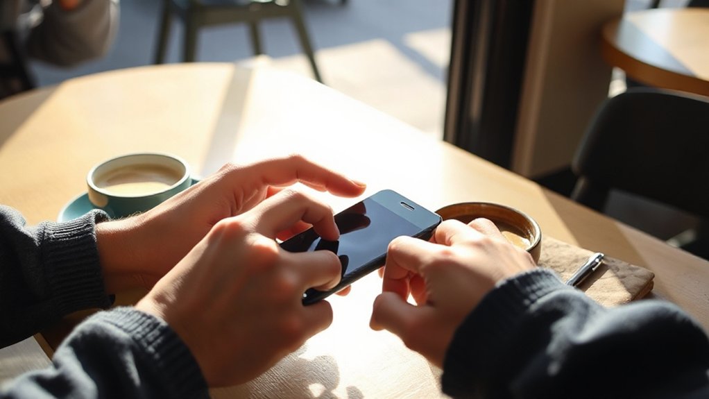
After the task is done, what lingers isn’t the layout—it’s the feeling you left behind. You’re designing the story users tell themselves: “That was effortless,” “I felt in control,” “This brand gets me.” Those Memorable impressions drive return visits, referrals, and forgiveness when something goes wrong.
To create Emotional resonance, choreograph the moments people notice: the first screen, the microcopy at decision points, the tone of empty states, the clarity of success and failure. Use language that sounds human, not corporate.
Reduce uncertainty with previews, progress cues, and explicit next steps. Add small, earned delight—never surprise users with consequences, only with care. When you make people feel competent and respected, they’ll repeat the experience and recommend it to others.
How to Trade Off Flow, Function, and Feeling
Even when your team wants everything—seamless flow, rich function, and an emotional hit—you can’t maximize all three at once. You’ll make smarter trade-offs when you name the primary promise of the experience, then let the other two support it without competing.
- Picture a fast-moving hallway: you trim options, tighten copy, and let flow win.
- Picture a Swiss Army knife: you surface power features, accept a slower path, and protect function.
- Picture a gallery spotlight: you simplify actions, refine microinteractions, and chase Emotional resonance.
- Picture a well-tuned orchestra: you align typography, spacing, and color so Aesthetic harmony keeps compromises feeling intentional.
Choose your winner per screen, not per project, and your design stays coherent under pressure.
Checklist: Improve Flow, Function, Feeling Today
When you’re short on time but still want the experience to feel effortless, useful, and memorable, a tight checklist gives you leverage.
Start with flow: map the primary path, remove one step, and add clear signposts where people hesitate.
Next, lock function: confirm the core job-to-be-done, write one success metric, and test the riskiest assumption with a quick prototype.
Then tune feeling: choose one emotion you want to earn, align microcopy and motion to support it, and create moments of Emotional resonance at key junctures.
Finally, refine craft: enforce consistent spacing, type, and contrast for aesthetic harmony, and run a five-minute accessibility pass.
Ship, measure, and iterate tomorrow.
Frequently Asked Questions
How Do You Measure Flow Improvements Without Harming Creativity?
Measure flow improvements by tracking user experience metrics, time-on-task, and error rates, while running creative sprints with no metric pressure. You’ll preserve aesthetic balance by reviewing outcomes qualitatively, then iterating lightly with structured retrospectives.
What Research Methods Reveal Emotional Response Beyond Usability Testing?
Like a stethoscope for feelings, you’ll use diary studies, contextual inquiry, in-depth interviews, and physiological measures with Emotional analytics, plus social listening and post-task narratives to capture User sentiment you won’t see in usability tests.
How Does Accessibility Influence Flow, Function, and Feeling Simultaneously?
You improve flow when everyone navigates smoothly, you strengthen function through Universal usability, and you elevate feeling with Inclusive aesthetics that signal respect. You’ll reduce friction, boost confidence, and make every interaction feel effortless and welcoming.
When Should Branding Override Pure Functional Clarity in Interface Decisions?
Let branding override pure clarity only when you’ve guaranteed users still complete key tasks. 94% judge credibility by design; use branding priorities and interface aesthetics to reinforce trust, not obscure labels, controls, or feedback.
How Do Cultural Differences Change What “Delight” Means in Design?
Cultural differences reshape “delight” because you’re designing for cultural nuances and aesthetic preferences: humor, color, motion, and hierarchy land differently. You’ll test locally, adapt tone and rituals, and avoid one-size-fits-all surprises.
Conclusion
When you design with flow, function, and feeling in sync, you don’t just make screens—you shape behavior. You remove friction so people glide, you build reliability so tasks finish fast, and you craft tone so users feel safe saying “yes.” Consider this: even a 100-millisecond delay can reduce conversions by 7%—like a single speed bump on a smooth road. Tighten these three, and your product becomes effortless, trusted, and remembered.