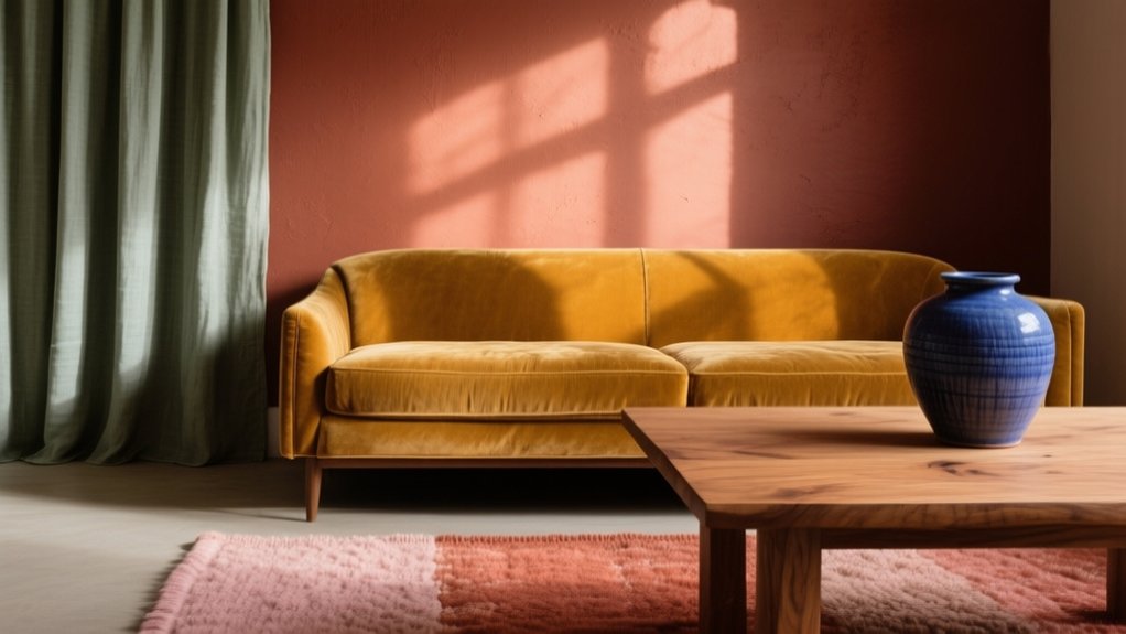

You shouldn’t choose interior colour by sight alone because you’ll live with how it feels all day—calm, energized, focused, or intimate. Light constantly filters colour, so morning sun, harsh midday glare, and warm evening lamps can shift undertones and even make a shade feel sterile or muddy. Test large samples on vertical boards, move them around, and watch them for 48 hours under natural and artificial light. Next, you’ll see how temperature, contrast, and texture complete the effect.
Choose Interior Colour by the Mood You Want
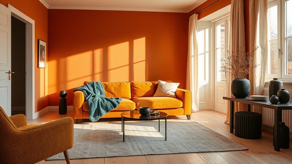
If you start with the mood you want a room to create, you’ll choose colours with far more confidence and far fewer do-overs. Name the feeling first: calm, energized, focused, intimate, or social. Then use Color psychology to narrow options.
For calm bedrooms, lean into muted cools or softened neutrals; keep contrast low to reduce visual noise.
For energizing kitchens or gyms, use warm, clearer hues in controlled doses, and anchor them with steady neutrals so the space doesn’t feel frantic.
For focus in offices, choose mid-value tones and avoid overly saturated accents that compete for attention.
Test 2–3 paint swatches against fixed finishes and fabrics, and judge the Emotional impact at your typical viewing distance.
See How Light Changes Interior Colour
Because light acts like a filter, the same paint colour can read warm, cool, bright, or muddy depending on when and where you see it. Test your shortlist on large sample boards, not tiny chips, and move them around the room. Check colour on vertical surfaces, since walls catch glare and shadows differently than tables.
Track it across the day: morning, midday, late afternoon, and after dark. Stand where you’ll actually live—on the sofa, at the desk, by the doorway—and note shifts under natural light from each window.
Then repeat with artificial lighting: overheads, lamps, and any dimmers. Turn off competing bulbs and confirm the bulb type matches what you’ll keep. Photograph and label each condition so you can compare.
Use Interior Colour Temperature to Add Warmth or Cool
You control a room’s feel by choosing colour temperature with intent: warm hues read inviting, while cool tones read calm and spacious.
Start by identifying whether your existing light and finishes skew warm or cool, then reinforce that direction rather than fighting it.
Use reds, oranges, and warm neutrals to add warmth where it’s needed, and lean into blues, greens, and cool greys to visually cool rooms that feel hot or tight.
Understanding Colour Temperature
While hue sets the basic identity of a colour, temperature determines how it *feels* in a room—warm colours (reds, oranges, many yellows) visually advance and add intimacy, while cool colours (blues, greens, blue-based neutrals) recede and create a calmer, airier effect.
To control that feeling, you’ll evaluate undertones, not labels: a “grey” can read warm if it carries brown or red, or cool if it carries blue or green.
Test paint with large swatches and view them morning, afternoon, and night, since lighting shifts perceived temperature.
Balance matters: pair a dominant temperature with smaller counter-notes so the space doesn’t feel flat.
This is Color psychology in action—temperature subtly guides attention, comfort, and emotional impact throughout daily use.
Warming Spaces With Hues
Colour temperature becomes most useful when you apply it deliberately to shift a room’s mood—warming a space that feels stark, or cooling one that feels too intense.
To add warmth, choose hues with yellow, red, or terracotta undertones and repeat them across key planes: one dominant wall colour, one upholstery tone, and one accent in textiles. You’ll feel the change immediately because colour psychology links warm wavelengths with comfort, sociability, and perceived proximity.
Balance saturation so warmth reads inviting, not loud: keep large surfaces muted, then push richer colour into smaller, tactile elements like cushions, rugs, and artwork.
Use Complementary colour schemes sparingly—pair a warm base with a cool counterpoint in small doses to sharpen edges without chilling the room.
Cooling Rooms With Tones
Balance cool bases with controlled warmth. Choose light, desaturated textiles and pale woods, then add a single warm counterpoint (terracotta, brass, or muted blush) for comfort without flare.
If you want energy, use Complementary colour schemes sparingly: pair teal with a softened coral in small doses, not large planes.
Finish with cool lighting (3000–3500K) to reinforce calm.
Match Interior Colour to Undertones and Contrast
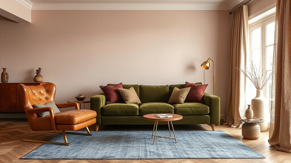
To match interior colour to your space, you’ve got to identify undertones accurately by comparing paint samples against a true white and your fixed finishes in consistent daylight.
Once you confirm whether a colour reads warm, cool, or neutral, you can choose adjacent hues for harmony or opposing notes for controlled contrast.
Balance contrast by setting one clear dominant colour, supporting it with mid-tones, and using accents to sharpen edges without fighting the undertone.
Identify Undertones Accurately
Although two paints can share the same name or look identical under showroom lights, their undertones often pull your room in completely different directions. You’ve got to identify them before you commit, because undertones steer mood as much as hue—Color psychology starts in the subtle bias beneath the surface.
Do undertone analysis with a large sample, not a chip, and view it on multiple walls. Check it in morning, noon, and evening light, plus under your actual bulbs. Compare your sample against a true white sheet and a neutral grey card; the hidden warmth or coolness shows fast.
Then read your fixed finishes: flooring, stone, tile, and upholstery. If they carry yellow, pink, green, or blue casts, your paint must acknowledge that reality.
Balance Contrast And Harmony
Once you’ve pinned down the undertones in your paint and fixed finishes, you can control whether the room feels calm or dynamic by tuning contrast and harmony on purpose. Start by matching like undertones: warm whites with oak and brass, cool greys with chrome and blue-based textiles. That alignment prevents “muddy” mixes and keeps your sensory experience clean and coherent.
Then set contrast with value, not chaos. Use a 60–30–10 ratio: dominant field, secondary support, and a sharp accent. For calm, keep contrasts within two value steps and repeat one hue at three scales (wall, upholstery, accessory).
For energy, push one element five steps darker or lighter, and isolate it. Apply Color psychology: high contrast reads alert; low contrast reads restorative.
Add Depth With Texture, Sheen, and Materials
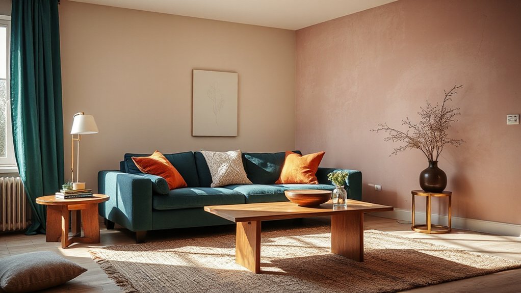
When a room’s colour feels flat, you can deepen it fast by layering texture, controlling sheen, and mixing materials.
Start with Textured finishes: limewash, microcement, grasscloth, or a lightly plastered wall scatters light, making the same hue read richer and more dimensional. Pair that with varied weaves—bouclé, linen, wool—so colour registers through touch as well as sight.
Then manage sheen deliberately. Use matte on large planes to calm glare, eggshell for wipeable walls, and satin or semi-gloss to highlight trim, cabinetry, or a feature ceiling. Keep sheen shifts intentional or they’ll look like patchy paint.
Finally, rely on Material combinations: oak with brass, stone with leather, or blackened steel with ceramics to anchor colour and add weight.
Test Interior Colour Samples Before You Commit
Before you buy gallons of paint or commit to a sofa fabric, test real samples in the exact room you’re colouring. Tape large paint swatches to multiple walls, and drape fabric next to the largest upholstery and rug. Check them morning, midday, and night under your actual bulbs; light temperature can flip undertones fast. Evaluate from your main sightlines and at seated height, not just standing.
Don’t judge colour alone—pair it with finishes to confirm texture contrast. A matte wall can mute a saturated hue, while satin can sharpen it. Use colour psychology deliberately: energising reds may feel aggressive at night, and cool blues can read sterile in bright daylight.
Live with your samples for 48 hours, then decide with confidence.
Frequently Asked Questions
How Does Colour Affect Acoustics and Perceived Noise in a Room?
Colour shifts perceived noise through Color psychology: warm, bright hues feel louder; cool, muted tones feel quieter. You’ll reduce echo by pairing calming palettes with Acoustic absorption materials—textiles, rugs, curtains, panels—and matte finishes.
Can Colour Choices Influence Appetite, Sleep Quality, or Productivity?
Yes—your colour choices can shape appetite, sleep, and productivity through psychological effects and emotional associations. Use warm reds/oranges to boost eating, cool blues/greens for better sleep, and balanced neutrals with accents for focused work.
What Colours Are Best for Neurodivergent Sensory Comfort and Regulation?
You can’t go wrong with soft, low-saturation blues, greens, and warm neutrals for neurodivergent regulation; they reduce glare. Use Color symbolism and Emotional associations cautiously. Avoid harsh reds/yellows, choose matte finishes, adjustable lighting.
How Do Cultural Meanings of Colours Impact Emotional Response Indoors?
Cultural symbolism shapes your Emotional associations, so the same colour can calm or unsettle you indoors. You’ll research residents’ backgrounds, test swatches in situ, and avoid universal claims; contextualize reds, whites, and greens before committing.
How Can Colour Help With Wayfinding and Accessibility for Low Vision?
Coincidentally, you improve wayfinding for low vision by using high-contrast colour bands on doors, floors, and handrails; you’ll add tactile colour cues and sensory integration—pairing paint with textures, lighting, and clear signage.
Conclusion
When you choose colour for how you want to feel, you’re designing more than a palette—you’re shaping the air in the room. Watch it shift from crisp morning to amber evening, and let temperature guide you: warm tones hug, cool tones calm. Check undertones and contrast so nothing turns muddy. Build depth with matte, gloss, wood grain, and soft textiles. Then test large samples on your walls—you’ll see the true colour you’ll live with.